Become a MacRumors Supporter for $50/year with no ads, ability to filter front page stories, and private forums.

fisherking

macrumors G4
Jul 16, 2010
11,251
5,561
ny somewhere
Yes. And Catalina was optimized for Intel Macs, and Mojave was, and HS was, and ...

So for everyone else, the new appeal to Big Sur is largely aesthetic. Like I said.

But since you're hammering it I'll revise my previous position: BS is running poorly somewhere, at least on my wife's 2017 Macbook that she reflexively updated since the notification told her to. Hanging menus, stuttering dialogue boxes, etc. I've yet to identify the technical specification that explains why that machine can run BS but a mid-12 MBP can't. If any sleuths want to help me out I'd be grateful.
reinstall. reset the nvram. post details in a new thread and ask for help.

you do know that every version of the OS has had people experiencing issues? this is not new to big sur. and how is all the work under the hood not, in fact, more important than the aesthetics?
 
  • Like
Reactions: Never mind

Silverlox

macrumors member
Aug 9, 2016
53
23
Most opinions of Big Sur are concerned with how the icons look or how the screen is transparent to this or that or some other visual aspect.
Well its only my opinion but the visual aspect changes of all variations of MacOs are all minimal. Yes they are different but I don't really care about that. In reality, all variations for the last 6 years or so look basically the same.
Yes its getting near to when IOS/IpadOS and MacOS are going to be nearly identical (although I remember Apple saying that would never happen) but my wish is for the programs and functionality to get better, easier to use etc.

For an example, moving files is still a mess, requiring me to use a program like mucommander.
Photos on iPhone are easy to get to but on a MacBook in Finder? Yes I know there is an app for it but I want to be able to use finder not the app.
There are other niggles like these that should be made better, not this incessant concern over how an icon looks, round or square corners, is ridiculous.
 
  • Like
Reactions: mgymnop

Feyl

Cancelled
Aug 24, 2013
964
1,951
This community is full of octogenarians wearing Apple watches, and enjoying an OS with bad design just because some icons look pseudowhatever which make macos look old and ugly, at the same time the wasted space and the contrast.

macOS Catalina looks better.

I don’t understand the hate for Windows 10it’s functional, compatible with everything, stable and it does the work done, sometimes even better than macOS.
I don’t understand the hate for Windows too. Well I do, but the fact is that it performs faster than macOS and it’s absolutely smooth in every area. For me the only major issue with Windows is that it’s very ugly.
 

chabig

macrumors G4
Sep 6, 2002
11,434
9,299
For an example, moving files is still a mess, requiring me to use a program like mucommander.
I use Finder to move files. What are you doing?
Photos on iPhone are easy to get to but on a MacBook in Finder? Yes I know there is an app for it but I want to be able to use finder not the app.
You can keep photos in folders on Mac. You don't have to use the Photos app.
 
  • Like
Reactions: fisherking

colourfastt

macrumors 65816
Apr 7, 2009
1,047
964
of course not. people who are happy with something tend to just enjoy it, and people who are unhappy tend to rant a lot; hence, this thread. am fine with big sur's sleek, modern, simple look.

honestly, i wish apple would allow us to customize aspects of our mac experience; this is something apple has never really supported. but i at least appreciate that, in not being able to satisfy every individual, they give us (basically) great-looking hardware, and a great-looking OS to match.
That was possible prior to 10.9 (I believe—my aged memory isn't what it used to be), albeit with 3rd party apps. I believe that has been "broken" for a while though.
 

whoawhoa

macrumors newbie
Feb 2, 2021
4
5
I had grown tired of all the flatness on the iPhone and windows and I switched to a MBP just in time last year to experience macOS like I wanted to... sad that this UI has an end date already.
In the end though, I would also just move on as nothing is permanent but I will stick to Catalina for as long as I possibly can.

The UI in Catalina just looks much cleaner to me with sharp lines which appears to be on the way out everywhere in the apple ecosystem (granted, the BS screenshot below is compressed and grabbed online).

Screenshot 2021-02-02 at 19.44.25.png
 

fisherking

macrumors G4
Jul 16, 2010
11,251
5,561
ny somewhere
That was possible prior to 10.9 (I believe—my aged memory isn't what it used to be), albeit with 3rd party apps. I believe that has been "broken" for a while though.
i've been changing system-level icons, ie dock icons, folders (with liteicon) thru catalina; hiding menubar icons with bartender (works in big sur), etc.

there used to be cool options (custom dropdown menus, 'themes' etc). to be honest, i miss liteicon a little... but am happy to be using my mac, not studying the GUI under a microscope. i don't 'look' at icons, i click on one to open something, and what i'm then using is what matters most.
 
  • Like
Reactions: retta283

retta283

Suspended
Jun 8, 2018
3,180
3,482
i've been changing system-level icons, ie dock icons, folders (with liteicon) thru catalina; hiding menubar icons with bartender (works in big sur), etc.

there used to be cool options (custom dropdown menus, 'themes' etc). to be honest, i miss liteicon a little... but am happy to be using my mac, not studying the GUI under a microscope. i don't 'look' at icons, i click on one to open something, and what i'm then using is what matters most.
I do miss those apps as well. I remember using an app called ThemePark back in the Tiger days to make some cool themes that removed brushed metal and gave the OS a brighter appearance overall which I liked.

Personally, I don't care particularly what Apple decides to do with their GUI, I only wish they left the option for us to change the app icons or other minor things. Some of the icons bug me, and currently the solution is to keep those ones in Launchpad... Before I had a "homey" feel to the OS, I had selected custom app icons for everything over the years. I've been getting used to Big Sup's UI, can't say I love it but it is what it is.
 

Feyl

Cancelled
Aug 24, 2013
964
1,951
I had grown tired of all the flatness on the iPhone and windows and I switched to a MBP just in time last year to experience macOS like I wanted to... sad that this UI has an end date already.
In the end though, I would also just move on as nothing is permanent but I will stick to Catalina for as long as I possibly can.

The UI in Catalina just looks much cleaner to me with sharp lines which appears to be on the way out everywhere in the apple ecosystem (granted, the BS screenshot below is compressed and grabbed online).

View attachment 1723556
One screenshot that perfectly explains what's wrong with Big Sur.
 
  • Like
Reactions: vddobrev

fisherking

macrumors G4
Jul 16, 2010
11,251
5,561
ny somewhere
Your view of beauty is highly questionable.. as I'm concerned.
which is why, with every new OS, we have people happy and unhappy. there's no way to create a GUI that everyone is ok with... and why, ultimately, it should matter less than how the OS behaves, and how our apps run.
 

pizzabox

macrumors newbie
Jul 2, 2020
26
29
I'm glad you brought up "how our apps run."

The fact is they've been running fine this whole time. (Well, except for those 32-bit apps—oops.) So when app and general system performance are consistent from one OS to the next, then what we're left to talk about truly is "how the OS behaves."

But here's a case study about apps.

I used to use the Reminders app to sync lists (fun stuff like groceries and vacation packing) with my wife. It worked, and that was that. But then, mysteriously, the same time she updated her computer to Big Sur, our lists stopped synching, without any explanation. On my phone, I finally dug through some "Upgrade" literature to find that the NEW AND IMPROVED Reminders app requires "upgrading" for both cross-device (same person) and shared (different people) functionality. You can run legacy Reminders or THE FUTURE IS NOW Reminders. You can either upgrade everywhere or nowhere.

What's the oldest OS to support these upgraded Reminders?

Catalina. The newest OS as of not even four months ago.

This is what happens when Apple arbitrarily ties system apps to the OS. There is no technical reason why Reminders—freaking Reminders, about as lightweight an application as there is—should not be able to maintain its functionality through this SUPER EXCITING UPGRADE PROCESS on OS versions going all the way back to the days of Adam.

Am I going to update my entire computer operating system just to be able to use my phone to tell my wife to buy me the smooth sunflower butter, not the crunchy sunflower butter, this time, once again?

Or am I going to hop on the internet and point out how dumb this is?

I think you know the answer.
 

fisherking

macrumors G4
Jul 16, 2010
11,251
5,561
ny somewhere
I'm glad you brought up "how our apps run."


Am I going to update my entire computer operating system just to be able to use my phone to tell my wife to buy me the smooth sunflower butter, not the crunchy sunflower butter, this time, once again?
if it's for something that important, the OS update seems worth it.

do you really believe that apple (or any developer) changes things just to make your life difficult? either way, everything changes; apps, hardware, the OS. just how it goes, and (sometimes) we get useful new features, changes, bug fixes (along with, sigh, new bugs).

i lost a small app that i depended on, with big sur. not happy about it, but also not focused on it, am too busy doing real work (and, lol, posting on this forum). so it goes...
 

ErikGrim

macrumors 604
Jun 20, 2003
6,525
5,145
Brisbane, Australia
I had grown tired of all the flatness on the iPhone and windows and I switched to a MBP just in time last year to experience macOS like I wanted to... sad that this UI has an end date already.
In the end though, I would also just move on as nothing is permanent but I will stick to Catalina for as long as I possibly can.

The UI in Catalina just looks much cleaner to me with sharp lines which appears to be on the way out everywhere in the apple ecosystem (granted, the BS screenshot below is compressed and grabbed online).

View attachment 1723556
Maybe don't compare a non-retina screengrab with a retina one next time?
1612354381529.png
 

fisherking

macrumors G4
Jul 16, 2010
11,251
5,561
ny somewhere
Well, that doesn’t change anything. It’s just sharper. If you like sharpness so much, try to compare iOS 6 with iOS 7-14 and OS X Mavericks with OS X Yosemite - macOS Big Sur.
or, we could just live in the present, and focus on the work (& play) we do, and not stress about what once was...
 
  • Like
Reactions: opeter

Jpoon

macrumors 6502a
Feb 26, 2008
553
38
It's all in the eye of the beholder. Some people think Windows 10 looks great, ads in the start menu and all!
 

colourfastt

macrumors 65816
Apr 7, 2009
1,047
964
It's all in the eye of the beholder. Some people think Windows 10 looks great, ads in the start menu and all!

Indeed it is.

Back in the day, I used Vista when it first came out (I moved to OS X because the computer I was using died) on a computer specifically designed for Vista, unlike many people who were using systems that were older and really didn't have the "power" to run Vista well. I really liked the look of the Vista UI. Also, I installed Win 8 on my iMac to play a Windows-only game for few years and really liked it as well—the tiled "tablet-like" desktop was a big step forward. I've never seen the need for a "start button" just so one can hunt through levels of menus to open an application.
 

Jpoon

macrumors 6502a
Feb 26, 2008
553
38
Indeed it is.

Back in the day, I used Vista when it first came out (I moved to OS X because the computer I was using died) on a computer specifically designed for Vista, unlike many people who were using systems that were older and really didn't have the "power" to run Vista well. I really liked the look of the Vista UI. Also, I installed Win 8 on my iMac to play a Windows-only game for few years and really liked it as well—the tiled "tablet-like" desktop was a big step forward. I've never seen the need for a "start button" just so one can hunt through levels of menus to open an application.
Yeah - the reality is most people hunt through the start menu because they couldn't be bothered to type the name correctly because they can't touch type.
 

colourfastt

macrumors 65816
Apr 7, 2009
1,047
964
Yeah - the reality is most people hunt through the start menu because they couldn't be bothered to type the name correctly because they can't touch type.
That's rather sad; I use Spotlight to launch certain apps I use frequently but not frequently enough to stick in the Dock. After using OS X (yes, I know it's called "MacOS" now, but I really don't care) for almost 15 years, I don't think I could go back to "WinDUHS" as a daily driver; the interface of OS X is generally better and more convenient to use.
 

nickdalzell1

macrumors 68030
Dec 8, 2019
2,787
1,670
To be honest, I was never addicted to the Windows start menu like everyone else. I was used to Windows 3.1 for many years so the start menu felt well, nested and time-consuming making what was once one step, double clicking an icon in Program Manager, into up to five or more, example:

Start-->Programs-->Games-->Microsoft Games-->Microsoft Flight Simulator-->FSX.exe

And heaven forbid your mouse didn't hover outside of it or it'd disappear and you'd begin again, and again, and again. What the solution ended up being was eventually a desktop splattered with icons. It happens today. My boss's PC has the entire desktop littered with icons for each document, app, or website, so does my Mom's. My Grandmom's. Windows 10 even!

I actually liked Windows 8 at first as it brought the old Program Manager back, and seeing as I had been using an Xbox 360 quite heavily at the time, the UI felt consistent with the Xbox. What killed it were the unintuitive gestures. I HATED them. They didn't make sense. I'd try to shut down the system and the charms bar made no sense and had a mind of its own and wanted to show whenever it felt like (or, I didn't figure out how to reveal it properly), and scrolling tended to switch apps randomly (maybe I can blame the touchpad sensitivity for that though?)

Another were the gestures in apps. Keep in mind there is no first-time walkthrough of the gestures when you launch a Win8 app the first time. I found an old Toshiba Windows 8 tablet I had forgotten about, powered it up, and for the heck of it, thought it'd make a decent e-reader. Installed Kindle, logged in, and now the challenge: How on earth do I download a book? It took a Google search to find out you had to touch and 'slide down' on a book to download a book. Why? I kept looking everywhere for a download icon since that's how the Kindle app has always worked. I tried tapping and holding expecting a menu. Nope. You tap, hold, and slide down on a book. That doesn't make any sense! Then a new challenge. How do you reveal the UI when in a book to change text size, page colors, or even go to the contents? I never did figure that out, so I gave up and shoved that tablet in the drawer.

But overall I liked the Windows 8 UI, and that's from someone who hates flat design overall. But if not for the gestures system (I know you can turn it off, but it breaks a ton of the Metro apps such as Kindle and others) it might have succeeded. I certainly didn't like going back to the alternatives, such as a littered icon desktop or pinning each app I use to the taskbar making it into one ugly Mac clone afterwards.

My complaints about MacOS go farther than Big Sur though. It started its flatness in Yosemite. I'd go back to Mavericks in a heartbeat if I could.

There's some hope at the end though. I brought my more recent HP laptop back online, installed the latest Windows 10 update (not that it gave me much choice!) and this laptop I bought last fall, it's got a themed start menu mimicking Windows 7 as best it can, but thanks to a YouTube channel (MichaelMJD) I discovered that MSN Explorer, titled Premium today, still exists, and has a nice, beautiful skeuo UI. So I paid for it, ($9 a month, but hey, I will pay for quality and skeuo if I have to, after all, you get what you pay for!) and I'm back on Windows 10 enjoying life. I do hope this skeuo UI that it uses will be a sign of future Windows 10 design. It seems they brought Aero back. Cortana is now reduced to a mere circle in the taskbar instead of taking up 1/3 of it. Microsoft started this flat wagon, here's hoping they start the reverse and everyone follows them again!

Has anyone seen Facebook though within the last week? The desktop page has been dumbed down to what looks like a mobile site, and this is how it is on a freaking Windows machine! I only knew about it since my mom couldn't access her games after they changed it (apparently a couple of days ago! I was still playing Gardens of Time no problem a week ago)

I eventually had to install Gameroom to her PC for the games to work again. Whatever they did to the site causes an odd error to show when you try to access games:

domain-url-not-included-app-domains.png
 
Last edited:
  • Like
Reactions: colourfastt

MrTSolar

macrumors 6502
Jun 8, 2017
369
444
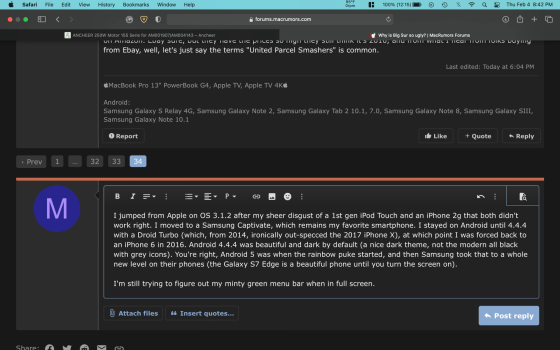
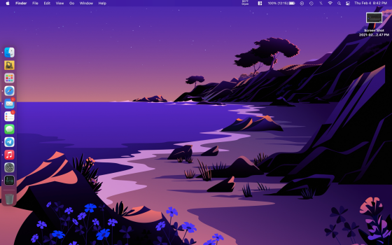
Anyone know what drives the menu bar color with fullscreen apps? My main wallpaper is an early-morning Beach (pulled one photo from the dynamic wallpaper) with mostly purple-ish hues, but the menu bar on all my full-screen apps is a very bright minty green. Where is it getting that color from?

As for Big Sur overall, a lot of things are more consistent with Apple's other devices, but it is on the verge of being too minimal and rounded. As much as I don't like Windows 10, it's appearance (once it has been de-crapified) is quite professional looking (bold colors, sharp lines, everything squared up), yet iOS/MacOS continue to become more cartoonified (I guess following Android?). I'd almost roll back to Catalina, but there are definitely some functional improvements that I don't want to give up. Icons just kinda float in the middle with no buttons to anchor them, and everything is so spread out that I almost just want to load MacOS on my iPad and be done with it.

As for iOS, I still miss how professional iOS 9 looked, but the best was the iPad's skeuomorphic glass dock.
 
  • Like
Reactions: RandomDSdevel

nickdalzell1

macrumors 68030
Dec 8, 2019
2,787
1,670
Windows 10 has been quite good at having the UI match the wallpaper you use, which started around the same time they brought Aero glass back. I had my win10 stuff offline so long they were still on 1004 or whatever version it was back in '17. The only way I knew there was a 'new' Edge (the chromium-based version) was at the work PC. I didn't know they had made the taskbar transparent nor white. All new to me. But seeing Aero return then seeing the newest version of MSN, well, it gives me hope. Apple's continually losing my hope. I just wish many websites and apps would do whatever Windows is doing today.

No, Apple's not following Android. In fact, in 2013, when Apple started with iOS 7, Android followed by introducing 5.0 Lollipop which was about as close to iOS 7's ugly as Android could get. They more recently started following every bad UI choice Apple has done, and replaced Nexus with Pixel, which resembles an iPhone. If anything, Apple has become the benchmark of design to every OEM except Microsoft, apparently, strange, given that MS started the flat design train and is now going back to skeuo update after update, while Android and Apple and many others keep stripping even more fun, design, and usability from their apps, sites, or OSs.

Here I am using a HTC Thunderbolt in 2021 as not just a form of protest, but it's the only phone I can use that checks all my boxes. Small screen? check. Skeuo UI? check. Two-day battery, check. Brick build like a 3310 Nokia? definite check. Removable battery, headphone jack, kickstand? yes! Only thing it is missing is a sliding keyboard. The only classic HTC phones with that are dead since 3G is dead. The original Droid was also 3G only. You can't activate a 3G phone without a SIM. Even a SIM-swap into a 3G/2G phone that operates on a GSM network won't last into 2022. AT&T is the only carrier keeping it going until then. The only way I even have VoLTE support on this 2011 phone is by mere luck--I activated it via SIM Kit from Straight Talk, in 2020. That means it's only using LTE as the only cellular network (law requires no more activations of CDMA/2G/3G on a Verizon phone after 2018) and that's the only network it shows under settings-->about phone. It keeps showing LTE icon in calls and when sending texts. It's a technicality really, since it's 2021, and still working 100%. Since the Pandemic has killed any chance at me having any fun outside, it's only use is as a MP3 player, and texting my girlfriend who lives a few states away from me. That's been it. If it weren't for the really cool animation of weather on the lockscreen (which is also useful) I wouldn't even have data or wifi turned on.

As for Apple, I really miss iOS 6. It was peak skeuo and peak future-looking UI and very easy for anyone from kids to grandparents to use. I still wish I could buy a used iPhone 3GS or an iPad 2 that hadn't been updated to 9. No such luck on Amazon. Ebay sure, but they have the prices so high they still think it's 2010, and from what I hear from folks buying from Ebay, well, let's just say the terms "United Parcel Smashers" is common.
 
Last edited:

MrTSolar

macrumors 6502
Jun 8, 2017
369
444
I jumped from Apple on OS 3.1.2 after my sheer disgust of a 1st gen iPod Touch and an iPhone 2g that both didn't work right. I moved to a Samsung Captivate, which remains my favorite smartphone. I stayed on Android until 4.4.4 with a Droid Turbo (which, from 2014, ironically out-specced the 2017 iPhone X, my current phone), at which point I was forced back to an iPhone 6 in 2016. Android 4.4.4 was beautiful and dark by default (a nice dark theme, not the modern all black with grey icons). Android 5 lost me, and then Samsung took that to a whole new level on their phones (the Galaxy S7 Edge is a beautiful phone until you turn the screen on).

I'm still trying to figure out my minty green menu bar when in full screen. It's that color if I'm in dark mode or light. It doesn't change.

**UPDATE**

I think I just figured out the problem with the menu bar. On fullscreen apps when I move the mouse cursor to the top edge of the screen to show the menu bar, it would appear in a color different from my desktop (as can be seen in the screenshots). To correct the color, I have to exit fullscreen, then go back fullscreen (green button). The app then grabs the correct desktop color and applies it to the background tint and menu bar color. The apps don't dynamically adapt the background color, so with changing wallpapers, the desktop will drift from the fullscreen apps. This is on mainstream 11.2, just installed yesterday.
 

Attachments

  • Screen Shot 2021-02-04 at 8.42.47 PM.png
    Screen Shot 2021-02-04 at 8.42.47 PM.png
    678.5 KB · Views: 70
  • Screen Shot 2021-02-04 at 8.42.59 PM.png
    Screen Shot 2021-02-04 at 8.42.59 PM.png
    1.9 MB · Views: 76
Last edited:
Register on MacRumors! This sidebar will go away, and you'll see fewer ads.