Become a MacRumors Supporter for $50/year with no ads, ability to filter front page stories, and private forums.
I personally believe if there were very few users depending on Flash, then supply and demand would have properly meant sunsetting it. But there were still tons of folks using it. The fact Adobe felt it necessary to add in a time bomb to the latest version and even kill the ability to play *.SWF files offline is telling.

Personally it was unetical to do so. Now, if less than 5% of users were relying on it? sure. Wait until usage drops. Otherwise you're being a dick.

10 years ago ain't that long ago. Heck, I'm using a Galaxy SII right now as my main phone. Works perfectly fine. I suppose you think it'd be better off in the garbage and people needlessly buy and consume because newer is always better, am I right? Your type of mentality is why change for the sake of change remains a huge issue today. Seems you are quite personal about Flash. Come on...If it were that bad, why not simply not use it yourself instead of force others to believe exactly like you do?

Java and Javascript are far more archaic than Flash ever was. They're also known to be resource intensive, and exploit-happy (ever had a Javascript based ad inject a trojan before?! That's why I don't understand how anyone browses without adblock on.). By your own issues with Flash, perhaps Javascript and Java should die also? I'd personally love to see Javascript die off.
 
Last edited:
I know I'm jumping into the conversation at mid-point (I'm exhausted after a long day so I'm not going to browse all 26 pages yet) but I can help you on the Adobe Flash question.

One of the main reasons why Flash was requested to be shut down was because it was a proprietary format - patented, licensed and operated purely at profit by Adobe (formerly Macromedia), with no oversight, and counteracting the open nature of the web. One of the main benefits of the web being that anyone can view the code of anyone else's work to a large extent for the benefit of everyone.

Additionally, because Flash was compiled at source, it had issues around rendering (mobile devices couldn't cope with it on small screens which increasingly became a problem as now over 60% of all web traffic is handheld).

But they aren't even the biggest issue... the two most problematic issues were security and accessibility.

First off, while you've mentioned script injection (which is somewhat limited as browsers sandbox code these days so exploits are becoming increasingly less viable through JavaScript, though I'll freely admit the increasing access to API's pose a threat if users inadvertently give permissions) - Flash is in an entire league of it's own. Adobe freely admitted that Flash Player had a literal hundreds of exploitable holes to which it couldn't keep up with, even worse, when exploits were found, Adobe being closed source they often took over a year to fix them (browser makers fix exploits in weeks). Aside from undocumented hacks, Flash being implemented through ActiveX (in IE) or direct code injection in other browsers from compiled local libraries had full unrestricted access to your OS, Registry, cookies, and file system. Flash implemented a basic sandbox in very latter versions but when exploited it failed to work correctly. So basically Flash was an all access by-pass through any security you or your browser had in place.

Then there's accessibility. Speaking as someone with disabilities, Adobe hates the disabled. If you have disabilities an open standard like HTML is great. CSS can enrich it. Heck, JavaScript can boost accessibility nowadays beyond HTML. Adobe technologies like PDF and Flash can be made to be somewhat accessible but it's time consuming, limited and 99% of the time was largely ignored. Anything with flash attached basically was a big neon sign saying if you have any issues, please politely **** off. Which aside from not being nice is actually against the law... and many international laws... and these days leads to a lot of million dollar lawsuits.

So yea... Adobe decided that they didn't want to drag the dead corpse around any longer and gave everyone notice. I should point out that they gave everyone over 5 years warning that they were considering ditching Flash and 2 years warning that they were killing Flash. So if people didn't prepare and export their old projects to something different then I guess their fault? You might think it's unethical to kill Flash because some folks stuck in the past want to keep using it, but with a technology as dangerous (security wise), inaccessible (and damaging to the disabled), and just plain scummy, as a 20+ year developer, I won't miss it.
 
I've never had any security issues or viruses nor have I ever known anyone who had when using Flash.

Mom used it to play FarmVille. I used it to play around on NewGrounds and Joecartoon.com before that.

It was better as a youtube player for low-end systems.

Adobe didn't kill Flash. APPLE did. Adobe sadly did a dick move and instead of just not releasing newer versions, added a time bomb to the latest version. That wasn't even necessary. Sadly, this means a great majority of Facebook games have EOLd (including one of my favorite, Gardens of Time), NewGrounds has EOL'd, and I'm sure tons more will also. It's a shame that no younger folks will be able to enjoy the likes of Henry Stickman...

Now, mom's games are gone, the HTML 5 limited selection isn't much, and all her games have gone. I had to do a hacky way to force an older Flash player to work just to restore her games (no telling how long that lasts)

I stand by my belief--if you don't like it, don't use it. Don't force us all to give up something we've used for years because 'newer is always better'. I can't stand how most young folks think. If it's older softwares or 'outdated' it is going to be instantly hacked or something. They always cry out "don't put Windows XP on the internet!" but I did, and nothing of consequence happened.

The lack of common sense and being smart is astounding. I am guessing a lot of morons frequent ThePirateBay, Torrents, P2P and p*rn or something, and that's just asking for hack attacks or viruses.

Also, here's a reality check for ya: hackers aren't going to target the 1% using XP today. They will almost always target that OS with the largest usage base to extort more people. The fake scammers from Microsoft almost always target Windows 10. Their little scripts won't even run on Internet Explorer. If you're thinking of becoming a hacker, you'd be an idiot to go after 1% of PCs out there languishing on XP or phones running Android 2.3.

The lack of taking responsibility for your sketchy browsing habits is telling. We have more and more companies attempting to protect users from themselves and it makes me sick.
This post is nonsensical.
 
Today my work computer showed a pretty major update to Windows 10 (or maybe just Office 365) that showed significant back-tracking away from flat design, which was one of the main beefs I had that inspired me to start this thread. Again, for me at least, the complaints about flat/vague/white-out/scoll-tall-heavy websites were first and foremost a reduction in intuitivity and ease of use which also applied to app/operating system design fads/trends of a few years ago that just drove me nutty due to the resulting backsteps in efficiency and intuitivity that I felt.

So just like Apple’s recent resounding back step from form over function for macbook hardware design, now Windows or Office 365 surprised me with a few improvements to the interface. The scroll bars are now less flat (no more simple flat grey box sliding in a simple darker grey track such that it was sometimes impossible to guess which was the slider) and are much more obvious as to where the bar is vs. the scroll track; the menu/command areas are now bordered with soft-corner boxes instead of appearing in a ”boxless area” at the top of the window which used to blend in to the top menu bar such that sometimes it was hard to quickly discern where the top window ended vs. the windows underneath…and now I see much more color in the menu icons vs. all black/white/grey.

Keep it up world. Less flat/vague fad-dom. More return to interface design based on what was proven to work well before Jony got his mits into software design.
 
Tozo, you should look at Windows 11. The last couple of feature updates skeuo'd more of the icons, as well as added in more colour saturation.

Unfortunately, that's about where it ends. At least, as far as I can see. I do appreciate it not being so 'busy' the way the W10 start menu was.

Flat has not gone yet. It might never will. UIs have been pretty stagnant since 2014-15. Either staying the same, going flatter, or going darker. That's about it.

Star Trek TNG might have been more ahead of it time than I thought, with how the UI of LCARS was, their computer interface they saw as the 'future'

screenshot-1-500x300.png
 
  • Like
Reactions: Tozovac
UIs have actually changed dramatically in the last 8 years. They just have changed away from the flat style. However, padding, borders, layering, and most importantly - interaction - have all changed a lot in 8 years. We've even introduced things like 3D Touch...and then removed it in that time. We've incorporated a huge amount of features and swipable/tapable areas that do different things. Hell, the way that almost every iPhone in the range is unlocked now did not exist 8 years ago. Remember that a User Interface is not how a system a looks. It is how a user interfaces with the device below. And that is a LOT more in depth and complex than if something has fake 3D shadows or not.

UIs are there same...only if you ignore everything that has changed.
 
  • Like
Reactions: WoodNUFC
UIs are there same...only if you ignore everything that has changed.
Completely disagree, and it’s impossible to ignore what’s changed that’s a component of the topic and can’t be conveniently disregarded. If there were a Tozovac scale of intuitiveness of interface interaction, where universal subjective perfection is a 10, and even considering all the intolerance, nightmares, and severe indigestion by some over green felt, leather stitching, and fake woodgain that can’t be ignored since it too plays a part in interface interaction, then all things considered, Apple interfaces and even website interfaces (interfaces in general by all the lemmings who follow Apple even if over a cliff at times) were an 8 from around 2005 to 2012, a 2 around 2013 (iOS7), and are slowly working up towards a 6 or 7 in the past few years.
 
Completely disagree, and it’s impossible to ignore what’s changed that’s a component of the topic and can’t be conveniently disregarded. If there were a Tozovac scale of intuitiveness of interface interaction, where universal subjective perfection is a 10, and even considering all the intolerance, nightmares, and severe indigestion by some over green felt, leather stitching, and fake woodgain that can’t be ignored since it too plays a part in interface interaction, then all things considered, Apple interfaces and even website interfaces (interfaces in general by all the lemmings who follow Apple even if over a cliff at times) were an 8 from around 2005 to 2012, a 2 around 2013 (iOS7), and are slowly working up towards a 6 or 7 in the past few years.
I didn't say that things had improved (or degraded). I said they had changed. You continually talk about flat interfaces and your dislike about them - and you're correct that those have not changed much. However a User Interface is more than about cheap drop shadows. It's about, quite literally, the way the user interfaces with the machine.

Or lets put it this way. The muscle memory you will develop with iOS15 with an iPhone 13, would be completely unusable on iOS7 with an iPhone 6. You literally cannot even unlock the phone in the same way, never mind talking about navigation and where different UI elements are and how they are accessed.

Or, if you'd like An analogy - saying interfaces haven't changed in 8 years because they're still flat is like saying cars haven't changed in 40 years because they still have 4 wheels. That aspect of the interface has not changed, no, but interfaces have.

Or (again), this is another case of the people in this thread who don't know anything and think that user interface design is simple, don't even have enough knowledge to know what they don't know. It appears that certainly people don't even know what an interface actually is, and think it's purely graphical.
 
Microsoft also released Windows 8 in 2012. It flopped for them. If Apple does it, everyone loves it. If only it were and Apple thing and didn't become a disease that infected Android and others, along with websites.

Flat UI is still very much a thing. It hasn't gone away much to my dismay. It's an interface dating back to the 80s. It's very outdated looking. Designed for an era with limited computing power and old display tech. The one part of that decade I cannot be nostalgic for.

Airbus incorporated glass cockpits with flat UI design back in the late 1980s on the A300, and later the 310 and 320. Complete with 80s office noises such as a very 80s phone ringer for autopilot disconnect as well as a seatbelt chime for a master warning alarm. This remains true to this day. Spacey cockpit but very outdated UI and sounds.


If that ain't 80s to you then I can't help ya!

We're supposed to be living in the 21st Century not the 20th!

01-early-mac-os.png

Apparently Apple hasn't gotten the memo that they've done flat UI before^^^
 
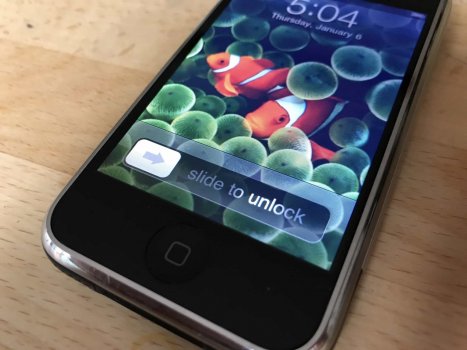
Just wanted to add that Apple actually made their interface LESS accessible for many, including my grandmother. She easily understood that classic 'slide to unlock' animation. When her iPhone 4 got updated to iOS 7, she couldn't figure it out, and it's worse any time she has to use my mom's iPhone 11 Pro for anything because she literally cannot make head nor tails out of the gesture nav system.

How more intuitive could you get from this?

slide-to-unlock.jpeg

If you have perfection, best to leave it alone.
 
Completely disagree, and it’s impossible to ignore what’s changed that’s a component of the topic and can’t be conveniently disregarded. If there were a Tozovac scale of intuitiveness of interface interaction, where universal subjective perfection is a 10, and even considering all the intolerance, nightmares, and severe indigestion by some over green felt, leather stitching, and fake woodgain that can’t be ignored since it too plays a part in interface interaction, then all things considered, Apple interfaces and even website interfaces (interfaces in general by all the lemmings who follow Apple even if over a cliff at times) were an 8 from around 2005 to 2012, a 2 around 2013 (iOS7), and are slowly working up towards a 6 or 7 in the past few years.
That seems to be an oxymoron?
 
  • Like
Reactions: Tozovac
btw - Microsoft started the flat design trend with Metro UI for Windows 8 and Windows Phone. This came before iOS7 and macOS.
I agree. I recall reading about Jony losing sleep over aspects of Microsoft’s Phone’s uber-minimalist and artsy-fartsy weather app and wispy-thin font. But I don’t think the world’s lemming designers fully embraced such flat/white-out/minimalist UI’s until iOS7 and Google’s crap Material Design hit the streets.

I wasn’t in love with everything-iOS6, but I loved the general obviousness of controls vs. info and other aspects that lent itself to a highly-recognizable hierarchy of info. I could give or take the artsy-design-heavy felt/wood/leather stuff. I liked underlying platform basics….I liked the aspects of the interferface designed to be undersood quickly, I didn’t worry about not the aspects meant to be gawked at for its style.

How ironic is it that Jony led Apple’s throwing out of certain artsy-design-heavy skeuomorphic stuff only to replace it with artsy-design-heavy minimalist sometimes to a fault stuff? Potayto Potahto?
 
Last edited:
can anyone recommend a good website builder software on a disc or download for keeps
that one can use and type web things <table> and <tr> etc?
my dreamweaver CS3 dissolved int abobisms.

RocketCake just simply sucks!
thanks in advance!
 
How more intuitive could you get from this?

View attachment 1914069

If you have perfection, best to leave it alone.
most (most, not the person who is reading this relative) elders cant comprehend (or don't want to) initiate the finger tap behind the Samsung phones.
they tap constantly and cant just rest their finger as the younger generation does,
must be a thing they learned a while back like getting finger prints or something like that embedded in their brain.
 
Samsung's early UIs weren't nearly as intuitive as iOS 6 or below were though. iOS had a definitive leg-up in accessibility. Unfortunately, due to internal issues regarding Scott Forstall, they had to up and get rid of anything he ever had a hand in, good or bad. It didn't matter if it affected their customer base at all; it was clearly a personal vendetta. I have no clue when companies started listening to their shareholders instead of their customers nor do I know when or why customers became complacent when companies make bad decisions, but we've all lost touch with true supply/demand economics. NO ONE asked for a larger than 3.5" display, there was ZERO demand for flat UI. Why can't companies listen to their customers instead of dictating direction to them?

No phones weren't selling due to headphone jacks or removable batteries either so why did they take them away? There was zero customers demanding it!

NO ONE else had Cover Flow, or those chrome buttons that clearly indicated play, volume or skip, or any other Apple magic that's lost today.
 
Why the lack of gridlines/borders and why all the wasted empty white space at an extreme loss of organization and efficient use?

I’ve mentioned a few times how my original thread regarding awful website design fads equally applies to certain trends in operating system and app design.

Just updated my iPhone to 15.1 and noticed something that I think is new; instead of running each mail folder within a white rectangle that bleeds to offscreen on each side, I think I see a new defined rounded-edge border/zone that no longer bleeds to the left and right offscreen. This to me adds a lot of subtle interface context that was missing before starting with iOS 7 where gridlines and borders/zones were reduced away to the absolute minimum. Now this clearly defines each folder as being “pressable,” and it also helps separate the grouped folders from the mailboxes below in the screen.

Way to go Apple. Keep on undoing all the reduced interface design aspects that were enacted during Jony “The Axe” Ive’s leadership reign.

A6A7F7E3-C8C8-4DC3-B69C-3980576DFEAC.jpeg


Maybe overall, these changes occurred at the onset of iOS 15. The examples that I speak about can be better seen when comparing 14 to 15:

B3EC14E9-6D83-4C5D-866F-82205244BB68.jpeg EA92EDD9-49F1-4206-8498-3BAC5833D359.png
 
Last edited:
  • Like
Reactions: decafjava
Hmm I just checked it and I actually agree with you. ;) A noticeable improvement over the last iteration.

An improvement not only in appearance, but in cognition and almost subconscious recognition. Seeing things gathered and defined just seems to help with quick recognition how to work with what’s in front of you before you even start working with it. Most everything with iOS 7 was so vague that it increased the time, even if and microseconds, to understand and navigate a bunch of the interface elements. It’s similar to why I detest most everything about flat design. Decreased obviousness and intuitiveness all around. And for what game? Something new and different at the time?
 
Last edited:
They've definitely improved a lot since iOS 7. I got an old iPhone 4 lying around (sadly on 7.1, and I found it in the junkyard!) that I turned on to see what was different. It was awful. I don't miss the frosted glass, or the barren looking control center it had over what they got now.

I had temporarily put my SIM into my 6S but like the last time, a week later it refuses to connect to anything other than 1x networks so back to my Note II it is! Was a nice week while it lasted, I was quite enjoying iOS 15.1 and WatchOS 8.1. There's this weird bug I have with Verizon where it messes with my iPhone's (and HTC Thunderbolt's) MIEI and makes data stop working and then calls, with texts working 1 way only (Can recieve but not send). Becomes a deal breaker.

I think these days, with the hardware finally plateaueing and there not being many things to improve upon except cameras, that the only thing they got left is software UI changes. They gotta find some way to keep selling phones even if the planet can't thrive much longer on unfettered consumerism.

With everything shifting towards digital consumption, the 'cloud', I would like to hope that hardware will be less important, and we can just focus on the Internet side of things for awhile. No one needs a new iPhone or Android phone anymore.
 
Last edited:
  • Like
Reactions: Tozovac
I just realized that the iOS 15.1 weather app has been vastly improved, undoing much of Jony JIve‘s minimalist folly rework at iOS7. Great job Apple! Keep keeping it up!


Function first, and (hopefully) never (again) sacrificed by form! (though rumors sure seem to indicate the MacBook Air may be getting a little bit of an unfortunate Revlon/Barbie Doll makeover)
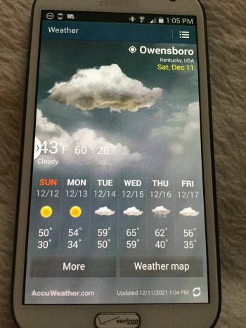
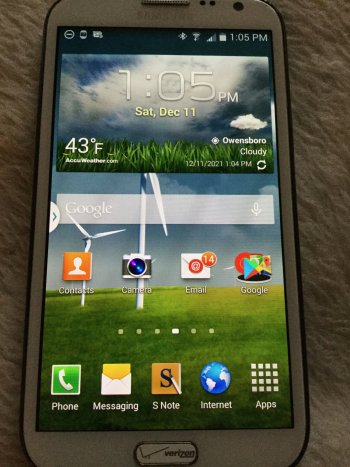
Yeah it's nice seeing it all coming back, but I still remain partial to my Galaxy Note II Weather:

IMG_0155.jpeg

Also, the home screen. Yes, that wallpaper changes to reflect day/night/weather conditions; the wind turbines spin different rates to indicate wind speeds:

IMG_0156.jpeg
 
I think it's much more because you're kind of a broken record on this topic and there's no real point trying to discuss anything.

But if you want to feel like you've "won", then congrats.
Microsoft also released Windows 8 in 2012. It flopped for them. If Apple does it, everyone loves it. If only it were and Apple thing and didn't become a disease that infected Android and others, along with websites.

Flat UI is still very much a thing. It hasn't gone away much to my dismay. It's an interface dating back to the 80s. It's very outdated looking. Designed for an era with limited computing power and old display tech. The one part of that decade I cannot be nostalgic for.

Airbus incorporated glass cockpits with flat UI design back in the late 1980s on the A300, and later the 310 and 320. Complete with 80s office noises such as a very 80s phone ringer for autopilot disconnect as well as a seatbelt chime for a master warning alarm. This remains true to this day. Spacey cockpit but very outdated UI and sounds.


If that ain't 80s to you then I can't help ya!

We're supposed to be living in the 21st Century not the 20th!

View attachment 1914068

Apparently Apple hasn't gotten the memo that they've done flat UI before^^^


OP the flat design is what Apple is doing, Microsoft is doing, Google is doing and Android is doing.

If it is well keeping you up all night long and you are yelling and screaming you are out of luck. You best of than switching to Linux as some destros have the old look but even than many Linux distros have moved to the flat design. But you could probably theme it and change the icons back to the older look but be some work. The light linux distros still kinda had that 10 year older look.

It could be 4 years from now or 8 years from now to when flat fad look is over and Apple or Android moves back to UI like Lion or Snow Leopard.

I don’t see Apple moving away any time soon the latest updates are flatter than 3 years ago.
 
Register on MacRumors! This sidebar will go away, and you'll see fewer ads.