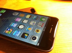
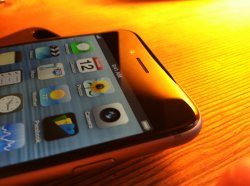
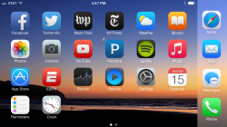
I hope things design wise do get improved on iOS 9. I have iOS 8 on my iPad Air, iPad Mini and iPhone 6. My iPod touch is running iOS 6 as thats the last supported OS. I still use it every week and when i open it up i love it! It makes me smile, the animations are smoother, better, and just more inviting. I get a feeling from iOS 6 thats just not there with iOS 7 or 8. I don't hate 7 or 8 as they have features i like, and the design is ok, but something makes them feel colder to me. Even down to the Apps iOS 6 feels better to me, like the address bar in Safari fully goes blue from left to right when loading instead of a thin bar you get in iOS 7/8.
I think it comes down the visual cues, as shown in the screen shot in a previous post, in iOS 6 it clearly says 'Off' in iOS 7/8 its not as instantly clear. Its not as clear in 7/8 whats press-able, whats a button, whats just text? (and turning on the buttons makes iOS 7/8 look horrendous)I think its areas like this that the iOS 9 design needs tweaking.
Yep, this pretty much sums it up to me.
It comes down to "user friendliness" vs. "modern art." Would you rather your couch be comfortable, or would you rather it looks like this: [___] ? Would you rather the folding bed part be easy to pull out, or would you rather that half time time it gets stuck?
"But most people never use the folding bed part." "Comfort and usefulness looks bad."
What constitutes "beauty" and "art" is not measurable. However, being user friendly is measurable. Apple should think to itself, "Is this design harsh on people's eyes? Does the design go out of its way to help people see where useful information is and where different sections of the interface are? Does it provide useful metaphors to convey function?"
What is feels like now is that Apple said to its each of its teams, "find five things to remove from the design of your section. Find one more layer deep to bury controls or hide them from the user. Don't be afraid to make controls ambiguous. Find any visual metaphors and remove them. Assume people already know how to use iOS and don't need visual cues. Make as many white pixels as possible... we want to maximize stark whiteness at all costs, no matter how much design we have to remove. Do not try to make anything obvious... use low contrast."
Am I wrong?
I think Jonny Ive makes a great hardware designer because this strategy is perfect for hardware design, where every extra thing adds weight and bulk, and no matter how thin and uniformly-colored you make things, the human sense of touch can easily distinguish the edges because of how sensitive touch is.
However I do not think this strategy translates well into computer UI, because using color and shape does not *cost anything* in a UI. User interface is all about functionality and interaction. Simplicity in UI is about reducing the number of steps required to perform a task or execute a function—not about just the visual appearance.
Simplicity in UI is aided by user-friendliness, which is about going out of your way to help the user know what step to take, where to look, or what next interaction to do—and in general to make all of this a pleasant, fun, and stylish experience.
Apple has always excelled at style and user friendliness, and I certainly can't fault them for boldly *trying* a new direction in iOS 7/8. I like the use of easy-to-recognize colors in the new app icons, and the use of blur in places to highlight the active control. The new resizable system font looks wonderful. The new back gesture is great.
But bugs and glitches aside, they also took some steps backwards, and went too far in the quest for minimalism. To me, it's no longer true minimalism when you start sacrificing truly useful things, like user-friendliness, in favor of just eliminating stuff because it is there. There is no useful purpose for overly thin lines in icons or text, no reason to use low-contrast color schemes, and really no point to having stark white everywhere.
I know in iOS 7, Apple introduced CoreText and brought in some designers from the world of print. I also come from the world of print, and I can attest that in print design, especially newspaper, "whitespace" is something you talk about and design around. But this is primarily because of the technical realities of the print medium—the paper is already white; gradients can look bad because of dot screen patterns and press inconsistency; color pages cost more to print; all ink/toner costs money (relevant if you are paying for that consumable); ink rubs off on people's hands (relevant in newspaper and some magazines).
Based on these reasons, when you get educated in print design in school, you are taught that minimalism and white-space are wonderful things, and in the case of print, I completely agree with this philosophy! In print you don't care at all about user friendliness. You care about a clean design because the more colors and graphics you use, and not just for design reasons, but also because the more ink you need, the muddier the press will get, and the more quality-control problems your print runs will have (we've all seen that magazine where some pages are all screwed up).
However the result of designing a UI using concepts and principles that come from the world of hardware design and print design is, if you'll forgive me, STUPID.
Pixels never bleed, color costs nothing, and you're dealing with an illuminated screen. In print, "whitespace" is only minimalistic because the paper is already white. In reality an LCD or LED screen is actually *black* by default, so using white is not at all minimalistic. In fact white is achieved by using the maximum values for red, green, an blue in the pixels. That is maximalism, not minimalism.
Bright white light hitting the eyes is just bad, too. At night it causes melatonin release to stop in the brain and keeps you up longer. All professional Mac software I use, from MOTU DP8 to Photoshop to PHPstorm to Apple's own XCode, offers a user-customizable color palette for the UI, including a dark-background mode. Why not do this with iOS?
I just don't get it. Why force a maximalistic, over-simplified, thin-line, low-contrast interface on us, and recommend developers to make all their apps in this style?
Fortunately some have not. Including Apple. Garage Band for iOS 7/8 looks great and still uses skeuomorphism where appropriate. And hey look, it's one of Apple's highest-rated apps! Coincidence?
Or look at Daily Routine, a wonderfully colorful time management utility, with bold, high-contrast icons and great UI customizability, although it could probably be simplified.
I don't hate the lack of design in iOS 7/8, because what little design they did use is not terrible (although I find myself using "invert colors" at night or indoors so as not to blind myself and ruin my ability to internally produce melatonin on a given night).
But making "deference" a design goal in iOS 7 led to more steps for the user by having apps hide things and require you to perform some extra gesture or step to get to the controls. This is to require more interaction in order to pay for visual simplicity. It makes apps much more confusing for people like my parents and grandmother. It is rarely a trade-off worth making.
Going to thin-line, hard-to-look-at icons was also really annoying. You do this in print design because ink always bleeds into the paper and ends up looking thicker, but I mean, how does using a 1-pt stroke with no visual relief improve a UI over a 4-pt stroke with a hairline of relief to improve contrast?
Compare the icons and tabs in iOS 6 Safari to iOS 7/8, or the keyboard. How is iOS 7/8 better in any way? The iOS 6 keyboard is a nice translucent gray and the platinum color of the address bar and tabs separates it apart from the webpage itself (as it should be). The slightly curved edges of the tabs is an eye-pleasing visual touch that shows refinement and prevents tab separator lines from appearing contiguous with any lines in the webpage that might happen to line up with the separation.
I just can't understand why Apple thought it was an improvement to get rid of all that.


