Become a MacRumors Supporter for $50/year with no ads, ability to filter front page stories, and private forums.
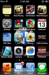
I just want them to somehow change the dock and add more dropshadows. There's no diffeentiation between the icons and the wallpaper now, and the dock is just so sudden, plus it covers a lot of the wallpaper. The homescreen of iOS 6 looked incredible because of the shadows and the smaller dock. Now, finding a wallpaper that looks good is almost impossible. Just revamp the icons and the shading and the dock and it will be much better. After that add a dark mode and TAKE ADVANTAGE OF THESE LARGE SCREENS IN THE IPHONE 6/6+ AND IPADS.

Agreed. Before iOS 7 came out, when I was beta testing it, I suggested they add manually configurable levels of drop-shadows, and create a Visual Preferences section of Settings, rather than hide all the visual settings in "Accessibility."

Frankly—and no offense to people with disabilities—I really resent being made to feel like a handicapped person because I don't like Apple's very peculiar taste in fonts and lack of visual contrast, etc. By putting the controls for font size, contrast, boldness, etc. in "Accessibility" along with the settings for colorblind people and deaf people, etc., it's like they're saying, "If you don't like how it is, then there's something wrong with you, but we're here to make it more accessible to you."

The new frameworks behind iOS 7 truly could enable a high degree of customizability, so I'm not sure why Apple doesn't give people a choice of different system fonts or have a "dark mode." They really could if they wanted to. But their version of "customizability" was to add translucency in more places so you could colorize things by just changing the background. While that works in places where there is translucency and a background, on the other hand, as you point out, due to the lack of drop-shadows on app icons, there are very few backgrounds that look good.

I guess the only thing we can do is start an internet campaign to get people to send feedback to Apple on this. While I know that MacRumors is a forum where only the nerdiest nerds gather, I guarantee you that there are millions of people who agree with us.
 
BTW I'd like to add, because I don't want to seem like a negative Nancy, that I really liked the change of the *shape* of icons in iOS 7/8, and the introduction of the design grid to help app developers make icons that are visually pleasing and proportionate. Not that they all have, but I certainly tried to. I appreciate that.

I also like the way that iOS 7's removal of borders and boundaries lets your app use more of the available screen real estate, which was super nice on iPhone 4 and 5 screens. My own app was really fighting for space before iOS 7, and the new design principles opened up the screen and gave noticeably more space to my design, allowing me to make some aspects of the view less cramped.

The removal of the background elements from the UIPickerView was really lame though, as you can see in the timer section of Apple's Clock app. To me that's one of the prime examples of how the removal of design just looked bad. In my own app, I manually added a "dial" shape back behind the UIPickerView, to make it look more like the old way, but I just don't understand why this was done by Apple.

The only logical explanation I could think of was that they needed to make everything in the UI into scalable vector graphics so that the entire OS could be scalable to any screen DPI or resolution, and so removing all bitmap graphics from the UI elements was the path of least resistance to accomplish this objective.

I'll really be interested to see how they can spice things up in iOS 9 with some simple, user-customizable, programmatically generated graphic enhancements, like gradient-shaded buttons and topic headers, picker view backgrounds, etc.
 
Agreed. Before iOS 7 came out, when I was beta testing it, I suggested they add manually configurable levels of drop-shadows, and create a Visual Preferences section of Settings, rather than hide all the visual settings in "Accessibility."

Frankly—and no offense to people with disabilities—I really resent being made to feel like a handicapped person because I don't like Apple's very peculiar taste in fonts and lack of visual contrast, etc. By putting the controls for font size, contrast, boldness, etc. in "Accessibility" along with the settings for colorblind people and deaf people, etc., it's like they're saying, "If you don't like how it is, then there's something wrong with you, but we're here to make it more accessible to you."

The new frameworks behind iOS 7 truly could enable a high degree of customizability, so I'm not sure why Apple doesn't give people a choice of different system fonts or have a "dark mode." They really could if they wanted to. But their version of "customizability" was to add translucency in more places so you could colorize things by just changing the background. While that works in places where there is translucency and a background, on the other hand, as you point out, due to the lack of drop-shadows on app icons, there are very few backgrounds that look good.

I guess the only thing we can do is start an internet campaign to get people to send feedback to Apple on this. While I know that MacRumors is a forum where only the nerdiest nerds gather, I guarantee you that there are millions of people who agree with us.

A "Visual Preferences" section in settings would be incredible. Perhaps they could merge it with the oddball "Display" and brightness. The resulting section would be "Visual Preferences and Brightness" or something, however that seems to be a mouth-full.

Pretty much what I'm thinking now is that this whole pane would be the same as "Display and Brightness" at the top. However there would be "Text Size" an added "System Font", and a switch for "Bold Text".

All the new and more in-depth options could reside below the current settings. First off, a switch for "Dark Mode". Then there would be options for the current dock, a more iOS 6-style one (obviously styled just a bit for iOS 7/8) or none at all.

Then there could be your drop shadow options, under a the header "HOME AND LOCK SCREEN" Here would be a toggle for a drop shadow for the status bar (similar to the dark bar for the status bar in iOS 6) a toggle for a drop shadow above the dock, as well as text drop shadow and icon drop shadow toggles. A drop shadow toggle would also exist for the clock on the lockscreen, this tends to show up on its own if the image is considered too bright and it ruins perfectly good wallpapers all too often. Next would be lock screen and home screen text colors, black or white. Sometimes these automatically change and its annoying.

If that happened, I would be very, very pleased.
 
I just hope it's a bug fix and performance release. Like the Snow Leopard of iOS. I also hope the next OS X is a performance release too.

I like iOS 7/8. I liked the fact that iOS 8 fixed a few of the annoyances of iOS 7. Like making the pop up menus better etc.
 
ios 9 is "rumored" to be more of a bug fixing release than anything. ill take that, i think ios 6 & earlier was a nice design, yet at the same thing ios 7 & later is also a nice design, ill take either or
 
"When you’re a carpenter making a beautiful chest of drawers, you’re not going to use a piece of plywood on the back, even though it faces the wall and nobody will ever see it. You’ll know it’s there, so you’re going to use a beautiful piece of wood on the back. For you to sleep well at night, the aesthetic, the quality, has to be carried all the way through."
- Steve Jobs, 1985
 
Transparent dock. That is literally all I want. I have some gorgeous wallpapers, but they only really "work" on the lock screen.
 
You remind me of those people who think a giant blue square is "art," like this crap:
Image

OK, if you want to define "art" as anything that someone says is "art" ... then the word can mean literally anything, and therefore is a meaningless word, because it has no set definition anymore. But OK.

However don't bring that crap into iOS. Design is something with a definition. You can't just "select all" and then hit Delete, and tell me something has not been erased. If all that remains of the design is NOTHING, then the design is GONE.

Lack of design is not design, it's lack of design. To design is to take an action, otherwise designers wouldn't get paid money to do it. If all you had to do in order to design something is just to use the default font on a white background, then any schmoe off the street is a world-class designer. Give me a break.

Darkgoob basically wants the green felt back, and maybe dogs playing poker as the dynamic icon on the felt. Art.
 
Darkgoob basically wants the green felt back, and maybe dogs playing poker as the dynamic icon on the felt. Art.

I know it has become fashionable to criticize skewomorphism (aided by the buzz created by ive's lobby 2 years ago, which stupidly enough only benefited android)...but not that the current Game Center icon is much better...a bunch of balls? Is that the best you could come up with, Apple?! Really?! And that's one of the best iOS 7 icons, because some are really so horrible it looks like they were sketched by some rookie with terrible taste...the reminders, and newsstand...arghhhhh!
 

Attachments

  • iOS-6-vs-iOS-7-icons-teaser.png
    iOS-6-vs-iOS-7-icons-teaser.png
    172.7 KB · Views: 304
Last edited:
I know it has become fashionable to criticize skewomorphism (aided by the buzz created by ive's lobby 2 years ago, which stupidly enough only benefited android)...but not that the current Game Center icon is much better...a bunch of balls? Is that the best you could come up with, Apple?! Really?! And that's one of the best iOS 7 icons, because some are really so horrible it looks like they were sketched by some rookie with terrible taste...the reminders, and newsstand...arghhhhh!

That's highly subjective and debatable. I'd rather prefer the new icons, by far
 
I really hope that  and Google get away from the super bright white background for everything. Not only does that eat battery life, but it is annoying as well. Tone down the white for the love of all things holy!

Using a white background uses no more power than a black background on LCDs, which iPhones, iPads, and iPod touches use. It's a different story for OLEDs, which is used on the Apple Watch (see why Apple picked a black background?) and many of the more popular Android devices.

----------

Not all iDevices are LCD anymore, and many Android devices are not. White backgrounds impact battery life on these devices.

Ah, you weren't done. Yes, all iOS devices still use LCDs except the Apple Watch, which technically is not an iOS device. It doesn't run iOS.
 
Ah, you weren't done. Yes, all iOS devices still use LCDs except the Apple Watch, which technically is not an iOS device. It doesn't run iOS.
For your edification, direct from Apple's website:

"Because a WatchKit app extends the behavior of your existing iOS app, the WatchKit app and WatchKit extension are bundled together and packaged inside your iOS app bundle. During installation of your iOS app, the system prompts the user to install the WatchKit app when a paired Apple Watch is present."

Apple Watch runs Watch OS, which is iOS in the sense of Steve Jobs announcing the iPhone with "iPhone runs OS X." You can pretend it does, but in all reality, iOS and Watch OS are two separate beasts, just like iOS and OS X were then and are today.
 
Oh look, everyone thinks they're a designer. And for clarification. Anyone who thinks the lack of shadows and gradients means there is no design.......yeah there's a reason you aren't a designer. If you can't handle it, there are droids calling your name.

Apple is not going to do a redesign on iOS 9. Simple. This topic got beaten to death when iOS 7 came out.

----------

He didn't say "cluttered," or mean cluttered. It's not cluttered.

Apple could have improved the organizational structure of the Settings app in iOS 7/8, but didn't. They actually made it worse by burying some of the most useful new settings three layers deep in Settings > General > Accessibility, an ironically-named place to hide common UI preferences.

God forbid Apple reorganize anything and have to retrain all their phone support staff and Geniuses. What would Apple support staff (and forum denizens who like to sound smart) ever do if they didn't have to explain to people where the useful settings are hidden? God forbid they move them to a top-level category called "Visual Preferences" or something logical where people might actually find them on their own.


No.

I mean using design elements like light and color in pleasant, useful ways.

iOS 6 was is a minimalistic, functional, uncluttered UI. I don't miss the app icon shininess effect, but 99% of the design they removed still needs to be replaced.


Are you suggesting fuel-additives and their bottles don't get designed?

If I told you to design a fuel additive and you removed half the useful chemicals, such that it no longer worked as well, was that a design process? Or the lack thereof? Can you not fairly call that a "lack of design"?

I do not find the removal of design in iOS 7/8 to be logically or intellectually defensible. It appeals to emotion only, like a feeling that somehow lots of white pixels and thin icons feels "less heavy" and "cleaner," although logically, heaviness is not a factor in visual design, nor is cleanliness. These are merely personal preferences, based on emotion and neuroses.

What *is* a scientific fact, however, is that white screens and thin fonts cause more eye strain with extended use. If what you call "design" were anything like engineering, as you suggest, then it would privilege science over whimsy and milquetoast neuroses.


It's important for you to realize that it's not actually clean, nor native, nor less cluttered. Those are merely words that represent your negative reactions to certain shapes and colors on a screen. Calling it "cluttered" is due to your own psychological issues. There is actually no more clutter or dirt when fonts are bolder and there is more contrast.


Which apps exemplify the "lazily squeezing ever-more tiny details into an icon"? Why is detail "lazy" or likely to cause "cognitive overload" (whatever that is)?

What is your opinion of the interface of common professional software on the Mac, like ProTools, Photoshop, or Maya? Would you agree being good these apps requires learning, and this is necessary for using them on the job as a professional?

Do you think people who get "cognitive overload" easily from detail should use professional software or buy professional computing devices with large, super-high resolution color screens?


Yeah I stopped reading when you claim iOS 6 was minimalistic. You also don't seem to know what the word "design" means yet you are posting long diatribes to push your OPINION out.

And isn't your view of the iOS 6 look a proof of your emotion and neuroses? Throwing around tons of big words doesn't really make up for anything relating to the fact that if you don't like it move on, get a job at Apple or switch to another platform.
 
Go Directly to Jail, Uncollect $99

Why can't the WiFi version of iPad, and the iPod Touch, run non-signed code like Macs can? It's ridiculous to have to pay a $99 developer license fee just to learn how to program on your device, or run MiniVMac, etc. Apple's argument for why iPhones are locked down is because it's your phone and it could cost you thousands of dollars in extra usage fees if something runs out of control, but the WiFi iPad is not your phone. Yet it's still locked down. Why? Don't even answer that, because there is no valid reason.

No, the reason is that Apple doesn't want unsigned code running on iOS devices, and the $99 fee covers a certificate so that developers can sign code to run on iOS devices.

If you don't know this most basic fact, you probably should consider a day job outside iOS app development.

I think (and hope) we don't need to go into why Apple doesn't want unsigned code running on iOS devices, but feel free to prove me wrong.
 
That's highly subjective and debatable. I'd rather prefer the new icons, by far

same here


old design was nice but the new one is far cleaner and slicker. Perhaps they could improve the icons or experiment with new graphics but the current design complements apple's "simple" design philosophy

that said I can understand why some people prefer the older design too.
 
I can look at all the details on the left and adore them for hours, while the right just makes me want to lock the device as soon as possible.

----------


The animations and "feedback" here are actually almost the same.


I agree. I have iOS 6 running on my 4S and my iPod Touch 4G. They look beautiful. My work iPad Air came with iOS 7 and, It drives me crazy.

Both the modern and the classic design have disadvantages and advantages. I have gotten use to the new design but, I am not jumping to update. My friend the other day during a party pointed out my 4S and said it was beautiful :cool: He said I was smart to stick with iOS 6 and, wished he could have done the same: )

Overall, a cool way to fix this dilemma would be to introduce a classic mode that can be enabled without jailbreaking your iOS device. It would toggle old UI and new UI. In the future, this will be possible due to the compression of space of your iOS software.

Until then, all we can hope for is that someone at apple brings back the "Steve Jobs Legacy"
 

Attachments

  • image.jpg
    image.jpg
    206.1 KB · Views: 261
Last edited:
  • Like
Reactions: Dino F
I can look at all the details on the left and adore them for hours, while the right just makes me want to lock the device as soon as possible.

----------


The animations and "feedback" here are actually almost the same.

Let me ask you this: why does space have to be white? Are you a spacist?

When I look up to the heavens or look at my iPad screen when it's off, the space that I see is black. I call out any minimalist who de-privileges blackspace under whitespace as a spacist and, in fact, a maximalist.

I say let the user set their own color palette throughout the system, and be able to choose between different sets of home icons. Why not? Why have to live under the visually oppressive tyranny of white spacist maximalists?


I concur, that's an improved homemscreen right there. If I was Apple I'd hire you as Head Design Refiner.

Wow thats a great idea. :apple: :cool: I would die for a feature like this on my iPad Air. I hate the new main app icons at the bottom of the screen.

However, there is already a website to create your custom icons for both safari and app icons. However, for the app icons, it redirects them through safari and then into the app. On the other hand, with internet shortcuts, I have used this site for a while and it will bring some much needed customization to your home-screens jailbreak free. Here is the link http://icustom.tooliphone.net/en/config#.VPebbGK9KSP

By the way, I also used the nested folder trick on this folder. :D
 

Attachments

  • image.jpg
    image.jpg
    259.3 KB · Views: 182
I agree. I have iOS 6 running on my 4S and my iPod Touch 4G. They look beautiful. My work iPad Air came with iOS 7 and, It drives me crazy.


I'm know the feeling. My iPhone 5s also came with iOS 7, but I wish i could revert my iPad 2 back to iOS 6...my bad, should have never upgraded it.

I totally agree with Jobs that the iPad was a "magical device", or at least felt like one. I'm sure most of you felt the same when you tried an iPad for the first time...Now it's crap thanks to iOS 7! :(


Same. When I updated my old iPad 2 from iOS 6 to iOS 7, I regretted it. It took from September of 2013 to April of 2014 for my iPad 2 to be reliable again. :D At one point at my work, everyone's iPads were crashing due to being loaded with iOS 7:p . During meetings, it was hilarious XD!
 
If you are referring to Apple bringing back skeuomorphism from iOS 6 and bellow, no they won't.
It seems it's more about helpful design elements vs. just some soecific methodology like skeuomorphism.
 
There is always hope

If you are referring to Apple bringing back skeuomorphism from iOS 6 and bellow, no they won't.


Who knows what could happen with the future. Apple may learn its lesson and, bring back the old skeumorphisism design. Right now, all we know about iOS 9 is that it brings "innovation and bug fixes" rather than adding new "features". It even is possible for a new leader of Apple to step up and continue the Steve Jobs Legacy.

One great thing I have learned from these forum is "Don't give up from Apple." Every company has its ups and downs and, times of hardship will make both us and Apple stronger :rolleyes: :cool: :D !
 
If you are referring to Apple bringing back skeuomorphism from iOS 6 and bellow, no they won't.

It seems it's more about helpful design elements vs. just some soecific methodology like skeuomorphism.

Who knows what could happen with the future. Apple may learn its lesson and, bring back the old skeumorphisism design. Right now, all we know about iOS 9 is that it brings "innovation and bug fixes" rather than adding new "features". It even is possible for a new leader of Apple to step up and continue the Steve Jobs Legacy.

That's not what skeuphormism is! Thats just gaudy textures
 
You remind me of those people who think a giant blue square is "art," like this crap

You also sound like one of the people that scream THIS IS NOT ART just because you personally don't get/like it. That doesn't make it any less of a design, it just makes it a design you don't appreciate.

The days of drop shadows and 3D bevels are over, and it looks very outdated to me.
 
  • Like
Reactions: AustinIllini
Register on MacRumors! This sidebar will go away, and you'll see fewer ads.