Become a MacRumors Supporter for $50/year with no ads, ability to filter front page stories, and private forums.

luke lau

macrumors regular
Jan 25, 2015
133
29
Belfast
The only logical explanation I could think of was that they needed to make everything in the UI into scalable vector graphics so that the entire OS could be scalable to any screen DPI or resolution, and so removing all bitmap graphics from the UI elements was the path of least resistance to accomplish this objective.

The UI still uses bitmap graphics. Graphics are still loaded on a @1x @2x @3x basis
 

TRDmanAE86

macrumors 6502
Jan 27, 2015
310
51
New England
You also sound like one of the people that scream THIS IS NOT ART just because you personally don't get/like it. That doesn't make it any less of a design, it just makes it a design you don't appreciate.

The days of drop shadows and 3D bevels are over, and it looks very outdated to me.

Nothing is ever over. Skepticism can be modernized. This is a huge debate these days. Appearance vs functionality. Material UI vs Skeptocism. Both UI's are ok but, people already have a personal preference. It's good to be different and, Apple should realize this. Our IOS devices are our own and, we should be allowed to choose which UI fits our tastes and, not be dictated what UI our phones should look like!
 

AustinIllini

macrumors G5
Oct 20, 2011
12,699
10,567
Austin, TX
Nothing is ever over. Skepticism can be modernized. This is a huge debate these days. Appearance vs functionality. Material UI vs Skeptocism. Both UI's are ok but, people already have a personal preference. It's good to be different and, Apple should realize this. Our IOS devices are our own and, we should be allowed to choose which UI fits our tastes and, not be dictated what UI our phones should look like!

No, but skeumorphism no longer is a critical piece of the UI puzzle. When the iPhone first came out, skeumorphism was vital because using real life imagery allowed for the end user to figure out how to work the device. Now, however, the learning curve has been met. We all know how to slide to unlock and the like, so skeumorphism is no longer a means of understanding, but is now ugly and superfluous.
 

kmj2318

macrumors 68000
Aug 22, 2007
1,669
712
Naples, FL
The UI still uses bitmap graphics. Graphics are still loaded on a @1x @2x @3x basis

The OS uses a lot less images for graphics. Toolbars and backgrounds in iOS 6 had to be images and each redesigned for each screen size. In iOS 7/8, the toolbars and backgrounds are just flat colors that are defined in the code. Icons are still images but that's not as big of a deal because they don't have to be redesigned, just resized.
 

Menel

Suspended
Aug 4, 2011
6,351
1,356
Nothing is ever over. Skepticism can be modernized. This is a huge debate these days. Appearance vs functionality. Material UI vs Skeptocism. Both UI's are ok but, people already have a personal preference. It's good to be different and, Apple should realize this. Our IOS devices are our own and, we should be allowed to choose which UI fits our tastes and, not be dictated what UI our phones should look like!
You are buying a device from company who has the largest smartphone share in the US. Used by all the popular movie stars and businesses. Apple is about big corporate popculture uniformity.

If you want to be different, look elsewhere.
 

TRDmanAE86

macrumors 6502
Jan 27, 2015
310
51
New England
No, but skeumorphism no longer is a critical piece of the UI puzzle. When the iPhone first came out, skeumorphism was vital because using real life imagery allowed for the end user to figure out how to work the device. Now, however, the learning curve has been met. We all know how to slide to unlock and the like, so skeumorphism is no longer a means of understanding, but is now ugly and superfluous.

Come on. UI is a work of art. Some people like the material design and, others hate it. The Material UI and the Skepticism UI's have different aspects that make them unique to the end user.

For example, with Michelangelo's David Sculpture, just because it is old does not mean it is pretty

I ignoloege your point but, that is not what I am trying to spell out. Everyone has different tastes and, should have options that best fits them.

As I'm typing this, I'm a teenager who grew up with iOS 4 back in 2013, iOS 7 came around and, I hate it with a passion. It is dull, flat, and boring.

Just like me, there are other people out there that dislike the old UI and, like the old one. It's like comparing a red t-Shirt to a blue one. Everyone has there own tastes. and, we should be allowed to respect them.

As humans, we are all unique in our special ways and, should be able to express ourselves freely any way you want it!

I'm going android soon because, I like customization!
 
  • Like
Reactions: Dj64Mk7

luke lau

macrumors regular
Jan 25, 2015
133
29
Belfast
The OS uses a lot less images for graphics. Toolbars and backgrounds in iOS 6 had to be images and each redesigned for each screen size. In iOS 7/8, the toolbars and backgrounds are just flat colors that are defined in the code. Icons are still images but that's not as big of a deal because they don't have to be redesigned, just resized.

The individual background images and edges didn't need scaling for each screen size, because the actual toolbars etc weren't just one massive image. A really detailed button or whatever was usually composed of a tiling texture image that's masked so it's rounded and the right shape, with edges loaded from images and tiled as well. If you want a good idea of what I mean, poke about in an Mac app that's still kinda texture-y (like tweetbot) and look in its resources folder by going to right click -> show package contents. The elements are kind of like stitched together, not just one static bitmap.
 

C DM

macrumors Sandy Bridge
Oct 17, 2011
51,392
19,461
That's not what skeuphormism is! Thats just gaudy textures
I don't think I referenced as to what it is/was.
You also sound like one of the people that scream THIS IS NOT ART just because you personally don't get/like it. That doesn't make it any less of a design, it just makes it a design you don't appreciate.

The days of drop shadows and 3D bevels are over, and it looks very outdated to me.
Seems like the bolded parts point out the disjointness of that quite well.
 
  • Like
Reactions: TRDmanAE86

Paradoxally

macrumors 68000
Feb 4, 2011
1,987
2,898
You are buying a device from company who has the largest smartphone share in the US. Used by all the popular movie stars and businesses. Apple is about big corporate popculture uniformity.

If you want to be different, look elsewhere.

300px-Apple_logo_Think_Different_vectorized.svg.png


Funny how that works out. Apple catering to the masses made them billionaires, but they are now the elephant in the room; the company that is always compared with.

It's a shame Android seems permanently in a phase of "never quite there", because I think Google have been doing wonders with its design. I cannot accept having a phone that doesn't receive 0-day updates (Nexus is not really an option when phones like the S6 have better hardware), however, and that's why I stick with an iPhone.
 
  • Like
Reactions: TRDmanAE86

chekz0414

macrumors 6502a
Jul 3, 2011
770
99
FL
Personally as a user of iOS since 2.0 I liked that Apple updated the design in both iOS 7 and 8. I prefer a lot of the newer iconography in comparison to the old one. I would like however if Apple refined the UI in 9.0 with a more Yosemite look. Also if it's designed to be more efficient and friendly I'll be all smiles. There is no reason for an A8/A7 device to lag on an OS that it shipped with. (iPhone 6, 6 Plus, iPad mini 3.) I'm confident that Apple will fix this in the next update, and address a lot of the bugs, including dynamic wallpapers too. (It worked seamlessly in iOS 7, only to be broken in 8, and causing crashes on the most powerful iOS device -iPad Air 2- it's a shame!)
 

TRDmanAE86

macrumors 6502
Jan 27, 2015
310
51
New England
I'm generally OK with the design of iOS 7 and higher, but I do agree that the OS could benefit from a lot less white.

This is my main priority for iOS 9.
Choose another color besides white! It is annoying to open up my screen and, be blinded by the music app!


My other requests for the UI would be...

2. Custom colors for your dock (a black would be nice or, have option to get rid of completely! )

3. Custom lock screen buttons (instead of relying on wallpaper in the background to determine the key color, have options to choose from the settings)

4. Custom skins (just like android)

Yes. I don't personally like the design of post-iOS7 anymore. Doesn't mean it's "NOT ART" or "NOT A DESIGN", just not one I appreciate.

True. I dislike iOS 7 and up's material design. However, I still consider it a UI design and, a work of art. Heck it may not look good in my eyes but, in someone else's, it could be a masterpiece!

Hopefully, a combination of both would be great. Skepticism iOS and Material iOS software downloads.
 
  • Like
Reactions: jsmith189

C DM

macrumors Sandy Bridge
Oct 17, 2011
51,392
19,461
I prefer much of how iOS is going now. But do we still even need a dock? I've lost the purpose of it being there.
Easily accessible most common/favorite applications no matter what app page you are on? Seems like the purpose is still there.
 
  • Like
Reactions: KALLT

vista980622

macrumors 6502
Aug 2, 2012
369
178
I'm curious if Apple will put design back into iOS when 9 comes out?

I thought it was weird that they erased design from most places in the system on iOS 7 and then did not add it back in 8. All the stuff that used to have design is still just plain white with the default font in black, or sometimes in that really ugly blue color.

Do you think they'll add back nice beautiful gradients and the easy-to-look-at high-contrast gray interface with drop-shadows to help you visually distinguish things?

Or for those who hate everything being white, do you think they might let users change the default background to gray or black, at least?

While iOS 9 mainly kept the previous design, there's some good news:
Apple added back drop shadows for pop-overs on iPad.
 

Agent-J

macrumors regular
Sep 20, 2014
148
38
Some call the iOS 7 design bold, I call it bland. It's all in the eye of the beholder. However, whichever you prefer, we're basically beholden to the aesthetic of a single person for both hardware and software now. Committees are a wretched way to get things done, but the point of a compromise is that (most) everybody can live with it. When Ive picks some new idea, you've no choice but to go along with it, unless you want to go Android.

Would that Apple would give SOME choice, even if it's exactly the same basic design only darkened a bit. That would likely drop the volume of complaints by a huge factor. I tend to take umbrage when my betters tell me I'm too stupid to make any choices for myself. As it is, it's almost certain that when my iPhone 5 dies, my next phone won't have an Apple on the back; but it's not for me wanting Android, it's feeling Apple doesn't want me as a customer.
 
  • Like
Reactions: TRDmanAE86

vista980622

macrumors 6502
Aug 2, 2012
369
178
Some call the iOS 7 design bold, I call it bland. It's all in the eye of the beholder. However, whichever you prefer, we're basically beholden to the aesthetic of a single person for both hardware and software now. Committees are a wretched way to get things done, but the point of a compromise is that (most) everybody can live with it. When Ive picks some new idea, you've no choice but to go along with it, unless you want to go Android.

Would that Apple would give SOME choice, even if it's exactly the same basic design only darkened a bit. That would likely drop the volume of complaints by a huge factor. I tend to take umbrage when my betters tell me I'm too stupid to make any choices for myself. As it is, it's almost certain that when my iPhone 5 dies, my next phone won't have an Apple on the back; but it's not for me wanting Android, it's feeling Apple doesn't want me as a customer.

I set triple click home button to toggle "Invert Color". When using my iOS devices at night, it helps a bit.
When going through photos or watching videos, I'll toggle it back.

Not desirable, but better than nothing before Apple tones down over-use of white spaces.

Jailbreak tweaks like Eclipse can also help (if you're into that sort of thing).
 
  • Like
Reactions: TRDmanAE86

TRDmanAE86

macrumors 6502
Jan 27, 2015
310
51
New England
Some call the iOS 7 design bold, I call it bland. It's all in the eye of the beholder. However, whichever you prefer, we're basically beholden to the aesthetic of a single person for both hardware and software now. Committees are a wretched way to get things done, but the point of a compromise is that (most) everybody can live with it. When Ive picks some new idea, you've no choice but to go along with it, unless you want to go Android.

Would that Apple would give SOME choice, even if it's exactly the same basic design only darkened a bit. That would likely drop the volume of complaints by a huge factor. I tend to take umbrage when my betters tell me I'm too stupid to make any choices for myself. As it is, it's almost certain that when my iPhone 5 dies, my next phone won't have an Apple on the back; but it's not for me wanting Android, it's feeling Apple doesn't want me as a customer.

I completely agree with you. Like I have said earlier. it is unacceptable to force a UI design on the consumers. There should be options in Apple. If you want the classic UI, you should be able to have it. Comprehensive UI. Just like you, I have given up and, am going to Android. I'll still have a iPod Touch but, will pretty much stick with the 4th gen cause it maxes out at iOS 6!

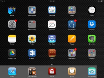
Btw, this is how angry I am at iOS 7 (I rescinded some icons to reflect the good old days):)
 

Attachments

  • image.jpg
    image.jpg
    527.5 KB · Views: 198

Jsameds

Suspended
Apr 22, 2008
3,525
7,988
"Will Apple reintroduce design to iOS 9?"

"I'm curious if Apple will put design back into iOS when 9 comes out?"

Implying that iOS 7/8 doesn't have "design" is hilarious haha :D
 
Register on MacRumors! This sidebar will go away, and you'll see fewer ads.