Become a MacRumors Supporter for $50/year with no ads, ability to filter front page stories, and private forums.
Status
Not open for further replies.

MagnusVonMagnum

macrumors 603
Jun 18, 2007
5,196
1,452
And how would Apple know that I am still using a late-2011 MBP running SL? They are not asking for any feedback, nor send any survey to its users.

It's simple. Every time you use the App Store or even check for a software upgrade on older OS versions, they receive data about your computer including what OS version it's running. Otherwise, it wouldn't know what software updates to offer you. They use this to keep track of how many are using what version of the operating system.

Why wouldn't it be both powerful and beautiful, just like previous iterations?

I think in 2008 the Macbook Pro was the peak of notebook technology (beyond the desktop in a notebook type "gaming" laptops). But the "desktop" Macs have LAGGED in GPU support for a long time now. You have been able to get a decent GPU once in awhile for previous versions of the Mac Pro, but it was so sporadic, you couldn't count on staying up to date for graphics. Really, not since the PowerMac (back when you could just flash many cards to run on the Mac that had a driver and pay the same price even) have Macs really had the latest GPUs and of course back then they used different CPUs (PPC) than Windows machines so it was harder to compare them tit for tat.

I mean if I wanted to build the ultimate PC that runs both OS X and Windows (the latter for gaming mostly) what Mac would I buy from Apple? THAT is what I'm talking about. There is no truly "great" Mac for gaming (even running Windows) because Apple puts mobile GPUs in their so-called "desktops" save the Mac Pro and it uses a Pro GPU that isn't designed for gaming either. You could get gaming cards for the previous Mac Pro, but as I said they weren't updated often and they never offered SLI type options except in Windows.

My point is that shouldn't the "best OS" have the best capabilities in ALL areas? Apple has never paid much attention to graphics since the 1990s except in iOS. They STILL don't have OpenGL up to date. They regularly refuse to cooperate with gaming companies to improve the OS for gaming, let alone improve their drivers...like EVER. In the Windows world, you get driver efficiency updates all the time direct from NVidia and AMD. It's one of the reasons (along with OpenGL always being behind and often having to be translated from DirectX) that games run slower in OS X on the same machine. It COULD be fixed by Apple. They've got more money than Microsoft so it shouldn't be an issue for them these days in terms of resources like they might have feigned a dozen years ago. They simply have no interest in providing POWER computers anymore.

I personally think the new Mac Pro was a pet project of Ive's or someone to make some futuristic looking thing (maybe to go along with the "spaceship" campus) and somehow I doubt the trend of ignoring the Mac Pro for years at at time will change. In other words, don't expect the Mac Pro to get regular updates. I would expect more iMacs like the 5k. At least IT has a good mobile GPU but it's not because they suddenly care about performance. It's only because it's practically NECESSARY to run that 5k display (i.e. they do seem obsessed with "RETINA" monikers. That's funny since I used to own a "Retina" GPU card for my Amiga 3000 at one point in the mid 90s. I wonder if they bought the name or it just never got renewed.

How much effort would it take Apple to get a regular non-XEON motherboard adapted from the current Mac Pro and put a standard GPU slot on it that can use modern PC graphics cards (maybe even two with SLI support)? Not hard at all. The Mac Pro case would make a kick-arse gaming box at its size and quiet operation. With a top notch card a good desktop i7 quad, the box could sell like hotcakes around the $2k mark, even to people that only want to run Windows. It'd be like a gaming cube but a gaming cylinder. I'd buy one. I won't buy the current Mac Pro. It's not what I'm looking for.

Basically, the ONLY option to get a truly POWERFUL consumer desktop "Mac" is to build a Hackintosh and that is SAD as there is simply no reason Apple couldn't make a high-end consumer Mac and even re-use the same case as the Mac Pro (i.e. the PowerMacs all had similar cases). The ONLY expansion card slot you NEED in a high-end gaming computer is the GPU slot and the Mac Pro already has those, but not the right kind and the XEON is overkill for gaming (especially price wise). Build it and they will come. There's no reason why Macs couldn't make headway into the gaming market if Apple offered better hardware, improved drivers and kept OpenGL up-to-date and in the mean time Windows would run games full tilt. Personally, I hate booting into Windows so I'd be all for a gaming solution on the Mac. The Mac doesn't need EVERY game ported. It only needs the really good ones. Break that mold and the rest would follow, but not with the OS going to hell and the "desktop" Macs being virtual TOYS compare to REAL desktops.

I bring up gaming since I do like to game, but more powerful GPUs are helpful to all kinds of areas of software, not just gaming. The iMac 5k doesn't have a Pro GPU, but it makes a good gaming GPU AND it still works well enough for many Pros as well given the other specs and the 5k screen.

Meanwhile, I just looked at a Lenovo Yoga3 Pad Pro II computer that has a built-in video PROJECTOR for only $799. I go on business trips for weeks at a time sometimes and frankly that would be awesome to have in a dark hotel room instead of whatever crap TV they offer. Why don't we see some more innovations like that in Macs or even iPads these days? I thought Apple was supposed to be an innovator? The GUI of Macbooks (via OS X) was the one bright spot, but they seem intent on screwing that up lately.
 

frgough

macrumors newbie
Jun 28, 2007
15
0
Apple is a company consisting of people. People organize themselves in teams and departments. Apart from designers there will be product management and marketing. There's no way a single person will have much influence in the end.

The current result more looks like a bad compromise, resulting from endless committee meetings without clear directions. But that is only my opinion.

Simply not true. Someone always stamps "approved" at the end of the day. That's where the buck stops.
 

frgough

macrumors newbie
Jun 28, 2007
15
0
We do need to keep in mind that our perception of Yosemite is only an opinion. There is are other threads dedicated to how beautiful Yosemite is. Drastic change will always spark resistance.

Disagree. While some comments here are purely subjective, a large portion of the comments give quantitative reasons why Yosemite is an inferior UI.
 

joedec

macrumors 6502
Jul 25, 2014
443
51
Cupertino
Disagree. While some comments here are purely subjective, a large portion of the comments give quantitative reasons why Yosemite is an inferior UI.

Agreed. "Looks terrible" for me, is poor quality; shading, dim fonts, pixelation, clearly measurable things. I can live with the design.

Its funny people who "love it", also say "get your eyes checked". Actually, its quite the opposite, I have perfect vision and I see all those defects. People who "love it" probably can't see the blurry edges or how colors bleed into one another.

What we have here is differences in tolerance for quality, or poor vision.
 

Cubytus

macrumors 65816
Mar 2, 2007
1,437
22
We do need to keep in mind that our perception of Yosemite is only an opinion. There is are other threads dedicated to how beautiful Yosemite is. Drastic change will always spark resistance.
This is not just a matter of aesthetics, but functionality as well. Even finding Yosemite beautiful (!), lack of compatibility is an objective problem.

It's simple. Every time you use the App Store or even check for a software upgrade on older OS versions, they receive data about your computer including what OS version it's running. Otherwise, it wouldn't know what software updates to offer you. They use this to keep track of how many are using what version of the operating system.
Yet they don't seem to be offering compatible software. On iOS I can download the latest compatible app with iOS 6, but such an option isn't offered in the Mac App Store.


I mean if I wanted to build the ultimate PC that runs both OS X and Windows (the latter for gaming mostly) what Mac would I buy from Apple? THAT is what I'm talking about. There is no truly "great" Mac for gaming (even running Windows) because Apple puts mobile GPUs in their so-called "desktops" save the Mac Pro and it uses a Pro GPU that isn't designed for gaming either. You could get gaming cards for the previous Mac Pro, but as I said they weren't updated often and they never offered SLI type options except in Windows.
Were mobile GPUs included in previous-generations iMacs?

In the Windows world, you get driver efficiency updates all the time direct from NVidia and AMD. It's one of the reasons (along with OpenGL always being behind and often having to be translated from DirectX) that games run slower in OS X on the same machine. It COULD be fixed by Apple.
Having befriended a hardcore PC gamer before, I can tell you that GPU drivers are the single most problematic piece of software you can put on Windows. So much for efficiency updates!

They've got more money than Microsoft so it shouldn't be an issue for them these days in terms of resources like they might have feigned a dozen years ago. They simply have no interest in providing POWER computers anymore.
It all started when they dumbed down the OS, now the hardware is following suit.

I bring up gaming since I do like to game, but more powerful GPUs are helpful to all kinds of areas of software, not just gaming.
Are you referring to the never-used OpenCL technology Apple once touted?

Agreed. "Looks terrible" for me, is poor quality; shading, dim fonts, pixelation, clearly measurable things. I can live with the design.

Its funny people who "love it", also say "get your eyes checked". Actually, its quite the opposite, I have perfect vision and I see all those defects. People who "love it" probably can't see the blurry edges or how colors bleed into one another.

What we have here is differences in tolerance for quality, or poor vision.
This.
 

grahamperrin

macrumors 601
Jun 8, 2007
4,942
648
Problems with appearance, expressions of hatred in various App Store locales

In their own words …

After just a few days on iOS 7 I "got it", fell in love with the UI. Not so Yosemite. Still looks like someone hit it with the ugly stick.

– John Scalo, Apple, Inc ex-pat. Coder, designer, entrepreneur. Founder of Numerous, Inc., a joint venture with the former CEO of Spanning Cloud Apps Inc. (Spanning Is Now a Part of EMC.)​

More than just change; there are undeniable problems with appearance

… Drastic change will always spark resistance.

That's often true, but this is not simply drastic change.

Some things are drastically wrong with the appearance. I have been using and managing Macs since System 6. I have never seen things so drastically wrong as they are in Yosemite.

Expressions of hatred in the App Store

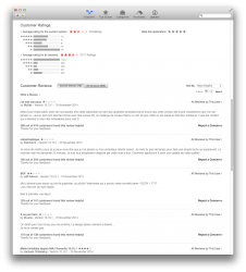
I just checked the App Store and right now at the time of this post the number of 1 star ratings (112) exceeds the number of 5 star ratings (105.) …

That trend in the store for the United States is continuing.


A proportion of the hatred (the one-star ratings) will be unrelated to appearance. I'll not guess a percentage, but from what I see on Twitter and elsewhere, I do believe that the swings to hatred of OS X are significantly fuelled by the ugliness and reduced usability of the appearance.

Canada:


Switzerland:


France:


– oh.

United Kingdom:


(From my UK perspective, I expect French users of the OS to have a greater sense of style/design than users of the OS in the UK.)

Related reading

Negativity Bias – cognitive lode by ribot

We've a greater recall of the unpleasant over the positive …

The Sour Grapes Effect – cognitive lode by ribot

We tend to justify a purchase by overlooking any faults seen …

Introductions to OS X Yosemite

… Blues are much too intense …

An introduction to Yosemite might inspire the user to switch off the blue appearance as soon as possible.

… just colored circles and nothing else.

Honestly, for a person being introduced to a computer, I could seem them not even realizing they were buttons. They don't look like buttons! They just look like. . . well...dots.

If the blue appearance was switched off, the circles will be worse; they'll be colourless.

Apple Human Interface Guidelines (HIG) for Mac OS X Tiger

… Mac OS X Tiger's unified title / toolbar look …

This, for example?

TigerDesk.png


Attachments

  • 2014-11-24 18-56-03 United States.png
    2014-11-24 18-56-03 United States.png
    105.2 KB · Views: 640
  • 2014-11-24 19-00-54 Canada.png
    2014-11-24 19-00-54 Canada.png
    102.4 KB · Views: 637
  • 2014-11-24 19-01-56 Switzerland.png
    2014-11-24 19-01-56 Switzerland.png
    97 KB · Views: 615
  • 2014-11-24 19-04-32 France.png
    2014-11-24 19-04-32 France.png
    221.4 KB · Views: 650
  • 2014-11-24 19-06-59 United Kingdom.png
    2014-11-24 19-06-59 United Kingdom.png
    248.5 KB · Views: 641

Omega Mac

macrumors 6502a
Aug 16, 2013
582
346
It's simple. Every time you use the App Store or even check for a software upgrade on older OS versions, they receive data about your computer including what OS version it's running. Otherwise, it wouldn't know what software updates to offer you. They use this to keep track of how many are using what version of the operating system.


I think in 2008 the Macbook Pro was the peak of notebook technology (beyond the desktop in a notebook type "gaming" laptops). But the "desktop" Macs have LAGGED in GPU support for a long time now. You have been able to get a decent GPU once in awhile for previous versions of the Mac Pro, but it was so sporadic, you couldn't count on staying up to date for graphics. Really, not since the PowerMac (back when you could just flash many cards to run on the Mac that had a driver and pay the same price even) have Macs really had the latest GPUs and of course back then they used different CPUs (PPC) than Windows machines so it was harder to compare them tit for tat.

I mean if I wanted to build the ultimate PC that runs both OS X and Windows (the latter for gaming mostly) what Mac would I buy from Apple? THAT is what I'm talking about. There is no truly "great" Mac for gaming (even running Windows) because Apple puts mobile GPUs in their so-called "desktops" save the Mac Pro and it uses a Pro GPU that isn't designed for gaming either. You could get gaming cards for the previous Mac Pro, but as I said they weren't updated often and they never offered SLI type options except in Windows.

My point is that shouldn't the "best OS" have the best capabilities in ALL areas? Apple has never paid much attention to graphics since the 1990s except in iOS. They STILL don't have OpenGL up to date. They regularly refuse to cooperate with gaming companies to improve the OS for gaming, let alone improve their drivers...like EVER. In the Windows world, you get driver efficiency updates all the time direct from NVidia and AMD. It's one of the reasons (along with OpenGL always being behind and often having to be translated from DirectX) that games run slower in OS X on the same machine. It COULD be fixed by Apple. They've got more money than Microsoft so it shouldn't be an issue for them these days in terms of resources like they might have feigned a dozen years ago. They simply have no interest in providing POWER computers anymore.

I personally think the new Mac Pro was a pet project of Ive's or someone to make some futuristic looking thing (maybe to go along with the "spaceship" campus) and somehow I doubt the trend of ignoring the Mac Pro for years at at time will change. In other words, don't expect the Mac Pro to get regular updates. I would expect more iMacs like the 5k. At least IT has a good mobile GPU but it's not because they suddenly care about performance. It's only because it's practically NECESSARY to run that 5k display (i.e. they do seem obsessed with "RETINA" monikers. That's funny since I used to own a "Retina" GPU card for my Amiga 3000 at one point in the mid 90s. I wonder if they bought the name or it just never got renewed.

How much effort would it take Apple to get a regular non-XEON motherboard adapted from the current Mac Pro and put a standard GPU slot on it that can use modern PC graphics cards (maybe even two with SLI support)? Not hard at all. The Mac Pro case would make a kick-arse gaming box at its size and quiet operation. With a top notch card a good desktop i7 quad, the box could sell like hotcakes around the $2k mark, even to people that only want to run Windows. It'd be like a gaming cube but a gaming cylinder. I'd buy one. I won't buy the current Mac Pro. It's not what I'm looking for.

Basically, the ONLY option to get a truly POWERFUL consumer desktop "Mac" is to build a Hackintosh and that is SAD as there is simply no reason Apple couldn't make a high-end consumer Mac and even re-use the same case as the Mac Pro (i.e. the PowerMacs all had similar cases). The ONLY expansion card slot you NEED in a high-end gaming computer is the GPU slot and the Mac Pro already has those, but not the right kind and the XEON is overkill for gaming (especially price wise). Build it and they will come. There's no reason why Macs couldn't make headway into the gaming market if Apple offered better hardware, improved drivers and kept OpenGL up-to-date and in the mean time Windows would run games full tilt. Personally, I hate booting into Windows so I'd be all for a gaming solution on the Mac. The Mac doesn't need EVERY game ported. It only needs the really good ones. Break that mold and the rest would follow, but not with the OS going to hell and the "desktop" Macs being virtual TOYS compare to REAL desktops.

I bring up gaming since I do like to game, but more powerful GPUs are helpful to all kinds of areas of software, not just gaming. The iMac 5k doesn't have a Pro GPU, but it makes a good gaming GPU AND it still works well enough for many Pros as well given the other specs and the 5k screen.

Meanwhile, I just looked at a Lenovo Yoga3 Pad Pro II computer that has a built-in video PROJECTOR for only $799. I go on business trips for weeks at a time sometimes and frankly that would be awesome to have in a dark hotel room instead of whatever crap TV they offer. Why don't we see some more innovations like that in Macs or even iPads these days? I thought Apple was supposed to be an innovator? The GUI of Macbooks (via OS X) was the one bright spot, but they seem intent on screwing that up lately.

Great post!

If I remember correctly and I was young. Wing Commander sold PC clones out the door. Games make platforms in the end. I think you've outlined a path of salvation for future Apple development and sales. It's amazing to ignore the market so.

My 2008 iMac was the first time I got excited about computing when I got my first Amiga 500. The windows period in between was a drag so I dropped it, once you go mac you won't go back. How true will that be for people now?
 

n-evo

macrumors 68000
Aug 9, 2013
1,910
1,731
Amsterdam
This, for example?
Unified title/toolbar look. Read up:

http://arstechnica.com/apple/2005/04/macosx-10-4/3/

Oh btw, some of the complaints about Mac OS X Panther back in the day:

- Oh no, Apple removed the bright pinstripes!
- Oh no, Apple changed the Finder icon!
- Oh no, the System Preferences icon has a more subdued Apple logo making the icon harder to identify!
- Oh no, Mac OS X Panther's Aqua is only slightly darker and now it looks like Windows 95!
- Oh no, Apple decided to change Mac OS X' look after three major versions. Change for the sake of change!

http://arstechnica.com/apple/2003/11/macosx-10-3/4/

Does any of that sound familiar to what's happening today?
 

Partron22

macrumors 68030
Apr 13, 2011
2,655
808
Yes
It's getting harder to see the point where Yosemite percent crosses Mavericks. With a slope of around 0.3% per day perhaps January, but Yosemite just can't seem to sustain a level above 30% for long.
I expected a bump from the surprisingly early 10.10.1 update, I bet Apple did as well.
If it's there, I can't see it for the noise.
 
Last edited:

Eithanius

macrumors 68000
Nov 19, 2005
1,557
419
Unified title/toolbar look. Read up:

http://arstechnica.com/apple/2005/04/macosx-10-4/3/

Oh btw, some of the complaints about Mac OS X Panther back in the day:

- Oh no, Apple removed the bright pinstripes!
- Oh no, Apple changed the Finder icon!
- Oh no, the System Preferences icon has a more subdued Apple logo making the icon harder to identify!
- Oh no, Mac OS X Panther's Aqua is only slightly darker and now it looks like Windows 95!
- Oh no, Apple decided to change Mac OS X' look after three major versions. Change for the sake of change!

http://arstechnica.com/apple/2003/11/macosx-10-3/4/

Does any of that sound familiar to what's happening today?

No... They did not take out the Aqua interface and called the new one Pancake, like what they did to Yosemite...
 
Last edited by a moderator:

AndreSt

macrumors member
Mar 4, 2014
63
0
An introduction to Yosemite might inspire the user to switch off the blue appearance as soon as possible.

Yes, but afterwards you'll just have an all black and white user interface that is impossible to look at (unless you want to become depressive). Except for the bright blue folder icons and the colorful application icons which no longer fit to the overall appearance.

There are now public signs of organizational issues at Apple:
https://forums.macrumors.com/threads/1822634/

(And also don't forget the iPad Air 2 screen issues and iPhone 6 bend-gate.)
 

grahamperrin

macrumors 601
Jun 8, 2007
4,942
648
Miscellanous

Wow I just happened to open that link to the "Yosemite looks terrible" thread and I can't believe people can be so obsessed up over the look of software. :eek: …

Yeah. There's no point in lamenting over visuals unless it hinders usability or practicality. I actually think Yosemite looks pleasant, but i went back to Mavericks because of the lack of contrast. …

There's much to love but ultimately, for some customers, the appearance of OS X Yosemite does hinder usability and practicality. From my point of view that type of degradation of operating system software by Apple is without precedent. I guess that some of the people who obsess are those who remain loyal to Apple despite the shocking ugliness of an Apple product.

… Any links?

It was a basic review for a forced management class, so it isn't anything deep like my thesis, but these were a few links. I was just shocked at the environment when I read accounts from employees at other companies … a more "fun" environment, which is what I expected at a creative firm like Apple. I suppose that secrecy has its price.

Former employees shed light on Apple's internal corporate culture (AppleInsider, 2010-07-07)

Insight: At Apple, Tim Cook leads a quiet cultural revolution | Reuters (2013-08-22)

Former Apple designer dispels myths about Steve Jobs, corporate culture (AppleInsider, 2014-05-22)

What Apple Employees Say About The Company's Internal Corporate Culture – Business Insider (2013-10-09)

Traverse: I hope to read at least the Reuters article later. In the meantime, that's an interesting choice of words in the headline. (It sort of fits with my change of signature here, which occurred before reading that headline.)

Macintosh Performa came close to killing the company.

There's moderator encouragement to keep things on topic (one of my recent posts, with an encouragement to thank Apple for its good work over three decades, was understandably removed). So my PowerPC-related comments are in the following topic:


… That window style is called brushed metal.

The brushed metal is incidental; there's unification of the title bar and toolbar.


Just one comment from readers of a twenty-one page review by John Siracusa! Compared to readers' comments these days, it's incredible to find just one in 2005.

More substantially, concerning's Siracusa's review:

… I have no idea what motivated this change, or why some applications use it and some don't. Mail uses it; TextEdit does not. System Preferences uses it; Disk Utility does not. Spotlight uses it; Preview does not. Xcode uses it, but not in every window. …

Most of his questions would have been answered when Mac OS X 10.5 was released. (Apple gave Disk Utility as an example, and so on.)

If I had to guess what motivated the creation of this new style, I'd say it was done to eliminate a line (the line between the titlebar and the toolbar) that someone at Apple decided was unnecessary clutter, and to increase the size of the drag area for non-metal windows. These new windows can be dragged by clicking and dragging on any "gray" area in the titlebar or toolbar.

I'm not sure how smart it is to encourage users to try to drag by clicking in an "empty" area of the toolbar. The click activation regions for toolbar buttons are not always easy to predict. They often extend well beyond the bounds of the toolbar graphic itself. And even ignoring that, who wants to get in the habit of aiming between buttons anyway?

But who knows, maybe I will start dragging these windows using something other than the top 22 pixels that used to be the clearly delineated titlebar. …

As for the elimination of that darned line, well, just look at how that worked out for menu separators. They disappeared in Mac OS X 10.0, much to my disappointment, only to make their triumphant return in 10.3. I am "pro line" in this case as well, although not strongly so.

Incidentally, this is not really a totally new window style. Instead, it's simply a variant of the normal (non-metal) Aqua window style. …"

One of the problems now: removal of the title is a totally new style of window that can not be applied consistently. Apple failed to apply the style consistently months before 10.10 was released. To find that problem not fixed after months makes me believe that some people in Apple are ignorant. There'll be a price to pay for that ignorance.
 

n-evo

macrumors 68000
Aug 9, 2013
1,910
1,731
Amsterdam
The brushed metal is incidental; there's unification of the title bar and toolbar.
Fact is it's not the name of the window style. Simple as that. Anyway, I just thought was nice to share the above complaints from the Mac OS X Panther-erra with you. Like I said: History repeating itself and the complaints are almost exactly the same. People deal just as poorly with change in 2014 as they did in 2003.
 

F1Mac

macrumors 65816
Feb 26, 2014
1,284
1,604
I just saw the hmv.ca updated site this morning... I don't think I was wrong when I said flat design was a general trend nowadays. Until the next one... I'm not sure hmv decided to make this new design because Yosemite was released a month ago or because of iOS7. Yosemite doesn't look terrible, it looks like 2014! ;)

One could argue my post OT but the image speaks for itself I guess.

attachment.php
 

Attachments

  • Screen Shot 2014-11-25 at 6.54.36 AM.png
    Screen Shot 2014-11-25 at 6.54.36 AM.png
    300.1 KB · Views: 457

n-evo

macrumors 68000
Aug 9, 2013
1,910
1,731
Amsterdam
No... They did not take out the Aqua interface and called the new one Pancake, like what they did to Yosemite...
Except they did. Things like the stoplight buttons and other elements became sunken (ie. flattened more) compared to Mac OS X Jaguar and prior versions. The article specifically mentions that, so apparently you didn't actually read things though. Way to miss my point though, which was about the actual comments not the interface itself. ;)
 
Last edited by a moderator:

TheGuruOfMac

macrumors newbie
Nov 25, 2014
1
0
I completely agree with the OP. The finesse and beauty of this beautiful OS have been massacred at the alter of trying to be indistinguishable from Google. Google was, is, and will always be overly simplistic and spartan. What the hell is wrong with having a bit of creativity and eye candy in an OS? Having too many super light shadings with no discernible bordering between elements and areas makes the eye work twice as hard to figure out what the hell is going on.

**** work, Apple, just ****. Stop dismantling the concept of beauty at every turn. Is there no one left at Apple to stand up to these tyrants of BLAH?!?!!?
 
Last edited:

Badagri

macrumors 6502a
Aug 9, 2012
500
78
UK
I completely agree with the OP. The finesse and beauty of this beautiful OS have been massacred at the alter of trying to be indistinguishable from Google. Google was, is, and will always be overly simplistic and spartan. What the hell is wrong with having a bit of creativity and eye candy in an OS? Having too many super light shadings with no discernible bordering between elements and areas makes the eye work twice as hard to figure out what the hell is going on.

**** work, Apple, just ****. Stop dismantling the concept of beauty at every turn. Is there no one left at Apple to stand up to these tyrants of BLAH?!?!!?

I remember both 1999 to 2001 between OS X and Windows how everyone craved gorgeous 32bit alpha icons and UI.

Now we've had it so long we've to have all this blandness. Flat and no shading. No creativity.

Think Different. No respect for the status quo.
 

Traverse

macrumors 604
Mar 11, 2013
7,711
4,491
Here
I think Apple just went a little too far with the flat this attempt and maybe they'll bring some depth back in a few years. (A little depth is a good thing.)

As for the functional changes in the UI such as toolbars, I don't know. Someone quoted me earlier about how the argument was over bad UI, I agree, but who is the judge of bad non-functional UI?

Apple's UI guidelines where put in place after years of computer usage. Perhaps they are trying a new paradigm with this "new" UI. I hope they revert back to many of the old ways, but I'm not sure they will. If the masses are fine and don't miss titlebars, toolbars, pronounced buttons, I don't see Apple having incentive to change other than that ugly "Increase Contrast" option.

*sigh*

----------


You know what, and this is just my personal preference, I prefer that to Yosemite. It's not because, as some on this forum have accused, I'm just old and stuck in the past. I'm only 21 and started with SL, but even I prefer that look. I like a little depth as opposed to everything looking like paper taped to glass.
 

ssandromar

macrumors newbie
Nov 25, 2014
1
0
Yosemite GUI: a disaster!

This is definitively the worst GUI ever invented on a Mac. Even Windows95 was an improvement with respect to 3.1, but this is the greatest disaster ever introduced by Apple.

Boys at Apple: we want real new ideas, not smoky nonsense like this.

I agree 200% with the comment below:
"From my point of view that type of degradation of operating system software by Apple is without precedent. I guess that some of the people who obsess are those who remain loyal to Apple despite the shocking ugliness of an Apple product. "
 

Abba1

macrumors regular
Aug 6, 2014
117
0
I completely agree with the OP. The finesse and beauty of this beautiful OS have been massacred at the alter of trying to be indistinguishable from Google. Google was, is, and will always be overly simplistic and spartan. What the hell is wrong with having a bit of creativity and eye candy in an OS? Having too many super light shadings with no discernible bordering between elements and areas makes the eye work twice as hard to figure out what the hell is going on.

**** work, Apple, just ****. Stop dismantling the concept of beauty at every turn. Is there no one left at Apple to stand up to these tyrants of BLAH?!?!!?

I agree as well. Despite the problems, of which there are many, there really is beauty to this OS, but it is less than obvious in the appearance. And, the OS itself still needs work, which must take precedence over visual beauty.

Architecture and visual beauty don't always match. And although many may look for the visual beauty, if I can't have both then I want the architecture.

Saying that, I still say to Apple: please let us have some eye candy without sacrificing the workings of the OS. What I remember most is how Steve Jobs saw that his creations were truly beautiful in both function and form. Apple should not forget the example he set for the company.
 

grahamperrin

macrumors 601
Jun 8, 2007
4,942
648
A sometimes terrible user experience (UX)

In their own words …

… as much as I like the aesthetic in Yosemite, the UX can be pretty terrible at times.

… it no longer has affordance. My father in law wouldn't learn it. Thats why UX in important.


– Khoi Vinh, currently Vice President of User Experience at Wildcard and co-founder of Kidpost. Previously, Khoi was co-founder and CEO of Mixel (acquired by Etsy, Inc.), Design Director of The New York Times Online, and co-founder of the design studio Behavior, LLC. He is the author of “Ordering Disorder: Grid Principles for Web Design,” and was named one of Fast Company’s “fifty most influential designers in America.”

Something here

… History repeating itself and the complaints are almost exactly the same.

If that's truly your interpretation, then I must say that you are reading with rose-tinted spectacles.

People deal just as poorly with change in 2014 as they did in 2003.

That's a huge oversimplification. The masses of complaints about Yosemite can not be dismissed in that way.


What colour is that old chestnut through those spectacles?

n-evo, if you suggested that I deal poorly with change, then you're a hair's breadth away from addition to the shortlist of people who I ignore in MacRumors. I use that list as rarely as possible, and I respect much of what you write, so please: let's try to keep things that way :)
 

Salido165

macrumors newbie
Nov 25, 2014
1
0
Biggest Problem with Yosemite - UGLY!

I do not care if I am the only person who thinks so, but from what I have read I am in some pretty good company. But I think this new interface is ugly. I don't see how flat, jagged images the look like they were lifted from a EGA version of Windows 3.0 can be considered new, fresh or even design.
I left the Windows environment because MS made their OS Flat, Square, and Ugly. Only to have Apple do the same thing two years later.
I don't care what enhancements may or may not have been added, the new UI is so harsh it is hard to use my Mac for more than an hour. The extreme eye strain I experience since the "upgrade" makes me regret my decision.
I accept my responsibility here, having installed Yosemite without a backup. My experience with OS X had been so positive I failed to take reasonable precautions.
 

TheBSDGuy

macrumors 6502
Jan 24, 2012
319
29
Unified title/toolbar look. Read up:

http://arstechnica.com/apple/2005/04/macosx-10-4/3/

Oh btw, some of the complaints about Mac OS X Panther back in the day:

- Oh no, Apple removed the bright pinstripes!
- Oh no, Apple changed the Finder icon!
- Oh no, the System Preferences icon has a more subdued Apple logo making the icon harder to identify!
- Oh no, Mac OS X Panther's Aqua is only slightly darker and now it looks like Windows 95!
- Oh no, Apple decided to change Mac OS X' look after three major versions. Change for the sake of change!

http://arstechnica.com/apple/2003/11/macosx-10-3/4/

Does any of that sound familiar to what's happening today?

There's a world of difference between making subtle changes from one OS release to another, and doing the same with a sledgehammer. The changes I see in Yosemite can be described as radical. It's not like the refined an icon here or there, or made mild changes to windows and frames, they radically changed everything.

The argument that implies this is the same thing as the Jaguar to Panther transition is ridiculous. This thread currently has, as of this posting, has over 193,000 views. Did the same happen with the Jaguar to Panther change? I don't think so!
 
Status
Not open for further replies.
Register on MacRumors! This sidebar will go away, and you'll see fewer ads.