Got a tip for us?
Let us know
Become a MacRumors Supporter for $50/year with no ads, ability to filter front page stories, and private forums.
Zym Blog graphic
- Thread starter TheZimm
- Start date
- Sort by reaction score
You are using an out of date browser. It may not display this or other websites correctly.
You should upgrade or use an alternative browser.
You should upgrade or use an alternative browser.

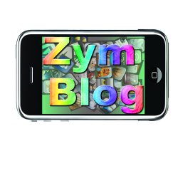
Its way way too busy. The script font alone is a little tough to read, when you add the grey shapes to the background its especially busy. I think you should just focus on the type first then worry about putting it on some kind of background or composition. Also, the script Z reads as a stylized 3, maybe its just me.

why is there an iphone? is the blog about iphones?
and the background shouldn't be part of a logo, since the idea of a logo is that it can be adapted and transplanted easily to different uses.
Yup, its an iphone app reviewing site. So do you think the first or secind is better, I feel the first is
Zym
does it have to have a script font, because it doesn't really seem right for an iphone app review website
stop worrying about a background or what you can put the type on. Start with a simple B/W font. Use illustrator to combine/manipulate fonts to make your logo. You need to think about what people think when they see your "zym blog". I honestly would never see it and think of an iPhone app review. Do some research on logo design. Dont steal others designs, but see what works and what makes them successful. I would stay away from the script, zym isnt a common word already, so to use a stylized font doesnt help.
Why are you still trying it with color and putting it in a composition? I would recommend using illustrator and manipulating a font or fonts to create a typeface. Once you get a good logo in B/W (just the type) then you can worry about adding color and putting it in a composition.
You seem fixated on putting your type inside of an iPhone. My advice is to try ten different concepts that do not involve an iPhone, but do somehow relate to iPhone Apps and reviewing.
Secondly, please start with black and white. This will help you concentrate on the form of the logo. Once you're fairly confident with that, then you can start adding color. And I would also suggest using a very limited palette when you do add color.
A logo needs to fundamentally be legible without having to stare at it to decipher it. Crazy backgrounds and spectrums really detract from that.


It's not really a logo though, is it? Type only logos can look fantastic when done well, but that just looks shoddy - there's nothing in the text that implies it's related to iPhones/apps/whatever.
It's not really a logo though, is it? Type only logos can look fantastic when done well, but that just looks shoddy - there's nothing in the text that implies it's related to iPhones/apps/whatever.
Thats a really good point. I've been looking at some other logos etc. and heres what I came up with.

Zym
hmmm...well, i'm not trying to be an a$$ but, have you ever designed a logo/blog header before? I mean to me, you are just pasting type and other elements together and using every photoshop effect you can think of and then Voilá!...done. ok, so i took 5 minutes and threw something together to give you an idea of something that would look more polished. I'm not saying to use this or even try to replicate this. This was 5 Minutes, and is not that good or clever, or even slightly creative. But it's alright, and to me gets the point across a lot faster.
If i were you, i would start with just type, see how intersting the word Zym would be on it's own, or if it looks good run together with different weights. ZYMBLOG or zymblog. Try clean and simple san serifs. Try to stay away from cheesy photo filters. Think of what a review place is about. Maybe it's a series of stars. Maybe it's 4 stars in clossy "app" boxes that sit on a dock like backround. Rating...Apps...iPhone. Don't use a picture of an iPhone, that's pretty lame. I also would stay away from showing certain apps in the header, do you have permission to use their artwork? do you have permission to associate your blog with their app? i'm sure that's a "no". Anyway, try a lot of things....
-je
Attachments

hmmm...well, i'm not trying to be an a$$ but, have you ever designed a logo/blog header before? I mean to me, you are just pasting type and other elements together and using every photoshop effect you can think of and then Voilá!...done. ok, so i took 5 minutes and threw something together to give you an idea of something that would look more polished. I'm not saying to use this or even try to replicate this. This was 5 Minutes, and is not that good or clever, or even slightly creative. But it's alright, and to me gets the point across a lot faster.
If i were you, i would start with just type, see how intersting the word Zym would be on it's own, or if it looks good run together with different weights. ZYMBLOG or zymblog. Try clean and simple san serifs. Try to stay away from cheesy photo filters. Think of what a review place is about. Maybe it's a series of stars. Maybe it's 4 stars in clossy "app" boxes that sit on a dock like backround. Rating...Apps...iPhone. Don't use a picture of an iPhone, that's pretty lame. I also would stay away from showing certain apps in the header, do you have permission to use their artwork? do you have permission to associate your blog with their app? i'm sure that's a "no". Anyway, try a lot of things....
-je
Okay,
I've never done anything like this. I was just taught how to use photoshop a couple of years ago, so i would use it just to fix up some pics, never create something. Here I have tryed to take your advice, and you weren't being an a$$, I need the criticism =]
Zym
Attachments


I will say you are def moving in the right direction, still not their yet. One thing I noticed from all your ideas is you are trying to squeeze 10lbs of sh*@
in a 5lbs bag. I would focus on the words Zym Blog, dont worry about the tagline or anything else just yet. I also noticed you are trying to work in some app icons. Why not make your own app icon to go along with your logo.
in a 5lbs bag. I would focus on the words Zym Blog, dont worry about the tagline or anything else just yet. I also noticed you are trying to work in some app icons. Why not make your own app icon to go along with your logo.
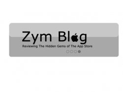
okay, so I think this looks better than the other version, I c=hanged the text a little that says "Zym Blog", I centered the stars a little more, and I put the phrase on the top, I think that it seems a bit less cramped up there.
Also, I made a little mock up that took me like 30 seconds literally, and was just wondering if I should continue this way for my own icon.
Thanks for all the feedback
Zym
Also, I made a little mock up that took me like 30 seconds literally, and was just wondering if I should continue this way for my own icon.
Thanks for all the feedback
Zym
Attachments


Once again you didn't listen to what everyone has told you. Stop worrying about color and the iPhone image. Just work on the typeface. Try a little more than just typing the word Zym Blog and picking a typeface. Try combing type faces, combing different weights, modifying the typefaces in illustrator, create your own custom type. Do not worry about some gradient photoshop effect or putting the type in something. Try and get your logo to work on its own, in black on a white background. I think people will start to get frustrated when they give you advice then you just put another idea on here without using that advice.
Once again you didn't listen to what everyone has told you. Stop worrying about color and the iPhone image. Just work on the typeface. Try a little more than just typing the word Zym Blog and picking a typeface. Try combing type faces, combing different weights, modifying the typefaces in illustrator, create your own custom type. Do not worry about some gradient photoshop effect or putting the type in something. Try and get your logo to work on its own, in black on a white background. I think people will start to get frustrated when they give you advice then you just put another idea on here without using that advice.
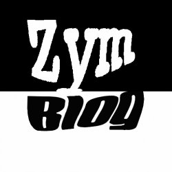
okay, yeah true, sorry. I tryed messin around with the typefaces and made half black and the other white(I could change colors later to my site's colors)
Attachments
Closer. But I personaly don't see any relevance to an iPhone or it's apps now. You don't need an iPhone or a piece of an iPhone, but with a name like zymblog, it needs to be recognizable as a blog about iPhone apps, or have a better name. Look at what other iPhone related blogs did.
Appshopper.com
Toucharcade.com
Those two don't need obvious iPhone relation because of the relation in the name. Your name has nothing to do with it, so it is going to need some kind of iPhone or iPhone app or app strore relation. Look at the fonts used with these devices. Helvetica neue is the system font on the iPhone. Myriad pro (or something very similar) is apple's marketing and product font. Try playing with some modification on those. Or you could do something simple like a solid black circle with a white rounded corner square in the center to mimic the home button, and them in a real clean font write zymblog in like helvetica neue bold and light or myriad pro regular and light.
Things I would stay away from:
Picture of an iPhone
App icons
Apple logo
Icons that have no relevance.
I hope that helps.
-je
I took your exact advice, "zymblog in like...myriad pro regular and light." Also, I looked at those icons and saw how their pretty similar to their logo, so I made the icon similar to the logo(with the slide thing), also I made one with a home button like look.Closer. But I personaly don't see any relevance to an iPhone or it's apps now. You don't need an iPhone or a piece of an iPhone, but with a name like zymblog, it needs to be recognizable as a blog about iPhone apps, or have a better name. Look at what other iPhone related blogs did.
Appshopper.com
Toucharcade.com
Those two don't need obvious iPhone relation because of the relation in the name. Your name has nothing to do with it, so it is going to need some kind of iPhone or iPhone app or app strore relation. Look at the fonts used with these devices. Helvetica neue is the system font on the iPhone. Myriad pro (or something very similar) is apple's marketing and product font. Try playing with some modification on those. Or you could do something simple like a solid black circle with a white rounded corner square in the center to mimic the home button, and them in a real clean font write zymblog in like helvetica neue bold and light or myriad pro regular and light.
Things I would stay away from:
Picture of an iPhone
App icons
Apple logo
Icons that have no relevance.
I hope that helps.
-je
I think I'm getting a hang of what a good design looks like, now that I look back at some they look really bad =]
Zym
Attachments


Register on MacRumors! This sidebar will go away, and you'll see fewer ads.