Quick review of latest -
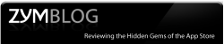
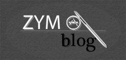
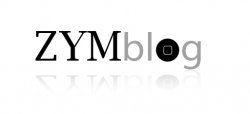
grey one with white 'glow' - what's with the ellipse at the bottom under ZYM Blog - it has no relevance to apple design or the 'touch' products in my view. You still haven't quite grasped the text principles that myself and jasonelise used - if you look at ours again and see whats quite obviously different - look at the line of the text your b is higher and breaks the line or flow that we used.
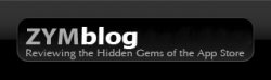
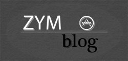
The new darker grey options - again whats the ellipse in the background for, what is the logo relating too and why is there a graphics tablet pen on a device that doesn't even use a stylus

And you still seem like you just play with the filters/effects within photoshop on a lot of the designs, design isn't just about seeing what filters work well
So lets start from the beginning again shall we as your designs aren't really working as is
Now several of us (myself included, most of some sort of designer I would suspect) have given alternative designs (for free I might add) which have been highly regarded (including by one of your own bloggers) but you still seem to ignore the essence of what we had been doing so lets see if we can make you think slightly differently about your design approach.
So this is what I would like you to do before the next design comes out (note theres more to it than this but this might help - its not the easiest thing to break down doing logos etc)
1) Draw 10-20 different logos with pen and paper - no colour. Might be worth knocking out a quick grid with the correct proportions that would end up on your blog here.
2) Now take the top 3-5 designs and break them down into key parts, ie things like positions of image or text, thickness of text, style of text etc, what style of background.
3) From that list you should see what aspects seem to be drawing you in, ie is the text in a set area for example
4) Using these key points do a rough sketch of what the layout could be and then work around this for your next couple of designs.
5) once you have a black and white concept (you can do this in photoshop if you wish) then start to consider colour as at present your site is brown and the logos all slightly different.
Lets see if that makes an improvement
If I get some spare time I will do a very simple design revision of mine along with a 'iphone' app icon
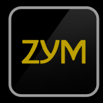
edit: heres the revisions/app icon - think the home/start button 'o' might make zym look a little like ozym in one of them but they're only for ideas more than anything
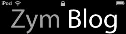
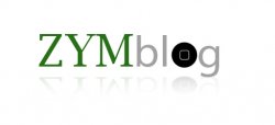
Took some aspects of jasonelise variation (not bad for someone who was a little under the influence
) of my original and used the same sort of idea (different colour - felt blue was a bit last year for mine if you get what I mine so went for a more zesty colour
) to add a bit of 'life' to it
Zimm - can you see how subtle alterations can give an entirely different feel to an image without having to resort to an entire redesign
edit: actually on thinking about it again the second iphone app button (zym) could easily be made into the basis of the header design. Just use zym and then a simple text (on a horizontal line like the other designs) to say blog/forum or whatever depending on section.