For me, I think 2.0 was more visually polished than 3.0. I've heard that the Mac OS team is no longer working on the iPhone UI... instead they have a new team and well, I think this new team isn't the greatest. Up until 3.0, I never really had much of a problem with the UI of the iPhone, but with 3.0, I seem to notice a lot of graphical glitches. Here they are so far:
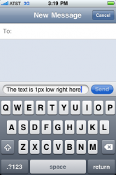
1.) The text within the input field in Messages is 1 pixel too high. It looks unbalanced because there is so much white space under the characters. I've attached a mockup to show exactly what I mean. I consider this to be a bug because no other text field in the OS has text in it that is too high. All other text looks centered within it's field.

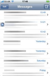
2.) In Messages on the main screen (where you view all current open conversations):
Notice the "Compose New Message" button's width. Then, turn the iPhone on it's side to switch to landscape mode. Then, when you switch back to portait again, the "Compose New Message" button stays long instead of going back to short (like it was when you first open Messages).
I've attached 2 images showing before and after turning it to landscape and back.

3.) When opening Maps, watch the bottom where the joined buttons are. The new joined buttons in 3.0 look like they shifted and distorted a little bit to the left. The new joined buttons lack definition on the right edge now. The easiest way to see this graphical glitch is to launch Maps and watch it change from the Default.png file to the actual running app. This bug is not only in Maps but system-wide as well... It's just easier to see it in Maps because of the Default.png image. Please check it out and see if you can make the joined buttons look like they did in 2.2.1.
Watch the animation to see what I mean:

4.) When starting up Contacts, the startup Default.png file is different than the running app's interface.
Here's how you produce the bug: Scroll to the top of Contacts, then quit and re-launch it. You'll notice that the startup image is the old Contacts screen and not the same interface as the 3.0 version.


5.) In Mail: Selecting an email while in edit mode, then rotating the screen causes the selection to break up. See below for example:
First select the message while in edit mode

Then turn the iPhone sideways to get this:

6.) There's also the weird icon bug. I got this one from this thread:

I've submitted the first 4 bugs to Apple already. Does anyone else have anything they'd like to add to my visual bug list? This thread is for graphical glitches and visual bugs... not stuff like "iPod app crashes".
Please feel free to post any more visual abnormalities or concerns. I'll try to keep this list as updated as possible.
I must also say... I'm not a big fan of the Messages Progress Bar being in the Title Bar. Progress Bars don't belong up there! It also covers up the person's name while you're sending. So if you're sending a couple of MMS messages and some texts, it will be covered up for a while and you can't glance up at the top to see who you're currently talking to. I think the black keyboard progress was much cleaner looking too. So what if you had to wait a second before you could type again. I didn't send messages rapidly anyways. Usually one is enough and if I have to type another, it usually takes a second to think about what I'm going to say anyways.
Anyone else hate the new progress bar location?
1.) The text within the input field in Messages is 1 pixel too high. It looks unbalanced because there is so much white space under the characters. I've attached a mockup to show exactly what I mean. I consider this to be a bug because no other text field in the OS has text in it that is too high. All other text looks centered within it's field.
2.) In Messages on the main screen (where you view all current open conversations):
Notice the "Compose New Message" button's width. Then, turn the iPhone on it's side to switch to landscape mode. Then, when you switch back to portait again, the "Compose New Message" button stays long instead of going back to short (like it was when you first open Messages).
I've attached 2 images showing before and after turning it to landscape and back.
3.) When opening Maps, watch the bottom where the joined buttons are. The new joined buttons in 3.0 look like they shifted and distorted a little bit to the left. The new joined buttons lack definition on the right edge now. The easiest way to see this graphical glitch is to launch Maps and watch it change from the Default.png file to the actual running app. This bug is not only in Maps but system-wide as well... It's just easier to see it in Maps because of the Default.png image. Please check it out and see if you can make the joined buttons look like they did in 2.2.1.
Watch the animation to see what I mean:
4.) When starting up Contacts, the startup Default.png file is different than the running app's interface.
Here's how you produce the bug: Scroll to the top of Contacts, then quit and re-launch it. You'll notice that the startup image is the old Contacts screen and not the same interface as the 3.0 version.
5.) In Mail: Selecting an email while in edit mode, then rotating the screen causes the selection to break up. See below for example:
First select the message while in edit mode
Then turn the iPhone sideways to get this:
6.) There's also the weird icon bug. I got this one from this thread:
I've submitted the first 4 bugs to Apple already. Does anyone else have anything they'd like to add to my visual bug list? This thread is for graphical glitches and visual bugs... not stuff like "iPod app crashes".
Please feel free to post any more visual abnormalities or concerns. I'll try to keep this list as updated as possible.
I must also say... I'm not a big fan of the Messages Progress Bar being in the Title Bar. Progress Bars don't belong up there! It also covers up the person's name while you're sending. So if you're sending a couple of MMS messages and some texts, it will be covered up for a while and you can't glance up at the top to see who you're currently talking to. I think the black keyboard progress was much cleaner looking too. So what if you had to wait a second before you could type again. I didn't send messages rapidly anyways. Usually one is enough and if I have to type another, it usually takes a second to think about what I'm going to say anyways.
Anyone else hate the new progress bar location?