Got a tip for us?
Let us know
Become a MacRumors Supporter for $50/year with no ads, ability to filter front page stories, and private forums.
[3.0] The Visual Bug List
- Thread starter TheSpaz
- Start date
- Sort by reaction score
You are using an out of date browser. It may not display this or other websites correctly.
You should upgrade or use an alternative browser.
You should upgrade or use an alternative browser.
I have the loading inditcator "blinking" a little bit too. Mostly when I'm in the App Store.
As for the message sending status bar, what if they chat bubbles were the status bars, say they go from a darker shade of green and "swipe" to the normal green.
Or they could just let you know if the message failed and do away with the status bar...it's not like a text ever only sends half way then stops. It's all or nothing.
i think this thread is just a good place to make note of things like this...apple will release updates so i wouldn't stress about any of it.
i think this thread is just a good place to make note of things like this...apple will release updates so i wouldn't stress about any of it.
I'm going to try to jailbreak and fix some of these things myself. I'm going to see if I can use the core-ui stuff from 2.2.1 in 3.0 (I doubt it will be pretty, but I wanna try anyway) and I'm going to try to modify Messages OR perhaps even try installing the old text.app into 3.0. Hehe.
I'll post back here as soon as I can try that stuff. It's worth a shot.
Ya, there are some weird 'bugs' here in there in the UI now. And it does seems a little sloppier.
But, there's also a certain 'solidness' to the text and stuff, I find now though. Like the aliasing changed or something. It might be in my head though.
But, there's also a certain 'solidness' to the text and stuff, I find now though. Like the aliasing changed or something. It might be in my head though.
Ya, there are some weird 'bugs' here in there in the UI now. And it does seems a little sloppier.
But, there's also a certain 'solidness' to the text and stuff, I find now though. Like the aliasing changed or something. It might be in my head though.
It's not in your head. Text is definitely more crisp now and the keyboard feels more responsive to me. They definitely made some changes... I don't mind that stuff.
they need to fix the random and occasiaonly SMS sound that doesn't go off. Its only happened 5 times out of my 1,000's of texts since 3.0 came out.
I agree, everything seems not polished and makes the iPhone OS 3.0 looks cheap. Palm Pre's webOS UI is way smoother and beautiful. Come on Apple, at least make the iPhone OS 3.0 the same too.
About the landscape typing, it's amazing and finally for all. There's a downside too, even after you have send a text it's hard to see your own text in landscape, there's no space at all. You can type but you can't see it. Same goes to every landscape enabled apps.
About the landscape typing, it's amazing and finally for all. There's a downside too, even after you have send a text it's hard to see your own text in landscape, there's no space at all. You can type but you can't see it. Same goes to every landscape enabled apps.

I fixed the first bug myself! I jailbroke my iPhone using PwnageTool 3.0 and I modified some of the graphics files. I've attached a zip of the necessary graphics to make messages look like this:

The files go in /System/Library/PrivateFrameworks/ChatKit.framework
The files go in /System/Library/PrivateFrameworks/ChatKit.framework
Attachments
LMAO! This is pretty funny! But true. I think that the 1, Q, B, N, and T are a little off also lol.
You have way too much f'ing time on your hands...I fixed the first bug myself! I jailbroke my iPhone using PwnageTool 3.0 and I modified some of the graphics files. I've attached a zip of the necessary graphics to make messages look like this:
The files go in /System/Library/PrivateFrameworks/ChatKit.framework
You have way too much f'ing time on your hands...
Jealous much? Hehe. It didn't take me long. I'm a Photoshop junkie.
Jealous that you're anal about 1px? Not in the slightest. I'm pretty sure there are better things you could be doing.Jealous much? Hehe. It didn't take me long. I'm a Photoshop junkie.
Jealous that you're anal about 1px? Not in the slightest. I'm pretty sure there are better things you could be doing.
Oh is that right? Isn't there something that you can do instead of responding to this thread. If you wanna hate on me, aren't you just wasting your time then?
If you didn't know already, not everyone has the same life as you or the same views. I think this kind of stuff is fun to figure out. I'm kinda surprised that Apple couldn't even fix it. It's too bad users have to jailbreak just to fix stuff. Makes me kinda wish I worked for Apple. It's obvious I'm not the average user. Does the average user care about this stuff?... No... But if everyone was like that, nothing would ever get improved.
I love this thread because I've been irked by the EXACT same things. Designers have an eye for these sorts of things. I think the compass and voice notes icons are absolutely awful and don't fit into the current crop of stylistic icons. They just don't match the same style. I almost want to put them on the second screen because of it.
The new message button switching from bezeled to flat is just sloppy. The off-center text has been irking me since the firmware was released.
I also can't see the artist name on the lock screen, only the song title.
I've not experienced any of the icon issues people have posted here, but I'm not a fan of many of the visual changes. I really hope we won't have to wait until a complete UI overhaul to get rid of these issues. Hopefully Apple will roll out a 3.0.1 update relatively swiftly to correct the little things that squeaked through testing.
EDIT: I also hate, hate, hate, hate the new progress bar. What if they incorporated the progress into the message bubble itself?
For example (using a google screenshot, not mine 'yo'):

I don't like the grey, but I just desaturated it for proof-of-concept. It's not as sleek as your solution, I suppose, but anything is better than what they've done.
The new message button switching from bezeled to flat is just sloppy. The off-center text has been irking me since the firmware was released.
I also can't see the artist name on the lock screen, only the song title.
I've not experienced any of the icon issues people have posted here, but I'm not a fan of many of the visual changes. I really hope we won't have to wait until a complete UI overhaul to get rid of these issues. Hopefully Apple will roll out a 3.0.1 update relatively swiftly to correct the little things that squeaked through testing.
EDIT: I also hate, hate, hate, hate the new progress bar. What if they incorporated the progress into the message bubble itself?
For example (using a google screenshot, not mine 'yo'):
I don't like the grey, but I just desaturated it for proof-of-concept. It's not as sleek as your solution, I suppose, but anything is better than what they've done.
I love this thread because I've been irked by the EXACT same things. Designers have an eye for these sorts of things. I think the compass and voice notes icons are absolutely awful and don't fit into the current crop of stylistic icons. They just don't match the same style. I almost want to put them on the second screen because of it.
The new message button switching from bezeled to flat is just sloppy. The off-center text has been irking me since the firmware was released.
I also can't see the artist name on the lock screen, only the song title.
I've not experienced any of the icon issues people have posted here, but I'm not a fan of many of the visual changes. I really hope we won't have to wait until a complete UI overhaul to get rid of these issues. Hopefully Apple will roll out a 3.0.1 update relatively swiftly to correct the little things that squeaked through testing.
EDIT: I also hate, hate, hate, hate the new progress bar. What if they incorporated the progress into the message bubble itself?
For example (using a google screenshot, not mine 'yo'):
I don't like the grey, but I just desaturated it for proof-of-concept. It's not as sleek as your solution, I suppose, but anything is better than what they've done.
I agree with everything you said. I'm kinda surprised that people here think this thread is a big joke. I guess since the iPhone is so popular that it's not just appealing to Mac people... Mac users are usually a little more picky about UI stuff. We're so used to perfection. I also agree that designers see this stuff way easier. I've never had a problem with the previous UI on the iPhone before 3.0.
Oh well. I guess it's up to the users to fix the problems (which is a lot harder than it is for Apple)
I'm sure designers at Apple are aware of their mistakes. Whenever I finish a poster design or mockup, as soon as it's printed I search it over one last time and sometimes you catch a mistake too late and it goes out the door. Unlike in my case, Apple has the chance to fix their mistakes though. Which is good for us.
I'm sure designers at Apple are aware of their mistakes. Whenever I finish a poster design or mockup, as soon as it's printed I search it over one last time and sometimes you catch a mistake too late and it goes out the door. Unlike in my case, Apple has the chance to fix their mistakes though. Which is good for us.
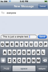
Back when beta 5 was out, I posted a bug report to Apple about the Messages text not being centered and they said "Engineering had determined that it behaves as it should". So when I try to point out a mistake and then they pretend it's normal, it doesn't make me feel like they're going to try really hard to fix it for us.
Edit: Oh, and obviously they didn't take me seriously because it didn't get fixed in the final version. It made me sad.
Back when beta 5 was out, I posted a bug report to Apple about the Messages text not being centered and they said "Engineering had determined that it behaves as it should". So when I try to point out a mistake and then they pretend it's normal, it doesn't make me feel like they're going to try really hard to fix it for us.
Wow, that's rather disheartening. It's even more disheartening to assume, as I do, that they probably didn't really look into it.
What's the issue here? You want them to somehow put the characters x.5 pixels from each edge?
I fixed the first bug myself! I jailbroke my iPhone using PwnageTool 3.0 and I modified some of the graphics files. I've attached a zip of the necessary graphics to make messages look like this:
The files go in /System/Library/PrivateFrameworks/ChatKit.framework
Okay, after looking at this work-around for a little bit... I don't like it. Yes, the text is centered in the field better but, the field is 1 pixel up too high now (that's the only way I could bring the text down) and the send button isn't tall enough to get the same spacing as the input field. Apple is going to have to fix this one because simply making everything else fit to the text is harder than just moving the text element down 1 pixel (which I can't do)
I have no eye for design whatsoever, but I knew that something about the text in the new messages app seemed off. Thanks for confirming. It is actually very distracting to me.
Register on MacRumors! This sidebar will go away, and you'll see fewer ads.