Become a MacRumors Supporter for $50/year with no ads, ability to filter front page stories, and private forums.
Sure. It could have been implemented in many ways. And I'm sure each of them would have had its detractors. For instance, your proposal would have the drawback that you couldn't be allowed to hide the Settings app from the home screen. You could hide any other app, but not this one. I'm sure someone would have moaned about it.
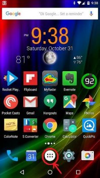
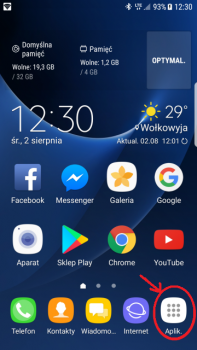
Or they could have put an 'all apps' icon on the home screen, which you couldn't hide. Like Android. But that would have been even uglier.
 
From everyone’s descriptions here, this feature is even worse than Launchpad in Mac OS. There are so many bugs and annoyances in Launchpad that I gave up on it entirely.

As soon as Apple talked about this feature in their first preview, I knew this was another garbage feature being pushed at us; change for the sake of change. I knew I wouldn’t want it and would avoid using it if possible. It was actively a reason to NOT update (because you know this thing is wasting system resources).
 
Sure. It could have been implemented in many ways. And I'm sure each of them would have had its detractors. For instance, your proposal would have the drawback that you couldn't be allowed to hide the Settings app from the home screen. You could hide any other app, but not this one. I'm sure someone would have moaned about it.
Or they could have put an 'all apps' icon on the home screen, which you couldn't hide. Like Android. But that would have been even uglier.

Put a non-removable settings icon in the Control Center. Problem solved.
 
  • Like
Reactions: dk001
? Android doesn’t have that. In fact, Android is the model for implementing what we’re talking about here.
Not anymore. But it used to have it for many, many years.

5502182400_1501674247.png Screenshot_20151031-213811.jpg
 
Last edited:
  • Like
Reactions: dk001
Not anymore. But it used to have it for many, many years.

View attachment 957485 View attachment 957484

You can still swipe up to get to all applications in Android or install a different launcher and do whatever you want.

Maybe I am naive, but I don't think the folks at Apple even benchmark Android for idea or there would be better implementation of some of these new iOS features.
 
  • Like
Reactions: mpavilion
I was a bit confused by the concept of the App library at first because while playing around with it I hid a few pages, installed a few apps and re-enabled the pages and found out that the newly installed apps are not on any home screen. Until I realized that hiding a page is the same as going through every app on that page and selecting "move to app library" for every app.
All in all, I like the app library so far.
 
  • Like
Reactions: mgscheue and ecr80
I was a bit confused by the concept of the App library at first because while playing around with it I hid a few pages, installed a few apps and re-enabled the pages and found out that the newly installed apps are not on any home screen. Until I realized that hiding a page is the same as going through every app on that page and selecting "move to app library" for every app.
All in all, I like the app library so far.


....there is a setting whereby you can select where newly downloaded apps go - to your home screen or straight to the app library instead (without an icon on the home screen).
 
  • Like
Reactions: chris4565
Love it or loathe it, it should be a choice.
Since it's basically just an application launcher I don't think that a choice is necessary to be honest (it doesn't even display as a dot on the bottom of the screen like the home screens do) so I think it's pretty ignore-friendly.
 
  • Sad
Reactions: dk001
Since it's basically just an application launcher I don't think that a choice is necessary to be honest (it doesn't even display as a dot on the bottom of the screen like the home screens do) so I think it's pretty ignore-friendly.

I don't even want to accidentally swipe there. I want my elastic bounce back when i swipe that way. I already have folders, I don't need redundant folders on another page that i'll never use. It's like buying a new car and they put a second steering wheel in the back seat.
 
For years Apple has stubbornly refused to give us a way of hiding the apps we didn't use. While on Android you could choose exactly which apps you wanted to see on your home screen(s), the rest being hidden in an 'all apps' view, Apple used to force everybody into keeping several home screens loaded with dozens of apps that couldn't be hidden (nor deleted, in the case of pre-installed ones).
So iOS users had no other choice than to arrange their icons on the home screens in a convenient way, using folders to keep similar apps together, moving rarely used apps onto the second or third screen, burying unused apps into a folder on the last screen, etc.

Now, for the first time in history, Apple has given in. They have finally decided to let us choose what to keep on the home screen(s) and to let us hide the rest. And that's great.

But if they do that, if they allow apps to be hidden away from the home screen, then they must also devise a means of accessing those apps later on. They must give us an 'all apps' view, independent of the home screen layout. Enter the App Library.

Currently it's ugly and not very versatile. But it must exist, otherwise we couldn't hide apps from the home screen lest we become unable to find them again. Given enough time, I'm sure it will evolve into something useful.

People who are determined to keep their home screen layout exactly as it is now, because it's been working perfectly for years and there's no need to change anything, find the App Library a nuisance, one more screen to avoid swiping to.
People who expect the App Library to be a complete replacement of the home screen (i.e. to rely on it exclusively) are disappointed and find it ugly and messy, with icons grouped in a way that doesn't always make sense.
However, if you see it just as a means of finding a rarely used app from time to time, complementing a home screen which now only contains frequently used apps, then it makes sense.

At first I was in the first category. I wanted to keep my home screen layout, which had served me well for so much time, and had no intention of making any change. So once I found out about the App Library and saw it for the first time, I was appalled at how ugly and useless it appeared to be.
But then I realized that I had two home screens filled with icons. And those apps were of three types:
1. Apps that I used every day, or at least once every few days
2. Apps that I used rarely, maybe once or twice a month, or even less
3. Apps I never used, but couldn't get rid of (e.g. Health)
So I thought, what if I kept just one home screen, and just the apps of the first category, and I hid the rest? And it's awesome! Now all the apps I use frequently are right on the home screen (just one screen this time, no second page, no folders), while the others are hidden. And on the once in a blue moon occasion that I need to use another app, I just pull down and search for it, or if I'm too lazy to search, I swipe left and look for it in the App Library (which, although ugly, is OK for this job).
Not only that, but keeping just the frequently used apps on the home screen has freed up enough space to also fit the weather widget, so no more swiping right to get to it.
It's great. I love it. Not the App Library itself, I don't love that, it's obviously in need of some improvements, but I do love the freedom that comes with it.


I get what you are saying, and part of me thought, rather than fight it just give in.

but I do like the new widgets and have a few pages of widgets. and I tried it, delete everything apart from one page and as you describe, basically use it like android, even then it was crap. cos it meant anything that wasnt on my front page was now too far away.

in an ideal world if I cant switch it off I want the App Library either to appear when I hold down anywhere on a page, or possibly, what about it being a pull down rather than notification centre. or a swipe up?

just trying to figure ways I might like it.


but if I could switch it off, id have 3 or 4 pages of apps like normal and all the hardly used apps id have hidden, just to appear in the search box. which is another story. how many search boxes do we need...
 
  • Like
Reactions: Vlad Soare
Just noticed if you pull down on the home page to generate a search box then enter say “T”. It will alphabetically list all your apps beginning with T.

Makes the swipe to the App Library and then pulling down to reveal the alphabetical list even more irrelevant.
 
i'd like to turn off the today screen; turn off app names under the apps & widgets. move the clock to the right on the lockscreen, show the weather there. etc etc.

outside of a jailbreak (& i miss those days!), things are as they are; this is apple. they'll make changes if they choose to, not because people whine on this forum (or any forum). still, no harm in discussing, or wishing....
 
I get what you are saying, and part of me thought, rather than fight it just give in.

but I do like the new widgets and have a few pages of widgets. and I tried it, delete everything apart from one page and as you describe, basically use it like android, even then it was crap. cos it meant anything that wasnt on my front page was now too far away.
Indeed. But anything that isn't on my front page is used so rarely that I don't mind it being so far away.
Besides, I've got so used to using the Spotlight for everything - contacts, files, messages, notes, web searches, that I can also use it for apps. One swipe down and two letters typed, and voilá, the app is right there.

in an ideal world if I cant switch it off I want the App Library either to appear when I hold down anywhere on a page, or possibly, what about it being a pull down rather than notification centre. or a swipe up?

just trying to figure ways I might like it.
It's new. Give it time. I'm sure it will improve.
It may not be perfect yet, but it's a start.
Right now, ugly and semi-useless as it may be, it's offering us a level of freedom that we've never had before. Let's enjoy it. :)

Nice simple solution for the App Library. Make it an icon.
Personally, I would hate that. I used to hate it on Android (and was happy when they finally replaced it with a swipe up). Having a mandatory icon on the home screen would be much worse than having a screen that's invisible as long as I do not swipe to it.
 
Last edited:
  • Like
Reactions: artfossil
That reply must have been stated 50 times on this thread already. An option to turn it off would be better then everybody is happy.

That’s not how IOS or Apple works though, I still don’t understand why not swiping isn’t an option it’s your own way to not even turn it on.
 
That’s not how IOS or Apple works though, I still don’t understand why not swiping isn’t an option it’s your own way to not even turn it on.

Because it's STILL there. That's like telling someone to ignore a knife in their leg. Sure, if you don't look at it, you won't see it but you still know it's there and it would be nice if you could remove it.
 
Register on MacRumors! This sidebar will go away, and you'll see fewer ads.