Become a MacRumors Supporter for $50/year with no ads, ability to filter front page stories, and private forums.
Sorry this gorgeous. So clean.

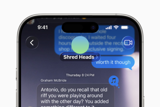
ummmm? What about this is "so clean?" Here's to hoping accessibility options save us.

Screenshot 2025-06-09 at 12.11.00 PM.png
 
Hot take, the concepts were better.
Without a doubt. Same every year. Why can’t a multi billion dollar company do the things someone in their basement can do. It’s ridiculous. They pay people to find bugs in their software. But won’t employ someone who’s done better from rumours and leaks in the last two months. That apple have been working on for 1 year.
 
You’re the one making it personal. I’m just pointing out distracting software design.
distracting... to you. Lol we haven't even held this in hand yet. I think it's looks great and find it perfectly legible from the visuals we've gotten. I'll probably want to customize a bit for personalization, but most of the default should be exactly as intended: less distracting / disappearing based on my focus.
 
Well thank goodness there’s a few months left before this goes out the door so this can be tweaked. I just hope you can turn off all this glass nonsense so I have a hope of being able to read the text and glance at icons without squinting at them. As presented this is an accessibility and UX nightmare.

Note to Apple devs: Aqua leveraged excess processor and graphic card cycles to enhance the screens appearance and make it more inviting, not to fill it with bling that make the user experience more cumbersome and difficult to read and distracting.
 
I’m waiting until I have a beta on my phone to give a firm opinion.

 
Frankly, this is a light overhaul design-wise (we are STILL in updated iOS 7 frosted /blurry glass) nothing groundbreaking but it will also not alienate usual BFUs. What is concerning for me is how many extra swipes there will be to perform old functions, too many pop in and out menus. Maybe looking good at first but once novelty will worn out, oh boy ..
 
I liked it until someone pointed out how close it is to windows Vesta Aero....but i'm not broken up over it. I'll learn to live with it i guess
 
I like the new design, the iOS7 aethertc was way overdue for a change. While it is not as nice or a drastic overhaul as some of the concepts made it out to be, it does give iPhone that "a fresh coat of paint" feeling. Over time, I am sure they will continue to refine and improve it.
 
I really like it. What I really don’t like is how EVERY MacRumors news post is full of pages and pages of negativity. Reading comments on this site seriously just ruins my mood sometimes.

It makes me feel awful when someone says something positive, like “Simply breathtaking,” and then people use the laugh reaction on it. It is so incredibly rude. It really disappoints me how grown adults can be so childish. I thought this site was better than that.
Agree 1000000% with your second paragraph and I have vocally said as much. It didn't matter though and the wrong people got pissed off and I lost my posting privileges in the Political Stories area. That's ok though.

In any case, I think the negativity with this story is due to the buzz about a "big new redesign" and then you look at the end product and it takes really close examination to notice a difference.
 
I like the new design, the iOS7 aethertc was way overdue for a change. While it is not as nice or a drastic overhaul as some of the concepts made it out to be, it does give iPhone that "a fresh coat of paint" feeling. Over time, I am sure they will continue to refine and improve it.
They better be cause this is suboptimal at best.
 
  • Like
Reactions: Orizaba
Register on MacRumors! This sidebar will go away, and you'll see fewer ads.