Okay…12 hours from VA to MI.
Phone - Pixel 5 running latest software and Google Maps
Car - VW Atlas running Android Auto
Bear in mind…I use Apple Maps 99% of the time, love it, works for me..some of the following is of course, my personal opinion…there is also a chance I may not be doing something right to access features I am “missing” or didn’t turn on properly?
Pros
* Announces when you enter a new State with banner…I hate to say it, I love this. “Welcome to Ohio!”
* I like the actual outside local temperature as well as a weather icon...actually very helpful to see in one place even if it is repeated on the dashboard of the car as I know not every car has an outside temperature display.
* Route was fine…matched what Apple Maps would suggest
* I liked the way Google handles waypoints…partially. When I asked to go to a gas station, I was able to tap on the top left box and see how far that was but also see timing for the rest of my ride home. Liked the access to that detail.
* That’s it…blech
Cons
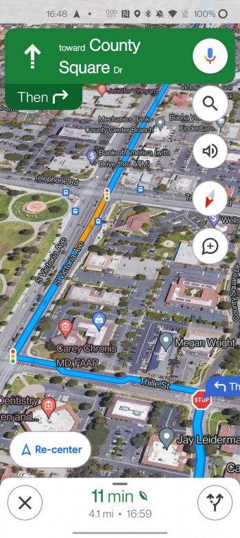
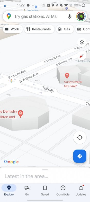
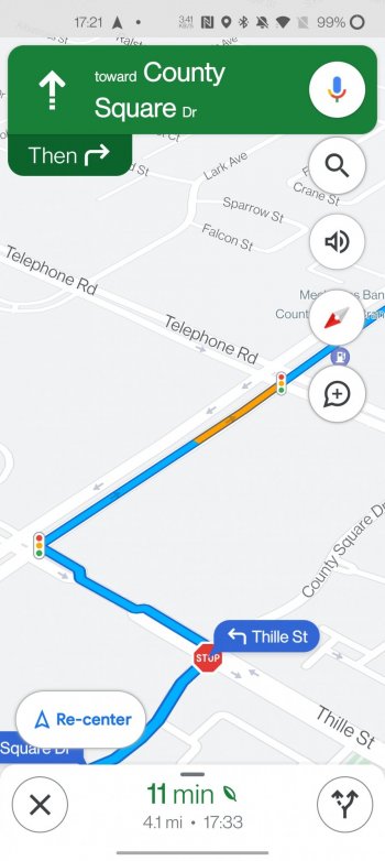
* Visually it just sucks IMHO…bad color background, small roads, no details like terrain, buildings, etc.
* Why does Google still show up to 5 highway placards on the road? It varies sometimes, but do I really need to know it is route 23 THAT much? Just label it once and let it be centered.
* I mentioned waypoints as a pro above, but one serious con is how it shows the distant to various options. If I asked for McDonalds along my route, for example, it might list 6 upcoming options and show them on the map, but the list of options on the lower left of the map only showed how far off the road it was…it didn’t show the actual distance TO the poi unless you tapped on one of the boxes. I don’t want to tap on the first box just to find out it’s 119 miles away. Apple shows all of the distance detail in the box on the map, both distance TO the POI and how far it is off the route.
* The map voice sounded like it was in a can. Just not as clear as Siri.
* Traffic lights and stop signs showed up on the route, but they were missing a bunch of times throughout the route. Google also just “shows” them. There is no reference to them while routing like Apple Maps does. I’m guessing this is coming in a future update, but for now, they are nothing more than a visual reference point (when they are actually shown)
* The background was “off white” almost the entire drive and I couldn’t see the other roads (white) next to my route.
* As I’ve said before, Google Maps shows “speed,” not “traffic.” I’m not sure how people really like this while driving when it never seems to represent what you are experiencing (reds and yellows unless there is actual traffic). I was exiting a highway on an off ramp that never has traffic….I was simply driving slower due to all the pot holes. Google showed the ramp as yellow even though there was no traffic there and is not busy enough to ever have real traffic. I just hate all the yellow and red at every single traffic light and stop sign when there is NO actual “traffic.”….that’s me.
* ETA was WAY off when I started and I arrived nearly 40 minutes earlier…with stops. In my experience, Apple Maps is always way closer to the actual arrival time…has it learned my driving habits?? Yes…I drive fast… 😇
* In general, I find the roads/graphics just too “skinny”…and the lack of 3D buildings is rough now that I am so used to them on Apple Maps (I did not see any building outlines as promised in Google Maps' latest announcement...at least that is coming to better define the map. But not 3D?).
* I couldn’t find any way to mark hazards, speed traps, etc. I think I read somewhere that it isn’t on Android Auto? Only the phone?
* Google missed the first two speed traps I passed (was very lucky), next one they marked was just a state trooper station and no speed trap, the next one marked, no police…the last one marked was real!
* Some construction areas were marked, but Google never announced them…it also didn’t notify me when I was coming up (very fast) to some traffic. Not sure why, but outside of the speed traps, it didn’t announce any other events.
Again, I fully admit to be biased, but the way Apple handles graphics, zoom levels, map details, etc. is so far beyond Google (new Maps areas). Google is definitely trying to catch up with its latest announcement, but not even close yet.
Video showing the terrain issue and too many route signs.


