Become a MacRumors Supporter for $50/year with no ads, ability to filter front page stories, and private forums.
I don’t think undoing skeuomorphism was a mistake. iOS 6 was looking very stale. I’m curious to try out iOS 26 when the public beta drops.
iOS 7 only took a few years to become just as "stale", and Apple didn't do much about it. Keep in mind that came out in 2013, so 12 years ago. The first iPhone came out in 2007, 6 years before. The frosted glass and flat gradients have been the current aesthetic for twice as long as skeuomorphism, with only minor refinements and changes along the way (excluding dark mode which I'd consider a major change).

From what I've seen of liquid glass so far, it's a very timid attempt to bring back skeuomorphism while keeping most of the post-7 design language intact. Better than nothing though, I'll take it.
 
Last edited:
  • Like
Reactions: imagineadam
iOS 7 only took a few years to become just as "stale", and Apple didn't do much about it. Keep in mind that came out in 2013, so 12 years ago. The first iPhone came out in 2007, 6 years before. The frosted glass and flat gradients have been the current aesthetic for twice as long as skeuomorphism, with only minor refinements and changes along the way (excluding dark mode which I'd consider a major change).

From what I've seen of liquid glass so far, it's a very timid attempt to bring back skeuomorphism while keeping most of the post-7 design language intact. Better than nothing though, I'll take it.
An OS is like a road network, it’s a framework for the apps and tasks users want to do. Apps are like the cars that run on the road network.

I need an OS to be highly functional, stable and clearly usable, just like a road network. I don’t need it to look fancy, boring is ok - as long as it’s very functional.

Liquid glass is like making the road network an art gallery. Very pretty, but not clear and functional. ‘Collisions’ are more likely whilst the user is distracted by the pretty visuals.
 
  • Like
Reactions: 01cowherd
When it first dropped I felt it needed toning down but I'm now so used to it I hope that they don't too much as it could be a step backward.
 
When it first dropped I felt it needed toning down but I'm now so used to it I hope that they don't too much as it could be a step backward.
Might be just something that takes a while to get used to. I’ve only used it on a spare phone (and spare iPad) so admittedly haven’t given it more than a few hours use.

On a side note, I do think it works looks much better on the iPad…I don’t mind the effect at all funnily enough there. No idea why though.
 
  • Like
Reactions: TgeekB
Might be just something that takes a while to get used to. I’ve only used it on a spare phone (and spare iPad) so admittedly haven’t given it more than a few hours use.

On a side note, I do think it works looks much better on the iPad…I don’t mind the effect at all funnily enough there. No idea why though.
I agree. It was enough of a change it might take some users some time. For myself I liked it immediately.
 
An OS is like a road network, it’s a framework for the apps and tasks users want to do. Apps are like the cars that run on the road network.

I need an OS to be highly functional, stable and clearly usable, just like a road network. I don’t need it to look fancy, boring is ok - as long as it’s very functional.

Liquid glass is like making the road network an art gallery. Very pretty, but not clear and functional. ‘Collisions’ are more likely whilst the user is distracted by the pretty visuals.
If everyone thought this way, we'd still have the Mac OS 9 Platinum UI on our Macs. Very early versions of OS X actually did have Platinum before Aqua.
 
If everyone thought this way, we'd still have the Mac OS 9 Platinum UI on our Macs. Very early versions of OS X actually did have Platinum before Aqua.
Well it might just have developed more slowly. Evolution, like in products such as the Volkswagen Golf.
 
I wasn’t happy about iOS 7 redesign, most wallpapers looked awful together with all the icons.
I had to always blur my wallpapers, even thought about making a sumple app for that, and like a month later Apple introduced the wallpaper blur option.

Since that time I was fine with the UI.
 
Apple may be trying to undo the mistakes of iOS 7 and add back some skeuomorphism into the UI, and although this Liquid Glass seems like a step forward to me (especially after it gets the inevitable refinements you mentioned), it isn't the greatest attempt at doing so. The UI / UX design team may have too much hubris to just revert back to the pre-7 design language for anything more than the Camera app icon. Pre-7 placed so much emphasis on contrast, and this is doing the exact opposite.
I never want to see skeuomorphism back again as it looks terrible and very dated. I was glad when they finally got rid of it. As for the camera icon, I hope it gets changed or the design flattened a bit, because at the moment it looks out of place.
 
  • Angry
Reactions: redheeler
I think the liquid glass is “fun”. It needs some tweaks for legibility but not too shabby for the first developer beta. Supposedly (according to rumors) they threw it together pretty quickly, so I’m not surprised it’s not perfect. Yes, functionality should be primary, but fun is good too.
 
I think the liquid glass is “fun”. It needs some tweaks for legibility but not too shabby for the first developer beta. Supposedly (according to rumors) they threw it together pretty quickly, so I’m not surprised it’s not perfect. Yes, functionality should be primary, but fun is good too.
Why would they do that and show it to millions of people?
They could improve it just by using more blur, literally one setting.
 
iOS 7 only took a few years to become just as "stale", and Apple didn't do much about it. Keep in mind that came out in 2013, so 12 years ago. The first iPhone came out in 2007, 6 years before. The frosted glass and flat gradients have been the current aesthetic for twice as long as skeuomorphism, with only minor refinements and changes along the way (excluding dark mode which I'd consider a major change).

From what I've seen of liquid glass so far, it's a very timid attempt to bring back skeuomorphism while keeping most of the post-7 design language intact. Better than nothing though, I'll take it.
iOS 6 was an Aqua design which had been around on Mac OS X since 2000. In their own wording, a redesign comes along once a decade (bit longer then I guess) and Liquid Glass is a continuation of what they started with Aqua. I agree that the change isn't huge though.
 
Seeing as it's only Beta 1 I doubt it's the final product. I like it but definitely see how it needs tweaks.
Correct, but they also thought it was good enough to show, have been working on it a long time, and are already internally testing 26.4 according to web traffic. Some stuff will get tweaked, but the really divisive stuff? Not expecting a lot of this to get walked back until 27.0.
 
  • Like
Reactions: !!!
Correct, but they also thought it was good enough to show, have been working on it a long time, and are already internally testing 26.4 according to web traffic. Some stuff will get tweaked, but the really divisive stuff? Not expecting a lot of this to get walked back until 27.0.
Divisive is subjective though. Liquid Glass isn’t going away. At the same time I don’t believe what shipped in beta 1 is what Apple intends to ship this fall. I think it’s what they were able to get out the door for WWDC.
 
Divisive is subjective though. Liquid Glass isn’t going away. At the same time I don’t believe what shipped in beta 1 is what Apple intends to ship this fall. I think it’s what they were able to get out the door for WWDC.
This is the correct answer.
 
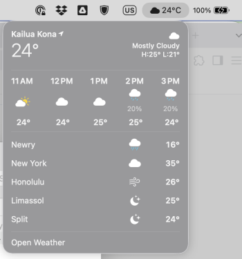
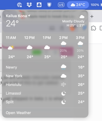
I agree with the title here - nobody asked for all this GPU intensive bloatware. For example, take a look at the weather in the taskbar. Something nice and easy to read, is now MORE difficult to read, due to contrast issues and blurry lines and colors in the background. It's really appauling tbh.

Compare it to when you turn on Accessibility -> Reduce Transparency. How much more legible it is. I'd keep this on, except that mode kills the Messages app and makes it close to unusable.
 

Attachments

  • Screenshot 2025-06-23 at 10.27.17 AM.png
    Screenshot 2025-06-23 at 10.27.17 AM.png
    88.6 KB · Views: 41
  • Screenshot 2025-06-23 at 10.26.07 AM.png
    Screenshot 2025-06-23 at 10.26.07 AM.png
    261.1 KB · Views: 41
Submit Apple feedback with your real name, then we will have a good chance that things will change for the better for the rest of us.
I've exchanged some message's with Dye.
Not holding my breathe for change anyway.
Some things will "definitely get polished over the next few betas, but we are much in-line with the vision"
 
I've exchanged some message's with Dye.
Not holding my breathe for change anyway.
Some things will "definitely get polished over the next few betas, but we are much in-line with the vision"
Anyone who thinks Apple is going to do a 180 on Liquid Glass…

Also so have rebranded the reduce transparency option in accessibility settings as ‘turn off Liquid Glass’ but that’s not what it’s for.
 
If everyone thought this way, we'd still have the Mac OS 9 Platinum UI on our Macs. Very early versions of OS X actually did have Platinum before Aqua.
Heck we'd still have CP/M. It was 'functional' but horrible and I don't like a UI that feels like work. I personally hope that this 'liquid glass' look becomes Aqua's revival. I miss it. I can never see iOS 6 as 'stale' because I was there during the first iteration of flat UI design and it's hardly modern. We're talking Tany DeskMate, Windows 1.x, and DOS. Why would I want to revisit the '70s and '80s computing era again? I've always despised flat design. It was 'good riddance' when XP and Vista launched, and then in 2013 I remember iOS 7 and hated every bit of it. I at first thought my iPhone 4 and iPad 3 were in 'safe mode' because it was so graphically ugly and cheap and looked like something you'd get if the device had a major software crash and rebooted.

I can never see flat design as 'modern' nor would I want it to be forever and never go back. All it will remind me of is work, or the times I sat in front of a Tandy 1000 in middle school.

To view flat design that we've had for 10 plus years as 'modern' and skeuomorphism as 'stale/dated' you could argue that would sound as ridiculous as it would if the last 10 years of video games were all in 8-bit form and people viewed that as 'modern' and amazing 3D games would be 'dated'.

Anyone who thinks flat is modern or that the previous one is dated has to be extremely young and associate say, Windows Vista with their grandma's laptop, or have never been around during the PC/XT days. At least during the PC/XT days we had an excuse.
 
  • Like
Reactions: redheeler
I never want to see skeuomorphism back again as it looks terrible and very dated. I was glad when they finally got rid of it. As for the camera icon, I hope it gets changed or the design flattened a bit, because at the moment it looks out of place.
The only thing dated is flat design. I'm guessing you weren't around when the 8088 CPU was 'modern' or UIs such as DeskMate existed. I felt skeuomorphism made the phone accessible and fun. It turned what was essentially a lifeless slab into whatever you wanted it to be, such as radio, calculator, notepad, the works. You can't get better than that. Plus, we live in a 3D world, and converging the real and digital just seems far more organic than wanting to revisit LCARS from Star Trek which looks completely alien in the real world.

Flat Design belongs in an era of 256-640KB RAM, 20 MB MFM HDDs, Model M Keyboards, and Hercules Graphics.
 
Register on MacRumors! This sidebar will go away, and you'll see fewer ads.