It’s supposed to be lifeless. It’s a phone. It’s a big black rectangle of glass and metal. Adding faux leather and wood grain or glassy special effects doesn’t make it Alive. The best thing an OS can do is be minimalistic and get out of the way so you can view the content you actually picked up the phone to view.I felt skeuomorphism made the phone accessible and fun. It turned what was essentially a lifeless slab into whatever you wanted it to be
Got a tip for us?
Let us know
Become a MacRumors Supporter for $50/year with no ads, ability to filter front page stories, and private forums.
Apple need to tweak the Liquid Glass Design badly
- Thread starter Aoligei
- Start date
- Sort by reaction score
You are using an out of date browser. It may not display this or other websites correctly.
You should upgrade or use an alternative browser.
You should upgrade or use an alternative browser.

I can't agree. If my first introduction to a smartphone had been after iOS 7, I'd have gone back to whatever I was using before. I was just blown away with the skeuomorphism and loved every bit of it. But I was around in the '80s when flat UI design was all computers at the time could do and was so glad when we got away from it. We're not held back by 640KB RAM and MFM HDDs anymore. Tech should go forward, not backward.
Boring, minimalist UIs remind me of work, and I just want to put the phone down before my eyes bleed from the white blindness of it all, especially when it brings back bad memories of Tandy DeskMate from the Tandy 1000s I had to use in 7th grade.
Skeuo UIs make me wanna touch it and go to App Store to find out what neat app comes out next. Perhaps you'd be more happy in CP/M or MS-DOS?
Yeppers and I still hate the flat design.I felt skeuomorphism made the phone accessible and fun.
Seriously, this seems incredibly dated.


I dunno, looking at it there it still makes my eyes happy. Also very easy to understand whether you're 4 or 84. Didn't Apple once pride itself on accessibility?
The only reason you see it as 'dated' is because it never improved because iOS 7 happened. If it kept being developed we might have even more amazing features on the Vision Pro or possibly holographic UX ala the Iron Man movie. You're seeing it from the year 2012 where it stopped.
But when I see flat design I see washed out, boring, bland, white, blinding, migraine inducing, reminder of the DeskMate and PC/XT era. It's like comparing a 'modern' home interior to one from the 1970s. I prefer the '70s one, with warm lighting, nature-inspired colours, soft carpeting, while the 'modern' one is like living in an office cubicle, all white, no colour, 5000K LED lighting, no decor, and worse, those wall-art pieces with 'Live Laugh Love' all over them in that horrid swoopy font that makes Comic Sans look good.
I don't know, when I get home I don't want to feel like I'm still at work, and when I use my iPhone or Mac, I don't want to feel like I'm back in the '80s or wanting to close the LCD lid or put the phone away as fast as possible due to the UI making me dread looking at it. I guess getting your things done on your phone and putting it away fast works for efficiency but back in the iOS 6 days I enjoyed my phone now I just hate it.
Last edited:
I think that’s just your personal nostalgia for times when you were younger, and that’s totally okay 👍looking at it there it still makes my eyes happy.
No, I was younger when CP/M and DeskMate were a thing, and believe me I have ZERO nostalgia for '80s computing. I was into my 30s when skeuomorphism was at its peak.
As long as we don't go back to the eye-searing white text on blue of WordPerfect, I am all in for some nostalgia. I think the Nothing skin on Android with its Atari-like icons looks incredibly cool. But I also like really simple designs like Niagra Launcher.
I must admit, I’m hating this design so much that despite the ecosystem integration it’s really driving me towards Android. This update improved the control panel but everything else is seriously bad. Also it is way too rounded for my liking. Been using it now since it came out and with the updates; both on my iPhone 16PM and MBP. But no, just no.
It’s supposed to be lifeless. It’s a phone. It’s a big black rectangle of glass and metal. Adding faux leather and wood grain or glassy special effects doesn’t make it Alive. The best thing an OS can do is be minimalistic and get out of the way so you can view the content you actually picked up the phone to view.
I agree, we tend to forget that what matters the most is the actual contents we work with. Thus iOS should not be a design marvel to stare at for hours per se, but to be as efficient and intuitive as possible. If Apple fine-tune the current Liquid Glass design to improve its legibility, it will be a very good development.
It's very refreshing to hear your opinion. I completely agree, I think it looks just terrible.I must admit, I’m hating this design so much that despite the ecosystem integration it’s really driving me towards Android. This update improved the control panel but everything else is seriously bad. Also it is way too rounded for my liking. Been using it now since it came out and with the updates; both on my iPhone 16PM and MBP. But no, just no.
Couldn’t agree more. Efficiency first. Looks whatever. As long as it’s legible, and it is and will be improved, it’s fine with me.I agree, we tend to forget that what matters the most is the actual contents we work with. Thus iOS should not be a design marvel to stare at for hours per se, but to be as efficient and intuitive as possible. If Apple fine-tune the current Liquid Glass design to improve its legibility, it will be a very good development.
Completely agree.It’s supposed to be lifeless. It’s a phone. It’s a big black rectangle of glass and metal. Adding faux leather and wood grain or glassy special effects doesn’t make it Alive. The best thing an OS can do is be minimalistic and get out of the way so you can view the content you actually picked up the phone to view.
And while it can be somewhat accepted with the new iOS 26 UI, what they did to macOS Finder windows is an abomination in my opinion.
I installed the iPadOS beta upon release to test the new design and multitasking features. While this might not be a popular take, I think the multitasking changes have overcomplicated the experience. It feels like users are forced to choose between two extremes: basic single-tasking or a Mac-style windowing system.
As for the new “liquid glass” design, it’s confirmed that switching to the Pixel and Android was the right move for me. I understand some people may like it, but it puts emphasis in the wrong places. In my opinion, UI elements should stay subtle and functional, not stand out. This aesthetic makes buttons and interface components too visually dominant, which goes against how I think a good UI should behave.
As for the new “liquid glass” design, it’s confirmed that switching to the Pixel and Android was the right move for me. I understand some people may like it, but it puts emphasis in the wrong places. In my opinion, UI elements should stay subtle and functional, not stand out. This aesthetic makes buttons and interface components too visually dominant, which goes against how I think a good UI should behave.
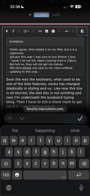
Totally agree. Only tested it on my iPad, but it is a nightmare.I must admit, I’m hating this design so much that despite the ecosystem integration it’s really driving me towards Android. This update improved the control panel but everything else is seriously bad. Also it is way too rounded for my liking. Been using it now since it came out and with the updates; both on my iPhone 16PM and MBP. But no, just no.
January this year I was sure to buy iPhone 17pro ´cause I let out the 16pro (coming from a 15pro).
But hell no, they will not get my money.
Will stick atleast one year to my 15pro without updating to this crap.
Even the way the keyboard, what used to be one of the best features, works has changed drastically in styling and ux. Like now this line is all blurred, the text box is not scrolling and now I’m underneath the keyboard typing bling. Then I have to tick a check mark to get rid of it. I can’t believe this is made by Apple.Totally agree. Only tested it on my iPad, but it is a nightmare.
January this year I was sure to buy iPhone 17pro ´cause I let out the 16pro (coming from a 15pro).
But hell no, they will not get my money.
Will stick atleast one year to my 15pro without updating to this crap.
Attachments
I don’t remember what it looked like before, but there is some frosted glass effect when scrolling. It’s pretty subtle. No other changes. It does not have the big glassy navigation buttons, giant blue check marks, or bottom search bar.Did Apple glass over the iTunes Store app, or is it still the UI from 2015?
Well, fortunately you can still enable the “reduce transparency” option, as well as the “reduce motion” one, to make it as bland and straightforward as possible.Phone GUI should be as bland and easy to read as possible and everything should be user customizable so that you could do Liquid Glass as a theme if you wanted to. As for me, iPhone is a tool and not a lifestyle.
I still can’t believe designers at Apple thought it’s a good idea to add blur to top and bottom of each website.
It literally blurs logos on websites and text that Im reading. 😂😂
It literally blurs logos on websites and text that Im reading. 😂😂
Exactly and then adapter the browser colour on the desktop to the keycolor. And not just that who though it was a good idea to have the active tab not underlined and all the others underline. It’s not even first of april. They really lost the plot.I still can’t believe designers at Apple thought it’s a good idea to add blur to top and bottom of each website.
It literally blurs logos on websites and text that Im reading. 😂😂
Register on MacRumors! This sidebar will go away, and you'll see fewer ads.