Got a tip for us?
Let us know
Become a MacRumors Supporter for $50/year with no ads, ability to filter front page stories, and private forums.
Apple Watch 4 - Missing complications in either Infograph or Modular watch face?? [MERGED]
- Thread starter iAdamator
- Start date
- Sort by reaction score
You are using an out of date browser. It may not display this or other websites correctly.
You should upgrade or use an alternative browser.
You should upgrade or use an alternative browser.
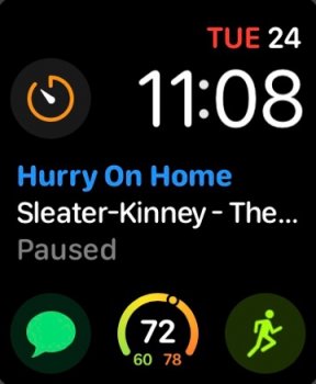
I'm missing a really good digital watchface for the Apple watch with seconds and plenty of complication slots where all complications work.
Yes it seems Apple does not care about the digital watch faces. At least have a fully customisable modular, where you could, for example, put the time in the middle (complete with seconds), rather than top right only.
Yes it seems Apple does not care about the digital watch faces. At least have a fully customisable modular, where you could, for example, put the time in the middle (complete with seconds), rather than top right only.
After using the modular infograph for several months I still miss having sunrise/sunset on it. It would also be nice with conditional complications, like for example have weather in a slot when a timer isn’t running, but temporarily replace it with the timer when it’s running.
Lol just use pocketcast...it’s better anyway.Apple updated Podcasts complication to work with infograph!
Ha! April Fools. It’s still AWOL.
Still so many complications missing.  I miss Reminders the most since I use it so much.
I still think it’s crazy that the email one doesn’t show the number of unread emails. It works perfectly well with messages so why not emails?
Many people seem to leave hundreds if not thousands of unread email in their inboxes. Maybe that’s why Apple opted not to show the unread email count on the complication? If so they could at least have made it an option
Many people seem to leave hundreds if not thousands of unread email in their inboxes. Maybe that’s why Apple opted not to show the unread email count on the complication? If so they could at least have made it an option
More so then to have it added. I don’t want to be penalised just because someone is too lazy to go through their mail.
Many people seem to leave hundreds if not thousands of unread email in their inboxes. Maybe that’s why Apple opted not to show the unread email count on the complication? If so they could at least have made it an option
Maybe but as you say, should be a choice. It could just say 10+ for example if there are loads of unread.
Maybe but as you say, should be a choice. It could just say 10+ for example if there are loads of unread.
Nice one.... A perfect compromise.

Nice one.... A perfect compromise.
Ta. It’s just another example of Apples half-assed approach these days IMO. It’s almost like everything is half a job and nothing is ever quite finished. No continuity between similar apps i.e. messages and email etc etc. If the Microsoft Outlook one did it I would use that one in a heartbeat.
just upgraded to the series 4. one of the reasons being more options to add complications to the home screen. but am i correct in saying it's not possible to add apple's podcast app? do i really have to press the dial and go to the apps screen just to launch podcasts?
*edit*
looks like podcasts isn't available as a complication on all watch faces:
https://support.apple.com/guide/watch/faces-and-features-apd6ce85daf4/watchos
i was trying to add it to the infograph watch face
*edit*
looks like podcasts isn't available as a complication on all watch faces:
https://support.apple.com/guide/watch/faces-and-features-apd6ce85daf4/watchos
i was trying to add it to the infograph watch face
Last edited:
Bet won’t be here til watchOS6just upgraded to the series 4. one of the reasons being more options to add complications to the home screen. but am i correct in saying it's not possible to add apple's podcast app? do i really have to press the dial and go to the apps screen just to launch podcasts?
*edit*
looks like podcasts isn't available as a complication on all watch faces:
https://support.apple.com/guide/watch/faces-and-features-apd6ce85daf4/watchos
i was trying to add it to the infograph watch face
Good news! Your wait is over.It's July 2019, I'm still waiting to add "Now Playing" to Infograph Module.
Good news! Your wait is over.
I’m obviously missing something but I can’t find it anywhere. This is on my Series 4 with watchOS 6. What am I doing wrong? Thanks.
Not sure. I have a series 4 as well and…
Aaahh that one, the Infograph Modular. I was just looking at the Infograph variant. Thanks.
Yes it seems Apple does not care about the digital watch faces. At least have a fully customisable modular, where you could, for example, put the time in the middle (complete with seconds), rather than top right only.
That's exactly what I want. Big digital time with seconds in the center. Complications on top and bottom of that. Seems so simple.
It does seem simple. My guess it that it would interfere with either the fung shui or the Golden Ratio or the Karma of the Apple Watch. Would you want that to happen? I think not! 😜That's exactly what I want. Big digital time with seconds in the center. Complications on top and bottom of that. Seems so simple.
Register on MacRumors! This sidebar will go away, and you'll see fewer ads.


