Become a MacRumors Supporter for $50/year with no ads, ability to filter front page stories, and private forums.

allan.nyholm

macrumors 68020
Original poster
Nov 22, 2007
2,317
2,574
Aalborg, Denmark
UPDATE:
Because of a request over at deviantART I put together a small update for macOS Mojave.
Available here: NO LONGER AVAILABLE.

Looks similar to that of High Sierra except for the Finder Toolbar buttons.

---
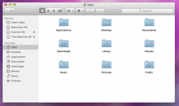
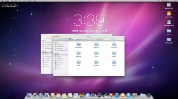
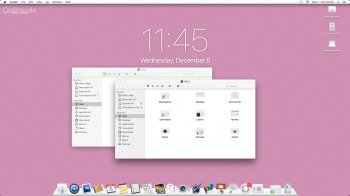
It's an Aqua-like (lick) theme for macOS High Sierra. With elements of some 'not Aqua-like' elements.

Version 1.0.5 is out and available at the same link as before. I've attached a newer screenshot.

Non Hi-dpi users can now use the theme too as I've made the graphics for that too.
Screenshot below and download 1.0.5 at:
NO LONGER AVAILABLE.
BasicScreenshot.png
 
Last edited:

Princess Cake

macrumors 6502
Jan 15, 2010
327
256
Cheboygan, MI
Pretty darn neat actually! And it sure beats that idiotic "High Sierra to Mavericks" total conversion application that pretty much corrupted my system's UI and made me have to do a full Time Machine restoration...

Would it be possible to use the assets from Snow Leopard in your theming? I always thought it had the most beautiful implementation of the traffic lights.
 

allan.nyholm

macrumors 68020
Original poster
Nov 22, 2007
2,317
2,574
Aalborg, Denmark
Hi, I'm glad to hear your feedback - and I'll make sure to check out the way the Snow Leopard traffic lights are made and get back to you. Luckily I have a Snow Leopard installation on a MacBook Pro that I can look to. Perhaps I can rely on you just to give me pointers if I'm off the path?

You are using a non-retina Mac? When I build the theme I'd like to know if I should take the time to make those as well - I'll probably do so anyway :D

Thanks.
 

Princess Cake

macrumors 6502
Jan 15, 2010
327
256
Cheboygan, MI
Oh yeah, 2012 20'' iMac 1920x1080 your theming already looks miles better than the default flatness!

But definitely try to get some actual Leopard assets! Also quick question, I know the .car files control all the art resources on the system but using them are you able to change the Menu Bar in anyway? I'd love to have the 3D shading back or at least the older Apple button with the shine!

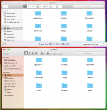
Update: I think you may have gotten some of the files backwards though as the title bar appears DARKER when its inactive and BRIGHTER when its active :p
 

Attachments

  • Screen Shot 2017-12-06 at 1.02.58 PM.png
    Screen Shot 2017-12-06 at 1.02.58 PM.png
    263.6 KB · Views: 836
Last edited:

allan.nyholm

macrumors 68020
Original poster
Nov 22, 2007
2,317
2,574
Aalborg, Denmark
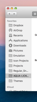
Ooh - you're right - that does look wonky. I'll fix. While I do that take a look here (I notice the jarring on the bottom part of the lights - I'll fix that too: If you can give the go ahead for the look of those - minus the jarring then I'll proceed making the rest of the files and fix the issues you have raised.

Screenshot 2017-12-06 20.32.11.png
 

Princess Cake

macrumors 6502
Jan 15, 2010
327
256
Cheboygan, MI
OHHHHHH YEAH, thats bloody beautiful! My eyes were screaming to have those lickable buttons back ^.^

How about this for an idea? Stretching the Back/Forward buttons and making them shorter as they used to be?
 

Attachments

  • oldbackforward.png
    oldbackforward.png
    182.5 KB · Views: 483
Last edited:

allan.nyholm

macrumors 68020
Original poster
Nov 22, 2007
2,317
2,574
Aalborg, Denmark
OHHHHHH YEAH, thats bloody beautiful! My eyes were screaming to have those lickable buttons back ^.^

How about this for an idea? Stretching the Back/Forward buttons and making them shorter as they used to be?

That stretching is not doable AFAIK. The glyph-stretching is. I already have huge issues with the Finder buttons on Retina sizes.. I'm preparing the version with the traffic lights right now. I'll start by giving it to you here and then let it migrate to the official Aqua-Lick release on dA.


By shorter you also mean less height? - thats' what I'm trying to achieve with my countless revisions.
 

Princess Cake

macrumors 6502
Jan 15, 2010
327
256
Cheboygan, MI
Yeah, less height by itself would fix them. They just look so "fat" and boxy the way they are now.

Concerning the wonky Inactive/Active window problem, you think I should maybe reboot my system and check again? I just did a Logout.
 

allan.nyholm

macrumors 68020
Original poster
Nov 22, 2007
2,317
2,574
Aalborg, Denmark
I have confirmed that I have indeed swapped the two graphics for the non-retina portion of the theme. A fix is coming - or if you can't wait I have the fixed one uploaded to Dropbox in this post, it won't take long for the rest of the theme to be done - minus the button height issue, which I'm willing to look into. I rarely get feedback.

https://www.dropbox.com/s/z8ex798s4qjdkv7/SingleFile.zip?dl=1
[doublepost=1512591458][/doublepost]I just realized that I wasn't finished with just making the colored traffic lights - that there are those inactive too and those disabled too
 

Princess Cake

macrumors 6502
Jan 15, 2010
327
256
Cheboygan, MI
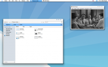
I'd love to test this stuff out for you, I used to do skin/theming myself back when I was on *ugh* ....Windows Vista. I was trying to port over the classic "Rulermilk" Mac visual style.

Once I finally arrived on the Mac with 10.5 I never found a reason to customize anything really until this whole new iOS look came about in Yosemite. I'm sure lots of people like it but I just prefer the glossy buttons with shadows and overall skeuomorphism OS X used to have. I bet Steve Jobs felt the same way, he loved to play with shiny icons with drop shadows and almost acted like a kid when he could show off the visual flair in slow-motion. Theres no way Steve would be into the current look-- regardless of it being designed by Ive.
 

Attachments

  • milk_for_vista___preview_by_princesscakenikki.png
    milk_for_vista___preview_by_princesscakenikki.png
    1.3 MB · Views: 714

allan.nyholm

macrumors 68020
Original poster
Nov 22, 2007
2,317
2,574
Aalborg, Denmark
Vista!?!?? At least you made it look good with that theme. I have been dabbling with Milk for High Sierra too. I have a release over at my dA account. I was going to make MetalMilk but I can't get it finished - mostly because of me doing some other stuff.
 

Princess Cake

macrumors 6502
Jan 15, 2010
327
256
Cheboygan, MI
I've got a Milk dock made for the cDock app but thats about it right now as I'm too tepid to mess with .car files.
 

Attachments

  • Screen Shot 2017-12-06 at 2.21.37 PM.png
    Screen Shot 2017-12-06 at 2.21.37 PM.png
    300.8 KB · Views: 581

allan.nyholm

macrumors 68020
Original poster
Nov 22, 2007
2,317
2,574
Aalborg, Denmark
Very nice cDock theme :)

Please try these files included in the .zip here as I have resized the retina elements for non-retina use and I hope that they are acceptable!? https://www.dropbox.com/s/p59q8wtqorhbuyd/Regular_SnowLeopard.zip?dl=1

btw.. the .car editing can be daunting at first but I think you'll settle in quite quickly - there's just a hell of a lot of files to change if the whole thing is to be turned over which may be why I'm taking a small break for the evening here today - unless there's some situation. It's nearing midnight here in DK

Oh and the Apple logo and menubar - those are pretty much set in stone - for the Apple logo I though of just making a GeekTool image overly that gives me that glossy logo. I'll try tomorrow to get a bit of what you are requesting into the logo. The menubar is not going to change - sadly. I have tried so many things - the only thing that can give a little hope is the utility called MenubarTint by www.manytricks.com
 
Last edited:

Princess Cake

macrumors 6502
Jan 15, 2010
327
256
Cheboygan, MI
I could kiss you! That looks so much better now!

Now I gotta work on making a Snow Leopard cDock to match this! >w<

Oh, and I had the same idea about using GeekTool to overlay the logo but I've yet to attempt it. Also for the Menubar if its not possible to change the texture theres still the Menu Bar Tint · Many Tricks Menu Bar Tint app. If you balanced the colors just right it might be possible to get the same shades of grey that were used in Leopard. THE PROBLEM there though is the tint is being applied over the text, so the Menu Bar text and icons are gonna look faded :/
 

Attachments

  • Screen Shot 2017-12-06 at 3.05.24 PM.png
    Screen Shot 2017-12-06 at 3.05.24 PM.png
    128.2 KB · Views: 511

allan.nyholm

macrumors 68020
Original poster
Nov 22, 2007
2,317
2,574
Aalborg, Denmark
I could kiss you! That looks so much better now!

Now I gotta work on making a Snow Leopard cDock to match this! >w<


Uhh la la - A kiss and a great screenshot.. nothing more to make my day :D

When I read your comment here I felt that I wanted to give it a go since proper feedback is rare for me.
I don't usually operate this quickly but it was fun to make.

A cDock theme would make the look more complete - If you haven't seen then there's a link with high-res wallpapers from older Mac OS X versions: https://512pixels.net/projects/default-mac-wallpapers-in-5k/

Oh, and some cDock themes here in case you haven't seen - some good ones : https://github.com/Wandmalfarbe/cDock-Themes
 
Last edited:

Princess Cake

macrumors 6502
Jan 15, 2010
327
256
Cheboygan, MI
Still got a ways to go before reaching the full Leopard brilliance but with your edits it got a big kick in the butt! Once I put together a Leopard cDock I'm sure it'll look even better... but I already know theres no way to get those Dock icon reflections back :'(
 

Attachments

  • Screen1.jpg
    Screen1.jpg
    1.7 MB · Views: 803

allan.nyholm

macrumors 68020
Original poster
Nov 22, 2007
2,317
2,574
Aalborg, Denmark
Yes there is quite a long way for Leopard - Snow Leopard perfection. I also just now made a cDock theme that I think is quite nice.

Also, great modding once again! Looks good what you've made.

Screenshot 2017-12-06 22.48.jpg
 

Princess Cake

macrumors 6502
Jan 15, 2010
327
256
Cheboygan, MI
What program do you use to edit .car files anyway? I'd love to do a version of RulerMilk for High Sierra using your port of Milk as a base ^.^

Also, do you have any ideas on how to customize the Calendar in the Dock? I know about the "App-empty.icns" file inside of the resources but I can't get it to refresh.
 

Attachments

  • Screen Shot 2017-12-06 at 11.45.04 PM.jpg
    Screen Shot 2017-12-06 at 11.45.04 PM.jpg
    808.5 KB · Views: 655
Last edited:

allan.nyholm

macrumors 68020
Original poster
Nov 22, 2007
2,317
2,574
Aalborg, Denmark
I use the program called ThemeEngine to edit the .car files with.. It's here - use the top most entry: https://github.com/alexzielenski/ThemeEngine/releases/

There's also a guy who has forked it on Github that aims to update it and fix bugs. Very promising. You can see it all on the Github page

The Calendar, as you know has a file(Empty .icns) in the DockTile.plugin that needs changing too for the whole thing to work. Other than that I'm not entirely sure why the app icon won't refresh.

Great screenshot - making use of Milkapp icons I see. Great choice.
 

Princess Cake

macrumors 6502
Jan 15, 2010
327
256
Cheboygan, MI
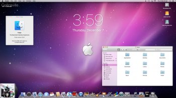
Ah, I didn't know there was a second file controlling the calendar, that fixed it! But I completely forgot that the text on top of the icon would look messed up. -_-

In other news I got the Leopard cDock completed. I don't know how to customize the Seperator image and theres no icon reflections (I know cDock offers some but they only work for open Apps which sucks) so this is about as good as I'm gonna get the Dock to look.

I also got the Menubar almost exactly as it used to be, it should be a bit more transparent but it works.
 

Attachments

  • Screen Shot 2017-12-07 at 3.59.23 AM.jpg
    Screen Shot 2017-12-07 at 3.59.23 AM.jpg
    1.6 MB · Views: 836

allan.nyholm

macrumors 68020
Original poster
Nov 22, 2007
2,317
2,574
Aalborg, Denmark
Very nice! Better cDock than mine. You got that retro thing going on. In actuality so do I; as I've kept the style of trafficlights I made yesterday on my system. The 10.13.2 .car files are built on a later date but the files I made work fine. I'm always a little worried if I have to rebuild the themes I make if a .car file is larger or newer.
 

Princess Cake

macrumors 6502
Jan 15, 2010
327
256
Cheboygan, MI
I haven't even updated out of fear of losing all the goodness you've given me xD

I took a look at the .car files and wow.... the traffic buttons alone have almost 50 files you have to edit >.> I think I'd be in over my head attempting to port RulerMilk. Project for a rainy day I suppose.

Also here's my Leopard cDock if you'd like it. I don't know how nice it'll look on your fancy-shmancy 4k screen though :p
http://www.filedropper.com/leopardconversion
 

allan.nyholm

macrumors 68020
Original poster
Nov 22, 2007
2,317
2,574
Aalborg, Denmark
Appreciate the share, I'll take a look and see. 4k??? 5k!! ;)

Sure, 50 files might seem like a lot - but think of the greatness that can come out of it :D
 

Princess Cake

macrumors 6502
Jan 15, 2010
327
256
Cheboygan, MI
Any progress made on shortening the Back/Forward buttons or the control bar in general? Thats pretty much the only missing piece of the puzzle @.@
 

Attachments

  • buttons.png
    buttons.png
    25.8 KB · Views: 463
Register on MacRumors! This sidebar will go away, and you'll see fewer ads.