Got a tip for us?
Let us know
Become a MacRumors Supporter for $50/year with no ads, ability to filter front page stories, and private forums.
Aqua-Lick also for Mojave
- Thread starter allan.nyholm
- Start date
-
- Tags
- aqua high sierra macos theme
- Sort by reaction score
You are using an out of date browser. It may not display this or other websites correctly.
You should upgrade or use an alternative browser.
You should upgrade or use an alternative browser.
Any progress made on shortening the Back/Forward buttons or the control bar in general? Thats pretty much the only missing piece of the puzzle @.@
Progress towards a less height button appearance - on Retina. Later on today I'll see to it that the regular sizes gets done.
It was pure luck this.
Can't wait! ^.^ you're bringing sexy back to the Mac!
Btw, its safe to update macOS, right? The .car files didn't get all screwy?
Btw, its safe to update macOS, right? The .car files didn't get all screwy?
Can't wait! ^.^ you're bringing sexy back to the Mac!
Btw, its safe to update macOS, right? The .car files didn't get all screwy?
Only thing I've noticed is that the buildnumber of the .car files in 10132 is from october of this this versus july in the previous 10131
So for me, I've updated without giving it a second thought and I got lucky that the .car files fits in perfectly with current macOS
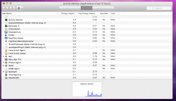
I have a situation that I can't get myself out of, see the images.. there's right now a huge issue with the pressed/active state of the buttons in Activity Monitor and the Calendar ... It's been going on like this for at least the past 2 hours and I've remade buttons using different programs, like Sketch, Pixelmator and Acorn(hence the slightly(understatement of the year!!) different appearance of the regular buttons. I kinda like these brighter buttons. Anyway...


The real issue is that no matter how I make the buttons there appears to be a minimum height that contains the text, or so it would seem. Earlier when I wrote everything was dandy but there was in actuality lots of various situations that I wanted to resolve. I fell asleep when I got home and I've been at it since I woke. I'll keep on getting the text to appear as it should - it HAS to be possible to lessen the buttons' height but then again they have to contain the standard height of the font in macOS on buttons. I believe right now as I type it out loud that it's probably what's happening. I'll attempt to heighten the buttons but keep them less tall as possible.
I don't want to ship half a theme where the user can't read the titles of the buttons of the interface.
Btw .. I have to say that the themes I made for Yosemite and El Capitan was never this stringent with the buttons and they all could have the same size with the same dimensions and placement within a canvas. Including margins and all. Once macOS Sierra came along there was a shift in the way that was handled. That's why I never really made buttons for my more recent themes other on as a concept. And I tried to keep the height on the buttons as per default.
Also, more of a note to myself, and possibly other too, try using non-retina resolutions and see how things appear there. If you can then upscale buttons from that. I think the reverse, like how I'm doing it is the worse of the two ways. I'll take that note with me as I go redo the whole button line up for non-retina and just upscale. This HAS to work.
With non-retina the blurriness can however kill even the best looking theme. Retina gives the whole interface a huge boost and clarity. Sorry to the non-retina users.
Last edited:
A bit of a problem I just found matter of fact, the version I've been using the last couple days seems to break in Activity Monitor. It's sure not enough for me to stop using it though 
Maybe we should just drop the idea of editing the button sizes and just go for giving them the Snow Leopard textures/colors?
Maybe we should just drop the idea of editing the button sizes and just go for giving them the Snow Leopard textures/colors?
Attachments
I'm all for that - I was kind of thrown back yesterday with all this hoopla. I'll go for changing the Finder buttons to have a more metallic look as it is within Snow Leopard. The background is also darker in Snow Leopard but I don't feel that the background needs to be or can be darker. I'll try and send some screenshots along the way as I progress. I've had the worse nights with regards to sleep and energy wise I'm not all that pep - But, as I drink 1liter of coffee it will come to me, I'm sure.
Sounds good ^.^ I've been trying to fix the Dock in terms of reflections/separators but so far each idea has backfired...
Reflections:
Using icons themselves with reflections makes the icon too small, the reflection moves with the icon, they look daft in Launchpad/Finder, and you'd have to change every single application that ever appears in the Dock... FAIL.
Separator:
My only idea for it was to put the separator in the Dock's texture itself. This does sort of work but if the Dock moves around or the items get re-arranged it quickly breaks... FAIL.
Also, if you don't feel like resizing the Snow Leopard assets to match High Sierra you can send them over here, I'll be happy to do some grunt work ^.^
Last edited:
Sounds good ^.^ I've been trying to fix the Dock in terms of reflections/separators but so far each idea has backfired...
Reflections:
Using icons themselves with reflections makes the icon too small, the reflection moves with the icon, they look daft in Launchpad/Finder, and you'd have to change every single application that ever appears in the Dock... FAIL.
Separator:
My only idea for it was to put the separator in the Dock's texture itself. This does sort of work but if the Dock moves around or the items get re-arranged it quickly breaks... FAIL.
Also, if you don't feel like resizing the Snow Leopard assets to match High Sierra you can send them over here, I'll be happy to do some grunt work ^.^
I thought that at one time there was an option for reflections on each app state with cDock? It must have been a different thing..
So now, after having watched the latest Transformers movie I must wash that off with some theming - I might take you up on that offer of possibly doing some 'grunt work' as you say
There once was as a different Dock theming app that costs a little - I forget the name. Then there's DragThing - which you can theme to also have the appearance of a Dock - but it's nothing like the Dock because it's just an add-on. I'm referring to reflections here when I mention DragThing.
Its hard to say for sure as your 5K stuff looks so different from my resolution, but as long as they are the same "pixel art" Snow Leopard has I'm a happy bunny.
But yeah, I've got Photoshop CC 2017 and an itchy drawing finger. I'd love to do some skinning again! I'd grab the assets myself but Parallels is being a jerk and won't let me install Snow Leopard for some reason despite having the disc...
But yeah, I've got Photoshop CC 2017 and an itchy drawing finger. I'd love to do some skinning again! I'd grab the assets myself but Parallels is being a jerk and won't let me install Snow Leopard for some reason despite having the disc...
I'm trying real hard to make it right,,, and as a matter of fact - I solved the button height issue  I save as a PSD file from Affinity Photo and that has brought a whole lot of good things with it. I won't jinx it by typing it - but I probably have.. The reason for the fix- the assets.car - the coverflow toolbar glyph was too tall.
I hope that you get Snow Leopard up and running. I have .iso
I hope that you get Snow Leopard up and running. I have .iso
Its hard to say for sure as your 5K stuff looks so different from my resolution, but as long as they are the same "pixel art" Snow Leopard has I'm a happy bunny.
But yeah, I've got Photoshop CC 2017 and an itchy drawing finger. I'd love to do some skinning again! I'd grab the assets myself but Parallels is being a jerk and won't let me install Snow Leopard for some reason despite having the disc...
Can you try and help... I have zero patience right now. I've attached the psd files I've worked with within Affinity Photo and Designer and that I have exported.. I'm at a loss at getting this to line up. I might have overlooked the detail. I'm sure I have. Right now it looks so odd on non-retina. While on my res it looks "fine". My eyes needs to get back on Retina. I've been working on 1920x1080 sometimes on 2560x1440 but it's getting to my head this ..
Updated slightly
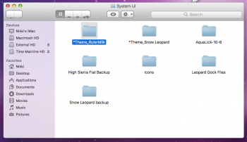
https://www.dropbox.com/s/91ypfdngcdur5zx/AquaLick-10-6.zip?dl=0
The resizing thing just doesn't seem like its gonna work >.> theres an entirely new problem now. If you make a window Active/Inactive numerous times the Back and Forward arrows start to slide down off the button, its quite odd...
I think you should stick with the default buttons and just give them the Snow Leopard textures. If you send me the default Finder buttons that need to be edited along with the textures from Snow Leopard I'll be able to morph and redraw them to fit the buttons correctly.
You might need to label them a little as sending me a big pile of generic buttons is gonna make it hard for me to know what goes where
Attachments
I totally hear what you're saying with regards to the zip file and the lack of labelling -_- I was in build-mode and forgot all about that.
The roll-effect is the absolute worst. It happens when the inactive buttons doesn't line up 100% with the front active(off) button.
The roll-effect is the absolute worst. It happens when the inactive buttons doesn't line up 100% with the front active(off) button.
If it's any help I have the SL resources in a theme park file?
That would be a help but like I said, I'm not sure what each individual asset really GOES to. Sure they have names like "Rollover-Menu-Down" but that could be anything... I really only want to edit those primary buttons people see in Finder windows.
At any rate, I'll need the Snow Leopard assets if I'm to create new buttons for High Sierra.
Could one of you guys send me the Snow Leopard Sidebar icons? I'm using MySIMBL to change them to the correct colored ones but I just cannot find them online! I found a Snow Leopard icon pack but its all .png files and when used in the sidebar they won't display correctly as they don't have a "Small Version"
Hang on just a few while I boot up my Snow Leopard.... I fell of the Internet yesterday ...
[doublepost=1512991332][/doublepost]
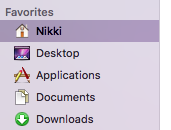
Here are the 'Toolbar' icons - for the Sidebar. https://www.dropbox.com/s/5l3m9wt137ui25w/ToolbarICNS.zip?dl=1
[doublepost=1512991332][/doublepost]
Could one of you guys send me the Snow Leopard Sidebar icons? I'm using MySIMBL to change them to the correct colored ones but I just cannot find them online! I found a Snow Leopard icon pack but its all .png files and when used in the sidebar they won't display correctly as they don't have a "Small Version"
Here are the 'Toolbar' icons - for the Sidebar. https://www.dropbox.com/s/5l3m9wt137ui25w/ToolbarICNS.zip?dl=1
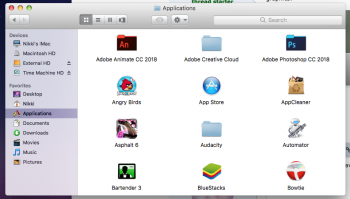
Beautiful ^.^ its amazing how different the system feels when you introduce some color to it!
Once I have everything sorted we can make a Sticky listing all the apps and things needed to convert High Sierra to Snow Leopard Aqua-Lick Edition ^.^
Once I have everything sorted we can make a Sticky listing all the apps and things needed to convert High Sierra to Snow Leopard Aqua-Lick Edition ^.^
Attachments
Also, I found that GeekSpiff Software still has a copy of ThemePark 4 and 3 hanging around - I downloaded version 3 and of course 4. Version 3 includes in its DMG some PSD files that can be quite useful. Just a heads up.
The website for ThemePark is http://www.geekspiff.com/software/
I'm also in the early stages of putting together a small instruction as to what goes where now that I failed previously with the explaining or lack thereof
The website for ThemePark is http://www.geekspiff.com/software/
I'm also in the early stages of putting together a small instruction as to what goes where now that I failed previously with the explaining or lack thereof
Why in the world won't the roll stop... I'm into the 9000th revision - these are built directly on top of the original graphics.

What a crazy person I am for letting that go -- I must inspect it. My Niqu theme does not have this behaviour and I just took a look at that too - it had the dpi for the buttons at 96dpi where it's usually 72dpi. Thanks Photoshop. Or else...
Register on MacRumors! This sidebar will go away, and you'll see fewer ads.


