I've been loyal to Aperture over the last five years, but now with it fading into the sunset and the new Photos app found wanting, I spent the afternoon exploring Capture One Pro 8. I previously looked at both LR and C1 a couple of years ago and at the time I didn't like the UI of LR and found the default RAW rendering of C1 to be superior which is why I went back to it today. It’s actually more similar to Aperture than I remember, and superior in a few ways.
Here’s what I found...
Photo Organization: Both offer very similar organization options. Aperture has libraries, folders, projects, and albums. C1 has catalogs, groups, folders, projects and albums offering the exact same organizational options. I like Aperture’s self contained Library Files… and C1’s catalogs work the same way. They are essentially package files which makes moving or dealing with them as a single file convenient at times. Both also support referenced files it seems if that’s your preference. UPDATE: More in post #35
Importing: Importing is equally as easy with C1 as it is with Aperture. There are way more import options in both apps than I ever use.
Rating: Both offer 5 stars and while Aperture has flags, C1’s colour tags are pretty much identical to flags with 7 different colour options (which admittedly requires an extra click to select). UPDATE: You can select keyboard shortcuts for the flag colours making it very fast and flexible to flag photos.
RAW Rendering: In most cases, C1 seems to do a better job at optimizing the RAW images from my Canon 5DIII to my eyes. This is actually a well known and highly regarded characteristic of C1. On the plus side, the images are sharper (I don’t need to do any additional post sharpening on my images in C1) and artifacts like purple fringing are removed automatically. The only exception to my satisfaction with the initial render is red tones which appear a slight bit less punchy and a bit more orange than Aperture… this is one thing I’d like to remedy somehow.
User Interface: The UI is very similar between the two with plenty of customization. As with Aperture, the library, info and adjustments are on the right by default and selected with tabs. The key difference with C1 is that the adjustments are on 7 different tabs rather than a single one but it’s pretty quick and painless to switch between them. There’s also a set of controls over the view layout. C1 has cursor tools at the top which is a quick way of selecting often used tools like zoom, crop, and rotation. You can opt to put the film strip on one side or the bottom. On a 16:9 display, it works ideally to have the adjustments on one side, the film strip on the other so the image can use the maximum realestate in the middle. UPDATE: See below for more on Customizing the UI
Adjustments: C1 has all the adjustments that Aperture has and more. Some stand-outs...
- White Balance quick presets like daylight, tungsten, etc.
- High Dynamic Range: A highlight and shadow slider that works much better than Aperture (doesn't decimate overall contrast). It also seems like recovered shadows in C1 have less noise than Aperture.
- Clarity: Clarity and Structure sliders that adjust mid-tone contrast and micro-contrast respectively - very effective and much closer to NIK’s structure and nothing like Aperture’s poor Definition slider which can leave halo’s around high contrast objects. There are three methods which offer a wide range of control
- Lens Correction and Keystone: Obviously something that Aperture lacks… but many people like myself filled the void with PTLens. C1 tools are better in my opinion with their parallel lines tool making keystone adjustments trivial and accurate without an annoying grid and of course, no round-trip is required with C1.
- Noise Reduction: It may be hard to believe but C1 offers no real improvement in high ISO noise reduction over Aperture. As I said above though, recovered shadows are cleaner from what I can see and any colour noise is easily adjusted out.
- Sharpening: As mentioned above, the RAW render already has some sharpening applied that seems perfect to me. Of course, if you don’t want it, you can remove it, or you can sharpen to taste. I find the sharpening presets to be great choices without adding any unwanted artifacts.
- Spot Removal: Works as expected.
- Clone and Heal: I played briefly with the clone tool and it seems a lot easier to use than the tedious tool in Aperture.
Local Adjustments: C1 has much more sophisticated brush tools with layers and multiple adjustments per brush mask. However, I loathe brushes compared to NIK control points so I rarely use them. However, given their added flexibility and power, I might be inclined to give them more of a chance in C1. Why can’t anyone else come up with a simple tonal mask selection tool like NIK?! UPDATE: I'm actually using the brushes more in C1 then I did in Aperture. In some cases it can save me a round-trip to Aperture.
Skin Smoothing: Strangely, C1 doesn’t seem to offer an equivalent to this Aperture brush. You can use a local adjustment brush and negative clarity but its effect is very subtle. UPDATE: There are some great video tutorials on YouTube for portrait retouching with C1... some pros have gone so far to remove Photoshop from their retouching workflow.
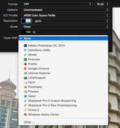
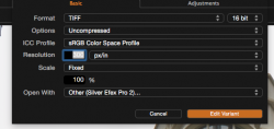
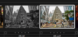
Round-trip Editing: I was surprised that C1 worked with NIK just like Aperture. There’s a right-click “Edit with…” option that launches another program of choice (e.g. NIK Viveza) and when you save, the TIFF image is back in C1 as you’d expect. It works identically to the way NIK works in Aperture. UPDATE: More info in Post #11... However, you may find that with C1, you need to round-trip less.
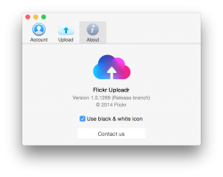
Exporting/Sharing: I haven't exported yet, but it seems like they have all the export options you'd expect. One feature I like in Aperture is the direct export to Flickr. It seems there's a tool you can get that will automatically publish dropbox folders to Flickr, so I'll have to try that. UPDATE: If you use Flickr, like I do, you'll be glad to know that Yahoo just released a new Uploader App for the Mac that works like a charm with C1... details in post #24
Performance: I notice that even with OpenCL acceleration turned on, the sliders are laggy in C1... it's just not as responsive. I need to see what I can do to improve things. I'm running 4K displays which may not be helping matters. UPDATE: It turns out that every major RAW converter struggles on a 4K display. If you have 4K monitors or a 5K iMac, you're probably use to the growing pains associated with this technology... it turns out we need to wait for these software vendors to optimize their performance for high pixel density screens.
UPDATE - Customization: One feature I've really grown to like about C1 is how customizable the user interface is. Not only can you control the location and size of the adjustments pallet and film strip browser, but you can completely customize the adjustment tools tabs and bricks within the tabs. You can also setup your own keyboard shortcuts and take full advantage of dual displays. You can save different configurations as Workspace presets so that you can easily recall certain layouts or configurations with just a couple of clicks. For example, you may have one layout for culling photos, and another for doing adjustments... It's very cool.
Summary:
It seems like a natural switch. I’m going to try using it over the trial period and see how it goes.
Is anyone else using C1? What’s your experience?
Did anyone evaluate it and choose something else?
UPDATE:
I'll continue to add more information to this thread and post as I learn more. I've added a number of UPDATES to the above text.
Last edited:


