Become a MacRumors Supporter for $50/year with no ads, ability to filter front page stories, and private forums.

HUGE AL

macrumors regular
Aug 4, 2010
238
19

VirtualRain

macrumors 603
Original poster
Aug 1, 2008
6,304
118
Vancouver, BC
Yeah, I saw that. However, I'm looking more at altering the date and time of a photo as I tend to occasionally forget to change it on the camera when I fly into different time zones. I didn't see this addressed anywhere on their website.


Hmmm I'll see what I can see tomorrow.
 

VirtualRain

macrumors 603
Original poster
Aug 1, 2008
6,304
118
Vancouver, BC
Yeah, I saw that. However, I'm looking more at altering the date and time of a photo as I tend to occasionally forget to change it on the camera when I fly into different time zones. I didn't see this addressed anywhere on their website.

While there are extensive metadata fields, I couldn't find any way to edit the date and time... It's not a editable field.

----------

Here's a bit of an old article that reinforces what I've found about similarities in general between C1 and Aperture... http://www.bobrockefeller.com/blog/10-things-to-know-about-capture-one-pro
 

OreoCookie

macrumors 68030
Apr 14, 2001
2,727
90
Sendai, Japan
I played around with Capture One for a while. Here are some initial impressions in no particular order:
- I find that at least for my Nikon RAWs the default RAW conversion looks too punchy, it's too saturated, and I'd prefer a more neutral look.
- I find the DAM aspects of this app quite bad: you have three different window pane instead of just one (Catalog, User Collections and Folders). Aperture's single pane still works best.
- I don't like switching between different tabs when doing photo edits, who came up with this? This way I have to switch tabs when doing very common edits such as picking a white balance and playing with the exposure a bit.
+ Lens corrections work -- if your lens is supported (some of my older lenses do not show up, but I guess I could scavenge the internet for lens profiles).
+ The image manipulation tools seem reasonable, they work as expected and so far the quality is good.
+ I have the option to have C1 manage my RAWs. This is great, I always loved that Aperture allowed you to export self-contained libraries which you can shuttle back and forth.

I'll play with it some more. Maybe I can customize the app to fit to my preferences a little better.
 

maflynn

macrumors Haswell
May 3, 2009
73,682
43,740
I played around with Capture One for a while. Here are some initial impressions in no particular order:
- I find that at least for my Nikon RAWs the default RAW conversion looks too punchy, it's too saturated, and I'd prefer a more neutral look.
For my Olympus camera, the images were more vibrant then Aperture or LR, but they were probably closer to reality imo. That is, they weren't over saturated, but rather Aperture had under saturated some of my images.

- I find the DAM aspects of this app quite bad: you have three different window pane instead of just one (Catalog, User Collections and Folders). Aperture's single pane still works best.
This was and is, my biggest issue. It was a show stopper for me. If I cannot manage my images within the app, the way I want too, then I'm not going to spend the money. Lightroom has so many DAM features, that I've developed a nice workflow.

- I don't like switching between different tabs when doing photo edits, who came up with this? This way I have to switch tabs when doing very common edits such as picking a white balance and playing with the exposure a bit.
I'm not a fan of the UI of C1, but from what I've read, you can really customize the application and set it up the way you want it too. Because of the above issue with the DAM features, I did not go further with the tool.

+ I have the option to have C1 manage my RAWs. This is great, I always loved that Aperture allowed you to export self-contained libraries which you can shuttle back and forth.
Same here and it was an adjustment for me to work with Lightroom, this was one reason why I probably gave C1 a close look
 

OreoCookie

macrumors 68030
Apr 14, 2001
2,727
90
Sendai, Japan
My plan is to give C1 a fair share first and then try Lightroom again (I've played with every version of Lightroom so far).
For my Olympus camera, the images were more vibrant then Aperture or LR, but they were probably closer to reality imo. That is, they weren't over saturated, but rather Aperture had under saturated some of my images.
I feel this is something I can fix with import presets and some tinkering.
This was and is, my biggest issue. It was a show stopper for me. If I cannot manage my images within the app, the way I want too, then I'm not going to spend the money. Lightroom has so many DAM features, that I've developed a nice workflow.
I feel like I'm between a rock and a hard place here. This division makes it hard for me to figure things out without referring to the manual. I can usually tell a good app from a bad app by being able to dive right in. »Where are my photos?« Aperture's concept of projects was genius: your photos belong to exactly one project, and they can belong to infinitely many albums, light tables and books.
I'm not a fan of the UI of C1, but from what I've read, you can really customize the application and set it up the way you want it too. Because of the above issue with the DAM features, I did not go further with the tool.
I have just tried it for a bit more than a day, so these are very, very early impressions. I can lessen the pain points by tweaking the interface, I'm sure, but so far the app doesn't seem idea.
 

VirtualRain

macrumors 603
Original poster
Aug 1, 2008
6,304
118
Vancouver, BC
I played around with Capture One for a while. Here are some initial impressions in no particular order:
- I find that at least for my Nikon RAWs the default RAW conversion looks too punchy, it's too saturated, and I'd prefer a more neutral look.
- I find the DAM aspects of this app quite bad: you have three different window pane instead of just one (Catalog, User Collections and Folders). Aperture's single pane still works best.
- I don't like switching between different tabs when doing photo edits, who came up with this? This way I have to switch tabs when doing very common edits such as picking a white balance and playing with the exposure a bit.
+ Lens corrections work -- if your lens is supported (some of my older lenses do not show up, but I guess I could scavenge the internet for lens profiles).
+ The image manipulation tools seem reasonable, they work as expected and so far the quality is good.
+ I have the option to have C1 manage my RAWs. This is great, I always loved that Aperture allowed you to export self-contained libraries which you can shuttle back and forth.

I'll play with it some more. Maybe I can customize the app to fit to my preferences a little better.

Some comments/questions on your negatives...

1. It's interesting about your RAW images. As you probably saw, I found somewhat the opposite. What I like about the C1 RAW conversion is the micro contrast and default sharpening. It provides a more detailed image, but not overly saturated.

2. Can you elaborate on the DAM issues? As far as I can tell it's almost identical to Aperture in structure and features.

3. C1 provides an incredible amount of customization... one thing I really like about it. You can consolidate all your adjustment bricks onto a single custom tab if you like. However, there are a LOT of tools, so I actually have customized my adjustment toolset to four tabs that align with the phases I go through when adjusting an image...
- Composition: crop, rotate, keystone, spot removal (things I do before adjustments - all of these can be done with the cursor tool bar top-center of the window)
- Light/Detail: exposure, HDR, levels, vignetting, lens, clarity, sharpening , NR
- Colour: Their colour adjustment tool is very good (but not always used)
- Local Adjustments: Needs it's own tab
 

OreoCookie

macrumors 68030
Apr 14, 2001
2,727
90
Sendai, Japan
Let me preface everything by saying that I haven't dived into all the customization features, I want to get a feel for the app first, give me time to figure out the why's and how's of the default interface before I make changes.
1. It's interesting about your RAW images. As you probably saw, I found somewhat the opposite. What I like about the C1 RAW conversion is the micro contrast and default sharpening. It provides a more detailed image, but not overly saturated.
I'm really not so worried about this bit, with a bit of tinkering, I can give the images the look that I want. Also, I haven't tried how it handles the RAW files of my X100s, maybe there are differences.
2. Can you elaborate on the DAM issues? As far as I can tell it's almost identical to Aperture in structure and features.
What I dislike so far is that my files appear in three separate places, rather than just one, and especially if I use the »managed« option, I don't see any point whatsoever in the Files bit of the interface. As a mental model, the reason behind splitting Catalog and User Collections is not clear to me, why is this distinction useful to me? I can't see any purpose behind it –*although that doesn't mean there isn't one. Perhaps you can help me out here: where do the equivalents of Aperture Projects live?
3. C1 provides an incredible amount of customization... one thing I really like about it. You can consolidate all your adjustment bricks onto a single custom tab if you like.
That's very good to know. If the tabs are optional/customizable, this makes it much less of an issue. Although the division (which is the default) does make it seem as if C1 places more emphasis on the editing part than the DAM part. Is there also the equivalent of a HUD?
 

VirtualRain

macrumors 603
Original poster
Aug 1, 2008
6,304
118
Vancouver, BC
What I dislike so far is that my files appear in three separate places, rather than just one, and especially if I use the »managed« option, I don't see any point whatsoever in the Files bit of the interface. As a mental model, the reason behind splitting Catalog and User Collections is not clear to me, why is this distinction useful to me? I can't see any purpose behind it –*although that doesn't mean there isn't one. Perhaps you can help me out here: where do the equivalents of Aperture Projects live?

I also use the Managed Option like I did in Aperture... Capture One Catalogs are identical to Aperture Library files. They are an elegant way of hiding the messy file structure and makes it easy to backup or move your photos. Of course, they are just package files so you can right-click and choose "Show Package Contents" if you want to get at the insides.

Structure: C1 and Aperture are more alike than different... Both programs support Albums, Smart Albums, Projects, and Folders. Thus whatever structure you have in Aperture can be duplicated in C1.

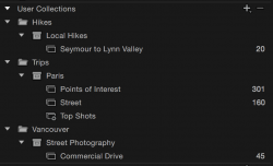
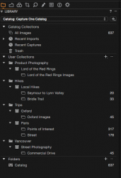
Attached are a couple of screen grabs of my structure in both applications... (identical)...

The key difference between them, is that in Aperture, you can import photos, or drag and drop them into Projects. In this way, Aperture's Projects and Albums are the same. In C1, you cannot put photos into Projects, only into Albums. Otherwise Projects still work the same as in Aperture in that they allow you to browse all photos in the underlying Albums... but they don't actually contain any photos. So, in Aperture, if you were in the habit of storing photos only in Projects and not using Albums, you will have to make an adjustment when moving to C1... Albums are where you need to put your photos now... not in Projects. You can still use Projects to group Albums and set the scope for Smart Albums, but you can't import or drag and drop photos to Projects.

As far as seeing your photos in multiple places, I don't think this is different...

Both apps have a section at the top of the Library tab for managing the catalog (all images, recent imports, trash, etc.).

In Aperture, a photo in my "Trips > Paris > Street" is visible in all three of those structures, as well as when selecting (All) "Photos" and/or "Last 12 Months" and maybe even "Last Import".

In Capture One, a photo in "Trips > Paris > Street" is also visible in Paris, and in "All Images" and in "Recent Imports" which is almost exactly the same as Aperture.

The only difference is that Capture One has the "Folders" brick which you can collapse if it annoys you (I believe it's for those not using Managed Catalogs).
 

Attachments

  • Screen Shot 2015-02-15 at 12.36.06 PM.png
    Screen Shot 2015-02-15 at 12.36.06 PM.png
    52.6 KB · Views: 201
  • Screen Shot 2015-02-15 at 1.09.05 PM.png
    Screen Shot 2015-02-15 at 1.09.05 PM.png
    59.3 KB · Views: 189

notrack

macrumors 6502
Feb 19, 2012
447
94
...

Structure: C1 and Aperture are more alike than different... Both programs support Albums, Smart Albums, Projects, and Folders. Thus whatever structure you have in Aperture can be duplicated in C1.

Attached are a couple of screen grabs of my structure in both applications... (identical)...

The key difference between them, is that in Aperture, you can import photos, or drag and drop them into Projects. In this way, Aperture's Projects and Albums are the same. In C1, you cannot put photos into Projects, only into Albums. Otherwise Projects still work the same as in Aperture in that they allow you to browse all photos in the underlying Albums... but they don't actually contain any photos. So, in Aperture, if you were in the habit of storing photos only in Projects and not using Albums, you will have to make an adjustment when moving to C1... Albums are where you need to put your photos now... not in Projects. You can still use Projects to group Albums and set the scope for Smart Albums, but you can't import or drag and drop photos to Projects.

As far as seeing your photos in multiple places, I don't think this is different...

Both apps have a section at the top of the Library tab for managing the catalog (all images, recent imports, trash, etc.).

In Aperture, a photo in my "Trips > Paris > Street" is visible in all three of those structures, as well as when selecting (All) "Photos" and/or "Last 12 Months" and maybe even "Last Import".

In Capture One, a photo in "Trips > Paris > Street" is also visible in Paris, and in "All Images" and in "Recent Imports" which is almost exactly the same as Aperture.

The only difference is that Capture One has the "Folders" brick which you can collapse if it annoys you (I believe it's for those not using Managed Catalogs).

Well, from my point of view Aperture and C1 Projects are fundamentally different. In Aperture, they actually hold the photos whereas in C1 not. In C1 they all go in the "root" bucket and can't be moved, hence you can't separate them. They are only referenced in Albums.

Why is that relevant? Mostly for the point of import but also for easy structuring your catalog: In your example you would have to do an import for every album in your project Paris. You can't import them into the Project (Paris) and then organise them in albums. You'll have to move them from the Last Imports into the albums. If you miss a photo out, it will be an orphan in the catalog root (you can only see 10 last imports). Also the other way around: If you remove a photo from an album, the only place it remains is in "All Photos" (root) but not in your project's root. And smart albums only show photos from other albums within the Project, so if it also was in there, it won't show up any more. I think that's a flaw but maybe it's just work-in-progress now.

Alternatively you could create an "All" album in the Project for importing, but I think that defeats the purpose of making things simpler.

In my case, I organise things in Projects which contain smart albums. So, unfortunately neither importing nor organising works for me in C1. It also doesn't import (migrate) smart albums from Aperture which is basically my entire organisation. Yay for that. :p
 

Attachments

  • Aperture Projects.jpg
    Aperture Projects.jpg
    33.1 KB · Views: 149

VirtualRain

macrumors 603
Original poster
Aug 1, 2008
6,304
118
Vancouver, BC
Well, from my point of view Aperture and C1 Projects are fundamentally different. In Aperture, they actually hold the photos whereas in C1 not. In C1 they all go in the "root" bucket and can't be moved, hence you can't separate them. They are only referenced in Albums.

True. In some ways, C1 makes a bit more sense in that all the image files are stored in the Catalog and the organizational structure is completely virtual... merely pointing to the images. Conceptually, it's simpler and just as powerful, if not more so. It analogous to iTunes in that you have a single music library (like the C1 Catalog) with multiple playlists (albums).

Why is that relevant? Mostly for the point of import but also for easy structuring your catalog: In your example you would have to do an import for every album in your project Paris. You can't import them into the Project (Paris) and then organise them in albums.

In my case, I imported them all into a single album, then selected all the street photos and dragged them to their own album.

This is almost identical to what I did in Aperture... In Aperture, I'd import them into the Paris Project, select all the street photos and drag them to their album and then do the same thing again with the points of interest photos.

In Aperture, it's two drag and drops, vs. a single drag and drop followed by a "Remove from album" in C1.

Either way, the result in the end is identical... you have photos separated into Albums with the ability to view the entire set in the Project.


In my case, I organise things in Projects which contain smart albums. So, unfortunately neither importing nor organising works for me in C1. It also doesn't import (migrate) smart albums from Aperture which is basically my entire organisation. Yay for that. :p

Migrating a library to any new DAM is going to be painful no matter what application you choose. That's why I'm going to migrate very little.

At least C1 has the same logical structure so you don't need to radically change your way of thinking. It shouldn't be hard to recreate those smart albums in C1 over time as you need access to your historical archives.

I'm actually not going to migrate anything from Aperture - other than the few shoots I did in January. The rest of my Aperture Libraries (one per year over the last 5 years) will remain untouched. If at some point, I realize I may never have access to those libraries again because Aperture will no longer run on my computer, I'll decide what to do with it based on how desperate I am to have access to them. I also keep a backup of all my RAWs outside of Aperture so I can always do an import directly to C1 in the future if I find there's an old image I really want to rework. And all my keepers are on Flickr in full resolution so needing access to the RAW files is extremely rare.
 

VirtualRain

macrumors 603
Original poster
Aug 1, 2008
6,304
118
Vancouver, BC
Tonight, after doing a backup, I imported my 2015 Aperture Library to my Capture One Pro catalog.

I start a new Aperture Library every year, so this Aperture Library only had a few projects with about 600 photos (or so I thought).

Some things I learned:

BTW, before you do anything, ensure you have a recent backup of your Aperture Library (and maybe your C1 Catalog if you have stuff in there already).

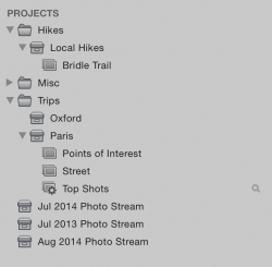
1. You can see what my Aperture Library looked like before I started in the screen shot below. Note that since I've opted to have Aperture sync my Photostream (as per Preferences > iCloud) I oddly have a few Photo Stream projects I wouldn't expect... July 2014, July 2013, and Aug. 2014. I'm not sure why these are there, but they are. And they contain photos shot with my iDevices in those months. And if you import your Aperture Library into C1 all those photos will come along for the ride. So, if you just want to import your true Aperture Projects, then first of all, disable My Photo Stream and delete all those Photo Stream Projects.

2. Similar to above, if you have iCloud Photo Sharing enabled, a copy of all those photos will be migrated over as well. This might be a lot more photos you weren't expecting. I would suggest turning off all the options under Preferences > iCloud and deleting anything you don't want to migrate.

3. Images in a project like Paris, get migrated and put into a C1 album called "Paris Images". The albums like Points of Interest and Street get migrated in-tact. So in my case, Paris Images could be deleted after migration.

4. Smart Albums don't get migrated.

5. Flags are not retained in the migration but star ratings are.

6. Cropping is retained but not other adjustments.

You can see where I ended up in the C1 screen shot... I moved the imported projects and albums into their proper home alongside a couple of shoots that I had setup in C1 directly. For example, Hikes > Local Hikes > Seymour to Lynn Valley was already in C1, and I dragged and dropped the imported Bridle Trail Album to the Local Hikes project.

For me, the only real surprise was how many photos were in my Aperture Library that I wasn't expecting from iCloud synchronization.
 

Attachments

  • Screen Shot 2015-02-16 at 8.31.45 PM.png
    Screen Shot 2015-02-16 at 8.31.45 PM.png
    71.4 KB · Views: 177
  • Screen Shot 2015-02-16 at 9.02.24 PM.png
    Screen Shot 2015-02-16 at 9.02.24 PM.png
    59.2 KB · Views: 172

VirtualRain

macrumors 603
Original poster
Aug 1, 2008
6,304
118
Vancouver, BC
I finally think I've got my Capture One workspace setup the way I like, so I thought I would share... just so you can get an idea of the wealth of adjustments and how nicely they can be organized.

You can define what tabs are displayed, create your own tabs, modify existing ones, add adjustment bricks to any tab, reorder them, collapse or expand them by default, and then when you're done, save the whole lot to a workspace preset.

My Tab order (as shown below) is... Library, Composition, Custom Adjustments, Local Adjustments, Adjustment Clipboard, and Output

(Click through for larger sizes)


Tab Setup in C1 by Virtual.Rain, on Flickr

Here's the full desktop... The dimensions of everything from the toolbar on the left to the filmstrip browser on the right and the viewer in-between is easily resized...


C1 Screen Shot by Virtual.Rain, on Flickr

Now I shamefully admit this ends up being a bit of a plug for a 4K screen and the real-estate it provides, but it sure is nice having all this room to work with on my photos. My 4K screens are one of the best pieces of kit for photography I've ever purchased.
 

maflynn

macrumors Haswell
May 3, 2009
73,682
43,740
It looks like you have the thumbnails/previews on the left and not the bottom, how hard was that to do? One of my biggest gripes with C1 is that filmstrip on the bottom, ate into my precious (non 4k) monitor.

Never mind, I figured it out.
 
Last edited:

notrack

macrumors 6502
Feb 19, 2012
447
94
Is there a way to place the thumbnails at the left side? I find it inconvenient that the tools and thumbnails are so far apart, e.g. when moving photos around in albums.
 

simonsi

Contributor
Jan 3, 2014
4,851
735
Auckland
Is there a way to place the thumbnails at the left side? I find it inconvenient that the tools and thumbnails are so far apart, e.g. when moving photos around in albums.

I haven't found one, you can "Place Browser Right" in the View Menu, then "Place Tools Right" - but that swaps the Tools and Browser so they are still on opposite sides...
 

maflynn

macrumors Haswell
May 3, 2009
73,682
43,740
Is there a way to place the thumbnails at the left side? I find it inconvenient that the tools and thumbnails are so far apart, e.g. when moving photos around in albums.

Put the tools on the right and then you will have the ability to put the thumbnails on the left by way of the view menu. I did this first in trying to get the thumbnails on the left. I figured out the combination of moves to get it there but I did have the thumbnails on the right initially.
 

VirtualRain

macrumors 603
Original poster
Aug 1, 2008
6,304
118
Vancouver, BC
Is there a way to place the thumbnails at the left side? I find it inconvenient that the tools and thumbnails are so far apart, e.g. when moving photos around in albums.

You can't place the tools and browser next to each other while the viewer is present, however if you hit the shortcut key (G for Grid in my case) or choose "Hide Viewer" from the menu, you get a full screen of thumbnails. It's very quick to toggle this off/on with the keyboard.

This is the mode I prefer for sorting photos...


simonsi

Contributor
Jan 3, 2014
4,851
735
Auckland
You can't place the tools and browser next to each other while the viewer is present, however if you hit the shortcut key (G for Grid in my case) or choose "Hide Viewer" from the menu, you get a full screen of thumbnails. It's very quick to toggle this off/on with the keyboard.

This is the mode I prefer for sorting photos...

You should seriously write "Capture One - The Insiders Guide" or something...

I've combined this into my workspaces as loading a workspace loads in your choice of Tool Tabs too....
 

VirtualRain

macrumors 603
Original poster
Aug 1, 2008
6,304
118
Vancouver, BC
You should seriously write "Capture One - The Insiders Guide" or something...

I've combined this into my workspaces as loading a workspace loads in your choice of Tool Tabs too....

LOL... thanks... yeah it's pretty cool... you can have different workspaces for different phases of your workflow if you want... sorting/rating, adjusting, exporting or something I suppose.
 

FredT2

macrumors 6502a
Mar 18, 2009
572
104
I finally think I've got my Capture One workspace setup the way I like, so I thought I would share... just so you can get an idea of the wealth of adjustments and how nicely they can be organized.
Just curious, how do you manage with text so small? I'd need one of those magnifiers on an adjustable arm!
 
Register on MacRumors! This sidebar will go away, and you'll see fewer ads.