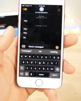
iOS 11 should have it because having a dark theme would make the OLED work less and save more battery.
Got a tip for us?
Let us know
Become a MacRumors Supporter for $50/year with no ads, ability to filter front page stories, and private forums.
Chances of iPhone 8 having dark mode for OLED ?
- Thread starter DBZmusicboy01
- Start date
-
- Tags
- dark mode ios 11 smart invert
- Sort by reaction score
You are using an out of date browser. It may not display this or other websites correctly.
You should upgrade or use an alternative browser.
You should upgrade or use an alternative browser.
Would also be a good way to show off infinite blacks. Doesn't get darker than individual pixels shut off
My OLED tv's are nothing short of amazing (contrast is exceptional too)
My OLED tv's are nothing short of amazing (contrast is exceptional too)
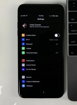
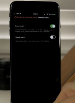
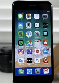
So a YouTuber posted a video showing off smart invert and it looks almost like dark mode. Some apps look normal black and not all crazy like it used to be and the homescreen looks almost normal except for the dock.
This looks like a stepping stone and I'm pretty convinced it's coming, who knows if it might be a iPhone 8 exclusive.
What do you guys think?
This looks like a stepping stone and I'm pretty convinced it's coming, who knows if it might be a iPhone 8 exclusive.
What do you guys think?
Attachments
For what I tested, its not a setting made to be permanently turned on. On lockscreen, the dark clock looks very ugly. It works well on Message, photos, home screen and settings apps, but in Safari, it looks the same as the classic invert colors. Maybe it will change when more beta's will release, but I hope something similar to Deluminate (an extension to google chrome) will be applied to safari (invert colors but not pictures)
Springboard IS what is outdated and wrong with iOS. Look at that 3rd screenshot!!! Like 9 pages of apps. It's a UI mess. Reinvent how we access and store apps. The grid is dead. Too many colorful apps and they all blend together. Up to 256GB phones with 500 apps. How do you use it. iOS is a bloated UI disaster on the home screen. Within apps, it is great. But the home screen(s) is overdue for innovation.
It's still just something that inverts colors, just does it smarter in the sense of not inverting photos/videos where it doesn't make as much sense to invert them. It's not dark mode. There was probably more evidence of actual dark mode elements and code back in iOS 10 beta days as I recall, and yet here we are with iOS 11 betas and still no actual mention or direct availability of actual dark mode.So a YouTuber posted a video showing off smart invert and it looks almost like dark mode. Some apps look normal black and not all crazy like it used to be and the homescreen looks almost normal except for the dock.
This looks like a stepping stone and I'm pretty convinced it's coming, who knows if it might be a iPhone 8 exclusive.
What do you guys think?
Maybe they're waiting to show it off, trying to perfect it on the iPhone 8. If not maybe next year (again)Perhaps. But I feel like Apple would have ultimately touched on dark mode during an iOS/developer conference if it were to happen. I'm not saying it won't happen, but it doesn't seem like a likelihood, even though I would appreciate this feature.
[doublepost=1496727802][/doublepost]
But even the icons look perfect, the settings app is straight dark mode.It's still just something that inverts colors, just does it smarter in the sense of not inverting photos/videos where it doesn't make as much sense to invert them. It's not dark mode. There was probably more evidence of actual dark mode elements and code back in iOS 10 beta days as I recall, and yet here we are with iOS 11 betas and still no actual mention or direct availability of actual dark mode.
. . . This looks like a stepping stone and I'm pretty convinced it's coming . . .
Hope you're correct.
[doublepost=1496742219][/doublepost]
. . . but in Safari, it looks the same as the classic invert colors. Maybe it will change when more beta's will release . . .
Yes perhaps if enough people provide feedback on this, they will address the Safari integration during the Beta process.
Springboard IS what is outdated and wrong with iOS. Look at that 3rd screenshot!!! Like 9 pages of apps. It's a UI mess. Reinvent how we access and store apps. The grid is dead. Too many colorful apps and they all blend together. Up to 256GB phones with 500 apps. How do you use it. iOS is a bloated UI disaster on the home screen. Within apps, it is great. But the home screen(s) is overdue for innovation.
Why do you have 500 apps on your phone? Ever heard of folders? I have 16 icons on my home screen, not including my dock. Half that on my second screen. That’s all.
I’ve seen lots of phones with icons all over, it’s a mess because people don’t care. Organize and it wouldn’t be a problem. Android is no better in this department.
I like your way of thinking. It's coming, but don't fret. Nice to see them using the opportunity to make something that'll adapt to things already made. Makes it great for accessibility AND as a Dark Mode feature. It'll be an OLED iPhone thing since they'll get to talk about how the mode greatly improves battery life then too.
I don't have 500 apps on my phone, probably about 200. I have one screen with 16 folders and my dock has 4 folders. Only 2 or 3 folders have more than one page of 9.Why do you have 500 apps on your phone? Ever heard of folders? I have 16 icons on my home screen, not including my dock. Half that on my second screen. That’s all.
I’ve seen lots of phones with icons all over, it’s a mess because people don’t care. Organize and it wouldn’t be a problem. Android is no better in this department.
You are correct. Android is worse. I would not switch to Android for quite a few reasons. But I still believe the Springboard home screen is outdated and could be a significant opportunity for innovation.
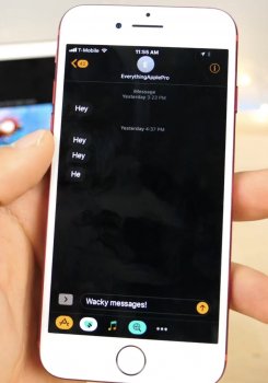
Here it is.Alright, so I know "Smart Invert" works to sort of suffice for the Dark Mode itch, but does anyone know what it looks like on iMessages yet? Or other applications? The video I found below doesn't show off much.
[doublepost=1496796955][/doublepost]
Maybe with future updates it'll get better.The native apps all are black, the same gradient as the settings app. If enabled with twitter dark mode the twitter app will look like the normal invert colors. If you disable it the app will be black as the system. The problem is with the media, looks awful in negative.
Attachments
For the million time it is in accessibility for a reason for ppl with colour problems in their eyes its not dark mode
What do you suggest to improve the home screen?Springboard IS what is outdated and wrong with iOS. Look at that 3rd screenshot!!! Like 9 pages of apps. It's a UI mess. Reinvent how we access and store apps. The grid is dead. Too many colorful apps and they all blend together. Up to 256GB phones with 500 apps. How do you use it. iOS is a bloated UI disaster on the home screen. Within apps, it is great. But the home screen(s) is overdue for innovation.
Why would it get better when this is not the purpose of it? I don't get why that's so hard for people to comprehend.Here it is.
[doublepost=1496796955][/doublepost]
Maybe with future updates it'll get better.
There's no way Apple doesn't take advantage of one of OLED's best advancements as a display technology when they move to that, especially when they already take advantage of that with the Apple Watch to help with battery life.
Whether they will or not, remains to be seen of course but I wouldn't rule out a dark mode until we see the new OLED iPhone
Whether they will or not, remains to be seen of course but I wouldn't rule out a dark mode until we see the new OLED iPhone
I've never used a device with a dark mode.
What happens when you visit a website with a white background?
That will hurt your eyes when you're reading in bed in the dark!
What happens when you visit a website with a white background?
That will hurt your eyes when you're reading in bed in the dark!
This single-handedly has been one of the biggest reasons against a dark mode that I have been saying. You can't change Safari to only display websites in black. Even the jailbreak tweaks couldn't overcome this.I've never used a device with a dark mode.
What happens when you visit a website with a white background?
That will hurt your eyes when you're reading in bed in the dark!
This single-handedly has been one of the biggest reasons against a dark mode that I have been saying. You can't change Safari to only display websites in black. Even the jailbreak tweaks couldn't overcome this.
Thanks for the info.
Yeah I couldn't imagine how they would handle that.
My "dark mode" has always been "turn down the brightness"
I use the triple click zoom trick to lower the display brightness below minimum. Works extremely well.Thanks for the info.
Yeah I couldn't imagine how they would handle that.
My "dark mode" has always been "turn down the brightness"
I honestly don't know. My kneejerk reaction is a windows phone live tile like scrolling screen with squares that take the space of two or four icons. Shop, Watch, Listen, Communicate, where a 3D Touch press on the tile reveals the apps in that "center" and sliding to the icon and holding reveals 3D Touch commands for that app. Something that gets rid of the rows of icons that after a while look similar and lose the ability to really draw you quickly into actions.What do you suggest to improve the home screen?
But I am not suggesting that Apple copy windows phone. I do think that so many home screen wallpapers don't work because the wallpaper with the app icons becomes a visual mess. I think the rows of icons worked well when Apple had stock only or there was a limited set of apps but over time people carry more apps on their phone and the grid is not access friendly.
I think that like the iOS 9 jailbreak griddy or gridswitcher and like the iPad iOS 11 app switcher the iPhone also needs a 2 or 3 column (depending on orientation and phone size and user preference as a setting) app switcher instead of the Rolodex/cover flow app switcher that is awful.
As I said, I don't have the answer and would hope the visionaries and designers at Apple could collectively design a new UI that was intuitive, graceful and not cumbersome, allowing us to access our apps without being a visual mess that I believe has become so bloated people can't quickly get to what they need on their phone.
Register on MacRumors! This sidebar will go away, and you'll see fewer ads.


