Become a MacRumors Supporter for $50/year with no ads, ability to filter front page stories, and private forums.
I like them at first glance but definitely want to see them in person. What is the material of the white bezel? Is it going to get dirty with fingerprints? If so, that's a dealbreaker.

The only way I can see this would be relevant is you have kids. Otherwise, you should never have to touch the bezels. Just use the edges of the display to adjust the tilt.
 
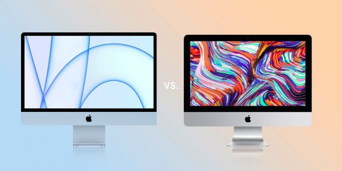
Having looked at a side-by-side photo I think the old one looks butt ugly now.
B892A0AF-B4AB-4055-80FC-956C5776153F.jpeg
 
I guess it depends on how close it is to the wall. It would really have to be stuck right to the surface to generate the kind of effect you're suggesting.

I would still prefer black for the opposite reason actually. I like the fact that the black bezel outlines my device against my environment and seamlessly funnels my focus into the screen.
I agree with the funneling your focus. I think the black is nice because it stands out in a passive way. For example, I hate that my car has a light grey headliner that continues down the A,B&C columns with black seats.
When I use my iMac at work or Macbook Pro at home, the black border stands out and makes it obvious where the screen edge is.

I think in most situations, the light grey edge will blend in more with your environment and the color on the display, but may not focus your vision because the edge won't be such a bold color as black.
 
Because everybody is used to black bezels nobody should ever try anything different, sounds boring to me...

Also I’m sure if the new iMacs had black bezels there would be talk of them, black would stick out like a sore thumb in the design they’ve gone for.
The reason everyone is used to them is because black bezels are neutral and do not distract in any way from the content on the screen. And at the end of the day that’s what matters. Virtual everything in Apple’s lineup that features a screen has black bezels, the only exceptions are the basic iPad and the iPad mini - and as of now the new iMacs. And the basic iPad and iPad mini represent the low end of the iPad lineup.

There’s a reason why all TVs have black bezels. There’s a reason why all movie screens do not have white or some other colored frames encasing the screen. The only justification I can see for the white bezels on the new iMacs is just to further the throwback element of the original iMacs whose CRTs were mounted in a forward facing white frame.

The new iMac colors don’t bug me. In fact since the introduction of various colors for laptops and phones it was arguably overdue. The now logo-less chin doesn’t bug me either (if for no other reason than it still looks immediately like an iMac and not an iPad Pro on a stick). Those white bezels though, they bug me. They stick out like a sore thumb from the rest of the design and seem to have no reason for being other than a chance for a little nostalgia for one of the design elements of a 1998 machine that- although wonderfully suited for its time - things have evolved significantly since then.
 
I like the looks and colors, and I have idea why they didn't continue the color on to the chin, by having the color only on the chassis allows them to build the base computer in color, but have the chin and glass as a common item to reduce having to have a matching part, less different inventory parts.
The chin is behind glass so it was always going to look a little bit different. It does match the stand anyway.
 
The colors are awful. They can offer whatever pastel crap they want, but for the love of god, offer one that looks normal. The chin is egregious. The white bezels are inexplicable and inexcusable. Ugliest Mac I can recall since the flower power imac.
There’s an all white version. That’s not neutral enough for you?

My thought is that these are “consumer” computers. I mean they showed tweens using these for tik tok dances in the video. The bright colors are to sell these to families and kids overall...and it will work.

These are not your “Pro” machines. I will expect those to look a bit more sleek, neutral and well...professional. These don’t disappoint me because I’m not the intended audience. As an audio engineer I will be disappointed if the Pro versions look this way.
 
I honestly don't care about the Colors or the Chin. It's that atrocious White Bezel that bothers me endlessly.

There is a reason why the entire computing industry has progressed to black bezels, on the way to zero bezels, and it's definitely not an aesthetic one.

It comes down to the very basic reality that a black border around a screen is more seamless and easier on the eyes than white. You don't have to be a "Pro" user to realize that.

I will give a reply that will ignite correction,

Apple releases the latest of their inventions, both in how they "Think Different" and how they are making the disciple going against what everybody looks and sees in the current market of computers/tablets/watches etc.

Meaning Apple gives us the next big thing that could end up in our hands, and not with what every other company has in mind with their products

GO APPLE

LOL
 
  • Like
Reactions: Silmakhor
That bottom photo is not white bezel. That is part of the screensaver dude to make it look like artwork on the wall. It's bezel is black.
 
People who worry about the aesthetics of a computer haven’t got enough work to do. There are two points to consider here
1) Will it help me be more productive?
2) see point 1
 
Don't get me wrong, this design isn't perfect. There is certainly room for improvement, like everything else on this planet. Actually, it has a lot of room for improvement. But is it really 'hideous', 'disappointing' or 'a step backwards'? Imo, people are critizing it way too quickly.

The colours
I have no idea why there's so much critism on this because people have been asking for more colourful macs for ages. Maybe the pastel colours aren't your thing, but they're supposed to be 'light and optimistic, while instantly brightening up any space'. And in my opinion, that's exactly what it does. Still don't like it? You always have silver.
But, maybe you're a more 'everything matte black' person. Then you're either a professional, a very boring person, or both. Like, Apple is trying to be optimistic and fit every colour of the rainbow in their lineup. So why tf would they offer space gray? If you want it to look cool, wait for the 27".

The chin
Of course, if I could choose, I want it to be gone too. But I understand why it's there and I can live with it. Here's why:

1. You concentrate on the screen anyways. Just like a hole punch or notch, the chin fades away after a while. And it doesn't even interrupt the screen itself, only making the front bigger.
2. It contains the six drivers and two pairs of woofers. If it gives me better sound experience, I'll happily accept a chin
3. Its value can't be too good. Remember that the price is 'only' 1299 dollars, you can only do so much with it. If it didn't have a chin, it'll probably come with a price hike. Guess what regular, non-techie customers rather want.
4. If the design is 'too' good, you might get a 'iPad Pro 2018/Apple Watch 4' situation; peaking too early. Apple is still struggling to add big updates with these two products.


No need to defend it. Buy it or don't.

I was actually excited to see the colors but the particular shades don't get me. I would've loved a deep red, but if I can't get that, the next choice would've been black, which is of course not an option. People will have their own reasons for buying it or not. I've pretty much decided I won't because I'm going to want more than 16 gb.
 
I like everything but the white bezels. The camera sticking out from it looks terrible. Also, with the lack of ports, I can barely justify for that price point. I think the Mac mini is a better buy, but the iMac still looks pretty ok!
 
They piss off Jonny Ive so much with their purple haired MBA's making decisions that he leaves the job of a lifetime where he's done the best work of any designer in modern history.

Jonny Ive still helps design Apple products. He left Apple to start his own design firm, and Apple was his first client. The current head of industrial design was also a major designer in a bunch of apples most popular designs from years ago. She just chooses to not be in the spotlight like Ive was, but she was his right hand designer for a long time.
 
That bottom photo is not white bezel. That is part of the screensaver dude to make it look like artwork on the wall. It's bezel is black.
I think that’s the point though. Picture frames often have white borders around them to highlight the picture. This isn’t the first iMac to have white bezels. Apple has a world renown, highest award winning design team out of any company. They know what they are doing.

Time and time again, Apple comes out with a new design, people bash on it for awhile, and then those products sell like hot cakes.
 
  • Like
Reactions: Silmakhor and MJBCA
I honestly don't care about the Colors or the Chin. It's that atrocious White Bezel that bothers me endlessly.

There is a reason why the entire computing industry has progressed to black bezels, on the way to zero bezels, and it's definitely not an aesthetic one.

It comes down to the very basic reality that a black border around a screen is more seamless and easier on the eyes than white. You don't have to be a "Pro" user to realize that.
I disagree. Unless you’re watching movies, whenever I have word documents or spreadsheets on the screen I feel like it blends way more seamlessly with the white bezels. I’ve used my iPad with word editing for that sole reason when they had white bezels available.
I respect other people’s opinions, and I understand a lot of folks disagree with me. But please, don’t generalize as if it were exact sciences and black bezels were “objectively” better. No, just no.

The only case I can see how black bezels are more immersive are with movies.
 
I love the new design -- it's a home run for me. I obviously can't speak for others, but I'm more likely to buy this iMac (in fact, more than one) than I would be to buy one with black bezels or more subdued colors. But for those who feel differently (or, in my case, when I'm ready to upgrade the larger iMac I use professionally), Apple isn't closing up shop just yet. We'll certainly see a replacement for the 27" iMac at some point, and we'll likely get darker color variants for the 24" iMac when the time is right (probably this fall or winter, if I had to guess). Not everything has to be for every person.
Yes, yes, yes. The whole design is a home run. The bottom bezel would be a problem for me… until I realized what Apple accomplished with the speakers in the MacBook 16”. With that quality and engineering of sound I am MORE than happy with the bottom chin. Also, putting it in the back would lead to either (1) “fatter” middle like every other monitor since the CRT era, or (2) the whole profile would become thicker, a waste of internal space for no reason whatsoever.

People just need to accept that the era of “clamshell”, “fatter in the middle” design is over. That was the old iMacs and MacBook Air design language. Now it’s the new iPad Pro flat box-y design everywhere, and I find it SO, so refreshing.
 
The reason everyone is used to them is because black bezels are neutral and do not distract in any way from the content on the screen. And at the end of the day that’s what matters. Virtual everything in Apple’s lineup that features a screen has black bezels, the only exceptions are the basic iPad and the iPad mini - and as of now the new iMacs. And the basic iPad and iPad mini represent the low end of the iPad lineup.

There’s a reason why all TVs have black bezels. There’s a reason why all movie screens do not have white or some other colored frames encasing the screen. The only justification I can see for the white bezels on the new iMacs is just to further the throwback element of the original iMacs whose CRTs were mounted in a forward facing white frame.

The new iMac colors don’t bug me. In fact since the introduction of various colors for laptops and phones it was arguably overdue. The now logo-less chin doesn’t bug me either (if for no other reason than it still looks immediately like an iMac and not an iPad Pro on a stick). Those white bezels though, they bug me. They stick out like a sore thumb from the rest of the design and seem to have no reason for being other than a chance for a little nostalgia for one of the design elements of a 1998 machine that- although wonderfully suited for its time - things have evolved significantly since then.
This doesn’t work if all you work with is a white page document. Looking at spreadsheets and word docs with the white bezel makes me feel like I have an infinity “paper” or “canvas” to work with. I feel like for document work - which is the biggest use case for home computer such as homework, school tasks, basic web browsing and spreadsheets, it works much better with a white bezel. And I’ve met a lot of people that agree with me - but guess what, these folks are not the tech-savvy people that frequent MacRumors.
I feel like there is such a rift of the more geeky types of here and the general Apple consumer base.
For me it is the opposite. I feel like I get highly distracted by a black bezel. Makes me remember, aware that this is a computer, that this is an all digital document I’m interacting with.
 
I love the new design -- it's a home run for me. I obviously can't speak for others, but I'm more likely to buy this iMac (in fact, more than one) than I would be to buy one with black bezels or more subdued colors. But for those who feel differently (or, in my case, when I'm ready to upgrade the larger iMac I use professionally), Apple isn't closing up shop just yet. We'll certainly see a replacement for the 27" iMac at some point, and we'll likely get darker color variants for the 24" iMac when the time is right (probably this fall or winter, if I had to guess). Not everything has to be for every person.
I don't think you would ever see more color options on the 24" model for at least a few years at the earliest. No way this year.
 
As much as I hate the previous design cuz I'm literally sick of seeing the same darn thing for so long, Apple better come up with 30"++ model with imac pro or previous imac like tone to blend in in more professional setting.
 
This doesn’t work if all you work with is a white page document. Looking at spreadsheets and word docs with the white bezel makes me feel like I have an infinity “paper” or “canvas” to work with. I feel like for document work - which is the biggest use case for home computer such as homework, school tasks, basic web browsing and spreadsheets, it works much better with a white bezel. And I’ve met a lot of people that agree with me - but guess what, these folks are not the tech-savvy people that frequent MacRumors.
I feel like there is such a rift of the more geeky types of here and the general Apple consumer base.
For me it is the opposite. I feel like I get highly distracted by a black bezel. Makes me remember, aware that this is a computer, that this is an all digital document I’m interacting with.
This very website is dark plus I use a Chrome extension called Dark Reader that makes all 'white' websites black. I would never want to use a white bezel machine as I browse. Factor in that white bezels are terrible for watching any type of video (YouTube included) and also that Apple now offers a dark mode option of course in macOS.
 
It's when you take white and wrap it around an illuminated screen that you stare at for hours, it clearly becomes the more inferior choice when compared to black.
based on what? this is just plan biased nonsense. If you actually would know about visual perception, psychophysics and more in detailed things like e.g. the effects of lightness on the Munker-White illusion and Simultaneous-Contrast illusion, or how to establish an ordinal lightness relation among minimum and frame presentations, well...

have your opinion.


please don’t forget to present it as such.

If you’re the pope... I beg your pardon and accept you’re the defining authority on the issue... for your flock. 😎
 
  • Like
Reactions: Silmakhor and MJBCA
The appearance of the new iMac seems simply to be a problem either with Apple's ID (Industrial Design) team esthetic, or in the product design directives they've received from management that accounted for this design decision.

Perhaps I represent an minority view, but the "very thin design" of a all-in-one desktop computer was never of great import to me. The overheating, fan-noise, lack of room for DVD drives etc. that are inherent in any thin design was of far more important. When sitting in front an iMac one cannot tell how thick (or thin) the computer actually is.

The overarching, and in my opinion foolish thin at all costs design decision necessitates somewhere to place any electronics thicker than a circuit board, which in turn necessitated a "chin". My vote goes to a thicker design, a minimal chin which has ports facing the front.

Apple, sleek design is great but should not come at the expense of functionality. Design for computer users, not exclusively for MOMA!
 
Last edited:
  • Angry
Reactions: MJBCA
Register on MacRumors! This sidebar will go away, and you'll see fewer ads.