Become a MacRumors Supporter for $50/year with no ads, ability to filter front page stories, and private forums.

bob24

macrumors 6502a
Sep 25, 2012
641
641
Dublin, Ireland
But if I have a screen with a very thin bezel attached to my white wall, I basically have a giant white bezel around my screen. ?

It is not really what you would get with this iMac and a white wall though.

What you would have is a display area surrendered by a small dark border*, then a light grey bezel (Apple didn't say white), and then a white wall.

And if you are watching full screen video content with a different aspect ratio from the display you also have 2 large dark patches between your video content and the bezel (which would be much less visible with a black bezel).

I have what walls myself and I would definitely prefer a dark bezel.


* the edge off the LCD display which isn't really visible with a black bezel but is visible with a white one.
 
Last edited:

bob24

macrumors 6502a
Sep 25, 2012
641
641
Dublin, Ireland
The one dubbed "pink" is clearly red View attachment 1766840

It indeed does look like it from the pictures on the website.

But I think we should be cautious and those colours might have a different feel when seen in person.

Not Apple's fault, but that is a problem with a fully virtual launch event. Had it been a usual in-person event there would have been demo units and comments on the colours by people present at the event.
 
  • Like
Reactions: Rina11 and ErikGrim

kmj2318

macrumors 68000
Aug 22, 2007
1,669
712
Naples, FL
Pink is such a funny color. You can have blue and light blue, green and light green, yellow and light yellow, but not red and light red. I assume it's because pink has gendered connotations so that people felt a strong need to differentiate red vs light red.
 

MisterK

macrumors 6502a
Jan 9, 2006
581
470
Ottawa, Canada
I love how it looks. People are acting like they were able to dream up something Apple couldn't imagine: a featureless aluminum and black rectangle screen. I appreciate that they came up with something more designed. Some risk taking. Some fashion. Some colour. Some sense of its history and playfulness. I'm immeasurably happy that it's not just the next stage of the last 14 years of grey. This is their entry level all-in-one. The one in retail and schools and kids rooms. The bright front is a better fit. This is 1000x better for these purposes than the previous version. I am pretty certain they're not going to use these same colours in their higher end versions. I'm really hopeful for the colourful laptops.
 

derekamoss

macrumors 65816
Jul 18, 2002
1,491
1,143
Houston, TX
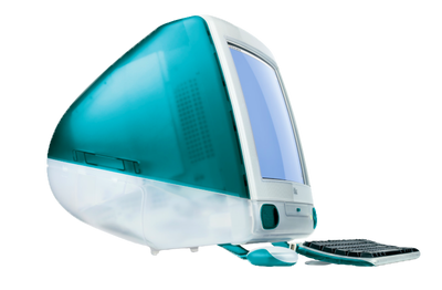
I defend the design, it's kinda like what I fell in love with Apple with in the first place. No one complained about a big chin, white bezels and colors back then lol.
 

Attachments

  • R6ee8a8c557cb3f321aba781365bbd9cc.png
    R6ee8a8c557cb3f321aba781365bbd9cc.png
    81.1 KB · Views: 74

nieks

macrumors 6502
Apr 7, 2016
401
332
The Netherlands
The chin
Of course, if I could choose, I want it to be gone too. But I understand why it's there and I can live with it. Here's why:
Fun fact: i just had a meeting with a brand/communication agency, and in the imagery shown in the meeting, they used the pre-2021 iMac design. In order to not promote any brand at all, they did what so many companies do while showing a "personal computer": the use the image of an iMac, but without the Apple logo. And guess what: it was instantly recognizable as an iMac.

I think this is one of the reasons Apple won't mind keeping the chin around: it is distinctly Apple, and anyone would know it is not any other computer. No one in his right mind would say "oh that's obviously a Dell, right?". Nope. The combination of chin and the new colors makes it an instantly recognizable Apple product. Just like the iMac on the photo below: no logo, but a screen, a chin, and a stand. It's an iMac.

8C6821E4-0285-45FD-97E5-2E81ADF1B1B5.jpeg
 
Last edited:
Register on MacRumors! This sidebar will go away, and you'll see fewer ads.