Become a MacRumors Supporter for $50/year with no ads, ability to filter front page stories, and private forums.

symphony

macrumors 68020
Original poster
Aug 25, 2016
2,232
2,641
Craig mentioned there’s also an increasingly growing group of people wants more from the iPad. So I guess we’re not in the minority after all.

Edit: Also mentioned the other group who prefers the focused experience, and how they also don’t have to deal with window management.

Interesting!
 

PrettyWings

macrumors 6502a
Nov 3, 2016
505
616

look at that (at 51:35)

Craig is aware that people can still use iPad like how they always used it, but understands that there are a group of people who wants to push the boundaries even further and want a richer experience.

Craig gives an example that I literally gave about with overlapping windows, with his example, he mentioned how a user would use Notes while reading a small portion of text behind it on Safari.

I’m kinda shocked he used Notes and Safari as the app example I did.

You have been living rent-free in Craig's head. Tell us where he's going next ;)
 
  • Like
Reactions: symphony

bcortens

macrumors 65816
Aug 16, 2007
1,324
1,796
Canada

look at that (at 51:35)

Craig is aware that people can still use iPad like how they always used it, but understands that there are a group of people who wants to push the boundaries even further and want a richer experience.

Craig gives an example that I literally gave about with overlapping windows, with his example, he mentioned how a user would use Notes while reading a small portion of text behind it on Safari.

I’m kinda shocked he used Notes and Safari as the app example I did.
I now generally agree we want to empower these use cases but from the videos I’ve watched I still think stage manager is too disjointed relative to the rest of the OS … i think the new overlapping window system could have been better integrated .
 
  • Like
Reactions: symphony

Digitalguy

macrumors 601
Apr 15, 2019
4,643
4,469
There’s a rumored 14” iPad Pro for next year which I’m betting will start at at least $1699.
Yes Ross Young confirmed the 14.1 so at this point it's just a matter of time. I do hope that for $1699 they give us at least 256GB storage as entry level. I am not of course hoping for 16GB RAM for that amount cause even the 12.9 is more expensive than that. But given the size increase I'll definitely be buying the 16GB RAM 5G version this time even if I end up spending $3000 with the $400-450 14.1 Magic Keyboard.
Really looking forward to it!
 
  • Haha
Reactions: alien3dx

Ludatyk

macrumors 603
May 27, 2012
5,963
5,131
Texas
I now generally agree we want to empower these use cases but from the videos I’ve watched I still think stage manager is too disjointed relative to the rest of the OS … i think the new overlapping window system could have been better integrated .

I’m curious.. have you finished the diagram?

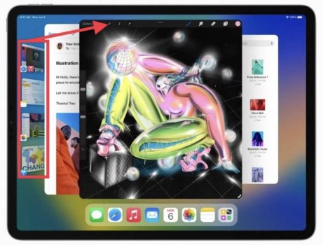
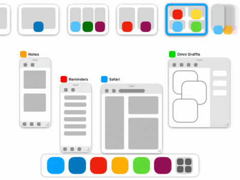
I’m doing a diagram now that I’ll post somewhere and link but in my head we replace the existing system with something that allows app groups to exist In a psuedo space/desktop type thing wherein - if enabled by the user - they can be arbitrarily sized and positioned. By integrating a mission control style version of multitasking you get a zoomed out view of the current space/app group to see all your open windows in that app group while seeing all the other app groups (and single apps) arranged horizontally across the top along with the Slideover apps on the top.

Because judging by your description… you are asking for this?

View attachment 2018107
 

Attachments

  • IMG_3076.jpg
    IMG_3076.jpg
    76.1 KB · Views: 67

The Game 161

macrumors Nehalem
Dec 15, 2010
30,980
20,169
UK
Yes Ross Young confirmed the 14.1 so at this point it's just a matter of time. I do hope that for $1699 they give us at least 256GB storage as entry level. I am not of course hoping for 16GB RAM for that amount cause even the 12.9 is more expensive than that. But given the size increase I'll definitely be buying the 16GB RAM 5G version this time even if I end up spending $3000 with the $400-450 14.1 Magic Keyboard.
Really looking forward to it!

Rumours say it will start at 512GB with 16GB of ram
 

alien3dx

macrumors 68020
Feb 12, 2017
2,193
524
One is a tablet, one is a laptop.

I don’t have a use for a $2K MacBook (prefer ThinkPads) but I do have a use for a 1TB 5G iPad.
Understood , you may have work office laptop / work but at home maybe ipad just for leisure and sometimes want to hook to external monitor .
 
  • Like
Reactions: symphony

rui no onna

Contributor
Oct 25, 2013
14,917
13,261
Yes Ross Young confirmed the 14.1 so at this point it's just a matter of time. I do hope that for $1699 they give us at least 256GB storage as entry level. I am not of course hoping for 16GB RAM for that amount cause even the 12.9 is more expensive than that. But given the size increase I'll definitely be buying the 16GB RAM 5G version this time even if I end up spending $3000 with the $400-450 14.1 Magic Keyboard.
Really looking forward to it!

I was thinking of getting one originally but now that I’ve thought more about it, I’ll probably give it a skip unless the overall dimensions are similar to 12.9”.

I often use the 12.9” Pro docked on a Logitech K780 keyboard in front of the dual monitors for my Windows desktop (work). It’s just right at the height limit in landscape where it doesn’t block the screen. Any taller and it would encroach on my primary displays.
 

bcortens

macrumors 65816
Aug 16, 2007
1,324
1,796
Canada
I’m curious.. have you finished the diagram?


Because judging by your description… you are asking for this?

View attachment 2018107
Kind of that, but with additional features, you'd want the apps in the current app group to zoom out so you can see them (as happens in mission control) so you can quickly zoom them out and then tap on one that is in the back.
One problem with Stage manager from the videos I've seen is that it tries to rearrange the windows to prevent you losing a window, if you had something like mission control it would let the windows be more easily positioned since they wouldn't need to always maintain disability since you could just enter the multitasking view to see the ones behind.
 

Attachments

  • Mission Control Example Gif.gif
    Mission Control Example Gif.gif
    126.9 KB · Views: 71
  • Mission Control Example 3 Gif.gif
    Mission Control Example 3 Gif.gif
    156.2 KB · Views: 83
  • Like
Reactions: Ludatyk

Ludatyk

macrumors 603
May 27, 2012
5,963
5,131
Texas
Kind of that, but with additional features, you'd want the apps in the current app group to zoom out so you can see them (as happens in mission control) so you can quickly zoom them out and then tap on one that is in the back.
One problem with Stage manager from the videos I've seen is that it tries to rearrange the windows to prevent you losing a window, if you had something like mission control it would let the windows be more easily positioned since they wouldn't need to always maintain disability since you could just enter the multitasking view to see the ones behind.
Cool mockup! I like it.

I think it’s more of stylistic viewpoint… because from a functionality angle it’s the same approach, but your recent apps/windows is at the top. I’m currently using Stage Manager now and when I swipe up, I get a grid-like visual showing me all my apps/windows (App-Switcher).

I think the problem you are referring to is Apple ”smart” way of window-resizing… my first thought was that’s primarily due to how apps are designed. But I think it’s more so Apple trying to dictate how apps appear on the screen and I can understand how that can be annoying.
 

symphony

macrumors 68020
Original poster
Aug 25, 2016
2,232
2,641
Kind of that, but with additional features, you'd want the apps in the current app group to zoom out so you can see them (as happens in mission control) so you can quickly zoom them out and then tap on one that is in the back.
One problem with Stage manager from the videos I've seen is that it tries to rearrange the windows to prevent you losing a window, if you had something like mission control it would let the windows be more easily positioned since they wouldn't need to always maintain disability since you could just enter the multitasking view to see the ones behind.
Mission Control is needed from my experience. When windows get covered up, I instinctively try to use the Mission Control gesture to try and reveal all the windows, only to end up in app switcher.

Not only is the auto arrangement annoying, but I’m also not a fan of all the windows auto resizing when you add another app.
 

Digitalguy

macrumors 601
Apr 15, 2019
4,643
4,469
I was thinking of getting one originally but now that I’ve thought more about it, I’ll probably give it a skip unless the overall dimensions are similar to 12.9”.

I often use the 12.9” Pro docked on a Logitech K780 keyboard in front of the dual monitors for my Windows desktop (work). It’s just right at the height limit in landscape where it doesn’t block the screen. Any taller and it would encroach on my primary displays.
Even the 12.9 with MK is too high for me for that (I use a samsung 12.4 tablet for that). The 12.9 sits now under a smaller 22in monitor (I am fine with it being higher if it's smaller, but not my main 28in monitor)
 
  • Like
Reactions: rui no onna

bcortens

macrumors 65816
Aug 16, 2007
1,324
1,796
Canada
Cool mockup! I like it.

I think it’s more of stylistic viewpoint… because from a functionality angle it’s the same approach, but your recent apps/windows is at the top. I’m currently using Stage Manager now and when I swipe up, I get a grid-like visual showing me all my apps/windows (App-Switcher).

I think the problem you are referring to is Apple ”smart” way of window-resizing… my first thought was that’s primarily due to how apps are designed. But I think it’s more so Apple trying to dictate how apps appear on the screen and I can understand how that can be annoying.
Mine would have all recent apps scrolling to the left at the top and integrates slide-over in the top right, this integrates both the new resizable window system with the existing multitasking system ... Which makes it conceptually cleaner IMO
 

Ludatyk

macrumors 603
May 27, 2012
5,963
5,131
Texas
Mine would have all recent apps scrolling to the left at the top and integrates slide-over in the top right, this integrates both the new resizable window system with the existing multitasking system ... Which makes it conceptually cleaner IMO
I completely understand, but I believe Apple doesn't want to disrupt the existing multitasking system. Craig mentioned this in the interview on The Talk Show... that there's a toggle for Stage Manager who want to use resizable windows and those who don't care for it can still use the iPad as they are accustomed to.

Because majority of users don't care to use multitasking on the iPad not because the apps didn't resize... but primarily because they prefer the single app approach.
 

bcortens

macrumors 65816
Aug 16, 2007
1,324
1,796
Canada
I completely understand, but I believe Apple doesn't want to disrupt the existing multitasking system. Craig mentioned this in the interview on The Talk Show... that there's a toggle for Stage Manager who want to use resizable windows and those who don't care for it can still use the iPad as they are accustomed to.

Because majority of users don't care to use multitasking on the iPad not because the apps didn't resize... but primarily because they prefer the single app approach.
That may be the intention but I disagree that it is the right approach. I do think there should be a toggle in settings to enable/disable resizable windows but beyond that a fully integrated approach is far more conceptually intuitive. Having two modes means maintaining two different mental models of where windows are and the fact that the two modes are distinct makes it more difficult to transition windows in and out of groups. There are very few benefits to having a separate mode and many downsides and I think those downsides generally outweigh the upsides and I think that by having two modes it makes multitasking more restrictive and difficult to use.

People who don’t want to use multitasking should be able to turn it off entirely to make it impossible to get into states they don’t want to.
 
Register on MacRumors! This sidebar will go away, and you'll see fewer ads.