Become a MacRumors Supporter for $50/year with no ads, ability to filter front page stories, and private forums.

deep diver

macrumors 68030
Jan 17, 2008
2,709
4,512
Philadelphia.
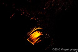
Here's my grungy contribution. Criticism welcome.

This isn't a bad shot. I like the reflection in the window thing. It does need a little work. In general, in an image that includes straight lines (such as the window frame) one of those edges should be parallel to the border of the image. In this case, the image should be rotated clockwise a few degrees so that the window frame is truly vertical. There is too much sky in the reflection. It is generally not appealing to have a line bisect an image either horizontally or vertically. In this image, the roof line cuts right through the middle. Can you find an angle to shoot this in a way that puts in more street and less sky?


Still looking for something that really fits the theme. You'd think with everything covered in dirty snow here I'd find it. This was from a frozen swampy area near the Potomac.

4382023314_6062aeb6c9_b.jpg

Very nice image.

I don't think I've ever participated in one of these because I know jack shyte about photography but I took this in a tube station one day and exaggerated the motion blur in photoshop to give you this piece of ugly beauty:

After I took the shot I walked up The Escalator Less Travelled. It didn't make all the difference but there you go. :p

Keep them coming. We are all here to learn. I really like your concept and I love the social commentary. The big challenge with this image is the escalator itself. Converging parallel lines will always carry the view's eye. When I look at your image the escalator carries my eye to the wall at the end of the hall. I have to force myself to find the people. Shooting with a wider lens will bring the people more into the frame.


I posted this photo to the daily thread last night because I temporarily decided I would not post it here. Why you may ask? Because, even though I shot it specifically for the challenge thread, somebody... **cough**...husband...**cough**...didn't think it was "ugly" enough. Well, I can assure you that most of the day, without the morning light and the morning dew, this dirty patio table looks just plain nasty. It's all covered in dirt and decaying petals (see this photo for proof). It was a fleeting moment yesterday morning that made it look beautiful. So here it is...

As a "**cough**...husband...**cough**" myself, I feel like I should be defending him but you were right about this one. Beautiful image.
 

Maxxamillian

macrumors 6502
Nov 16, 2004
359
0
Utah
I really like the color in this one, although I'm undecided about the heavy vignetting. I supposed you decided that shallow DoF was not enough to provide some isolation, but we still get a sense of unresolved focus here (that is, my eye looks in vain for a good place to rest). I wonder if going the opposite route and having a riot of texture and color might be the way to go here--by lifting the veil of darkness a bit? Just a thought.

Veil lifted. Thoughts?:)

795735252_weiyF-M.jpg
792850050_jAhw6-M.jpg
 

Maxxamillian

macrumors 6502
Nov 16, 2004
359
0
Utah
Nursing homes are usually seen as "ugly" places. My son's band was playing a concert at one of the local nursing homes. I was standing behind this lovely couple. They have probably been married forever and could not stop holding hands. They reminded me of my grandparents.

Your picture is touchingly appropriate.


Well done--I really like what you have captured here and your interpretation for the challenge. Very fitting.
 

deep diver

macrumors 68030
Jan 17, 2008
2,709
4,512
Philadelphia.
Veil lifted. Thoughts?:)

The new version is much better. The one with the heavy vignetting kept my eye stuck in the center of the frame and I could not take in the entire wall. Without the vignetting my eye travels down the wall and I get a much better sense of the place. I'm still not sure it is high on my list of places to visit. :D:D:D
 

Phrasikleia

macrumors 601
Feb 24, 2008
4,082
403
Over there------->
How's this?

Yes, that's a definite improvement. You probably could have been even more subtle with the vignetting (maybe lighter, but a bit larger spread?), but that's splitting hairs. It's a very well seen shot.

Veil lifted. Thoughts?:)

795735252_weiyF-M.jpg
792850050_jAhw6-M.jpg

I do prefer the more colorful one, but now I see a veil of blurriness. :p I'm especially distracted by the suddenly blurry foreground (far right of the wall). Was that shot with a LensBaby? Or did you add the blurriness in post? Just curious.
 

Designer Dale

macrumors 68040
Mar 25, 2009
3,950
101
Folding space
JDDavis: Very interesting shot. I like the way the leaf and ice play against each other. Looks cold and desolate.

iBlue: I like. I don't think I've ever looked at an escalator in that way before. One of the things I like about these groups is that others always show me a new way to look at life.

Phrasikleia: Well, I'm an ex, so I could question your hubby here but since I'm also me, I won't. This is spot on for the Challenge. Anyone else would have looked at that table and thought "I need to clean that thing". You look at it and think "I really need to get out there with my camera. That has beauty".

Maxx: I don't know if I like the new version or not. It looks too much like what it is. A wall of gum. Maybe if it had a bit more of a crop right and left so there wasn't so much of a fall-off from the focal point.

Nice photos, all.

Dale
 

Maxxamillian

macrumors 6502
Nov 16, 2004
359
0
Utah
Yes, that's a definite improvement. You probably could have been even more subtle with the vignetting (maybe lighter, but a bit larger spread?), but that's splitting hairs. It's a very well seen shot.


I do prefer the more colorful one, but now I see a veil of blurriness. :p I'm especially distracted by the suddenly blurry foreground (far right of the wall). Was that shot with a LensBaby? Or did you add the blurriness in post? Just curious.

I also noticed that sudden plane of blurriness in the pic--no PP effects to that nature was added. The pic was shot with a Nikor 24-70 2.8--at or very close to wide open and at 24MM. Wide open and 24 MM for this lens isn't such a hot combination. I wonder if this, along with an extremely busy subject (a wall simply loaded with chewed gum) combine for the effect? The lack of good bokeh negatively accentuates the blur even further I think.

Haven't used a Lens Baby yet. This is pretty low on my list of things to try. Of the Lens Baby shots I've seen, only a handful stand out as particularly interesting or artistic.
 

LumbermanSVO

macrumors 65816
Mar 15, 2007
1,234
622
Denton, TX
I like the shot. I think it's nicely done. Is the beauty part the fact you didn't end up driving off a cliff with brakes like this? I think it needs something else in light of the challenge. Not sure if you could do anything with the car (beauty) and the horrid brakes together?

Well, the car isn't exactly a beauty, if fact, most would call it ugly, but I love it. Only this one pad on the rear was down past the rivets, all the others still weren't at the wear indicators yet, so it wasn't super dangerous :D

I'll see what I can do with the car when I'm home next but I can't promise anything worthy of posting though :)
 

acearchie

macrumors 68040
Jan 15, 2006
3,264
104
I wouldn't say it's 100% with the theme but it's a sort of Man vs. Nature (have we aided or destroyed...) photo similar to my juxtaposition entry.

Oh and I'm not trying to suggest that my sister is ugly ;)


deep diver

macrumors 68030
Jan 17, 2008
2,709
4,512
Philadelphia.
I printed a copy of the couple holding hands and took it over to the nursing home. I found out that they are not, in fact, married. They "found each other" there. New love is a beautiful thing at any age.
 

Phrasikleia

macrumors 601
Feb 24, 2008
4,082
403
Over there------->
I printed a copy of the couple holding hands and took it over to the nursing home. I found out that they are not, in fact, married. They "found each other" there. New love is a beautiful thing at any age.

What a very sweet thing for you to have done, and what a wonderful story overall! I'm sure they were thrilled to have the photo. :)
 

Designer Dale

macrumors 68040
Mar 25, 2009
3,950
101
Folding space
I wouldn't say it's 100% with the theme but it's a sort of Man vs. Nature (have we aided or destroyed...) photo similar to my juxtaposition entry.

Oh and I'm not trying to suggest that my sister is ugly ;)

^^^ I think it works real well. The strong dark outline is in radical contrast to the soft hues of the sky. I think IO would like it better without the camera.

^^^ HDR seem to fit this theme very well. Folks either find it beautiful or ugly. I like it when applied to older buildings like this.

A service platform at Chicago O'Hare.
^^^ This photo has a nice fat histogram, but seems a bit fat to me. With the Brightness at -10 and Contrast at +10 it pops nice. I love the textures of rusting metal.

Dale
 

Attachments

  • Screen shot 2010-02-26 at 5.21.29 PM.png
    Screen shot 2010-02-26 at 5.21.29 PM.png
    34.9 KB · Views: 70

deep diver

macrumors 68030
Jan 17, 2008
2,709
4,512
Philadelphia.
^^^ This photo has a nice fat histogram, but seems a bit fat to me. With the Brightness at -10 and Contrast at +10 it pops nice. I love the textures of rusting metal.

Dale

Agreed. I rushed a little to get this one up and did not play with it as much as I might normally. I'm feeling a little bad that I have not been able to post many images in the last couple of weeks.
 

Chappers

macrumors 68020
Aug 12, 2003
2,247
1
At home
Bruce and Dale - I'm left wanting more in your photos, but not in a bad way.
They are both clever as is most of what I've seen in the thread.

Maxx - I like both versions of your gum picture, I can't decide why I like them both but they both work in my opinion.

Me - well I was never sure about this ugly egg.

4394379249_c21a9dccbc_b.jpg
 

Chappers

macrumors 68020
Aug 12, 2003
2,247
1
At home
Our goal is to exceed customer expectations. "More" in what way?

More in every way. I always enjoy your aquatic shots so I love seeing them. I also in this case want to see whole organism too. I miss these photos.


In Dales case I obviously want to see more sign (although obviously that would spoil the shot) but because I know there is more - I instinctively want to see it.

Someone once said, "Always leave them wanting more".
 

Designer Dale

macrumors 68040
Mar 25, 2009
3,950
101
Folding space
I found this at the Nisqually Delta Wildlife Preserve. It's kind of the polor oposite from the Challenge topic. More Ugly in the Beauty...:)...

I didn't stage this. It was just there.

skicap.jpg

EXIF Summary: 1/200s f/8.0 ISO100 60mm

Dale
 

deep diver

macrumors 68030
Jan 17, 2008
2,709
4,512
Philadelphia.
More in every way. I always enjoy your aquatic shots so I love seeing them. I also in this case want to see whole organism too. I miss these photos.


In Dales case I obviously want to see more sign (although obviously that would spoil the shot) but because I know there is more - I instinctively want to see it.

Someone once said, "Always leave them wanting more".

This is a Mali spiny-tailed lizard. I cropped what I wanted, adjusted the color levels, cloned to fill in the shadows, adjusted brightness and contrast, and created a negative image.
 

Attachments

  • lizard-base.jpg
    lizard-base.jpg
    620 KB · Views: 66

Chappers

macrumors 68020
Aug 12, 2003
2,247
1
At home
This is a Mali spiny-tailed lizard. I cropped what I wanted, adjusted the color levels, cloned to fill in the shadows, adjusted brightness and contrast, and created a negative image.
Damn I was going to guess a turtle - it really had the feel of some of your aquatic work. Still at least I was in the right class.
 
Register on MacRumors! This sidebar will go away, and you'll see fewer ads.