Become a MacRumors Supporter for $50/year with no ads, ability to filter front page stories, and private forums.
41mm Gold Attelage Double Tour, breathtaking in person ♥️
I agree. This is why I've been stalking the Apple website. The whole concept didn't hit me earlier until one day I happened to be at an Apple Store and I tried on the Double Tour. Just like you said Double Tour is REALLY breathtaking in person. Very elegant, very unforgettable.

If I don't get a Double Tour in any color, I don't think I'll get Hermes this year.
 
For Hermes Series 7 45mm now only come with 1 size sport band M/L?
as i am a S/M user using 44/45mm
 
This is the glenan double tour which I think was a release about the same time as the mini Kelly and mini Rivale bracelet. ☺️ The glenan will be on my left with my watch as it has the least chances of scratching the watch case. I might add a mini Rivale soon but need to figure the colour to get! The heavier arm stack will be on my right.
How did the glenan double tour work out?
 
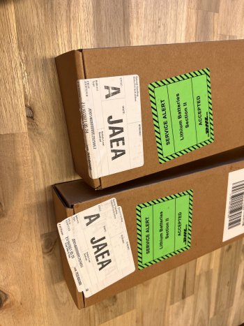
Apple putting pressure on DHL Express must have worked. Out for delivery. ???


C8BE29F7-5A5E-40AB-A598-8F025CDBF316_1_201_a.jpeg
 
Do any of you find yourself using Hermès faces near exclusively? My series is 7 is delayed until mid November so I picked up a standard just to toy with for a couple of days. Now I'm having a hard time finding faces I enjoy using regularly.

I do use Modular from time to time but I miss my faces quite a bit. I've settled on Chronograph Pro, but I do look forward to my SS model coming in.
The Hermes Circulaire face is the real reason I keep buying the Hermes edition. I use it 99% of the time. I only switch to infograph modular for workouts.
 
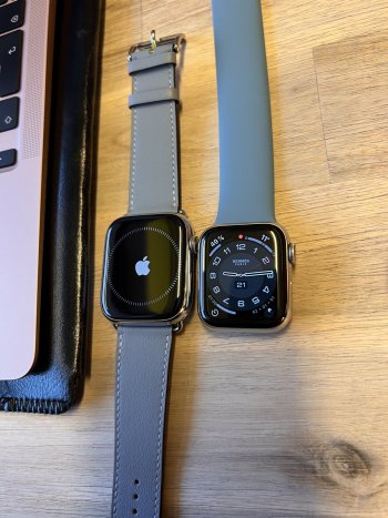
That has to be 45mm v 40mm? Huge difference! I love it!

Enjoy!
Thank you. Yes, you're absolutely right. The small one is my old series 6. I was very nervous ordering the big sized 7 and it's absolutely massive. But it was love at first sight. I've also ordered the 41mm but I think I will return it sealed and unopened so that someone else can buy it.
 
  • Like
Reactions: BillGates1969
I have a Bleu Indigo Swift single tour band that’s a few years old and a bit worn out. I’d love to buy a new one but the closest I can see now is the navy band. How close are these colours? Is the navy one lighter? I can’t seem to find a comparison.
 
Early thoughts that hopefully help Mayfair too:

It is hard to go for the smaller screen, when you have seen the bigger one. Especially when you see notifications for eMails etc... it just looks so much better on the bigger screen. Obviously also makes it easier to interact with things.
I also like the look of the bigger watch on my arm better. Feels more modern. Back when the S4 was released i prefered the smaller look, which is interesting.

The smaller one is much more comfortable though.
My arm actually hurts a little bit from the bigger one... hopefully i just need to get used to it.

I'll just wear it for a few days and see if i can get used to it and the smaller one will likely go back.
The smaller one also has some imperfect stitching and i would have to exchange the band since Hermes is so expensive. which makes me feel a bit better about having to return a watch that someone else could have gotten as new ?
 
Got my SB Hermès with Noir band in today. Have been using the regular Hermes Stainless Steel Hermès since the Series 4 so I thought I'd switch it up this year with the Space Black. I love pairing the black watch with the Noir Stainless Steel bracelet from Apple. Its my all time favorite band (the Hermès bands are a close second.

I'm a little bummed that my favorite watch face (Hermès) isn't optimized for the S7 watch. I really hope they fix this with an update as it is the exact same size as the Series 6 and is a complete waste of space for the larger watch face.

IMG_0401.JPG
 
Early thoughts that hopefully help Mayfair too:

It is hard to go for the smaller screen, when you have seen the bigger one. Especially when you see notifications for eMails etc... it just looks so much better on the bigger screen. Obviously also makes it easier to interact with things.
I also like the look of the bigger watch on my arm better. Feels more modern. Back when the S4 was released i prefered the smaller look, which is interesting.

The smaller one is much more comfortable though.
My arm actually hurts a little bit from the bigger one... hopefully i just need to get used to it.

I'll just wear it for a few days and see if i can get used to it and the smaller one will likely go back.
The smaller one also has some imperfect stitching and i would have to exchange the band since Hermes is so expensive. which makes me feel a bit better about having to return a watch that someone else could have gotten as new ?
I've had this whole thought process last year and have since then always regretted sending back the bigger size. My thinking back then was to stick with the humble and elegant small size. But in reality I craved the bold fashion statement. So this year I really only ordered the small size as a backup. I already knew I really wanted the big one. So, the small didn't even get unpacked this time. I just checked the big size and kept it. I really didn't want to go through all that decision making process again because it drove me mad last year and left me with the wrong size (in my case). I was so sure about the big one this time that I ordered a bunch of new watch bands from Apple two days before the pre-ordering day. It turned out to be a real good decision because some of them are now sold out but I have them here for my new watch.
 
After a few hours, the S7 Hermès is a bit of a mixed bag (for me).

The Bleu Lin Single Tour is fantastic, easily my co-favourite Hermès strap (along with the Bambou and Bordeaux Single Tours).

The Watch itself doesn‘t look perceivably larger on the wrist while the new screen is absolutely fabulous. It makes the S4-6 look quite old.

The new screen, like the tide, floats (almost) all boats, i.e. watch faces. For my most used ones, Infograph is bigger, bolder and more legible while Info Modular will be replaced in my daily routine by the very useful Modular Duo. Best of all, Typograph is massively improved by the digits moving much closer to the edge. I also like Stripes, now that they span almost the entire display.

The Hermès faces are where the bag gets (very) mixed. Circuit is nice, but I would only ever use it with a Circuit strap (which I do not plan to get). Circulaire was optimized in size and is bigger and more legible, but still very dim in always-on mode. (As Infograph is more useful, I never used Circulaire all that much anyway.) The keep-or-send-back question for me boils down to the regular Hermès face. I love, love, love the one with only 4 digits and the „fat“ hands (in Espace, mostly), and it looks as lovely as ever. As far as I can make out, it hasn‘t really been „optimized“ at all, i.e. the digits didn‘t move outwards, but especially with a black background (like I use it 90% of the time anyway) it still looks great … when it‘s on. It has always been – like all Hermès faces – noticeably dimmer in always-on mode than other watch faces, but on the S7 the gap gets really big. Typograph always-on looks easily twice as bright. Hence Typograph – optimized for the new screen in two ways (size and brightness) – is now for me in some crucial ways better than the not-optimized-at-all, I‘m-#1-so-why-try-harder regular Hermès watch face. Which makes me ponder the value I got for paying the Hermès tax.

Number1.jpg
 
After a few hours, the S7 Hermès is a bit of a mixed bag (for me).

The Bleu Lin Single Tour is fantastic, easily my co-favourite Hermès strap (along with the Bambou and Bordeaux Single Tours).

The Watch itself doesn‘t look perceivably larger on the wrist while the new screen is absolutely fabulous. It makes the S4-6 look quite old.

The new screen, like the tide, floats (almost) all boats, i.e. watch faces. For my most used ones, Infograph is bigger, bolder and more legible while Info Modular will be replaced in my daily routine by the very useful Modular Duo. Best of all, Typograph is massively improved by the digits moving much closer to the edge. I also like Stripes, now that they span almost the entire display.

The Hermès faces are where the bag gets (very) mixed. Circuit is nice, but I would only ever use it with a Circuit strap (which I do not plan to get). Circulaire was optimized in size and is bigger and more legible, but still very dim in always-on mode. (As Infograph is more useful, I never used Circulaire all that much anyway.) The keep-or-send-back question for me boils down to the regular Hermès face. I love, love, love the one with only 4 digits and the „fat“ hands (in Espace, mostly), and it looks as lovely as ever. As far as I can make out, it hasn‘t really been „optimized“ at all, i.e. the digits didn‘t move outwards, but especially with a black background (like I use it 90% of the time anyway) it still looks great … when it‘s on. It has always been – like all Hermès faces – noticeably dimmer in always-on mode than other watch faces, but on the S7 the gap gets really big. Typograph always-on looks easily twice as bright. Hence Typograph – optimized for the new screen in two ways (size and brightness) – is now for me in some crucial ways better than the not-optimized-at-all, I‘m-#1-so-why-try-harder regular Hermès watch face. Which makes me ponder the value I got for paying the Hermès tax.

Number1.jpg
Could you check the circular in the white version for me? I'm not quite sure but my white version doesn't look optimized for the new screen size. But the dark circular version looks optimized. Or maybe I am just imagining it.
 
Could you check the circular in the white version for me? I'm not quite sure but my white version doesn't look optimized for the new screen size. But the dark circular version looks optimized. Or maybe I am just imagining it.

Looks the same to me. ¯\_(ツ)_/¯ There have been several pictures of it in this thread as well that look optimized. In this example, the stop watch symbol in the left corner is clearly further out than it could have been on S4-6.


65b2f3b2-2a1a-4ab1-b791-d2a5dccba080-jpeg.1872701
 
Looks the same to me. ¯\_(ツ)_/¯ There have been several pictures of it in this thread as well that look optimized. In this example, the stop watch symbol in the left corner is clearly further out than it could have been on S4-6.


65b2f3b2-2a1a-4ab1-b791-d2a5dccba080-jpeg.1872701
Thank you. I've checked again and again in the meantime and came to the conclusion that my brain was indeed playing tricks on me. ?
Your band looks super gorgeous by the way.
 
Register on MacRumors! This sidebar will go away, and you'll see fewer ads.