Become a MacRumors Supporter for $50/year with no ads, ability to filter front page stories, and private forums.
Looks like the island is lower, source:Reddit
Whux-kygdujbCx5uGw7EVU5b67hy9NIkpmKlCBEDNtI.png


This is not entirely correct, because the dimensions of the phone and screen changed. (Phone is a bit bigger and bezel smaller)

So yes, the pill is a bit lower than the notch, but the screen was made bigger to still have the same amount of screen below the cutout.

It is like this:

14_19_25 - Window.png


Last edited:
This is not entirely correct, because the dimensions of the phone and screen changed. (Phone is a bit bigger and bezel smaller)

So yes, the pill is a bit lower than the notch, but the screen was made bigger to still have the same amount of screen below the cutout.

It is like this:

View attachment 2060039

This post taught me that the iPhone 12 Pro > 13 Pro notch cut down into space more than iPhone 13 Pro > iPhone 14 Pro does. I had no idea.
 
  • Like
Reactions: revs
👍 dynamic island thing is cool, first time a notch is interactive

👎 the new island is further down into the display than the notch. So it's gonna be MORE annoying when watching videos etc.
It’s not tho. The pros are slightly taller so the island lines up with the notch from previous models. 🤦🏾‍♂️
 
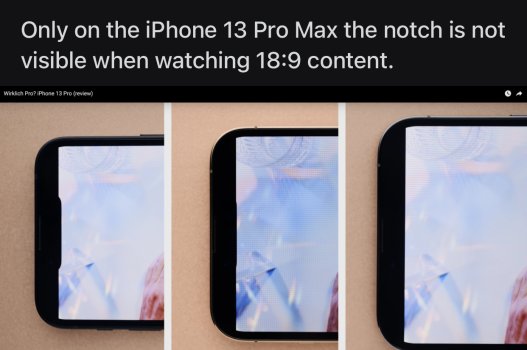
I started a thread about this but got no response. Has this been confirmed? If so, that’s crazy! What are they thinking???

They are both true. In one sense it's not further down since it's going down to the same bottom pixel, thanks to bigger dimensions and smaller bezels.

In practice it will be more "visible" since it's a cut-out and not a notch, so visually, it will seem as if its extending further down and intruding more.

That said IMHO is a good trade-off since it allows to both keep FaceID hardware (a much better solution than under-the-screen touchID IMHO), but also to enable further UI/software features, the "Dynamic Island".

So also to answer OP: how is this better?

Very easy: on which iOS or Android device you can use an app full-screen (e.g. a game), while also keeping constantly in view a timer *AND* a live result of a basketball/soccer match, without needing to do any click or pull-down any notification banner, and without "stealing" any screen estate from the full screen app?

This enables basically to provide additional useful information, which goes in pair IMHO with the new "live activities" as well (order/shipping tracking, sports results, weather, timers/alarms, stocks, crypto, business KPIs, etc. etc..), always visible even in full-screen application, without basically using any screen estate.

This is something you cannot achieve today neither on iOS or Android, and quite useful IMHO.
 
In one sense it's not further down since it's going down to the same bottom pixel, thanks to bigger dimensions and smaller bezels.
Okay. Let me see if I understand. The actual screen real estate on the 14PM is bigger because the bezels are smaller meaning that even though the DI might be slightly lower than the 13PM notch from the top there is still the same amount of space below the DI compared to the 13PM Notch down to the bottom of the screen.

Or have I got this wrong?
 
  • Like
Reactions: luigi.lauro
Okay. Let me see if I understand. The actual screen real estate on the 14PM is bigger because the bezels are smaller meaning that even though the DI might be slightly lower than the 13PM notch from the top there is still the same amount of space below the DI compared to the 13PM Notch down to the bottom of the screen.

Or have I got this wrong?

Actually it's both. In terms of pixel, you gain 8 but you lose 20, so overall you have 12 less pixels of visibile resolution until the notch/island.

Whux-kygdujbCx5uGw7EVU5b67hy9NIkpmKlCBEDNtI.png


In terms of physical size, if you put the phones next to one another, the island bottom lip is at the same level of the notch bottom lip, due to different physical size and more screen / less bezels.

So: you lose a few pixels, it's more "visible" due to being separate and further down in terms of pixels from the top, but the bottom lip is at the same distance from the bottom of the phone due to larger screen / less bezels.

14_19_25 - Window.png


Not that any of this matter since a functional area is always >>> than a non-functional area IMHO.
 
Last edited:
Mmm... I saw video playing on a DI screen and it wasn't great. It was quite off-putting. I wonder if you get used to it... I do use my phone to watch content (not games) and the notch is somewhat annoying, but the pill may be even more annoying. I guess I'm in the minority. I was thinking to upgrade from a 13PM as I could get 1000 bucks for it, but I think I'm going to hold off for next year now. Apart from the better camera I'm not sure there's much here for me. I'd also like to see how the DI lands and how people like it before making a final decision.

I love Face ID but geez we get caned for it with notches and pills.
 
  • Haha
Reactions: PirateP
Having a functional space rather than a useless block of space. Is that genuinely a question?
My question now is, when is a non functional space suck a better alternative to integrating useable space? And in what world? Am I missing something?
The space the island itself doesn’t appear to be usable or functional. The software makes it appear that way as the island gets bigger to display additional information that could be displayed with or without an island. The pro is the island is smaller than the notch, but couldn’t they have made the notch smaller and still displayed the same info as the island at the top of the screen? It’s still a useless part of the screen housing sensors, but with the software making it appear to expand and show other data gives the illusion it’s more useful 🤷‍♂️. I personally don’t see why people are excited about it.
 
Has someone seen in any review 18:9 video playing in 14 pro max? I really want to check if pill affects more than last year models (see picture below). Take into account that in portrait it is lower than notch, it should cover some portion of video in horizontal.
 

Attachments

  • D86859F0-441D-4A0D-A105-44FEA7C56698.jpeg
    D86859F0-441D-4A0D-A105-44FEA7C56698.jpeg
    639.4 KB · Views: 621
Has someone seen in any review 18:9 video playing in 14 pro max? I really want to check if pill affects more than last year models (see picture below). Take into account that in portrait it is lower than notch, it should cover some portion of video in horizontal.
That’s all I care about as well but haven’t seen a single shot of 18:9 yet. I thought MKBHD might show one of his 18:9 videos playing a 14 Pro darn.
 
That’s not a good source. I haven’t seen any comparisons yet that take into account the taller size of the 14 Pros. The unusable area of the screen already extends below the notches on current phones, and with the increased height taken into account, I doubt the island extends below that.
Here’s a 13 Pro vs a 14 Pro. Still not convinced?

E54FD79F-34F8-4D5B-8063-96A14EE66743.jpeg
 
Apart from 18:9 question, has anyone think about the amount of selfie photos that now we’re going to ruin because you touch the camera to interact with dynamic island?? This camera is going to be full of fingerprints everytime and maybe could affect face id precision… how knows.
 
Why would you ever watch a video in full screen and not its normal aspect ratio? Do you zoom in on your TV to hide blank bars in movies?!
We have to wait to see if 18:9 don’t arrive to dinamic island.
I see a lot of movies in the iphone in the train from Madrid to Valencia.
I am too concerned with in horizontal position with the notification’s plus dinamic island.
 
It's a really dumb idea, can't believe everyone is buying the marketing of "dynamic island". It makes more of the screen useless.

It's not functional vs non-functional. Putting functionals pieces *sometimes* around a non-functional area doesn't make it functional.
 
I think what’s important to remember at the end of the day; What works better for some may not work better for others. Is personal preference really something to try to argue about? Lol. I really can’t say I like the island better than the notch because I have not experienced it myself yet. Until I do, I’m going to keep an open mind. There isn’t really a point to try to change somebody’s mind on what they think they might prefer. I hope everyone chooses what makes them happy.
 
  • Like
Reactions: compwiz1202
my whole take is the 13 with the notch was a static space on the display. The pill if you will(see what I did there).....has become an interactive space with dynamic island. It is no longer a static spot at the top of the display. It is interactive...it grows and shrinks back to size. IMHO this is soooo much better than a static notch at the top of the display.
This a great way to use that space via software. Soon all apps will be using it and it will become a normal way of interacting with our phones.
 
Register on MacRumors! This sidebar will go away, and you'll see fewer ads.