Become a MacRumors Supporter for $50/year with no ads, ability to filter front page stories, and private forums.
Yup, Apple is going down. Meanwhile, they gets richer and richer 😉
But I miss Steve and Jony too.
You people keep making this argument, I just don’t understand it. Your stocks can do well even though your products are not as good as they were in the past.

Take the EA for example. They make much bigger profits than they did 10 year ago, yet most of the games they are releasing today are lame compared to the games they used to make. There are more examples like this one, but you should get the point by now.
 
  • Like
Reactions: redbeard331
I don't really miss the Jony Ive (it's Jony Ive, not Johnny Ive) era. His product designs always felt more form than function, as you can see with the touch bar Macbook Pro design and some of the iMacs over the years. Not sure if he created the Airpods Max case, but that is a clear indication of form over function in the Jony Ive design that I hate. Jony Ive is a high-end designer, and I understand why the reason behind Apple hired him because they wanted to be a luxury company back in the day. Can't believe in July, it will be 5 years since Jony Ive's departure from Apple. Can't wait to see what better products Apple can make without him. Oh, and Jony Ive created the coronation emblem for King Charle III.
 
For years I would go to the mall, get a coffee and mostly just walk around. It was the town square for me. I would almost always have a nice conversation with an employee or another shopper. One of my friends tells me that I’m resistant to change. I tend to think that I miss something I used to enjoy as our local malls are depressing shells now.
There was a time when I had a car and a allowance and all my bills were paid. I could afford to spend a lot of time at mall book stores looking for any sci-fi/fantasy books and Advanced Dungeons & Dragons stuff I could find. I wasn't in to coffee yet, but the food court always had lunch for me.

And Orange Julius was a must stop.

A slice of the past I remember fondly but is gone now.
 
But there was no way to add 3rd-party Notification Center widgets without jailbreaking, right? You could only add Apple’s built in ones.

Personally I don’t recall ever using NC widgets much. But what I really miss is the old full-screen Dashboard feature in macOS, which you could customize with whatever widgets and layout you wanted.

Dashboard was so easy with just one swipe to instantly see everything - no weird key combos, or scrolling and poking to find a widget. Most importantly, Dashboard widgets would stay in the same location so you could find them instantly.

The macOS Notification Center widgets are just so dinky and useless in comparison - I wish they would bring out a modern equivalent to the old macOS Dashboard, as a full screen that you can swipe to access just like the home/lock screen widgets on iOS.
I’ve been hoping Apple would add iOS style widgets to the Mac launchpad for years.
Launchpad has basically been neglected since it was introduced… 13 years ago.
Not sure why it hasn’t kept up with the iPhone in the iPads home screen when that’s what its original purpose was to be.
 
  • Like
Reactions: Reason077
I'm 39 years old, joined macrumors when I got my first Mac in 2003… a 12" powerbook g4 that I used in college and to make a local radio broadcast. I feel the same way...

but I also feel that way about a lot of things. so I think it isn't clear cut black and white. I think it's a mixture of coming into a hobby/product when the hero of a company was still in charge, watching him get sick and die, the company keep trekking on...
And im about to hit midlife. I would suspect there's a lot of 40 somethings who were into something in their 10 and 20 somethings that don’t miss using an 867 MHz processor. we miss the memories/nostalgia that are attached to when life was different-not in the world-but in our own personal lives.
 
Okay I agree with everything you said EXCEPT ‘SLIPPERY/FINGERPRINT MAGNET STAINLESS STEEL SIDES’


What in the HELL are you talking about? The stainless steel sides ARE EXTREMELY GRIPPY. Any other material Apple has used has been FAR FAR FAR MORE SLIPPERY.

The ****ing fingerprints DONT MEAN JACK ****. I care about GRIP NOT FINGERPRINTS.

I am specifically able to hold and use my phone without a case since the iPhone X THANKS TO THE GRIPPY STAINLESS STEEL SIDES.

If Apple changes them to matte titanium this year the phone will be a SLIPPERY PIECE OF ****ING GARBAGE.

The matte glass is far more slippery than the smooth glass of the iPhone X rear, but if they switch to matte metal it will be even that much slipperier.

I should be running everything Apple does. They just don’t think anymore
Here. Have a snickers.

🍫
 
I guarantee you that this would have been stopped by Ive or Jobs if they were still at Apple.

I definitely don’t miss these two. Both Steve and Ive were arrogantly stuck on their idea of how we should use our own devices. When demand for large screens was high, Steve still wanted the iPhone to remain in the 3.5 to 4.0 inch screen size… he also famously opposed the idea of an Apple Pencil or an iPad mini, saying 9.5” was “the perfect” size.

Their views on software and limited user customization/choices were also antiquated, it wasn’t the 80s anymore when computer systems were just breaking into the mainstream/home users, we now wanted more control and they weren’t willing to give it. I am glad both Jobs and Ive have nothing to do with the design of Apple software and hardware anymore.
 
Agree fully. Honestly surprised more people don't talk about this. I thought I would eventually get used to it, but I chose space gray to hide the ugliness of the camera array on my iPhone 13 Pro. The cameras on the X/XS looked so nice and discreet.
Absolutely. The X and XS were beautiful designs. Aesthetics is important to a lot of people. If it wasn’t, they’d just buy a knockoff Chinese phone. They all do the same thing anyway
 
  • Like
Reactions: AbhijitShanbhag
I miss the old skeuomorphism.
Honestly, they could have just toned it down rather than turning the OS into a text adventure. I mean Forstalls podcast app took it to such an extreme it was practically useless but before that, someone over there understood the efficiency of an icon designed as a symbol to communicate an idea across language barriers. I guess when the iconography team had to spend all its time making emojis they didn't have time to design nice graphics for a Ui anymore.
OH I KNOW, DRAG A GRADIENT ACROSS IT!!!
Gag
 
Jony Ive gave us iOS 7 and all it's preschool primary colors that were inspired by PlaySkool, Fisher-Price and Tutor Time.

Apple took multiple years to allow a dark mode on Mac and iOS. Apple withdrew widgets on the screen with iOS 7 (introduced in iOS 6), then took years to give them back.

You may miss that era. I do not.

BD6DC572-7419-4CB2-81E2-A359E1694DCE_4_5005_c.jpeg


I miss the good parts of that era, when touch screens and iPhones/iPads were still new enough that Apple/designers focused on implementing common-sense interface details based on decades of learning instead of shifting their focus to inventing new ways to do something that was already working pretty well, just to make a statement and freshen things up. Back when we could easily discern 1) actionable items from 2) info-only from 3) background. That all but disappeared with iOS7, flat design, material design, blah blah blah barf forced-change design around 2013.

Further, when everything went to text-for-buttons and light-colored low-contrast text on stark-all-white background, interfaces became amateurish and unfinished-looking in the least, and then difficult to understand quickly and clearly at worst.

What further proof does one need that the all-white interface was a mistake than the sudden onset of "Dark Mode..." which brought its own unique steps backward...when combined with borderless, flat-design windows, it's sometimes impossible to tell where different windows begin & end, especially when the menu bar blends into the background (more of an issue with Windows 10/11 than Mac OS...)

Instead of flat design, white-out UI's, Dark Mode, neumorphism (which is just a thinly-veiled admission that wiping out skeumorphism wholesale was wrong), etc. I wish a true design genius would right the ship and return Apple to the common sense Apple HIG from about a decade ago that, at worst ruffled the features of short-sighted customers clamoring for "something fresh and new," and, at best, "just worked?"

The Ive era was a necessity but it was allowed to supersede function for too long. Apple clearly has made a much needed correction and the public seems to have reacted positively overall.

Apple's headed in the right direction alright, with still a ways to go. I'd sure like a Mail app that doesn't look like the folders, preview, mail, menu bar, and header don't all blend together.

Screenshot 2023-02-13 at 12.36.02 PM.png


OldMail.jpg
 
Last edited:
View attachment 2157904

I miss the good parts of that era, when touch screens and iPhones/iPads were still new enough that Apple/designers focused on implementing common-sense interface details based on decades of learning instead of shifting their focus to inventing new ideas to make a statement and freshen things up. Back when we could easily discern 1) actionable items from 2) info-only from 3) background. That all but disappeared with iOS7, flat design, material design, blah blah blah barf forced-change design around 2013.

Further, when everything went to text-for-buttons with pervasive use of light-colored low-contrast text on stark-all-white background, interfaces became amateurish and unfinished-looking in the least, and then difficult to read clearly at worst.

What further proof does one need that the all-white interface was a mistake than the "sudden" onset of "Dark Mode..." which brought its own unique steps backward...when combined with borderless, flat-design windows, it's sometimes impossible to tell where different windows begin & end, especially when the menu bar blends into the background (more of an issue with Windows 10/11 than Mac OS...)

Instead of flat design, white-out UI's, Dark Mode, neumorphism (which is just a thinly-veiled admission that wiping out skeumorphism wholesale was wrong), etc. I wish a true design genius would right the ship and return Apple to the common sense Apple HIG from about a decade ago that, at worst ruffled the features of short-sighted customers clamoring for "something fresh and new," and, at best, "just worked?"
I have taken some peeks at early 2010s era Mac UI and it looks stunning. No really. I want my iPad to look like that. It's so... gorgeous.
 
  • Like
Reactions: Tozovac
View attachment 2157904

I miss the good parts of that era, when touch screens and iPhones/iPads were still new enough that Apple/designers focused on implementing common-sense interface details based on decades of learning instead of shifting their focus to inventing new ideas to make a statement and freshen things up. Back when we could easily discern 1) actionable items from 2) info-only from 3) background. That all but disappeared with iOS7, flat design, material design, blah blah blah barf forced-change design around 2013.

Further, when everything went to text-for-buttons with pervasive use of light-colored low-contrast text on stark-all-white background, interfaces became amateurish and unfinished-looking in the least, and then difficult to read clearly at worst.

What further proof does one need that the all-white interface was a mistake than the "sudden" onset of "Dark Mode..." which brought its own unique steps backward...when combined with borderless, flat-design windows, it's sometimes impossible to tell where different windows begin & end, especially when the menu bar blends into the background (more of an issue with Windows 10/11 than Mac OS...)

Instead of flat design, white-out UI's, Dark Mode, neumorphism (which is just a thinly-veiled admission that wiping out skeumorphism wholesale was wrong), etc. I wish a true design genius would right the ship and return Apple to the common sense Apple HIG from about a decade ago that, at worst ruffled the features of short-sighted customers clamoring for "something fresh and new," and, at best, "just worked?"
I really think people over at Apple never really liked the flat design that much, but still decided to somewhat flatten UIs on their products to not feel like they are falling behind the rest of the industry.

If you look at the Mac OS starting from the Yosemite, Apple flattened the UI way less than for example Windows 8 and 10. It looks to me when they saw this shift happening (Google and Microsoft spearheading it) they thought they had to do something, and the result was "kinda flat" UI. Granted, iOS got flattened considerably more.
 
  • Like
Reactions: Tozovac
I really think people over at Apple never really liked the flat design that much, but still decided to somewhat flatten UIs on their product to not feel like they are falling behind the rest of the industry.

If you look at the Mac OS starting from the Yosemite, Apple flattened the UI way less than for example Windows 8 and 10. But still the decided to do something, and the result was "kinda flat" UI. Granted, iOS got flattened considerably more.
How ironic was it that "someone" at Apple felt pressure to follow those who were following Apple...to throw out some of the secret sauce pirate from the pirates? Google, Android, Windows, etc., pirated so much from Apple's designs (iPhone, operating systems, hardware, packaging, color palette) around 10+ years ago but where they (some at least...Samsung, cough cough) tried to make things different enough so as to not be a carbon copy...

They wanted to be like class-leader Apple but had to at least try to invent something different, usually resulting in something compromised or not nearly as good as the leader. Each first time I saw Windows 10, the windows phone, material design, etc., I became more and more happy about switching over to Apple around 2005...

Only to then have Apple start to pirate from the pirates, stripping away all that made them special, and suddenly look like fad-followers?

How much sense did that make then and even now?

At least now we can sing Ding Dong the Witch is Dead (good riddance Jony), we just need a few other "leaders" to get replaced by bigger-picture-thinking form-follows-function true leaders. Slowly it's happening.
 
Last edited:
Yep, starting from the notch, glossy edges, 3-camera island, huge square form factor — the design is horrible. Maybe Jony Ive left because he didn't want to sign that crap, who knows. I don't remember whether he left before or after the notch.

Most Androids are no better, but some still look nice and fresh, like Google Pixel.
he left well after the notch. if I recall, he left just before they reversed his greatest monstrosity of all time—the butterfly keyboards—and I hypothesize that being a primary source for his departure. Macs have seen their best days since 2015 since he left, bringing his obsession with thinness and lack of connectivity with him.

I’m befuddled by the hate for the 14’s design when it is so reminiscent of the 4/5, which I’ve found to be many’s favorite designs in history. perhaps it’s the camera bump, perhaps it’s the notch (or DI on the Pros). who knows.

to credit the critics: Apple botched the “narrowing” of the notch pretty badly by making it taller, such that only the Plus (Max? I can’t keep track anymore; biggest phone at the time) could play video without the notch intruding on it. that is one hell of an oversight.

anyway: I don’t miss Ive at all. his greatest modern achievement was bringing us alloominneumm.
 
anyway: I don’t miss Ive at all. his greatest modern achievement was bringing us alloominneumm.
Apple was better with Ive sticking to what he could do best (focusing on hardware) and when he had Steve reining him in. And when *others* were in charge of software/interface; Jony could design a bland (for the time) case so the content could shine.

Without a moderator to rein in Jony, and with keys to the castle so he could start stripping away all the good interface stuff to match his minimalist hardware, we got what we got. The software version of his Christmas Treescape and his Lovefrom website (gag me with a spoon):

 
There was a time when I had a car and a allowance and all my bills were paid. I could afford to spend a lot of time at mall book stores looking for any sci-fi/fantasy books and Advanced Dungeons & Dragons stuff I could find. I wasn't in to coffee yet, but the food court always had lunch for me.

And Orange Julius was a must stop.

A slice of the past I remember fondly but is gone now.
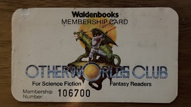
Yep that all sounds familiar. My college summer job was at Waldenbooks. Great memories!
I hope you were a member of their sci-fi club and got your discount 🤪🤓
 
he left well after the notch. if I recall, he left just before they reversed his greatest monstrosity of all time—the butterfly keyboards—and I hypothesize that being a primary source for his departure. Macs have seen their best days since 2015 since he left, bringing his obsession with thinness and lack of connectivity with him.
Thanks for this note.

Ive may have been carried away sometimes with "form over function" and had some misses, but he's a better designer than the current Apple's ones. The things he made are a pleasure for the eyes: MacBook Air, iPod, early iPhones, EarPods.
I’m befuddled by the hate for the 14’s design when it is so reminiscent of the 4/5, which I’ve found to be many’s favorite designs in history. perhaps it’s the camera bump, perhaps it’s the notch (or DI on the Pros). who knows.
I think that's because what looks nice when it's small and has the right proportions, becomes ugly when it gets too large or has some disproportionate elements, like a notch or a camera array. Materials used and the combination of glossy/matter surfaces also matters. And Ive knew how to make it right.
 
  • Like
Reactions: phenste
Okay I agree with everything you said EXCEPT ‘SLIPPERY/FINGERPRINT MAGNET STAINLESS STEEL SIDES’


What in the HELL are you talking about? The stainless steel sides ARE EXTREMELY GRIPPY. Any other material Apple has used has been FAR FAR FAR MORE SLIPPERY.

The ****ing fingerprints DONT MEAN JACK ****. I care about GRIP NOT FINGERPRINTS.

I am specifically able to hold and use my phone without a case since the iPhone X THANKS TO THE GRIPPY STAINLESS STEEL SIDES.

If Apple changes them to matte titanium this year the phone will be a SLIPPERY PIECE OF ****ING GARBAGE.

The matte glass is far more slippery than the smooth glass of the iPhone X rear, but if they switch to matte metal it will be even that much slipperier.

I should be running everything Apple does. They just don’t think anymore
When you're right, you're right! I don't want slippery smooth matte sides. The aluminum sides of the iPhone 8 Plus was already a nightmare to handle, even with the sticky glossy back! With the SS sides, the fingers grip it like glue.

I've always hated the term 'fingerprint magnet'. We're human beings, we're going to leave fingerprints on EVERYTHING. Finger prints on glasses, windshield, mirrors, etc I understand. But something you're intentionally handling all day? C'mon lol
 
  • Like
Reactions: 9594864
When you're right, you're right! I don't want slippery smooth matte sides. The aluminum sides of the iPhone 8 Plus was already a nightmare to handle, even with the sticky glossy back! With the SS sides, the fingers grip it like glue.

I've always hated the term 'fingerprint magnet'. We're human beings, we're going to leave fingerprints on EVERYTHING. Finger prints on glasses, windshield, mirrors, etc I understand. But something you're intentionally handling all day? C'mon lol
Yeah exactly. And the really truly embarrassing and sad part is that most of the idiots who complain about the ‘fingerprint magnet’ put their phone immediately into a case and never take it out.

It’s like stupidity on a whole new level to complain about something you physically don’t touch.

I mean I touch it, but I don’t use a case and I love it because it offers grip.

A tip for the people who call of fingerprint magnets: try not wiping your hand across your greasy face or picking up your phone after you devour that glazed donut :) lol
 
This is all subjective, of course, but in my opinion, iOS 7 was an aesthetic disaster and the start of a long downward spiral of Apple's GUI design.

Unfortunately, today's iOS aesthetic is pretty much the same and hasn't evolved much visually in 10 years. We didn't need to go from leather stitching and linen to flat, cold, boring, jellyfish interfaces with tiny navigation arrows, vast blank spaces, and a poorly implemented Dark Mode that took years and years to release. A happy medium was in there somewhere. They continue to pile onto the iOS 7 foundation, but really, iOS needs a major design overhaul.

Sadly, Apple is doubling down and continuing to extend this design language and functionality to where it doesn't belong, in macOS. They are catering to the iPhone buying masses to cross and/or upsell other products. 'Look, it's like an iPhone or iPad but in a laptop, so now I know how to use it!'

I never thought I would see boring, flat, lazy, hard to decipher and uninspired tile icons, multi-click notifications with small navigation arrows and 'x' buttons, and small, monotone glyphs and icons in an iOS style system preferences, that all look a bit too similar, in macOS. But, here we are.

Having said that, I will take iOS and macOS over anything from Microsoft or Google. I just wish Apple would bring a bit more refinement, depth, subtle texture and personality back into their interfaces. Even adding something as simple as a fade-in and out effect as you navigate to different system setting windows, etc.

But, what the hell do I know, they're bringing in billions and sitting on a 30%+ profit margin, so catering to the masses, while not great for those of us who remember the days of Thinking Different, is good for their bottom line, for sure.
I agree that it is quite a mess. That's what I was getting at. But I will say this: iOS is so much better now than it was at the launch of iOS 7. They've made little refinements to iron out some of the more egregious design choices.

Interesting that you say that about macOS. The latest version of macOS that I used on my personal laptop was 10.12, so I can't comment extensively on current macOS. But from the outside looking in (seeing screenshots and looking at products in the Apple store), I think that macOS, as it stands today, is beautiful. I think that Apple needs to borrow from macOS and implement some of those design changes into iOS. It's "flat" without being totally flat.

You don't think Windows 11 looks good? I think Microsoft is killing it with the design of that OS. That is, until you poke around some of the settings and find certain apps that are still using their Windows 7 design. It's inconsistent, but forgivable. But I digress. :p
 
Yep that all sounds familiar. My college summer job was at Waldenbooks. Great memories!
I hope you were a member of their sci-fi club and got your discount 🤪🤓
Ahem…clears throat…

2023-02-13 12.40.53.jpg

At some point I had to watch them. They were pushing the newer book club and some employees had never heard about OtherWorlds. The newer book club had a lesser discount. I usually had to get managers involved.

EDIT: I have all my Xignals out in the garage somewhere…
 
Last edited:
  • Love
Reactions: fatTribble
But there was no way to add 3rd-party Notification Center widgets without jailbreaking, right? You could only add Apple’s built in ones.

Personally I don’t recall ever using NC widgets much. But what I really miss is the old full-screen Dashboard feature in macOS, which you could customize with whatever widgets and layout you wanted.

Dashboard was so easy with just one swipe to instantly see everything - no weird key combos, or scrolling and poking to find a widget. Most importantly, Dashboard widgets would stay in the same location so you could find them instantly.

The macOS Notification Center widgets are just so dinky and useless in comparison - I wish they would bring out a modern equivalent to the old macOS Dashboard, as a full screen that you can swipe to access just like the home/lock screen widgets on iOS.
You could add Apple's and any widgets that third party apps supported. For instance, there was a Twitter widget and a Facebook widget. You could respond to tweets/posts from the NC.

Jailbreaking gave you access to many more.
 
  • Like
Reactions: GeoStructural
Register on MacRumors! This sidebar will go away, and you'll see fewer ads.