Got a tip for us?
Let us know
Become a MacRumors Supporter for $50/year with no ads, ability to filter front page stories, and private forums.
Identify this font
- Thread starter Doctor Q
- Start date
-
- Tags
- discussions fonts
- Sort by reaction score
You are using an out of date browser. It may not display this or other websites correctly.
You should upgrade or use an alternative browser.
You should upgrade or use an alternative browser.
You missed one. There are four different typefaces there.I see three different typefaces there. Which one?
I see three fonts used.
I would say tell your client? to scrap that hand written font for something a little more legible like the following...
my2¢
Agree.
As for the font, I believe it is hand-lettered. Look at different instances of the same lowercase letter, and there are slight differences.
As for the font, I believe it is hand-lettered. Look at different instances of the same lowercase letter, and there are slight differences.
No, the repeated t, a and r are all the same. Definitely a font. Unfortunately, the tracking is so tight that Whatthefont is unable to pick up the individual characters for an ID.
Cheers
Jim
Last edited:
No, the repeated t, a and r are all the same. Definitely a font. Unfortunately, the tracking is so tight that Whatthefont is unable to pick up the individual characters for an ID.
Cheers
Jim
Well, the repeated "y" is not. So, no.
Sorry, I see slight differences even in the other repeated letters that would not be accounted for even if all three words in "Unleash your creativity" were different sizes, which they appear to be.
Well, the repeated "y" is not. So, no.
Because, of course, no font ever had alternate versions of some characters within its typeface.
I don't have time to overlay these in Photoshop to prove the point, but the downturn on the crossbar of the t in creativity is identical in both uses and in About Us. The capital U in Unleash is the same as in About Us, the r in your is the same as in creativity, it's just cut through by the flourish coming off the u in your.
I've set a lot of type over the years: this is a font.
Cheers
Jim
Congrats!
I have no idea why you think that's appropriate for a rolleyes in a font ID thread. Design, and type-based design in particular, has been my primary source of income for the bulk of my working life.
A couple of decades' hands-on typographic experience informs my opinion. If you want to offer a counter-argument, be my guest -- I'm open to being persuaded. If you're just going to snipe, well, that tells me all I need to know.
Cheers
Jim
Well, the repeated "y" is not. So, no.
Sorry, I see slight differences even in the other repeated letters that would not be accounted for even if all three words in "Unleash your creativity" were different sizes, which they appear to be.
The middle y has been amended post setting with the the crossing tail, if you lay the last y over the middle y you can see they fit together. I believe the differences are attributed from the differing strokes someone has put on this font, and the optical juxtaposition of Brown type white stroke Vs. White type black stroke. Obscure nasty font none the less!
Attachments
I have no idea why you think that's appropriate for a rolleyes in a font ID thread. Design, and type-based design in particular, has been my primary source of income for the bulk of my working life.
A couple of decades' hands-on typographic experience informs my opinion. If you want to offer a counter-argument, be my guest -- I'm open to being persuaded. If you're just going to snipe, well, that tells me all I need to know.
Your supposed background is not evident merely from your user name, and you trotted out the rolleyes first. That's pretty much why me using it is appropriate.
Anyway, are you still replying because you're waiting for me to say "you were right; I was wrong?" In all honestly, I figured that would be redundant at this point.
The middle y has been amended post setting with the the crossing tail, if you lay the last y over the middle y you can see they fit together. I believe the differences are attributed from the differing strokes someone has put on this font, and the optical juxtaposition of Brown type white stroke Vs. White type black stroke. Obscure nasty font none the less!
Quite right. Thank you.
Your supposed background is not evident merely from your user name,
But my long history of posting in the Design forum is easily accessible from my username.
and you trotted out the rolleyes first. That's pretty much why me using it is appropriate.
Not really, because I haven't said anything quite as roll-eye worthy as "Look, a variant character! It must be hand lettering!"
Anyway, are you still replying because you're waiting for me to say "you were right; I was wrong?" In all honestly, I figured that would be redundant at this point.
Well, yes, it's redundant now because you've obliquely conceded that this is a font and not hand-lettering, which you hadn't done at the time of my last reply. Since the OP was asking for a font ID, your response was distinctly unhelpful and, although I couldn't provide the ID, I wanted him to be sure that there was a font to be IDed.
Odd as it may seem, I wasn't trying to turn this into a d*ck-waving contest, I was trying to ascertain whether your opinion proceeded from some professional experience that gave it additional weight.
You may deploy further roll-eyes to your heart's content.
Jim
But my long history of posting in the Design forum is easily accessible from my username.
Which a) means sweet F.A. to me, and b) isn't something I vet every time I need to determine if somebody is doing something more than making the same guess I am.
Not really, because I haven't said anything quite as roll-eye worthy as "Look, a variant character! It must be hand lettering!"
What is eye-roll-worthy is pretty subjective. Clearly I thought I saw differences in the lowercase letters. That might come from bad eyes or a quicker read, but not some deficiency of experience. Or post history.
Since the OP was asking for a font ID, your response was distinctly unhelpful and, although I couldn't provide the ID, I wanted him to be sure that there was a font to be IDed.
Which is only undistinctly unehlpful?
Incidentally, I stripped the letters apart, re-arranged them in a new image with a generous spacing, and Whatthefont still couldn't identify the font.
The HTML source code available from the Authors Unleashed website also doesn't point to a font since it's all images as published to the web.
I agree, it's a font. But a hard-to-pin one based on the images available.
There. That may not be distinctly helpful, but it didn't take 20 years of "experience," either.
Thanks for all help guys. The reason I needed it was because my client wanted to use that same type face on his sister site.
Unfortunately, I don't recall the font's name and was hoping one of you had seen it before. It IS a font, I just forgot it.
Thanks again for all your input, maybe we'll find out one day...
Unfortunately, I don't recall the font's name and was hoping one of you had seen it before. It IS a font, I just forgot it.
Thanks again for all your input, maybe we'll find out one day...
Please Help - Urgent Non-profit need
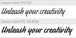
Can anyone identify this font?
http://www.spoki.lv/upload2/articles/52/523042/images/_origin_KONY-2012-2.jpg
I support Kony 2012.
Can anyone identify this font?
http://www.spoki.lv/upload2/articles/52/523042/images/_origin_KONY-2012-2.jpg
I support Kony 2012.
What font is used in the CS5 logo? I've tried some simple fonts that look like it, but none of them have the same width, or corners.


Hello,
Can anyone tell me what this font is ("the mallow")?
http://www.themallow.com.au/
There's also a PDF of their menu which uses the same font.
http://www.themallow.com.au/menu_dinner_271011_web.pdf
Can anyone tell me what this font is ("the mallow")?
http://www.themallow.com.au/
There's also a PDF of their menu which uses the same font.
http://www.themallow.com.au/menu_dinner_271011_web.pdf
Hello,
Can anyone tell me what this font is ("the mallow")?
http://www.themallow.com.au/
There's also a PDF of their menu which uses the same font.
http://www.themallow.com.au/menu_dinner_271011_web.pdf
It is ITC Clearface Black (and others in the family)
http://www.faces.co.uk/fonts/ITC/Clearface-Black-ITC001575113/index.cfm
Ah, thanks for that. Appreciate it.
It is ITC Clearface Black (and others in the family)
http://www.faces.co.uk/fonts/ITC/Clearface-Black-ITC001575113/index.cfm
Can anyone tell me what font this logo/band name is in image here.
The fonts are Caslon Bold & BoldItalic
"we are" = Caslon BoldItalic
"S" = Caslon BoldItalic Swash
"cientists" = Caslon Bold
The cut is not perfect (especially the italic), but this is close: http://www.linotype.com/164324/AdobeCaslonSemiboldItalic-product.html
Need some help. Looking for a pretty specific font quality. I need a capital K sans serif that's as long on the top arm as it is on the bottom. Something very near the Monacco K, but that fits the above description. The arms most also join in the exact center of the character and form at a 90' angle Anybody ever seen this? The K is one crazy letter for fonts. Who knew?


Last edited:
Register on MacRumors! This sidebar will go away, and you'll see fewer ads.


