Become a MacRumors Supporter for $50/year with no ads, ability to filter front page stories, and private forums.

Cryates

macrumors 68040
Original poster
Nov 19, 2013
3,341
5,283
at iOS users falling out of their chairs now that they can add widgets, change app icons, and just generally theme their phones how they want. It makes me laugh since this has been a thing on Android since the beginning, and after hearing all of these years that they didn't need those things.

I'm not at all looking to start an Android vs Apple war, ever. I saw the MR article on the front page, and I just needed to post/say this in (what I think is) a safe space.
 

jamezr

macrumors P6
Aug 7, 2011
16,072
19,067
US
Totally agree! also all the articles written everywhere about how great IOS widgets are! I am an iPhone user..buy a new iPhone every year as a lot of us are here in Alternative section. But IOS widgets need some time to evolve and catch up...


giphy.gif
 

Aneres11

macrumors 601
Oct 2, 2011
4,353
9,551
On my iPhone SE earlier I noticed that there was a Google widget. I LOVE the Google search bar on Android and probably use it multiple times a day.

The iOS widget is utterly dreadful. Looks terrible, and does nothing more than basically open the Google Now app. Was very disappointed.

The widgets look nice but I only use them as a way to make my phone feel and look different. They serve no other purpose other than the battery widget which is the only one I find useful.
 

Sikh

macrumors 6502a
Mar 8, 2011
548
320
... and after hearing all of these years that they didn't need those things

to be fair the users who said they didnt need the widgets aren't the ones excited. Its the normal/ non android vs apple war people that are enjoying the widgets. Let people enjoy what they want.

There are people that complain about one or the other platform or fanboy, ignore them.

As for iOS Widgets, I like that peter's design and implementation finally made it to iOS 5(?) years after he got hired. I also like the iOS Widgets for the simple fact that they dont suck battery life like some of my android widgets have before.

The widgets arent as advanced as android but they are good for what they are and fit the iOS look and feel really well. I'm sure as more third party devs jump on widgets are going to be hella more useful but all i cared about was battery, calendar and weather. I dont mind swiping left but not having to is kind of nice
 

drinkingtea

macrumors 65816
Jan 31, 2016
1,240
3,271
I love the design of iOS 14 widgets. Android widgets look so dated in comparison, IMO. A lot of them haven’t been updated in years, either. I’m really happy with my iOS 14 widgets.

People who are changing their icon look completely via Shortcuts will get tired of going through three layers of apps just to get to the app they selected. Not worth it.

I also noticed that a lot of the same iOS people who mock Android users for their ugly home screens have equally ugly home screens now. Lmao. Some of the stuff I see at r/iOSsetups is legitimately gaudy and horrifying.

Like, WTF: https://www.reddit.com/r/iOSsetups/comments/ixvtub
https://www.reddit.com/r/iOSsetups/comments/ixupj3
 
Last edited:
  • Like
Reactions: Sikh

Cryates

macrumors 68040
Original poster
Nov 19, 2013
3,341
5,283
Are you sure? Not even a skirmish? A limited engagement? A diplomatic incident? Nothing? Then I’m microwaving all that popcorn for nothing... 😂
Ha. Honestly it's pretty impossible not to, becasue I think a lot more iOS users browse this section of the forum than they would like to let on, but I actually meant this more in a light-hearted manner than anything else. Both are great OS's in their own ways, it's just funny to sit back and watch the collective minds be blown at this thing that has existed elsewhere for like 15 years.
 

drinkingtea

macrumors 65816
Jan 31, 2016
1,240
3,271
Ha. Honestly it's pretty impossible not to, becasue I think a lot more iOS users browse this section of the forum than they would like to let on, but I actually meant this more in a light-hearted manner than anything else. Both are great OS's in their own ways, it's just funny to sit back and watch the collective minds be blown at this thing that has existed elsewhere for like 15 years.
iOS widgets were even trending on Twitter at like #3 just a couple of days ago. Damn.
 
  • Like
Reactions: 5105973

Cryates

macrumors 68040
Original poster
Nov 19, 2013
3,341
5,283
The widgets arent as advanced as android but they are good for what they are and fit the iOS look and feel really well. I'm sure as more third party devs jump on widgets are going to be hella more useful but all i cared about was battery, calendar and weather. I dont mind swiping left but not having to is kind of nice
Widgets definitely have a great future on iOS, and I'm not even disregarding them with this post. I definitely think that since developers are working under strict parameters and an approval process by Apple, that will be good for mostly keeping the cohesive look of the OS intact.
I love the design of iOS 14 widgets. Android widgets look so dated in comparison, IMO. A lot of them haven’t been updated in years, either. I’m really happy with my iOS 14 widgets.
Basically my reply above applies to this as well. But I'll add on that I agree a lot of Android widgets do look dated (hell, I only use the Google search widget and stock weather widget on my home screen; I'm not even a widget user per se), but that could also be due to data suggesting far less users actually use widgets than we would like to believe.
 

slitherjef

macrumors 65816
Feb 8, 2012
1,402
1,189
Earth
I barely use widgets, think the only one I've used lately is the google one for weather. 🤨

Enjoy the widgets, Apple users... From an Android user *whispers* you don't have to use em if you don't want to 🤫 🙂
 

Cryates

macrumors 68040
Original poster
Nov 19, 2013
3,341
5,283
I barely use widgets, think the only one I've used lately is the google one for weather. 🤨

Enjoy the widgets, Apple users... From an Android user *whispers* you don't have to use em if you don't want to 🤫 🙂
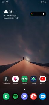
Back when I got my first Android phone many years ago (Droid X; Wow lol), I had every possible widget I could stuff in across like five home screen pages and thought it was the coolest thing ever. I was tired of just having all of these icons on black wallpaper with my iPhone. Then at some point I realized I was just pressing the app icons anyhow so like, what's the point? What's missing for me though on iOS in that regard is the app drawer (and don't get me started on the App Library in iOS 14), because I like a clean home screen with only a few icons of frequently used apps, but quick access via the drawer. It's just how I use my phone these days.

Basically I want this option on iOS for the home screen, but NO says Apple.

Screenshot_20200922-211621_One UI Home.jpg
 

drinkingtea

macrumors 65816
Jan 31, 2016
1,240
3,271
Back when I got my first Android phone many years ago (Droid X; Wow lol), I had every possible widget I could stuff in across like five home screen pages and thought it was the coolest thing ever. I was tired of just having all of these icons on black wallpaper with my iPhone. Then at some point I realized I was just pressing the app icons anyhow so like, what's the point? What's missing for me though on iOS in that regard is the app drawer (and don't get me started on the App Library in iOS 14), because I like a clean home screen with only a few icons of frequently used apps, but quick access via the drawer. It's just how I use my phone these days.

Basically I want this option on iOS for the home screen, but NO says Apple.

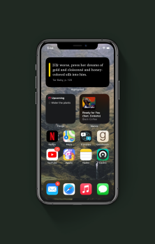
View attachment 957792
I agree. Very clean.

Mine currently. I normally don’t like such busy home screens, but I’m attached to these widgets.
 

Attachments

  • A70A27E3-E6F9-4A15-8107-8A24DA03921C.png
    A70A27E3-E6F9-4A15-8107-8A24DA03921C.png
    1.7 MB · Views: 284
  • Like
Reactions: 5105973 and Cryates

ian87w

macrumors G3
Feb 22, 2020
8,704
12,638
Indonesia
Agree that widgets are old news for us Android users, but at the same time, widgets on Android is stagnant. Even today, many widgets from the top developers and Google themselves don't even have consistent sizes and measurements. Eg My Spotify widget looks so off at the home screen. It's all over the place, and don't see them being better from the beginning days.

Meanwhile on iOS with its restrictions, typical Apple, the widgets look more like Windows Phone tiles with curved corners. The result is a much cleaner feel and consistencies. Even on some of the messy screens that people did, at least everything is aligned.
 

jamezr

macrumors P6
Aug 7, 2011
16,072
19,067
US
Agree that widgets are old news for us Android users, but at the same time, widgets on Android is stagnant. Even today, many widgets from the top developers and Google themselves don't even have consistent sizes and measurements. Eg My Spotify widget looks so off at the home screen. It's all over the place, and don't see them being better from the beginning days.

Meanwhile on iOS with its restrictions, typical Apple, the widgets look more like Windows Phone tiles with curved corners. The result is a much cleaner feel and consistencies. Even on some of the messy screens that people did, at least everything is aligned.
I don't think widgets on Android have become stale...they have become part of the norm....big difference.

We have come to expect great widgets on Android because we have had them for so long.
IOS users are just getting them now and there is a lot of buzz around it. But they are still in the early stages.

Wait til they get themes...and custom icons system wide along with custom sounds and notifications.
They are just scratching the surface...
 

throAU

macrumors G3
Feb 13, 2012
9,204
7,354
Perth, Western Australia
at iOS users falling out of their chairs now that they can add widgets, change app icons, and just generally theme their phones how they want. It makes me laugh since this has been a thing on Android since the beginning, and after hearing all of these years that they didn't need those things.

I'm not at all looking to start an Android vs Apple war, ever. I saw the MR article on the front page, and I just needed to post/say this in (what I think is) a safe space.

And I'm having a good chuckle at android users

never mind relying on services delivered by an advertising company who's entire business model is predicated on owning your data.
 
  • Like
Reactions: Sikh

tbayrgs

macrumors 604
Jul 5, 2009
7,467
5,097
On my iPhone SE earlier I noticed that there was a Google widget. I LOVE the Google search bar on Android and probably use it multiple times a day.

The iOS widget is utterly dreadful. Looks terrible, and does nothing more than basically open the Google Now app. Was very disappointed.

The widgets look nice but I only use them as a way to make my phone feel and look different. They serve no other purpose other than the battery widget which is the only one I find useful.

Design preferences are certainly subjective but as far a functionality of the Google widget, how are they different between the two platforms? If anything, the Google widget on iOS offers more functionality than its counterpart on Android. Tapping the search field opens Google search in both widgets. On the iOS version, you also have the added option to go directly into Google Lens or straight into Incognito mode. Google doesn’t make an Android widget equivalent for their own platform.


IMG_0445.png

I also find it a bit amusing that these are two recent articles that were found on the front page of Android Central:

How to get iOS 14-style widgets on your Android phone right now

iOS 14 widgets make Android's look like an absolute embarrassment

And to be clear, I‘m not a big fan of the changes Apple has made to iOS widgets. The previous versions offered much more functionality—why not just allow those on the home pages instead of only on the left side panel? But look at how quickly widgets are being implemented by developers on iOS in just a week. If this was a new feature on Android, this level of change would take months, if not years.
 

Natzoo

macrumors 68020
Sep 16, 2014
2,016
646
at iOS users falling out of their chairs now that they can add widgets, change app icons, and just generally theme their phones how they want. It makes me laugh since this has been a thing on Android since the beginning, and after hearing all of these years that they didn't need those things.

I'm not at all looking to start an Android vs Apple war, ever. I saw the MR article on the front page, and I just needed to post/say this in (what I think is) a safe space.
One thing that annoys me is that you cant place widgets on the bottom row of apps, its either in between or on top. Ehh never a fan of the widgets, just updated to not have the call screen take up the whole page... took them long enough.
 
  • Like
Reactions: 5105973 and Cryates

Cryates

macrumors 68040
Original poster
Nov 19, 2013
3,341
5,283
To be fair, both of those articles were written by the same person, though they're admittedly still a pretty embarrassing headlines for Android. Not everyone is going to share that opinion either, and that writer clearly seems to be in love with the implementation in iOS, and that's totally fine.

That doesn't mean there are not faults with the implementation as a whole though, regardless of taste preferences. Non-resizable widgets is almost a non-starter in itself. My wife is furious over that actually, ha. She was messing with them on day one, and in her head she had to map out how she wanted her entire screen laid out then do everything one-by-one in order, and that's mainly because everything snaps in single file line on the grid they have set. Interaction with widgets will come in future software versions I'm sure, but is still a pretty large hindrance for the time being. On the topic of taste preferences, I'm obsessed with displaying beautiful wallpaper on all of my devices, and I lean towards transparency options for widgets, always, which will very likely never be an option on iOS to keep the cohesive look alive. I completely understand that, it's just not my cup of tea per se.
 

drinkingtea

macrumors 65816
Jan 31, 2016
1,240
3,271
Design preferences are certainly subjective but as far a functionality of the Google widget, how are they different between the two platforms? If anything, the Google widget on iOS offers more functionality than its counterpart on Android. Tapping the search field opens Google search in both widgets. On the iOS version, you also have the added option to go directly into Google Lens or straight into Incognito mode. Google doesn’t make an Android widget equivalent for their own platform.


View attachment 957833

I also find it a bit amusing that these are two recent articles that were found on the front page of Android Central:

How to get iOS 14-style widgets on your Android phone right now

iOS 14 widgets make Android's look like an absolute embarrassment

And to be clear, I‘m not a big fan of the changes Apple has made to iOS widgets. The previous versions offered much more functionality—why not just allow those on the home pages instead of only on the left side panel? But look at how quickly widgets are being implemented by developers on iOS in just a week. If this was a new feature on Android, this level of change would take months, if not years.
I agree with everything you’ve said. Android widgets are just awful. A lot of my iOS apps have already been updated with useful, beautiful widgets. You never see such initiative from Android developers. I never used widgets when I had an Android—I use a lot of them on my iPhone. Speaks volumes, TBH.
 

jamezr

macrumors P6
Aug 7, 2011
16,072
19,067
US
Design preferences are certainly subjective but as far a functionality of the Google widget, how are they different between the two platforms? If anything, the Google widget on iOS offers more functionality than its counterpart on Android. Tapping the search field opens Google search in both widgets. On the iOS version, you also have the added option to go directly into Google Lens or straight into Incognito mode. Google doesn’t make an Android widget equivalent for their own platform.


View attachment 957833

I also find it a bit amusing that these are two recent articles that were found on the front page of Android Central:

How to get iOS 14-style widgets on your Android phone right now

iOS 14 widgets make Android's look like an absolute embarrassment

And to be clear, I‘m not a big fan of the changes Apple has made to iOS widgets. The previous versions offered much more functionality—why not just allow those on the home pages instead of only on the left side panel? But look at how quickly widgets are being implemented by developers on iOS in just a week. If this was a new feature on Android, this level of change would take months, if not years.
Lol...so the article were on AC and that means something? Should we post articles from Apple sites criticizing IOS?
I find it amusing Apples own weather widget is not as good as third party apps.....I mean it's their app and widget I guess that criticism swings both ways.

Then resize IOS widgets and arrange them wherever you want them....oh yeah...you can't
 
Last edited:

Cryates

macrumors 68040
Original poster
Nov 19, 2013
3,341
5,283
The more I think about iOS widgets, and how they implemented them, the more I think my frustration is with the requirement that they be placed in a specific order with no layout customization given to the end user. As in, if I don't want any icons on my main page but my weather on the top right, it's not do-able. It's going to default to the top left. Or if I want the weather widget in top left, google search widget in the top right, then one row of frequently used app icons just above my dock, I can't do it. If I could do that, and have my App Library be on the second page sorted how I want, I'd be much happier with iOS. Can't tell you how crazy it drives me when I see family or pet photos covered up by icons, and it's going to be even worse with widgets, ha. Those are the little things that just drive me crazy mad about iOS these days. And I know all of that is just a personal taste thing but it's something they need to consider.
 
Register on MacRumors! This sidebar will go away, and you'll see fewer ads.