Become a MacRumors Supporter for $50/year with no ads, ability to filter front page stories, and private forums.

cobbyco

macrumors 6502a
Aug 6, 2012
740
91
Very interesting: it seem's Apple are allowing apps to show an "alternative" app icon. They aren't dynamic like the Clock app icon, but developers can bundle in any number of alternative app icons to be shown on the homescreen. It also seems to be supported on tvOS. If you're a developer you can read up on them below:

https://developer.apple.com/reference/uikit/uiapplication/2806815-supportsalternateicons
https://developer.apple.com/reference/uikit/uiapplication/2806808-alternateiconname
https://developer.apple.com/reference/uikit/uiapplication/2806818-setalternateiconname
 
Last edited:
  • Like
Reactions: pmostoff

zorinlynx

macrumors G3
May 31, 2007
8,351
18,577
Florida, USA
Very interesting: it seem's Apple are allowing apps to show an "alternative" app icon. They aren't dynamic like the Clock app icon, but developers can bundle in any number of alternative app icons to be shown on the homescreen. It also seems to support tvOS. If you're a developer you can read up on them below:

https://developer.apple.com/reference/uikit/uiapplication/2806815-supportsalternateicons
https://developer.apple.com/reference/uikit/uiapplication/2806808-alternateiconname
https://developer.apple.com/reference/uikit/uiapplication/2806818-setalternateiconname

Hm, I wonder how flexible this will be?

It would be neat, for example, for a weather app's icon to show thunderclouds when it's raining, or just a sun and blue sky when it's clear out.

Anyone else think it would be awesome if Apple would knock it off with the yearly "big" updates, and just do incremental changes throughout the year like this?
 

Knowlege Bomb

macrumors G4
Feb 14, 2008
10,280
8,961
US
Very interesting: it seem's Apple are allowing apps to show an "alternative" app icon. They aren't dynamic like the Clock app icon, but developers can bundle in any number of alternative app icons to be shown on the homescreen. It also seems to support tvOS. If you're a developer you can read up on them below:

https://developer.apple.com/reference/uikit/uiapplication/2806815-supportsalternateicons
https://developer.apple.com/reference/uikit/uiapplication/2806808-alternateiconname
https://developer.apple.com/reference/uikit/uiapplication/2806818-setalternateiconname
This is a welcome change. Sucks when you find a great wallpaper and one or two app icons clash with it.
 

cobbyco

macrumors 6502a
Aug 6, 2012
740
91
This is a welcome change. Sucks when you find a great wallpaper and one or two app icons clash with it.

The change in icon is determined by the app, not the user. Most of the time I'd expect the icon change to be automatic and non customisable, but some developers may make it a user choice within the app which app icon is shown.
 

Solver

macrumors 65816
Jan 6, 2004
1,230
3,205
USA
A likely an iOS 10.3 bug...
Locating my Apple Watch with "Find my iPhone" works fine, but on my iPhone under Settings/"person's name" (new in iOS 10.3 and at the top)/"person's" Apple Watch, the status for, "Find My Watch" is set "off."
 
  • Like
Reactions: ad931

sbailey4

macrumors 601
Dec 5, 2011
4,571
3,253
USA
Installed on iPad mini 4 and I happen to love the iCloud section. Its super nice place for all that to reside. Not sure how it will be on iPhone but for iPad I like it!
 
  • Like
Reactions: VSMacOne

Antoni Nygaard

macrumors 6502a
Jun 23, 2009
802
895
Denmark
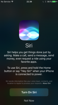
If you haven't turned on Siri yet and press the home button to activate Siri you will be presented with this screen
 

Attachments

  • IMG_0003.PNG
    IMG_0003.PNG
    383.2 KB · Views: 463
  • Like
Reactions: jojost1

campyguy

macrumors 68040
Mar 21, 2014
3,413
957
Just noticed that the "unread" indicator in the Mail app is a number in a blue dot, instead of the number embedded in parenthesis and the name of the mailbox/folder is no longer in the header.
 

dadiduekappa

macrumors regular
Mar 15, 2013
243
100
Naples - Italy
I like the new multitasking animation with the apps that seems to bump from bottom to the middle of the screen. Do you notice it? I will add to first page.
 

jojost1

macrumors member
Oct 18, 2014
48
15
Just noticed that the "unread" indicator in the Mail app is a number in a blue dot, instead of the number embedded in parenthesis and the name of the mailbox/folder is no longer in the header.
Screenshot? (-:
 
Register on MacRumors! This sidebar will go away, and you'll see fewer ads.