iOS 1-3 Same Design
iOS 4-6 Same Design (New dock)
iOS 7-9 Same Design (Complete overhaul)
iOS 10-12 Same Design (New interfaces, see below)
iOS 7 is “same design?” Really?
iOS 1-3 Same Design
iOS 4-6 Same Design (New dock)
iOS 7-9 Same Design (Complete overhaul)
iOS 10-12 Same Design (New interfaces, see below)
Eh what?
Reread my posted. iOS 7-9 is the same design.You consider ios7 to be the same design as ios6 or - possibly my mistake here - are you speaking only about the dock?
Reread my posted. iOS 7-9 is the same design.
It's not about be dock, it's about iOS 7 through 9 being of the same overall design among themselves (just like iOS 4 through 6 were of the same overall design between themselves).Yes I get it now. I thought you were saying essentially that iOS 7-9 were the same as ios6, etc. But you were speaking only about the dock while I mistakenly thought you were speaking about the iOS in its entirety. My apologies for mis-interpreting.
Still not what I'm saying. Read the parenthesis for the changes I am referring to for those 3 versions of iOS. iOS 7-9 had the overhaul design that changed in iOS 7. Changes were not made until iOS 10 from that design.Yes I get it now. I thought you were saying essentially that iOS 7-9 were the same as ios6, etc. But you were speaking only about the dock while I mistakenly thought you were speaking about the iOS in its entirety. My apologies for mis-interpreting.
Still not what I'm saying. Read the parenthesis for the changes I am referring to for those 3 versions of iOS. iOS 7-9 had the overhaul design that changed in iOS 7. Changes were not made until iOS 10 from that design.
It's not about be dock, it's about iOS 7 through 9 being of the same overall design among themselves (just like iOS 4 through 6 were of the same overall design between themselves).
Its to keep uniformity. Not all Mac icons are round. Only a few are. Most are squared/rectangular.I don't understand why Apple doesn't come out with round icons like they have on the computers. The iPhone should be able to have rounded icons it would look really nice.
It would be nice if all were round. I don't want to jailbreak my phone just to have that feature.Its to keep uniformity. Not all Mac icons are round. Only a few are. Most are squared/rectangular.
I don't understand why Apple doesn't come out with round icons like they have on the computers. The iPhone should be able to have rounded icons it would look really nice.
iOS7's changing to round contact photos and round phone dialer buttons was as absurd to my iOS experience then as it is now;
Completely agree. When iOS 7 started using a stupid little circle of a contact photo for incoming calls instead of the full screen image was an idiotic design choice.
Love the design of iOS, don’t understand why it comes in for so much criticism on that front, I really think it looks wonderful.
Now only if it worked properly...
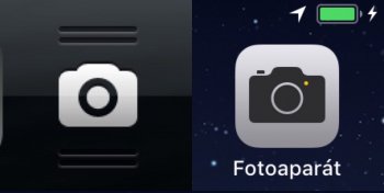
I just realized today that the new iOS 11 camera icon is also heavily inspired by iOS 6.Jony just had to be different with iOS 7. As time has proved, iOS7's UI fixed nothing broken in iOS6's UI. It was just different.
Same for going to five circles for signal strength in iOS 7 - used more space to show the same information in a more difficult way (I'd frequently have difficulty discerning which circles were filled in), whereas the previous method used bars of varying heights which displayed the info much quicker and more intuitively.
Dumb dumb dumb. But luckily someone is fixing the wrongs and slowly working back towards pre-iOS7, whereas the signal bars are currently back to what they should have stayed at.

I just realized today that the new iOS 11 camera icon is also heavily inspired by iOS 6.View attachment 738769
Those little circles were actually first introduced to Steve Jobs by Johnny Ive when the first iPhone was in the making. He was against that design and didnt like. And guess when those dots came to the iOS, one year after his death and after departure of Scott Fortall. And now we are back to bars. Ever since Scott Forstall left apple the iOS dev team has been more or less lost without clear vision for the iOS. It's becoming bigger and bigger mess with more and more bugs, while losing its simplicity and becoming more and more difficult for people, that bought iPhone for the sole reason of its simplicity.Completely agree. When iOS 7 started using a stupid little circle of a contact photo for incoming calls instead of the full screen image was an idiotic design choice.
For some reason the circle has stayed with other apps for no apparent reason other than it's not a square or rectangle.
And since type doesn't wrap around circles in the UI they take up just as much layout space with less information.
Great design choice.
I don’t know about you, but I definitely like the new icon better than the obe from iOS 7-10. The original icon was the best though.Yeah, they decided to remove two lines on the top and bottom of the lens of the iOS 7-10 icon.
Either this is another instance of 'change for the sake of change', or perhaps they're admitting that they 'overdesigned' the previous version of the icon... Who knows?

