now you can press remind me later while a call is incoming and continue use phone while still calls 
Got a tip for us?
Let us know
Become a MacRumors Supporter for $50/year with no ads, ability to filter front page stories, and private forums.
You are using an out of date browser. It may not display this or other websites correctly.
You should upgrade or use an alternative browser.
You should upgrade or use an alternative browser.
- Status
- The first post of this thread is a WikiPost and can be edited by anyone with the appropiate permissions. Your edits will be public.
With increased contrast turned on, my text bubbles in messages are darker shades of blue or green.Maybe I'm crazy but something looks a bit different with the colors. Nothing bad mind you, but I feel maybe the colors are darker everywhere, like on weather app, settings icons, imessage, etc.
Subtle touch but the Location icon in the status bar got updated.
What’s the difference?
I'm getting this on my 7 plus too and I have to say I'm not really a fan of it. It vibrates when I use touch ID to authenticate into apps too.Weird. Tried a restart and it's still happening. Looking for a setting but haven't turned one up yet.
Redesigned search in app store.
Just noticed the text size now matches the text size set for the device. If you increase the text size in Settings, it shows as such in App Store search.
Rounded corners I thinkWhat’s the difference?
It’s a bug, also message not work. Or they are changing something, it’s very bad that you can’t use your phone if you don’t want to answer and you don’t want to reject the call.now you can press remind me later while a call is incoming and continue use phone while still calls
I think it will be great if the authors here can do a video or article (preferably) on how to read the new battery information. Thanks.
[doublepost=1529440462][/doublepost]
[doublepost=1529440462][/doublepost]
Nice catch. I am in love with iOS again, can only imagine how stable the final version will be.Just noticed the text size now matches the text size set for the device. If you increase the text size in Settings, it shows as such in App Store search.
Not having any problem with Exchange.My work exchange email is still broken. Push works for a few minutes and then stops working. Tried removing and adding my account but no go.
Declined calls are non-intrusive now and it continues to ring in background and you can use the device when you decline a call and it doesn’t send them to voicemail so they won’t know you declined the call
Attachments
I had the same on a 5SE. You just need to reseat the SIM from you phone. Then the new unlock screen appears.Sim lock screen doesn’t appear after reboot on my iPhone X...
anyone else ?
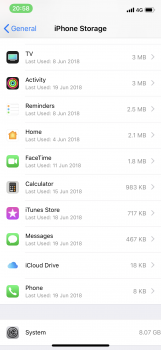
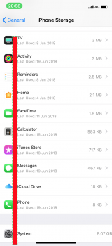
He meant from the right side where you see the stroage used
Is haptic feedback when unlocking with TouchID new?
Please report this in Feedback. I did earlier...but I really want this to go away!
He meant from the right side where you see the stroage used
Doh. Yep, thanks. Seems to be because it's not drillable but it definitely doesn't look right, smooshed right up to edge of the screen. Looks even worse on device than it does in a screenshot.
Try re-install profile as suggested above, restart phone etc.
Thanks man!
Is haptic feedback when unlocking with TouchID new?
Definitely new and doesn’t seem like there’s a way to turn it off...
I'm not sure this is a "thing". It looks to me like the icon is centered on the 1 or 2 line name/description. Look at iCloud Drive (the only other item with a single line of text) ... although the iCloud icon is smaller than the Settings icon, both appear to be centered between the icon and the description.
I never spotted it at first either but it seems the poster was referencing the alignment of the text on the right. The size is pushed all the way to the right. There should be some margin there, even without the arrow. It looks butt ugly if you have a look on your own device.
Twitter is working fine on my iPad, but a no go on the iPhone.grrrrrr. Still can’t login to Twitter.
Definitely new and doesn’t seem like there’s a way to turn it off...
Not everyone is experiencing it, even on the same device types. Seems like it's either a bug* or A/B testing (and I can't remember Apple ever doing A/B in a beta)
* Now, is the bug being experienced by those who are getting vibration, or those who aren't? That's the interesting question
Register on MacRumors! This sidebar will go away, and you'll see fewer ads.


