Become a MacRumors Supporter for $50/year with no ads, ability to filter front page stories, and private forums.

JokerPower

macrumors regular
Aug 12, 2017
169
187
According to the WWDC promotional ads, we will have a dark mode with neon style.

What I would like to see in the new version:

- Picture in Picture. It will be nice watching video on YouTube in the background while at the same time doing other stuff
- Redesigned incoming call window. When someone calls me, this nasty window interrupts the activity I'm doing. Very annoying. Android is much better in this regard
- Faster animations and overall performance. While iOS 12 delivered improved performance, I believe there is still room for improvements (especially cold app launching)
- Redesigned volume HUD, it just looks outdated..

To be honest, I would like to see a return to skeuomorphism design. I think it was aesthetically more pleasant.
 
Last edited:

ediks

macrumors 6502
Nov 17, 2015
452
808
According to the WWDC promotional ads, we will have a dark mode with neon style.

What I would like to see in the new version:

- Picture in Picture. It will be nice watching video on YouTube in the background while at the same time doing other stuff
- Redesigned incoming call window. When someone calls me, this nasty window interrupts the activity I'm doing. Very annoying. Android is much better in this regard
- Faster animations and overall performance. While iOS 12 delivered improved performance, I believe there is still room for improvements (especially cold app launching)
- Redesigned volume HUD, it just looks outdated..

To be honest, I would like to see a return to skeuomorphism design. I think it was aesthetically more pleasant.
the best request so far, hope we´ll see all of it tomorrow
 
  • Like
Reactions: f12003_ga

Natya Sadella

Suspended
Jun 20, 2016
833
679
Hell nah. Please just a instagram status bar style. Thats no better.
 

Attachments

  • 0BFCDC04-1D50-43C2-A13F-26E3CC8CE5C3.jpeg
    0BFCDC04-1D50-43C2-A13F-26E3CC8CE5C3.jpeg
    570.8 KB · Views: 342
  • Like
Reactions: iModFrenzy

dannyyankou

macrumors G5
Mar 2, 2012
13,806
29,777
Westchester, NY
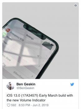
That volume HUD looks very fake

Does this guy have any prior reputation with leaks? I feel like he's saying he doesn't think it's the final design so he looks legit when he ends up being wrong.
 

gwhizkids

macrumors G5
Jun 21, 2013
13,267
21,425
That volume HUD looks very fake

Does this guy have any prior reputation with leaks? I feel like he's saying he doesn't think it's the final design so he looks legit when he ends up being wrong.

Stephen Troughton-Smith, while not confirming the screenshot - says the build number is consistent with an iOS 13 build.
 

gwhizkids

macrumors G5
Jun 21, 2013
13,267
21,425
Well that’s a sack of

Christ, my dog could have done a better job!

LOL. Don’t lose hope yet. If legit, that was a very early build. It may be much better now. And, if not, we all need to submit feature requests as early and as often as possible. They do fix things in later builds.
 
  • Like
Reactions: StumpyBloke

nortonandreev

macrumors 68030
Jan 11, 2016
2,870
4,215
Europe
That volume HUD looks very fake

Does this guy have any prior reputation with leaks? I feel like he's saying he doesn't think it's the final design so he looks legit when he ends up being wrong.
It honestly looks so bad haha. Hopefully they've changed it.
 

dannyyankou

macrumors G5
Mar 2, 2012
13,806
29,777
Westchester, NY
My favorite volume HUD has to be the one in the Apollo app.
I’m not sure if anyone brought this up yet, but 9to5Mac is reporting that it will be smaller than the leaked one and located on the left side of the notch. This tells me they went with this design. I hope.
 

AppleFan91

macrumors 68000
Sep 11, 2012
1,813
3,827
Indy, US
I’m not sure if anyone brought this up yet, but 9to5Mac is reporting that it will be smaller than the leaked one and located on the left side of the notch. This tells me they went with this design. I hope.

Yep. I have a feeling it will fade out the time and be housed right where the time is. Obviously when not invoked, the time returns
 
Register on MacRumors! This sidebar will go away, and you'll see fewer ads.