I'm surprised no one mentioned it yet, but I'd like the option to disable drag & drop on iPad. I never use it and it just gets annoying when it activates accidentally when I'm scrolling through apps like YouTube or Twitter.
Got a tip for us?
Let us know
Become a MacRumors Supporter for $50/year with no ads, ability to filter front page stories, and private forums.
All Devices iOS 13 Speculation Thread [Merged]
- Thread starter Ebok
- Start date
- Sort by reaction score
You are using an out of date browser. It may not display this or other websites correctly.
You should upgrade or use an alternative browser.
You should upgrade or use an alternative browser.
I've got a few wishes yet more over uniformity and stability:
1. Collapsable Sections! This is very usable in many areas and in core apps / functions in iOS.
1a > Music:
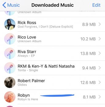
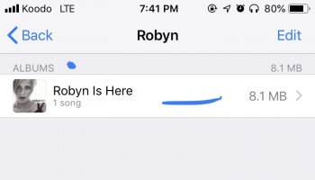
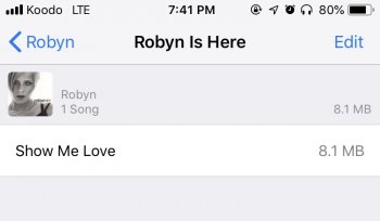
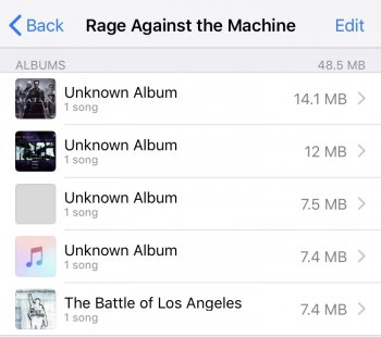
In iOS Settings > Music > Downloaded Music section ... for some reason when you're looking at an Artist > Album > Song. Seems very tedious and wasteful for a database to be organized this way just for 1 artist and 1 song.
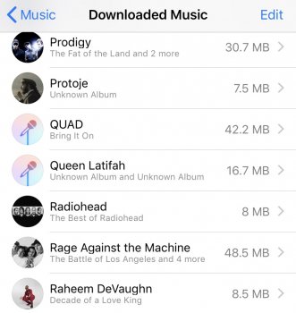
You can tell it gets VERY messy with multiple albums and 1 track.
2. Mail !!!!
Apple, please for GODSAKES enable collapsable folders man. This rubber banding scrolling takes a lot of energy over time and is getting old. it was cool in 2007 - 2011 ... this is 2019 give us something better please.
3. Macrumors (@MacRumors)
- Why is it 3D Touch on any Macrumors article or forums post messed up?!
Example I want to select the words "enable collapsable folders" in the paragraph above on my iPhone 8. When I try selecting using my fingers the entire paragraph is selected after dragging over the 2nd word. Same if I double tap the first word and drag. Also the same if I use 3D Touch.
What gives?
there are other unification issues in iOS when using features / functions.
[doublepost=1549334103][/doublepost]
FRAK NO! NO NO NO! Tiles? Garbage ... if Microsoft actually poled ALL Windows 10 users of Enterprise, Professional, Home ... then I can pretty much bet over 90% would LOVE the Tile to be a thing of the past even to get classic mode back!
Tiles ... no ... just for you is fine.
'Just Look at the Google Photos, Google Drive'.
Photos - is just lots of storage and compression ... and I agree Apple should not be monitoring this as much cheaper solutions are elsewhere and users are switching. Some are lazy and just done want other bills. Overall though ... privacy and dating mining (and awareness) is making the biggest user changes.
Drive ..
you do realize Apple was the first at this right? They've had this since MobileMe ... Google was far behind only accessible in Gmail originally. Apple got it right with sync with Mac's and soon after with iPhones or via browser. Again privacy and data mining awareness takes a HUGE role here.
Well seems like you enjoy Google's offerings ... probably best to enjoy their products and services then. Personally I'm nobody's to bleed on the street ... my data and privacy is my-own. Sure I screw up here and there but it's mine to own. Not that I have something to hide ... it's just I have nothing I want THEM to see .. not without my choice. And especially if I'm not being PAID for it. Nobody's price is $0 or free, and nobody's should be at any set dolla, here me holla? Yet if Google is monitoring your data they should be paying you ... it's your rights not theres.
1. Collapsable Sections! This is very usable in many areas and in core apps / functions in iOS.
1a > Music:
In iOS Settings > Music > Downloaded Music section ... for some reason when you're looking at an Artist > Album > Song. Seems very tedious and wasteful for a database to be organized this way just for 1 artist and 1 song.
You can tell it gets VERY messy with multiple albums and 1 track.
2. Mail !!!!
Apple, please for GODSAKES enable collapsable folders man. This rubber banding scrolling takes a lot of energy over time and is getting old. it was cool in 2007 - 2011 ... this is 2019 give us something better please.
3. Macrumors (@MacRumors)
- Why is it 3D Touch on any Macrumors article or forums post messed up?!
Example I want to select the words "enable collapsable folders" in the paragraph above on my iPhone 8. When I try selecting using my fingers the entire paragraph is selected after dragging over the 2nd word. Same if I double tap the first word and drag. Also the same if I use 3D Touch.
What gives?
there are other unification issues in iOS when using features / functions.
[doublepost=1549334103][/doublepost]
-Do something similiar to windows phone live tiles (make some adjustments from it)
FRAK NO! NO NO NO! Tiles? Garbage ... if Microsoft actually poled ALL Windows 10 users of Enterprise, Professional, Home ... then I can pretty much bet over 90% would LOVE the Tile to be a thing of the past even to get classic mode back!
Tiles ... no ... just for you is fine.
'Just Look at the Google Photos, Google Drive'.
Photos - is just lots of storage and compression ... and I agree Apple should not be monitoring this as much cheaper solutions are elsewhere and users are switching. Some are lazy and just done want other bills. Overall though ... privacy and dating mining (and awareness) is making the biggest user changes.
Drive ..
you do realize Apple was the first at this right? They've had this since MobileMe ... Google was far behind only accessible in Gmail originally. Apple got it right with sync with Mac's and soon after with iPhones or via browser. Again privacy and data mining awareness takes a HUGE role here.
Well seems like you enjoy Google's offerings ... probably best to enjoy their products and services then. Personally I'm nobody's to bleed on the street ... my data and privacy is my-own. Sure I screw up here and there but it's mine to own. Not that I have something to hide ... it's just I have nothing I want THEM to see .. not without my choice. And especially if I'm not being PAID for it. Nobody's price is $0 or free, and nobody's should be at any set dolla, here me holla? Yet if Google is monitoring your data they should be paying you ... it's your rights not theres.
Attachments
-
 6DDEE2A2-D790-496F-9A71-2541E47FCFE6.jpeg108.2 KB · Views: 210
 -
 6B8F46E5-5021-4BFF-A308-BBF21A73B803.jpeg43.2 KB · Views: 206
 -
 0C10435B-CE6B-4F6D-8DB9-D914C76542F6.jpeg44.4 KB · Views: 190
 -
 F3C1854A-F9DD-48F2-9D7D-AB6AA0BF23BA.jpeg122 KB · Views: 209
 -
 6DF3AEDF-CC49-427C-8354-6A17345EE69F.jpeg93.5 KB · Views: 208
Last edited:
I can’t believe I’m saying this... I like the Memoji feature. It would be cool in iOS 13 if it automatically generated a Memoji instead of having to manually choose every feature.
Well, Even the iPhone 7 will only get 19/100 Features while the iPhone 8 will only get 40/100 Features. I don't know. The problem with the iPhone 6S and below is:Sounds like there is a change to the UI planned. Hard to say what that would look like though. Perhaps we’ll finally see an update to the grid of icons that has been around since the beginning of iOS? Probably better optimization for X type devices.
As far as device support goes it will probably be A8 devices and newer (i.e. iPhone 5s and iPads Air, Mini 2 and Mini 3 dropped). Slight chance that they might drop the 6/6+ and iPod Touch 6 too (i.e. only support devices with 2 GB or ram or more) but I doubt it will go that far.
1. iPhone 6S/6 and below are STILL DUAL CORE JUST LIKE the iPhone 4S
2. Weak Battery.
3. Lacks 300Mbit on 4G
4. Newer iPhone has at least QUAD CORE, even some has Hexa Core.
5. Lacks HEVC Encoding
6. Battery Problems even after a battery replacement (it will still drain on iOS 12) just like the iPhone 4S on iOS 9) A9 and below is not as eco-friendly and power efficient.
It seems like iOS 13 would be like the next iOS 10 in terms of Hardware requirements, and the next iOS 7 (for redesigned of icons, and so on) iOS 13 probably would require more cores than just Ram (Extra ram of iPad 3 ignored by iOS 10 even it has the same ram as iPhone 6, it actually requires latest cpu and gpu)
I do hope that iPhone 6S will get iOS 13, but i think it is the same story as iPhone 4 which not get iOS 8 since it lacks one Extra core from the 4S. 4S has dual core vs single core on 4 so the iOS 7 is the last update for iPhone 4 (same ram as iPhone 4S. Even though they perform similarly on iOS 6, until extra core of 4S fully activated on iOS 7. Same story on iPhone 7 and 6S for sure, once iOS 13 comes it will now requiring more CORES than just RAM.
I want native photo airplay back! Up till iOS 9 or 10 native photo airplay was possible from all apps. For some reason Apple removed it from iOS for third party apps. Only the Apple Photos app can natively airplay photos now 
Yeah need that on iPhone XS MaxRemove the dam homebar or hide it
[doublepost=1537200467][/doublepost]And show batt % not the icon
SIRI UNDERSTANDING MULTIPLE LANGUAGES AT THE SAME TIME
Since SIRI "speaks" (supports) 20 languages it would be VERY nice that those of us who do not "only" speak one language can address SIRI in any of those languages supported by SIRI and SIRI automatically detects this ... and/or that we can speak sentences where me mix languages!
It is quite annoying that one has to manually change language preferences when wanting to address SIRI (or for that sake the whole OS / iOS) in another language than one chosen in preferences!
My iOS 13 wish list would be
Landscape mode for iPhone X/XS (there is plenty of room for it).
Being able to change the camera settings directly in the camera app instead of the main settings app.
New wallpapers and dynamic wallpapers without removing any of the ones that are already included.
Redesigned volume HUD (similar to Instagram).
More detailed battery health information (current full charge capacity, number of charge cycles).
Option to speed up animations instead of just turning them off.
Always on display with coloured notification dots.
New icons for all stock apps but make them dynamic.
Bring back cover flow on music player.
Complete redesigned home screen.
Option to be able lock each app individually.
Native MKV support.
Option to change default apps.
Setting to increase or decrease haptic feedback.
Turn off an on wifi & Bluetooth from control centre not just disconnect from current connection.
Improved Siri (Google and Alexa are way ahead).
Multiple user accounts on iPad.
Face ID should take you directly to the home screen without the need the swipe up.
That's a feature, not a bug.Face ID should take you directly to the home screen without the need the swipe up.
What’s the advantage to have to swipe up first?That's a feature, not a bug.
Keeps you from inadvertantly having your phone open to the last thing you were looking at simply by it seeing your face. There may be cases where one might not want that to happen.What’s the advantage to have to swipe up first?
This doesn’t apply to me. I have no shameKeeps you from inadvertantly having your phone open to the last thing you were looking at simply by it seeing your face. There may be cases where one might not want that to happen.
I use a few shortcuts fairly often.
I wish we could add shortcuts to the control center. Would make it faster to get to.
I realize I could make a Siri shortcut, but this isn’t always convenient. Control panel is accessible from all apps, including lock screen.
I wish we could add shortcuts to the control center. Would make it faster to get to.
I realize I could make a Siri shortcut, but this isn’t always convenient. Control panel is accessible from all apps, including lock screen.
Personally, I'd like to see:
- This will never happen but please allow us to replace the 'Today View' with an app of our choosing. I'd love to make the swipe right from the home screen show me my most frequently used app. I'm sure some would love that screen occupied by iMessage, Instagram, or Google. If not, just improve the experience of the Today screen because it often feels incomplete to me.
- More bluetooth options. Allow me to specify which devices I want to use or exclude from phone calls or media. Android has had this forever and it's one of my daily frustrations with iOS when driving.
- Better handling of notifications. I don't like how notifications disappear to the notification center so quickly. Sometimes I want that notification in my face.
- Picture in picture
- The current version of the home screen is cumbersome to use. I basically just swipe down and type for an app. I'd like a way to quickly see all my apps in alphabetical order w/o multiple swipes.
- Rotating wallpapers including a wallpaper app with plenty of great images similar to Google Wallpaper on Android.
having recently come back to the iphone after many years on android (last iphone was the 4), I am surprised to find I don't mind the home screen app layout at all. On android you access the app drawer which is essentially no different, on iphone you are already at the app drawer. I do think it would be better to be able to put apps wherever you like (I prefer apps at the bottom as easier to reach) and perhaps a better way to see the apps alphabetically but otherwise I don't mind things too much . I only need the home screen to launch apps. Oh and I wouldn't mind a larger clock as I always used to have a clock widget on android which was easier to see.
the main thing that bothers me on android that I wish they would change is how notifications seem to disappear from the lockscreen after just opening the phone ones (as poster above mentioned). On android I always new I had a notification because there was a status bar icon and they always stayed present on the lock screen or notification drop down until I had acted on them. Its far far far too easy on iphone to miss a notification and forget it was ever there until you happen to spot the red badge
the main thing that bothers me on android that I wish they would change is how notifications seem to disappear from the lockscreen after just opening the phone ones (as poster above mentioned). On android I always new I had a notification because there was a status bar icon and they always stayed present on the lock screen or notification drop down until I had acted on them. Its far far far too easy on iphone to miss a notification and forget it was ever there until you happen to spot the red badge
Split screen apps for the iPhone and home screen customisation are the things I want most. Oh and an always on display for the iPhone would be nice too.
- Fix the delay in safari when going back a page
- Individual app updates for safari are in the App Store vs needing a new software update. Example: messages, FaceTime, music, etc
- New Control Center layout. Make it easier to change audio output device
- Deeper Siri shortcut integrations
- Messaging, Apple Music, CALENDAR etc redesign. To much dead space
- Better share sheet design.
- Spam Filter phone calls built into iOS
- Deeper screen time settings and statistics.
- Enhanced do not disturb options
- Do not disturb options synced between devices
- Redesigned settings menu (no need for that first page to be so long (all those app settings for individual apps need to be moved somewhere else)
- The ability to have iCloud messages on, but have every message stored on the device as well.
They stay present in Notification Center on the iPhone as well.having recently come back to the iphone after many years on android (last iphone was the 4), I am surprised to find I don't mind the home screen app layout at all. On android you access the app drawer which is essentially no different, on iphone you are already at the app drawer. I do think it would be better to be able to put apps wherever you like (I prefer apps at the bottom as easier to reach) and perhaps a better way to see the apps alphabetically but otherwise I don't mind things too much . I only need the home screen to launch apps. Oh and I wouldn't mind a larger clock as I always used to have a clock widget on android which was easier to see.
the main thing that bothers me on android that I wish they would change is how notifications seem to disappear from the lockscreen after just opening the phone ones (as poster above mentioned). On android I always new I had a notification because there was a status bar icon and they always stayed present on the lock screen or notification drop down until I had acted on them. Its far far far too easy on iphone to miss a notification and forget it was ever there until you happen to spot the red badge
Register on MacRumors! This sidebar will go away, and you'll see fewer ads.

