Definitely takes some getting used to.safari redesign on iOS is hideous. WTH lol
Got a tip for us?
Let us know
Become a MacRumors Supporter for $50/year with no ads, ability to filter front page stories, and private forums.
iOS 15 Beta 1 ― Bug Fixes, Changes, and Improvements
- Thread starter Banglazed
- WikiPost WikiPost
- Start date
- Sort by reaction score
You are using an out of date browser. It may not display this or other websites correctly.
You should upgrade or use an alternative browser.
You should upgrade or use an alternative browser.
- Status
- The first post of this thread is a WikiPost and can be edited by anyone with the appropiate permissions. Your edits will be public.
According to the release page on Apple's website, the selected cities will get the real rendered updates on environmental items, but the road details should be available everywhere.I think the best way to describe the changes to maps is that the old version felt like you were looking at straight lines on a monotone background indicating where roads exist on a static plane whereas this version feels like you're looking at an actual map that someone has hand drawn by actually visiting every road, driving on them to scope out road markers, and measuring them with a laser to get accurate changes in width. There are no more road lines, they are now road drawings that give you a great sense of space, size, and movement.
The maps update is extremely impressive and without a doubt the best part of iOS 15 so far. It's a shame only a few places get it at the moment because it's awesome.
Detailed new city experience - Explore cities like San Francisco, Los Angeles, New York, and London with unprecedented detail for elevation, roads, trees, buildings, landmarks, and more.3
New driving features - An all-new driving map helps you see traffic, incidents, and other details that affect your drive at a glance. See incredible road details like turn lanes, bike, bus, and taxi lanes, medians, crosswalks, and much more. When approaching a complex interchange, Maps switches to a 3D road-level perspective to help you find your way.
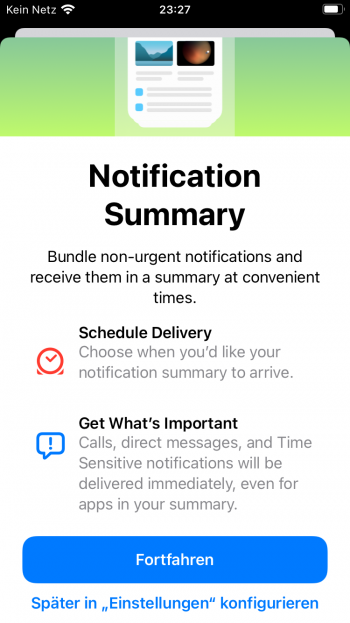
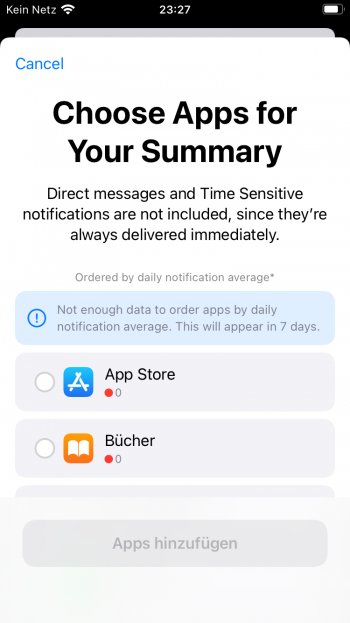
iOS is getting complicated. I have no idea what that even means like even the explanation screen doesn’t mean anything to me if I don’t know what a „Notification Summary“ is. What
Attachments
There you go!Geekbench anyone, just for s**ts and giggles?
I would of, but publics not out till July 2022.
iPhone 12 Pro Max - Geekbench
Benchmark results for an iPhone13,4 with an ARM processor.
Thanks, shame they’re tied together but this will have to be disabled on my work phone.Yes, you can disable that, but it'll also disable the status sharing.
safari redesign on iOS is hideous. WTH lol
Yep. The single collapsible title bar at the top was a lot easier to understand and it looked better. Now that there’s an ugly awkwardly colored title bar at the top AND bottom the web content feels compressed and squared off (really clashes with the curved corners of the display). Tab controls are not ergonomically placed and the wait time for the three dots tab menu is too long.
it’s definitely one of the worst aspects of the iOS update. Following close behind on the ugly list are the new notification designs. Terrible proportions that don’t fit the rest of the OS.
Yep, the remote is new.From Control Center, the new Apple TV 4K has side and volume buttons that work as part of the remote. Can someone confirm if this is new?
View attachment 1788587
Not a fan of Safari but I tell you what, iOS 15 feels VERY smooth on iPhone 12 Pro Max.
Agreed. Would be great if they made it so that you can allow that only your contacts to override the focus setting.Thanks, shame they’re tied together but this will have to be disabled on my work phone.
Might be something they implement in the future if enough people submit feedback.
Discord works and someone else previously said Pokemon Go works.So does discord and Pokémon Go work on IOS 15?
Yes you can disable it.Could someone check the do not disturb / focus / messages settings and see if you can disable the ability for someone to override send notifications even if your in DND. I can see this being abused by work and iMessage scams.
I would note also no more "Sleep" option... Not sure how I feel about that...New icons at top and some icons are te designed, also screen shot animation is really fast AW4View attachment 1788635
I feel tempted to install it on my 12PM (I won’t since it really isn’t much different anyway). It runs really good on the iPhone 6S. HOWEVER the new Safari will take some getting used to. Its unlike any other browser experience ever and involves way too many steps to get to something. I can see them changing that back by iOS 16 just like the updated / reverted date / time picker on iOS 15
Have you een screenshot?Love the new mail widget, so far it is refreshing pretty well
New mic mode while on a call with AirPods: standard, voice isolation, wide spectrum
I got tired of the address bar at the top. I dunno yet. Could get used to it.Definitely takes some getting used to.
This sounds good… didn’t get a mention in the WWDC. Built in password Authenticator. Be gone google. This will auto paste a code in. Boom

 apple.news
iOS 15 Includes Built-In Password Authenticator With Autofill, Replacing Google Authenticator and Authy — MacRumors
There are a slew of new features in iOS 15, so many in fact that Apple did not have time to cover all of them during today’s keynote event.
you want to know if the imessage bug is still present or not 😅👊🏻
yeah come on @s2mike… is it, is it back, the bar?
Am I missing something or shouldn't there be a redesigned control center?
The bar does still flash blank at first before showing the words (iMessage or Text Message) but the animation is a bit different and it happens super fast anyway. It doesn’t bother me at all but I AM wondering if Mike’s still got it too. 🤣yeah come on @s2mike… is it, is it back, the bar?
it works, no issues on my endCan anyone test the Bank of America app?
Register on MacRumors! This sidebar will go away, and you'll see fewer ads.


