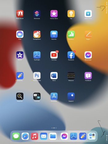
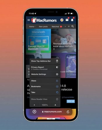
I turned that feature off; I don't need random stuff people send me to show up outside the Messages app.Some of the shared with me stuff is old, as it depends on who’s sent me something of that type last. Safari shows me 2 links sent by a family member years ago. It’ll change once someone sends me something more recent, I assume.
I don’t think Apple considered that someone might not have sent something related to that app for years. Lol. Probably should limit it to last 3 months or so.
Got a tip for us?
Let us know
Become a MacRumors Supporter for $50/year with no ads, ability to filter front page stories, and private forums.
iOS 15 Beta 6 ― Bug Fixes, Changes, and Improvements
- Thread starter Banglazed
- WikiPost WikiPost
- Start date
- Sort by reaction score
You are using an out of date browser. It may not display this or other websites correctly.
You should upgrade or use an alternative browser.
You should upgrade or use an alternative browser.
- Status
- The first post of this thread is a WikiPost and can be edited by anyone with the appropiate permissions. Your edits will be public.
I don’t post frequently, but I wanted to chime in on the Safari URL address bar situation. I think that Beta 6 is a step back in many ways, but it can be made to work well if some critical adjustments are made. I have outlined them below.
First, the URL and the whole tab bar section is very large and takes up a lot of screen real estate. It would be good to find a way to “shrink” the amount of space it takes up when on-screen to something closer to what was in prior betas.
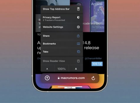
Second, the iconography is unintuitive. The “aA” button on the left side implies only text size adjustments, however it has a long-press reader mode behind it as well as an entire menu system to adjust how the page was loaded (with or without blockers, desktop or mobile, etc.). This does not make much sense and if it is to remain this way the icon should be changed to something that indicates this is a menu. Rather than making this an all-encompassing menu, I think there is a better approach outlined below, while changing this icon to reflect reader mode and related text adjustments only. That is, just make it a dedicated reader mode icon with related actions.
Third, it would be wise to move the “Turn Off Content Blockers” and “Requested Desktop Website” as long press context menu on the “Reload” button as these both reload the page anyway.
Fourth, “Website Settings”, “Privacy Report”, “Hide Toolbar”, and text size adjustments should be moved to the long press context menu of the URL, together with the copy and other features as they pertain to the page in general.
Fifth, “Move to Tab Group” should be removed from the URL context menu. It is already on the tab button when long pressed and unnecessary.
Sixth, “Show Top Address Bar” should be only in Safari Settings with the default set to the tab mode, otherwise too many will likely just switch back to “old and familiar”, negating the benefits of the change. The key to adoption is to leave the new tab mode the default and require the user to make the change in Settings explicitly.
Seventh, the tab bar should automatically hide and stay hidden even if the user scrolls up. The current implementation where the bar expands when scrolling up severely reduces screen real estate when using the tab bar to a point of affecting usability and usefulness of this mode. The bar should unhide only on user tap as it is now when collapsed and scrolling down on the page.
I have sent this feedback to Apple and am posting it here for anyone else that agrees and would like to echo the feedback to Apple.
Thanks all!
I see after 4 years and 5 posts in total, you never received any reaction. So I gave you one for the elaborately written post and also for the fact that you did take the time to send it to Apple as well instead of just typing it here.
I don’t post frequently, but I wanted to chime in on the Safari URL address bar situation. I think that Beta 6 is a step back in many ways, but it can be made to work well if some critical adjustments are made. I have outlined them below.
First, the URL and the whole tab bar section is very large and takes up a lot of screen real estate. It would be good to find a way to “shrink” the amount of space it takes up when on-screen to something closer to what was in prior betas.
Second, the iconography is unintuitive. The “aA” button on the left side implies only text size adjustments, however it has a long-press reader mode behind it as well as an entire menu system to adjust how the page was loaded (with or without blockers, desktop or mobile, etc.). This does not make much sense and if it is to remain this way the icon should be changed to something that indicates this is a menu. Rather than making this an all-encompassing menu, I think there is a better approach outlined below, while changing this icon to reflect reader mode and related text adjustments only. That is, just make it a dedicated reader mode icon with related actions.
Third, it would be wise to move the “Turn Off Content Blockers” and “Requested Desktop Website” as long press context menu on the “Reload” button as these both reload the page anyway.
Fourth, “Website Settings”, “Privacy Report”, “Hide Toolbar”, and text size adjustments should be moved to the long press context menu of the URL, together with the copy and other features as they pertain to the page in general.
Fifth, “Move to Tab Group” should be removed from the URL context menu. It is already on the tab button when long pressed and unnecessary.
Sixth, “Show Top Address Bar” should be only in Safari Settings with the default set to the tab mode, otherwise too many will likely just switch back to “old and familiar”, negating the benefits of the change. The key to adoption is to leave the new tab mode the default and require the user to make the change in Settings explicitly.
Seventh, the tab bar should automatically hide and stay hidden even if the user scrolls up. The current implementation where the bar expands when scrolling up severely reduces screen real estate when using the tab bar to a point of affecting usability and usefulness of this mode. The bar should unhide only on user tap as it is now when collapsed and scrolling down on the page.
I have sent this feedback to Apple and amposting it here for anyone else that agrees and would like to echo the feedback to Apple.
Thanks all!
chime in, I need to go put the kettle on for this Novel 😍
chime in, I need to go put the kettle on for this Novel 😍
It is a thought-provoking read. Apple should go through that feedback and consider the points made, and then do what they do best. They are a bunch of great minds that put out great work more often than not. I loved the beta 1 design of Safari, gesture operations made using Safari tabs far more intuitive, and beta 5 design was near perfection towards that design approach they started for Safari with iOS 15.
It is sad to see them backtracking on it and making a mess of it in beta 6.
I don’t post frequently, but I wanted to chime in on the Safari URL address bar situation. I think that Beta 6 is a step back in many ways, but it can be made to work well if some critical adjustments are made. I have outlined them below.
First, the URL and the whole tab bar section is very large and takes up a lot of screen real estate. It would be good to find a way to “shrink” the amount of space it takes up when on-screen to something closer to what was in prior betas.
Second, the iconography is unintuitive. The “aA” button on the left side implies only text size adjustments, however it has a long-press reader mode behind it as well as an entire menu system to adjust how the page was loaded (with or without blockers, desktop or mobile, etc.). This does not make much sense and if it is to remain this way the icon should be changed to something that indicates this is a menu. Rather than making this an all-encompassing menu, I think there is a better approach outlined below, while changing this icon to reflect reader mode and related text adjustments only. That is, just make it a dedicated reader mode icon with related actions.
Third, it would be wise to move the “Turn Off Content Blockers” and “Requested Desktop Website” as long press context menu on the “Reload” button as these both reload the page anyway.
Fourth, “Website Settings”, “Privacy Report”, “Hide Toolbar”, and text size adjustments should be moved to the long press context menu of the URL, together with the copy and other features as they pertain to the page in general.
Fifth, “Move to Tab Group” should be removed from the URL context menu. It is already on the tab button when long pressed and unnecessary.
Sixth, “Show Top Address Bar” should be only in Safari Settings with the default set to the tab mode, otherwise too many will likely just switch back to “old and familiar”, negating the benefits of the change. The key to adoption is to leave the new tab mode the default and require the user to make the change in Settings explicitly.
Seventh, the tab bar should automatically hide and stay hidden even if the user scrolls up. The current implementation where the bar expands when scrolling up severely reduces screen real estate when using the tab bar to a point of affecting usability and usefulness of this mode. The bar should unhide only on user tap as it is now when collapsed and scrolling down on the page.
I have sent this feedback to Apple and am posting it here for anyone else that agrees and would like to echo the feedback to Apple.
Thanks all!
yes, yes, yes, yes, yes, yes… I sound like Meg Ryan. Ha.
you don’t post much, but what a belta.
Apple needs you!!! really good points, hope is in the air. Feed back > Copy and paste > BOOM!
It is a thought-provoking read. Apple should go through that feedback and consider the points made, and then do what they do best. They are a bunch of great minds that put out great work more often than not. I loved the beta 1 design of Safari, gesture operations made using Safari tabs far more intuitive, and beta 5 design was near perfection towards that design approach they started for Safari with iOS 15.
It is sad to see them backtracking on it and making a mess of it in beta 6.
B6 design needs work.
Love B5 design.
B6 quick functionality, has me though. I’m flying about safari one handed without even thinking where to put my thumb, but it needs work.
Needs a blend of the two. If the Aa button was just a button and under it was bookmarks, + tabs, share, reader, all that gumf... you would have slick minimal but fast functional bar. quick access button - URL - reload button. hides when scroll up or down unless tapped on. for me. im happy.
very excited for B7 🥳 GROOT, keep it stum. It ain’t over till the fat lady sings. I don’t hear her, yet 😂
Last edited:
Native works fine for me, but thanks. lolcan report I can record video and it has sound from the “native” camera app. If that helps 🥸
Keep on finding broken stuff.
I had an iPad Air 2 between 2015 and 17. Saw the same thing off and on on that device too! They are still unable to fix it after so many iterations.
It didn’t work for me at all in the last couple betasIt worked for me in last beta.
Did anyone have issues with their iPhone/iPad showing a greater available capacity than the actual phone capacity?
So far it is good here. My available is smaller than the capacity amount. Did you maybe not see the decimal point on the available variable? On my phone it looks like this;Did anyone have issues with their iPhone/iPad showing a greater available capacity than the actual phone capacity?
Capacity: 256 GB
Available: 155.03 GB
The system on the phone is really small too, this go around. 656.4MB on the system, although iOS is reading: 7.94GB. The system is designed to go up and down as needed but I don't recall it being this small in quite some time. Good find.Has anyone noticed System Data is very low in the storage settings location.
This is on 12 Pro.
IOS 7.94 gb
System Data 767.8 mb
Thats the lowest System Data number I have ever seen. Can others verify.
CC
some people feel better when they complain lol at least there's a choiceIrritated with some people. Like, how do you want Apple to redesign UI, but then go crazy when they do change it. Theyll never give us a redesign with this attitude.
Literally with any new user interface or one you haven’t used before, it will take time to learn or get used to. I’m glad apple is giving choice, just for these people stuck in the past.
It is a thought-provoking read. Apple should go through that feedback and consider the points made, and then do what they do best. They are a bunch of great minds that put out great work more often than not. I loved the beta 1 design of Safari, gesture operations made using Safari tabs far more intuitive, and beta 5 design was near perfection towards that design approach they started for Safari with iOS 15.
It is sad to see them backtracking on it and making a mess of it in beta 6.
A fruity take on the Safari bar redesigned with B5 in mind...
• The quick actions table would have more options in there, just did this as an example of where to go for fast functionality.
• The bar is a lot lower than B5, so its even more out of the way for content above.
• Ditch the < > arrows. If you want to go back or forwards on a page, swipe left and right, like you swipe up and down to move on a page.
EDIT: suggestion submitted! With the mock ups 😆
Attachments
Last edited:
A fruity take on the Safari bar redesigned with B5 in mind...
• The quick actions table would have more options in there, just did this as an example of where to go for fast functionality.
• The bar is a lot lower than B5, so its even more out of the way for content above.
• Ditch the < > arrows. If you want to go back or forwards on a page, swipe left and right, like you swipe up and down to move on a page.
Dear Fruitiness, send this feedback to Apple, please.
The nearly Dock-sized height of the toolbar in beta 6 is something I could never have thought Apple would dish out even in a beta. They could have rickrolled us, but this ... no.
Not yet as far as I can see. Their updates are all over the place lolIs it available in PB yet?
That would be highly unusual being that the PB by this point is usually same day as developer release or next morning by 10am PST at most.Tomorrow
Is it available in PB yet?
TV OS public beta is out, so there is hope for iOS.
Anything on watchos 8 PB beta?TV OS public beta is out, so there is hope for iOS.
Register on MacRumors! This sidebar will go away, and you'll see fewer ads.


