Pull down on the pageNow how do I refresh in Safari……?
View attachment 1820815
Got a tip for us?
Let us know
Become a MacRumors Supporter for $50/year with no ads, ability to filter front page stories, and private forums.
iOS 15 Beta 6 ― Bug Fixes, Changes, and Improvements
- Thread starter Banglazed
- WikiPost WikiPost
- Start date
- Sort by reaction score
You are using an out of date browser. It may not display this or other websites correctly.
You should upgrade or use an alternative browser.
You should upgrade or use an alternative browser.
- Status
- The first post of this thread is a WikiPost and can be edited by anyone with the appropiate permissions. Your edits will be public.
Has anyone noticed that HomeKit through Siri is less responsive in iOS 15 than it was in 14?
For example, "Hey siri, turn on the office lights" takes noticeably longer than it used to.
For example, "Hey siri, turn on the office lights" takes noticeably longer than it used to.
Has anyone noticed that HomeKit through Siri is less responsive in iOS 15 than it was in 14?
For example, "Hey siri, turn on the office lights" takes noticeably longer than it used to.
“hey Siri, what’s your favourite iOS 14 or 15?” 😆😂
SAFARI this needs sorting. I’ve got dancing tabs when you open the app from fresh on the tabs page.
I was able to reproduce this on my 12PM as well. Good thing I rarely swipe Safari closed! 🤣SAFARI this needs sorting. I’ve got dancing tabs when you open the app from fresh on the tabs page.
View attachment 1820839
Has anyone noticed that HomeKit through Siri is less responsive in iOS 15 than it was in 14?
For example, "Hey siri, turn on the office lights" takes noticeably longer than it used to.
Yup, Siri is an even bigger more useless pile of horse
 with HomeKit than it was in 14. (Siri is generally crap but noticeably worse in 15 with regard to HomeKit)…in my experience and opinion.
Last edited:
Does anyone have a HomeKit camera? I’ve noticed with mine that the video freezes after a few seconds. Audio may or may not continue. Didn’t have this issue in iOS 14, and I don’t have this issue on other iOS 14 devices. This started with the last beta.
Cyclemeter, an app I use to record my bike rides, crashed mid-ride when I stopped to take some photos, losing the rest of the ride. This is the first time I actually lose data due to a beta. It's my fault and I signed up for it, but it's still interesting as this has never happened before in all my years of running iOS betas.
Anyone else use fitness apps and have had similar crashes? Just wondering if it's Cyclemeter-specific or if other similar apps are crashing too.
Anyone else use fitness apps and have had similar crashes? Just wondering if it's Cyclemeter-specific or if other similar apps are crashing too.
Nah, it’s been like that since beta 2 I think. 🤔Does this look a bit different than the previous beta? I don’t mean the inset group list style. Maybe the Apple ID section looks a bit smaller? Not sure…
They went with the same design as the settings page, looks cleaner and more modern. 👌
Weird. Not really a a dealbreaker, but on beta 1 my iPod touch had the new settings look. But beta 2-6 it’s just the old settings display. Wondering if it’s a 4 inch screen thing, anyone testing on an iPhone SE 2016 able to see if it looks the same. But I do have the new settings on XR so not really sure what’s going on
Attachments
Reduce motion is working properly again on iPhone 12 pro max, does lag or stutter like a S21 ultra when it’s turned on. 😬
Anyone have an issue with apps not remembering your login or giving an error after time? Like with capital one and chase apps. I find myself having to enter my password every other time.
All good here, maybe them apps need to be updated, report the issue just incase.Anyone have an issue with apps not remembering your login or giving an error after time? Like with capital one and chase apps. I find myself having to enter my password every other time.
All good here, maybe them apps need to be updated, report the issue just incase.
They updated. Well I guess it’s just a me issue. It’s been happening since beta 3 I think. Super annoying and now my T-Mobile app be doing it too. It’s like they don’t remember my login after a few hours.
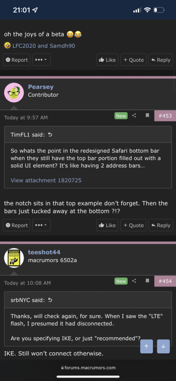
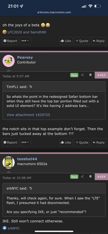
Right now you get the most content visible if you use the old style address bar at the top. There is about one to two extra lines of text visible in this mode compared to the address bar on the bottom. Definitely more tweaking is required. Whatever they do I just want them to sort out the menus and to maximize visible content.So whats the point in the redesigned Safari bottom bar when they still have the top bar portion filled out with a solid UI element? It‘s like having 2 address bars…
First is the address bar on the bottom, next on the top…see the extra line or two of text on the second screenshot?
Attachments
Strange one 🤔 have you tried deleting and reinstalling the apps?They updated. Well I guess it’s just a me issue. It’s been happening since beta 3 I think. Super annoying and now my T-Mobile app be doing it too. It’s like they don’t remember my login after a few hours.
They’ve definitely taken a step backwards when it comes to screen real estate, I actually like the address bar down the bottom, but they’ve ruined it in beta 6, put on a few kg. 🤦♂️😂 I’ve gone back to the top address bar until apple get their act together.Right now you get the most content visible if you use the old style address bar at the top. There is about one to two extra lines of text visible in this mode compared to the address bar on the bottom. Definitely more tweaking is required. Whatever they do I just want them to sort out the menus and to maximize visible content.
First is the address bar on the bottom, next on the top…see the extra line or two of text on the second screenshot?
🤢
👌
Strange onehave you tried deleting and reinstalling the apps?
Yep. I just understand why it’s happening. Same on my iPad with the same apps.
Call apple support.Yep. I just understand why it’s happening. Same on my iPad with the same apps.
I don‘t get why they force us to pick between new tab bar functionality at the bottom and the old vanilla one at the top? Why can‘t they just use the bottom tab bar design (address bar floating and being able to swipe between tabs) for the top one too?They’ve definitely taken a step backwards when it comes to screen real estate, I actually like the address bar down the bottom, but they’ve ruined it in beta 6, put on a few kg. 🤦♂️😂 I’ve gone back to the top address bar until apple get their act together.
🤢
View attachment 1820898
👌
View attachment 1820899
Looks like artificially limiting functionality to me so people switch to their new bottom bar design to get the quick tab changing. It‘s especially jarring when you use the bottom option and go landscape, the bar magically pops to the top again (+ horizontal orientation having the nasty top panel covering page real estate).
I’ve switched it back to the bottom, easier to reach, once you get use to it, it’s hard to use the top address bar again 🤦♂️😂 hopefully they make it smaller again. 🤦♂️I don‘t get why they force us to pick between new tab bar functionality at the bottom and the old vanilla one at the top? Why can‘t they just use the bottom tab bar design (address bar floating and being able to swipe between tabs) for the top one too?
Looks like artificially limiting functionality to me so people switch to their new bottom bar design to get the quick tab changing. It‘s especially jarring when you use the bottom option and go landscape, the bar magically pops to the top again (+ horizontal orientation having the nasty top panel covering page real estate).
Can't wait! I want my address bar vertical along the left edge.Another day, people asking for more safari tweaks, don’t worry apple has you covered, beta 7 is just around the corner. 😂
I was able to reproduce this on my 12PM as well. Good thing I rarely swipe Safari closed! 🤣
I always shut down my apps after using them on a beta. Stops any background run away processors caining my battery. Boots up fresh, contents reloaded… don’t have background app refresh on ether. You save so much battery on apps refreshing that you might not use for two days. Thats just me anyways. 👍🏼
They updated. Well I guess it’s just a me issue. It’s been happening since beta 3 I think. Super annoying and now my T-Mobile app be doing it too. It’s like they don’t remember my login after a few hours.
I had something similar with Face ID. I know that’s different, but still a logging in situ. I did two things: 1. off loaded the app, so it reinstalled a fresh copy but kept data. 2. Turned Face ID off and on in the apps settings.
I also was informed by an app dev that the “cross fade” option in accessibility turned on, was creating some logging in issues. That’s now off for now and sorted all my logging in issues out.
If any of that helps, even if just taken some of the process I went through to try but for your unique situ, like turn off and on “remember me” at login stage, stuff like that, Hope it helps. It was driving me up the wall too. 👍🏼
Attachments
Register on MacRumors! This sidebar will go away, and you'll see fewer ads.


 have you tried deleting and reinstalling the apps?
