Got a tip for us?
Let us know
Become a MacRumors Supporter for $50/year with no ads, ability to filter front page stories, and private forums.
iOS 15 Beta 6 ― Bug Fixes, Changes, and Improvements
- Thread starter Banglazed
- WikiPost WikiPost
- Start date
- Sort by reaction score
You are using an out of date browser. It may not display this or other websites correctly.
You should upgrade or use an alternative browser.
You should upgrade or use an alternative browser.
- Status
- The first post of this thread is a WikiPost and can be edited by anyone with the appropiate permissions. Your edits will be public.
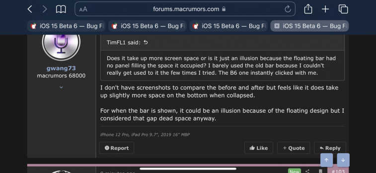
I don't have screenshots to compare the before and after but feels like it does take up slightly more space on the bottom when collapsed.Does it take up more screen space or is it just an illusion because the floating bar had no panel filling the space it occupied? I barely used the old bar because I couldn't really get used to it the few times I tried. The B6 one instantly clicked with me.
For when the bar is shown, it could be an illusion because of the floating design but I considered that gap dead space anyway.
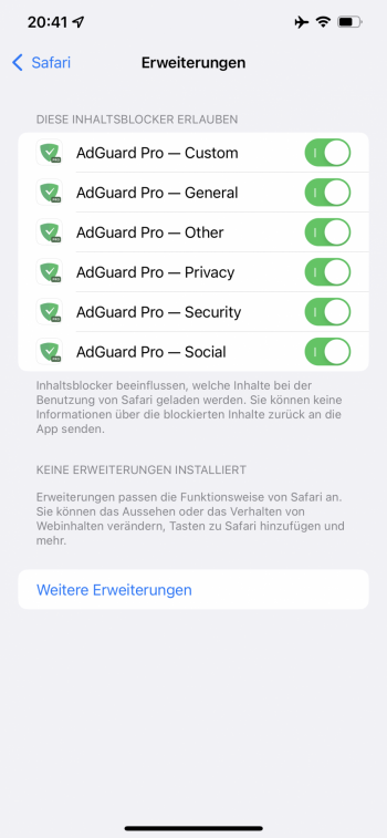
Content Blocker has been renamed (moved?) to extensions (at least in German) under Safari and it actually shows the blockers again (didn’t do it on the previous beta).
There is also a link to open the App Store to get additional extensions
There is also a link to open the App Store to get additional extensions
Attachments
I have beta 5 and beta 6 right next to each other but can't tell a difference in color.
This is what I’m getting.Can someone please tell me how to see tabs in landscape mode (iPhone)in safari. I thought they automatically showed when you held your phone in landscape. Not working for me now. Thank you
Attachments
Ok thank you. I closed and opened safari a couple times and it started working. Took more than once for it to kick in. 👍This is what I’m getting.
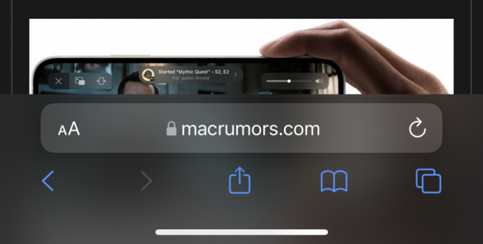
Yes it does . Looks like mirrored top bar when it’s expanded. Ugly.Looks good to me, an exact replica of the one used in iOS 14, just at the bottom. I guess it still shrinks down when we browse?
Kinda feels like I’m using a Pixel🤦🏻♂️Yes it does . Looks like mirrored top bar when it’s expanded. Ugly.
Maybe the change went into affect in beta 5, but it’s definitely different from earlier betas.I have beta 5 and beta 6 right next to each other but can't tell a difference in color.
Before and after-
Can't recall offering so many GUI design-elements as options before.
iOS7?
Kinda feels like I’m using a Pixel🤦🏻♂
It’s unnecessary huge. I liked previous version only if it would be adress bar static so I don’t have to fight with it if I want to click on something what is in address bar path.Kinda feels like I’m using a Pixel🤦🏻♂️
It is so ugly now.
Totally agree. The way it looked in previous betas was much better
My 12 PM isn't doing that. That's odd.Scrolling sensitivity I think they've pissed around with this again. its on steroids even with a slow thumb scroll. struggling to focus on text/content. As soon as it moves its like its bluring/jarring.
Go to settings, look at one one word and start scrolling slowly... its like the text is vibrating.
Might have tiered screen eyes. but it doesn't feel as smooth as B5 to me.
View attachment 1819956
They added more colors and shades to the radar in the weather app to make it easier to differentiate heavy and light precipitation.
Better but the precip “edges” are still too fuzzy.
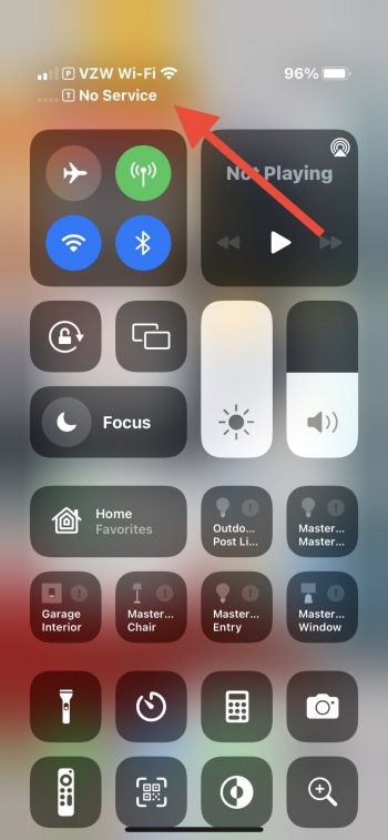
You look like this other 🍐 that contributes. Anyway, if it stops the drop from 5G to LTE just because I walked outside then it’s worth it!B5 firmware 2.09.05 to
B6 2.09.10
iP 12
Hope the .05 was worth it 😂
I prefer the floating bottom bar from Beta 5, and not liking the changes to Beta 6. as it gave so much of the web page to the whole screen.
Only thing I like about the change to Beta 6 is the option for people that like the top bar.
So, not an apologist here.
Indeed, you're not an apologist if you accept that other people have legitimate criticisms of the design. I too prefer the floating bar (if I were to go with the "bar design" over the old design). You're only an apologist if you deny the problems others are reporting and justify bad design by making excuses for obvious problems.
Same person, he's changed his username. ☺️You look like this other 🍐 that contributes. Anyway, if it stops the drop from 5G to LTE just because I walked outside then it’s worth it!
Messages app notifications are still using the contact’s nickname by default, despite having “Prefer Nicknames” turned off.
Very annoying bug.
You don’t have much luck with the messaging app hey Mike. 😬
At this point it seems like no further change to Safari will make everyone happy, at least there’s options now. Maybe they’ll bring the floating bar of death back as an option next beta if it makes some happy.
Register on MacRumors! This sidebar will go away, and you'll see fewer ads.


