Got a tip for us?
Let us know
Become a MacRumors Supporter for $50/year with no ads, ability to filter front page stories, and private forums.
iOS 18 Beta 3 ― Bug Fixes, Changes, and Improvements
- Thread starter Banglazed
- WikiPost WikiPost
- Start date
- Sort by reaction score
You are using an out of date browser. It may not display this or other websites correctly.
You should upgrade or use an alternative browser.
You should upgrade or use an alternative browser.
- Status
- The first post of this thread is a WikiPost and can be edited by anyone with the appropiate permissions. Your edits will be public.
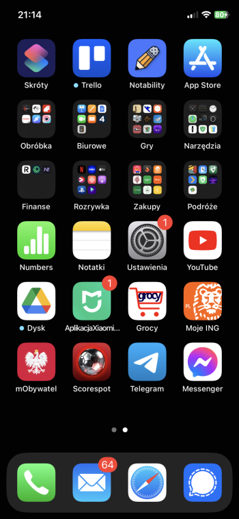
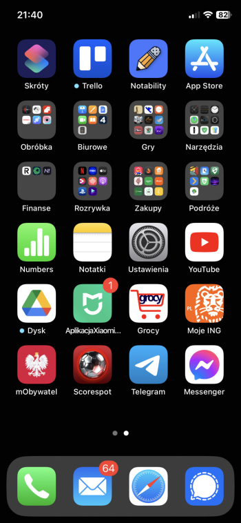
That was there last beta. Maybe even the first?Long touching on an app icon now allows you to convert it into a widget!
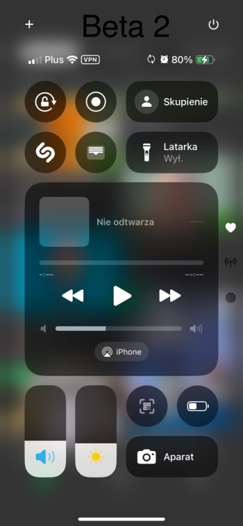
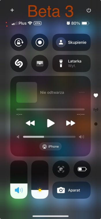
Looks the same for me…Is control center a little larger with B3?
Edit1:
However after I posted and seen photos there I see they moved top icons higher and decreased size of some text
Edit2: I see also different size of icons on the right - control center widgets screen page indicator
Attachments
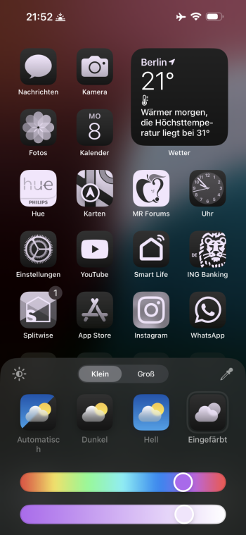
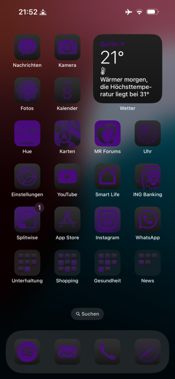
App icon tint color selection does not work as expected like when you move the bar, the colors don’t correspond to where you move the bar to. Only after you apply it, the icons actually change color so you have to do a guessing game of what the tint will look like when you attempt to to color shade xy.
Also the second swipe bar is too low and sensitive, I keep switching to another app by mistake
Also the second swipe bar is too low and sensitive, I keep switching to another app by mistake
Attachments
Glad they resolved the no keyboard feedback sound! This was the one bug that drove me crazy, always made me think I was in Silent mode!
Mentioned in the release notes as a known issue alreadyApp icon tint color selection does not work as expected like when you move the bar, the colors don’t correspond to where you move the bar to. Only after you apply it, the icons actually change color so you have to do a guessing game of what the tint will look like when you attempt to to color shade xy.
Also the second swipe bar is too low and sensitive, I keep switching to another app by mistake
Was in the initial betaLong touching on an app icon now allows you to convert it into a widget!
After you add the widget, you have to click on it (or before that enter widgets edit mode with “-“ ), this will open full screen edit mode where can uncheck “automatic” and choose one device - it needs to be connected or close.Not for me. Mine only shows my watch. The phone still isn't an option.
Apps haven't been able to update with dark icons yet. Doing so requires Xcode 16, which is in beta, and you can't submit app updates built with Xcode beta releases (except for TestFlight testing).Apple doing dark theme icons better then the actual devs.
add a new wallpaper. that will fix this.I can no longer edit my icons to light or dark....I follow the process but when I hit customize nothing happens.....
I really want to go find a place with a T-Mobile dead spot here and try satellite SMS/iMessage.
I see they changed folders and dock color in Dark Mode in Beta 3 :/
Grey now not dark grey.
Widgets are still eye-burning white in Dark Mode, so maybe in next Beta as it was already mentioned as noticed error in Beta2 changelog
Grey now not dark grey.
Widgets are still eye-burning white in Dark Mode, so maybe in next Beta as it was already mentioned as noticed error in Beta2 changelog
Attachments
Add a new wallpaper, then try again.Looks like a home screen bug. Curious if anyone else is having the same issue. When clicking customize, it doesn't do anything. Clicking add widget works. Restarted twice.
15 ProMax
Update went smooth but device got to 110.3F. On the back near the volume buttons. Oof! 🥵
On lockscreen I can now select battery device.
RCS for Mint Mobile is still not available.
Mail had issues with emails that were previously read but now show as unread form late June to present. iCloud Mail.
Some 3rd party apps are now showing dark version icons.
More to come…
I do wish we had a choice here though. I was happy to run with dark mode all the time but the original (light mode) icons. I'm not a fan of all the dark mode icons as they don't offer sufficient contrast to be glancable. The wrinkle is what (I believe) is a bug: when you select the light mode icons, it puts all your widgets in light mode too. This is opposite the behavior of iOS17. Apple really should give you the choice here or at least split out the light/dark settings for icons from widgets.I am so here for Apple dynamically changing icons to dark mode. Sorry Google, you can't maliciously refuse to comply for 3 years on this one!
Plus, I think the coerced dark mode on a lot of these icons actually looks pretty terrible. The colors are all off.
Last edited:
Weather radar loads much quicker for me. It is also defaulting to show 12 hr forecast instead of next hour.
That resolves it....silly that I have to use a new wallpaper.Add a new wallpaper, then try again.
I’ve had this issue forever. I dont think it’s new.For some reason I am not able to put App Folders anywhere on the home screen unless I move them all to another page first and then manually drag them back to the spot I want them to stick to one by one.
Register on MacRumors! This sidebar will go away, and you'll see fewer ads.


