Become a MacRumors Supporter for $50/year with no ads, ability to filter front page stories, and private forums.

winxmac

macrumors 68000
Sep 1, 2021
1,532
1,799
Now that macro mode can be forced to use the main camera and not the ultrawide, can we have a toggle to force the iPhone to use ultrawide or telephoto even in low light photography?

I'm still testing the Final Cut Camera and so far, it is laggy while recording but the recorded video is not during playback... Anyone who has used both Blackmagic Camera and Final Cut Camera? Which is better between the two?
 

boston04and07

macrumors 68000
May 13, 2008
1,834
934
Not sure how that would work, but I doubt the carriers would let Apple do this.
This would just be an enhancement to the existing WiFi calling capabilities, giving it a more complete and rounded out UI, so not sure why the carriers wouldn’t like this. As for the voicemail and syncing, I’d imagine iCloud could easily handle this. SMS messages are already forwarded to iPads and Macs so I see no reason why voicemail audio files couldn’t be as well.
 

HouseLannister

macrumors 6502a
Jun 8, 2021
698
1,116
This would just be an enhancement to the existing WiFi calling capabilities
But that’s a feature on a phone with a phone number. Your iPad doesn’t have a phone number. So this is creating some kind of call forwarding to your iCloud/FaceTime account? I guess I was thinking the carriers would have spoofing/fraud concerns, but they never did anything to stop text message forwarding for SMS/MMS.
 

boston04and07

macrumors 68000
May 13, 2008
1,834
934
But that’s a feature on a phone with a phone number. Your iPad doesn’t have a phone number. So this is creating some kind of call forwarding to your iCloud/FaceTime account? I guess I was thinking the carriers would have spoofing/fraud concerns, but they never did anything to stop text message forwarding for SMS/MMS.
Yes, exactly - as I said in my first post it would be for people who use WiFi calling already, giving us a UI for the feature that already exists. I don’t see Apple adding standalone phone call functionality for iPads that don’t have WiFi calling enabled via an iPhone (although that would be awesome).

I use Wifi calling (tied to my iPhone’s phone number) all day long for work on my iPad, for both receiving and dialing out calls. It is a huge pain in the arse not having a dialer, voicemails, and a call history log that’s separate from FaceTime on the device that’s in front of me all day long and that I use to make all these calls.
 

EllieCat

macrumors regular
Jan 10, 2024
164
159
U.S
Add a feature to block ads within a browser and not make the audio of a tab while in tab group sharing get quieter.

To have Android users on a facetime call and not make the bubbles green.
 

joshuabeg

macrumors member
Mar 23, 2022
68
295
Santa Clarita, CA
  • The ability in Messages to change the name and photo associated with a group message thread, without it appearing that way for others
  • The ability in Maps to edit the icon and color associated with a location in your Favorites
  • The ability to toggle off the folders page, and swipe immediately to the search/list view in the App Library
 

HouseLannister

macrumors 6502a
Jun 8, 2021
698
1,116
  • The ability to toggle off the folders page, and swipe immediately to the search/list view in the App Library
I’ve been submitting that in the feedback app every year since iOS 14 beta. It wouldn’t be so bad if the category sorting wasn’t so awful. Or at bare minimum, let me move apps into preferred categories.
 

Godspeed8230

macrumors regular
Jul 5, 2021
243
853
  1. Setting up an alarm is so annoying.
    There is the default alarm option with very disruptive sounds and then there is the sleep schedule option with much nicer sound options.
    I don't want to set up a sleep schedule, I just want to set up a decent sounding alarm with one or two clicks.

    Just yesterday I had to explain this to a friend of mine, it is super unintuitive.
  2. Improve reminders as setting up reminders is a mess and cumbersome. Why do I have to actively toggle on the date and time? By default they should be on as they are key elements of a reminder.
  3. Also, changing the wallpaper has become way to convoluted - this shouldn't take more than a couple of seconds.
 

HouseLannister

macrumors 6502a
Jun 8, 2021
698
1,116
Or give us an entire page of little icons, like those you get in the App Library when there are more than four in a category.
Now there's an idea.
Screenshot 2024-07-17 074031.jpg
 

adrianlondon

macrumors 603
Nov 28, 2013
5,521
8,332
Switzerland
  1. Setting up an alarm is so annoying.
    There is the default alarm option with very disruptive sounds and then there is the sleep schedule option with much nicer sound options.
    I don't want to set up a sleep schedule, I just want to set up a decent sounding alarm with one or two clicks.
Yep. And if you want the alarm volume different to your ring volume, you have to use the sleep alarm.
 

jedimasterkyle

macrumors 6502a
Sep 27, 2014
564
822
Idaho
  • Jiggle Mode needs to go away. The amount of times I've tried to put an App in a folder, only for it to go to the next screen or move other apps and widgets to other pages is ungodly annoying
  • List view of HKSV videos in the Home app. Scrolling left to right to find a specific event is dumb
  • I dont mind the swipe up notification center but it would be nice if they were actually shown in chronological order
  • This might be a stretch but forcing developers to open their apps to Siri Shortcuts (I'm looking at you Eufy Security).
  • Pipe dream but maybe tone down the emphasis on iMessage features and actually fix issues that we've been complaining about for years.
 

Ipadonly1

macrumors member
Jun 8, 2023
39
30
  1. Setting up an alarm is so annoying.
    There is the default alarm option with very disruptive sounds and then there is the sleep schedule option with much nicer sound options.
    I don't want to set up a sleep schedule, I just want to set up a decent sounding alarm with one or two clicks.

    Just yesterday I had to explain this to a friend of mine, it is super unintuitive.
  2. Improve reminders as setting up reminders is a mess and cumbersome. Why do I have to actively toggle on the date and time? By default they should be on as they are key elements of a reminder.
  3. Also, changing the wallpaper has become way to convoluted - this shouldn't take more than a couple of seconds.
I agree with your second point. I think Apple has a particular (weird) interpretation of what a reminder is. To them, because the date and time isn’t toggled on by default, it’s just some task that you should probably do at some point. Yet now reminders can be inserted into the calendar, so the date and time should be a key aspect of it, but it still kind of isn’t.

I’d completely redesign Reminders and call it Tasks. At the moment, I use it only for shopping lists. If Apple is adding reminders into the Calendar app, they should, imho, take leaves out of Things3 or Sorted3’s books. Tasks containing sub-tasks (actually visible ones) and tasks forming part of projects and projects forming part of areas. Let the user set a duration for a task and let them organise their schedule (tasks and events) based around that (like Sorted3 does brilliantly).
 

hagadol

macrumors newbie
Jul 13, 2015
25
10
In the Calendar app, if an entry has text contained in its Note section then an automatic icon is created to show you have notes within the entry.
 

redbeard331

macrumors 68040
Jul 21, 2009
3,101
5,788
Number 1 Request:

PLEASE LET US HIDE THE HOMEBAR !!!!

YES! It’s the worst part of iOS, it’s always in the way, and who needs a big ass bright bar to show them how to go back to the home screen when we’ve been swiping up for like 7 years now!?!

Second worst thing I wish they’d let us disable is the slide over feature on the lock screen that opens the camera. It’s dangerous.
 

Akinom

macrumors newbie
Dec 26, 2023
26
27
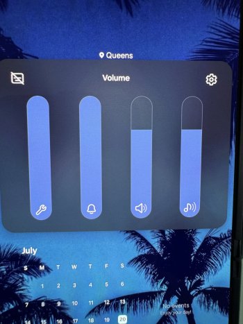
I would really love having a confirmation of something being copied, like how Pixels (and I assume Android in general) do. I switched teams in December and this is honestly the only thing I can think of to put on a wishlist for now.
 

tomtattoo

macrumors 6502a
Mar 8, 2013
545
889
Berlin
1. Appmediathek icon in dock - I would use more screens for widgets. Otherwise the way is too long.
2. More than 4 icons in the dock. And scrolling possibilty for the dock. Like Infinidock in earlier JB times.
3. Moving as many as possible control elements to the bottom of the screen, because my fu***ing thumb is there all the time!
 
Register on MacRumors! This sidebar will go away, and you'll see fewer ads.