I truly don't understand how Apple can think that this looks good. The bottom blur, just like at the top, was perfect up until beta 4 where it was removed and replaced with just a fade out. It's also not consistent. Some apps like Notes have no blur at all in some views. Some have a top blur and no bottom blur. Some do both. It's crazy. I wish they'd just put the progressive blur effect at the top and bottom again like in betas 1-3.

Got a tip for us?
Let us know
Become a MacRumors Supporter for $50/year with no ads, ability to filter front page stories, and private forums.
iOS 26 Beta 7 ― Bug Fixes, Changes, and Improvements
- Thread starter Banglazed
- WikiPost WikiPost
- Start date
- Sort by reaction score
You are using an out of date browser. It may not display this or other websites correctly.
You should upgrade or use an alternative browser.
You should upgrade or use an alternative browser.
The Bluetooth panel in the Control Center keeps appearing misaligned… if I tap another panel, like WiFi, then tap the a Bluetooth one again, it generally appears normal (temporarily)

To be clear, in b6 you have to press it not just slide it. So are you saying that has now stopped?The WiFi toggle in settings for some odd reason doesn’t have the Liquid Glass animation when tapping it
Was like this in beta 6
[Edit] B7 has the same behavior. You have to press it. Seems to work the same as it did in B6.
Last edited:
What have Apple done in safari with this update. Getting a few visual glitches which wasn’t present on B6. I’m getting a weird “slide-in” animation on the keyboard too. Video attached.
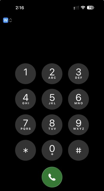
Note the blue w in the upper left corner. I have dual eSIM.always used dual sim on my 15PM. before on ios18 while on phone app before dialing a number i was able to choose wich sim would make the call. now on ios26 its no longer available and cant find it nowhere
anyone else?
Attachments
Really? I thought the earlier blue looked hideous, like some intern had just discovered the gradient fill in PowerPoint. 🤣I truly don't understand how Apple can think that this looks good. The bottom blur, just like at the top, was perfect up until beta 4 where it was removed and replaced with just a fade out. It's also not consistent. Some apps like Notes have no blur at all in some views. Some have a top blur and no bottom blur. Some do both. It's crazy. I wish they'd just put the progressive blur effect at the top and bottom again like in betas 1-3.
View attachment 2538700
It’s just turning dark from the tap. If you hold on it a little you’ll see it turn gray.Hmm not sure if intentional, but when using the Clear homescreen icons theme, when you tap on an icon they turn black color for a micro second before launching, wasn't happening on beta 6.
Works just fine with iOS 26B7 and WatchOS 11.6.1But what about if watch isn’t on beta? Anyone?
So every toggle now when you tap it shows the Liquid Glass bubble, starting in beta 6, but the WiFi toggle does not. It just abruptly switches. You’ll see the animation if you drag it, but tapping it doesn’t.To be clear, in b6 you have to press it not just slide it. So are you saying that has now stopped?
Not getting thisWhat have Apple done in safari with this update. Getting a few visual glitches which wasn’t present on B6. I’m getting a weird “slide-in” animation on the keyboard too. Video attached.
View attachment 2538706
9to5mac is completely broken as far as light and dark mode 😂 when my phones in light mode the website is dark, and then in dark mode it’s light
Force restart your iPhone and after it I would say wait a few days, it may settle downYea this feels less polished than beta 6.
Huh???? The phone still needs to index which takes hours after the update. Everyone else here is saying it’s smoother or the same as b6.Yea this feels less polished than beta 6.
The way, the glassy outline pops in after the app closing animation, is driving me mad!
That cannot be the way it’s supposed to look! With folders, the way the outline is animated on closure is different, it does not pop at all!
But with normal app icons, it just looks cheap. I cannot unsee it, even in light mode, the outline just pops in after the closing animation is compete.
Feedback provided already with b5 and b6, seems no one cares thou.
Not a great time for a springboard crash when the iOS is preparing to install...
It’s been this way since at least beta 4 (which is when I jumped in) and so far it is the only thing that still annoys me.View attachment 2538713
The way, the glassy outline pops in after the closing animation is driving me mad!
That cannot be the way it’s supposed to look! With folders, the way the outline is animated on closure is different, it does not pop at all!
But with normal app incons, it just looks cheap. I cannot unsee it, even in light mode, the outline just pops in after the closing animation is compete. Feedback provided already with b5 and b6, seems no one cares thou.
Force restart your iPhone and after it I would say wait a few days, it may settle down
I know about the indexing but I’ve noticed small visual quirks here and there that weren’t in beta 6. Something seems a little regressed in this beta 7.Huh???? The phone still needs to index which takes hours after the update. Everyone else here is saying it’s smoother or the same as b6.
I am experiencing zero problems/bugs so far. Pretty stable and no glitches.
I am on a 15 Pro Max
I am on a 15 Pro Max
Hopefully it settles for you later tonightI know about the indexing but I’ve noticed small visual quirks here and there that weren’t in beta 6. Something seems a little regressed in this beta 7.
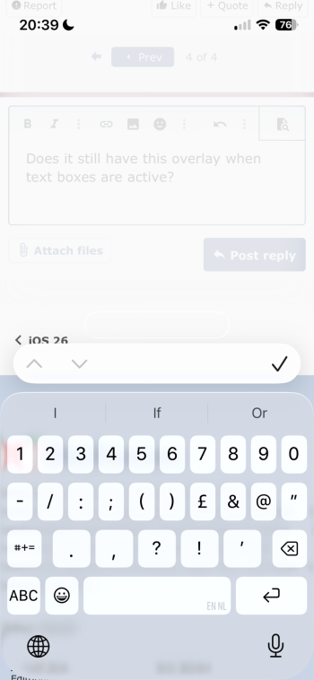
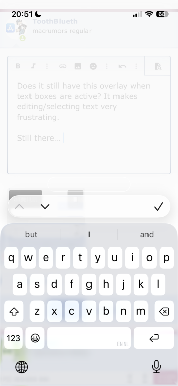
Does it still have this overlay when text boxes are active? It makes editing/selecting text very frustrating.
Still there…
I just realised it probably has something to do with the 'bottom' design.
Still there…
I just realised it probably has something to do with the 'bottom' design.
Attachments
Last edited:
Thanks, at least someone who’s getting annoyed by that 🤣It’s been this way since at least beta 4 (which is when I jumped in) and so far it is the only thing that still annoys me.
Register on MacRumors! This sidebar will go away, and you'll see fewer ads.


