Become a MacRumors Supporter for $50/year with no ads, ability to filter front page stories, and private forums.
Is that true? In the iOS 6 design, the first tap ends the current call and takes you to the new one, and tapping again ends the new one. In the new design, the first tap ends the new call, and the second ends the original call. It's the same problem either way.

iOS 6 design makes it easier to see that you pressed the button by making it darker. The button itself is also bigger.

The new iteration has an animation which doesn't react instantly. The button itself is also smaller, so we don't see it's getting darker (no feedback). Therefore, we get an increased chance of tapping twice.
 
Last edited:
Agree with most of your OP, @Andrew73875 . Great post.

There are so many new functions (e.g. Sidecar, Universal Control) that aren't intuitive at all. Tthe average user (most users), won't know how to use them and yet Apple is so focussed on these things that the simple apps (Phone, FaceTime, Messages) appear abandoned; just some little-used "share" type functionality being added and new buttons squeezed onto the FaceTime interface for adding new people, focussing the camera on who's talking etc..

Remember the hundreds of threads here, sometimes still happening, when people don't understand that turning WiFi or Bluetooth "off" in the control panel doesn't actually turn either of them off. Plus having to have Focus modes run from shortcuts that trigger automations just to get some basic functionality to work as they can't all be done in the same place.

It's interesting that many of my friends find WhatsApp much easier to use that iMessage such that we've pretty much moved there. Line and WhatsApp for video calls too. This, interestingly, makes it much easier to walk away from the Apple ecosystem which a couple of my friends have done.
 
iOS has been a disjointed mess since iOS 7. I did not understand the praise at all when it first came out and the years following as if it was/is so much better, I was seeing the complete opposite and felt like I was in this bizarro world. I pointed out the things you have here but whenever someone like me mentioned it we would just get mocked because, oh no… the wood, the linen and that green felt were just so terrible and we didn’t want to go back to that! Ignoring everything else, you know, the most important parts, that made pre iOS 7 great.

The amount of glitches, UI atrocity and wonky animations makes every iOS version since then feel like a team of amateur beginners made it. It feels duct taped together. Apart from that, the stuttering and frame drops are the worst for me. iOS 6 and prior versions were thoroughly smooth; iOS 7 > now = disjointed mess. It will feel smooth in one area and then you’ll have choppy animations and stuttering in another. It is very jarring.

I blame Jony Ive and more so Tim Cook for putting him as lead designer of iOS, just because Ive is/was good at hardware design Cook made the mistake of thinking he’d be the same with software. After Forstall was fired, Ive was so hell bent on un-skeumorphing everything, because he hated it and Forstall, that he and his new team of amateurs ended up ruining everything else about iOS in the process.
 
Last edited:
I can't tell if Apple is better or worse since he left. Any thoughts?
I have plenty. :) Jony doesn’t matter as much any more. 20+ years ago when laptops, music players, phones, and ear phones looked and worked like they did then, Jony was the right guy at the right time. His input helped de-clutter and simplify the hardware amongst a world of pretty awful designs full of compromises (think about any 2000-era MP3 player), and Apple as a whole de-cluttered, simplified, and beautified the interfaces and operating systems. They exploited so much low-hanging fruit that no other manufacturer both recognized *and* had the talent to design things that felt “how they should be” and “just worked.” Now that things are so rather well-refined, and now that the entire design world lemmingly copies Apple designs, there’s way too much focus on forced innovation for the sake of offering something new that stands out. Jony or Tim or someone convinced Apple that we users need more “think different” and ”more less” to be happy and keep buying Apple products. Mac Pro trashcan, butterfly keyboards for the sake of more thinner, and uber-minimalist interface design all are examples of unnecessary reinvention.

No, we need less Jony, we need more designers who design interfaces (and hardware) for how people think, not how for how Jony thinks people should think.

I can’t say with 100% confidence that phone or personal device/computer design will never be 180’d like the iPod, iPhone, iPad, and MacBook did, but just like the instruments in any local orchestra that hasn’t seen much significant reworking in the past century, how much more need is there to radically reinvent the iPhone’s dialer? Smaller tap buttons, flatter/less pixels, more monochromatic design, less interface cues…how is that better than before exactly?

I remember reading “people know how to tap screens now” as an excuse/reason for iOS 7. But as more and more complex functionality gets added to an iPhone/iPad, how much sense does the uber-minimalist, text-as-buttons, small tap area, simplified-all-white, flat interface design still make on Apple mobile devices and MacBooks? The negatives of reduced intuitiveness, ease of use, and even ”attractiveness and fun-to-use factor” are felt much more than any supposed gains from having a “fresh, modern, clean interface.” With those being Jony’s calling card, and with “the design world” all having the Apple industrial design mindset, I feel we’re way better off without him at Apple. But now those at Apple need to keep injecting so-called “neumorphism“ and un-flatting and de-monochromating the interfaces…
 
Last edited:
I blame Jony Ive and more so Tim Cook for putting him as lead designer of iOS, just because Ive is/was good at hardware design Cook made the mistake of thinking he’d be the same with software. After Forstall was fired, Ive was so hell bent on un-skeumorphing everything because he hated it and Forstall that he and his new team of amateurs ended up ruining everything else about iOS in the process.
One thing I LOVED and I mean LOVED that I noticed in my first 12 months of moving to OSX from windows was how they stuck with what just worked. Each OSX update kept what worked from the prior version while adding new improvements.

It underscored the laughable mess that Windows was, which radically reinvented itself every few years. I had always felt embarrassed for Microsoft, feeling like each radical plastic surgery Windows reinvention was an admission of how bad their OS was before.

Then came Jony and iOS 7 and Yosemite.

I mean come on, really, shame on anyone at Apple who felt all of the pre-iOS 7 interface elements were broken and needing complete revamping. The green felt, leather stitching, and wood grain were used as excuses to let Apple think it was a good idea to reinvent what they had successfully reinvented 5-6 years prior. Mistake.
 
Last edited:
Wow I forgot how much I missed iOS 5/6. iOS 6 and older are like wrangler straight cut jeans, classic comfy, and practical. The post iOS 7 releases are like ultra skinny low rider jeans, they hew to the latest trends and are great if your goal is to flex your style but you can’t sit comfortably for more than 10 mins and you have to carry a purse because your wallet will spoil the silhouette
 
I blame Jony Ive and more so Tim Cook for putting him as lead designer of iOS, just because Ive is/was good at hardware design Cook made the mistake of thinking he’d be the same with software. After Forstall was fired, Ive was so hell bent on un-skeumorphing everything, because he hated it and Forstall, that he and his new team of amateurs ended up ruining everything else about iOS in the process.

I’ve always had a problem with this appointment. It’s as if Tim doesn’t understand the different skill sets required for each discipline. Treating the title of ‘designer’ like some catch-all role who can do anything creative.

Why didn’t they promote a senior UI designer to lead iOS? Maybe it was political or allegiances to Forstall? But I wouldn’t be surprised if it was simply Ive’s ego. Now I don’t know how much input he had with iOS. But I suspect he focused on the look of the interface, rather than it’s usability.
 
Now I don’t know how much input he had with iOS. But I suspect he focused on the look of the interface, rather than it’s usability.

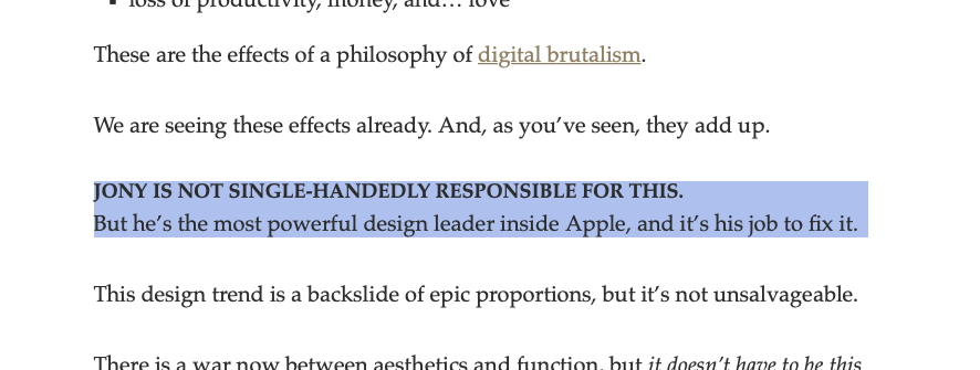
An excerpt from this well-written but now unpublished (on the web) article states it well:

Screen Shot 2022-02-20 at 10.14.04 AM.png

In other words, even if it wasn't his hand at the keyboard writing the code that flattened and un-intuitive'd iOS, he was in a position that permitted it. And the guy who thinks white, stark, ice-cold Christmas scenes are good is the guy who helped produce iOS 7.

I use oldOS from time to time. I don't miss many things from the pre-iOS 7 days.
Could you please expand upon that? I’m respectfully and honestly curious what you mean.

At the risk of leading the witness, it's difficult to gain any insight with comments like that since any interface has at least 3 completely different things to balance:

1) the user interface individual elements used across all apps and the iOS - how the individual buttons/dials/menus look like and work...their prompts, their status...the white screen or dark screen or colored screen...the flatness or detailed pixels...

2) the "gingerbread" that add ambiance and decoration to 1)...the Christopher Columbus compass, the green felt, the leather stitching, the cassette-player podcast app look...

3) the features that are completely independent of both 1) and 2)...either you have them or you don't...the addition of control center the addition of AirDrop...the overall changes to notification center, app switching, Settings...

Too many people who hated green felt and leather stitching (#2 above) and loved the introductions from #3 above short-sightedly overlook that those things could have easily been done without the wholesale reinvention of #1... The problem with iOS 6's interface elements was not that they were broken, but that they were just the evil product of Scott Forestall and not minimalist Jony.
 
Last edited:
I have plenty. :) Jony doesn’t matter as much any more. 20+ years ago when laptops, music players, phones, and ear phones looked and worked like they did then, Jony was the right guy at the right time. His input helped de-clutter and simplify the hardware amongst a world of pretty awful designs full of compromises (think about any 2000-era MP3 player), and Apple as a whole de-cluttered, simplified, and beautified the interfaces and operating systems. They exploited so much low-hanging fruit that no other manufacturer both recognized *and* had the talent to design things that felt “how they should be” and “just worked.” Now that things are so rather well-refined, and now that the entire design world lemmingly copies Apple designs, there’s way too much focus on forced innovation for the sake of offering something new that stands out. Jony or Tim or someone convinced Apple that we users need more “think different” and ”more less” to be happy and keep buying Apple products. Mac Pro trashcan, butterfly keyboards for the sake of more thinner, and uber-minimalist interface design all are examples of unnecessary reinvention.

No, we need less Jony, we need more designers who design interfaces (and hardware) for how people think, not how for how Jony thinks people should think.

I can’t say with 100% confidence that phone or personal device/computer design will never be 180’d like the iPod, iPhone, iPad, and MacBook did, but just like the instruments in any local orchestra that hasn’t seen much significant reworking in the past century, how much more need is there to radically reinvent the iPhone’s dialer? Smaller tap buttons, flatter/less pixels, more monochromatic design, less interface cues…how is that better than before exactly?

I remember reading “people know how to tap screens now” as an excuse/reason for iOS 7. But as more and more complex functionality gets added to an iPhone/iPad, how much sense does the uber-minimalist, text-as-buttons, small tap area, simplified-all-white, flat interface design still make on Apple mobile devices and MacBooks? The negatives of reduced intuitiveness, ease of use, and even ”attractiveness and fun-to-use factor” are felt much more than any supposed gains from having a “fresh, modern, clean interface.” With those being Jony’s calling card, and with “the design world” all having the Apple industrial design mindset, I feel we’re way better off without him at Apple. But now those at Apple need to keep injecting so-called “neumorphism“ and un-flatting and de-monochromating the interfaces…
This. I couldn’t agree more, 100%. I also can’t add much, it’s just a shame no one at Apple thinks like this apparently.
 
It's interesting that even marketing team is not showing iOS anymore. Here are two ads for comparison:

iPhone 4


iPhone 13

You are a rather observant one.

That's how things go when focus shifts away from the product's function to its image. Form over function equals fail.

"Subarus are built with love"... How about the attack helicopters they build, lol...
 
Last edited:
Never really before, but because of this thread and the comments, I’m considering jailbreaking my iPhone to finally have a reasonable UI again. I’m not particularly nostalgic about iOS 6 and prior, I did use iOS 3 and 6 one the first and fourth iPod touch respectively, and I surely liked the design, but when I first saw iOS 7 I knew it was the future. Yet, this thread made me realise again how cumbersome iOS has become with all the uni-form over function.
I will look into it and when I decide to wait out on iOS and go the jailbreak route, at least to try it, I’ll create thread to discuss my experience with whatever I’ll come up with by then.
 
I’d like to make a counterpoint to the books app example.

I think skeuomorphic designs have their place, and the neumorphic trend we’ve seen the last couple of years creeping out of the design world may one day come to iOS. But…

The newer designs affords us more data points that may be hard to accommodate in skeuomorphic design. For example, % read, a “more” options submenu per book, user ID, now reading hero. A less skeuomorphic design can lend itself to showing more data/options for better or worse. I think in the early days, apps had fewer options and the UI could be more focused. As time has gone on, apps have gotten much more complex and UX patterns got a bit weird trying to cram all that in to skeuomorphic design. For example: the notes app. Yellow lined paper just wouldn’t work well with all the features we have today.

Apple has certainly had missteps with design, but many decisions for change have been decent and the progression is net positive imo.
 
I’d like to make a counterpoint to the books app example.

A less skeuomorphic design can lend itself to showing more data/options for better or worse. I think in the early days, apps had fewer options and the UI could be more focused. As time has gone on, apps have gotten much more complex and UX patterns got a bit weird trying to cram all that in to skeuomorphic design.

Skeuomorphic iBooks is just gorgeous haha


Last edited:
  • Like
Reactions: N69AP and Tozovac
^ The good old days when Apple made exciting products and people camped outside for days. Now they fixed the supply chain, but the excitement is all gone. Actually, now I fear what else will be broken by Apple in the next iteration of the product. Like basically all MacBooks are now off limits for me because of headaches that the displays cause.
 
BTW, are there any mainstream publications that are critical of iOS and/or macOS in this way?
 
  • Like
Reactions: N69AP
As time has gone on, apps have gotten much more complex and UX patterns got a bit weird trying to cram all that in to skeuomorphic design. For example: the notes app. Yellow lined paper just wouldn’t work well with all the features we have today.
I'd like to guide you to my post above. I think you (and many others before you) are mistakenly grouping together what I call #2 above (gingerbread) with #1 (intuitive/efficient cues focused more on function than minimalist form). We can get away with less of #2 from the good old days but we are missing too much of #1 from the good old days.

You said it yourself, apps have gotten much more complex. It makes so little sense to keep whittling away intuitive cues in the UX via "so-called improvements" like flat design, teeny tiny tap areas, text for buttons, monochromatic white-outs to where too much blends together, light grey text on bright white backgrounds, yada yada yada. Like a light coating of oil on your glasses.

At least we have human nature to rely upon, we can only hope that the dabbling eventually returns full circle back closer to "classic" goodness.
 
Last edited:
I agree that iOS’s user experience design could be better. But I would like to give some arguments and some thoughts. I love this kind of thread!.

For first example you showed, you forgot that the older models have smaller screen size. Also the phone buttons aren’t that small either. But just like you said the add contact and the delete button should be place better. They are unreachable by thumb.

For skeuomorphism part I always thinking that Apple UI design never step outside skeuomorphism. Apple never went totally flat with their design. There are skeuomorphic UI and skeuomorphic UX. Apple softwares always have skeuomorphic UX. People who doesn’t know anything about UI/UX always thought Apple left skeuomorphic design for good. No, they never have done that. The UX stays mostly the same but the UI design just got simpl. I hate the term ‘Neuemorphism‘. I would called current Apple‘s design language as ‘Minimalist skeuomorphism’.

For the books app it stays mostly the same until iOS 12. The transition from iOS 6 to iOS 7 for book app aren’t that different. Just simpler UI design. But yes, I love the old one.

I do believe that truly skeuomorphic design is not benefit the user anymore. I saw it more like a transition from semi-analog world to a truly digital world. The newer generations wouldn’t recognize many the resemble objects in skeuomorphic design. Like the save icon being a floppy disk for a long time until they changed it to a share button.

Also it is necessary some apps have to evolve for the current use. For the TV app you showed, people are mostly watching streaming services more than buy a show nowadays. So that part is understandable. But I do hate the Musics app. I tried to be a streaming app and a local music player app at the same time. It’s a mess.

I do agree with too much white background. It would be nice to have a middle in-between choice.

In the end for me Apple did a better job implemented a flatter design than other companies. There are differences between good and bad flat UI design. For example Windows 8’s UI/UX is a mess unintuitive design. (but I love the Windows Phone version.) Google’s Material Design always look cheap (mainly because ugly typeface). Apple was able to balance between being simple and being expressive. I think what they are doing right now is implements what they learnt from designing tvOS design. Which I believe is the root of the current Apple‘s design languag.
 
As a designer, I realize reactions to design are subjective, so this is not meant as criticism of anyone's ideas or the OP's very thoughtfully presented message, but the need to be "excited" by tools is so fundamentally bizarre to me. Less emotion toward inanimate objects can only help us get past brand idolatry. Functional, sparse, flat, simple. I don't want my interfaces to look like real things because those interfaces are not real things. I want companies to stop trying to merge the virtual and the real, so the abrupt change in direction Apple made in its design language with iOS 6 (despite its faults) was a breath of fresh air to me.
 
Last edited:
Good point!

But still makes no sense why the "add contact" button was moved up from the bottom of the screen. And it happened with iOS7 when screens got larger.

0044-4-iphone-keypad.png
iphone-6-how-dial-call-3.jpg


I think the first iteration is a bit easier. Especially the big red button and "ignore". The new "decline" button lacks context. Will it it decline my current phone call or the incoming one? I think many of us have seen memes like this:

c82ca405332c9c7e8caa4fe2f07a663e9205f138fcade2bf4d76bbc3a7d85d61_1.jpg

Screenshot_20220220-220910~2.png


Android implementation is much more cleaner. There are lots of places Android 12 design is more interesting and just fun.
 
As a designer, I realize reactions to design are subjective, so this is not meant as criticism of anyone's ideas or the OP's very thoughtfully presented message, but the need to be "excited" by tools is so fundamentally bizarre to me. Less emotion toward inanimate objects can only help us get past brand idolatry. Functional, sparse, flat, simple. I don't want my interfaces to look like real things because those interfaces are not real things. I want companies to stop trying to merge the virtual and the real, so the abrupt change in direction Apple made in its design language with iOS 6 (despite its faults) was a breath of fresh air to me.

I don't want to turn this into Android vs iOS debate. But after using Pixel 3XL and Pixel 5 (replading my iPhone XS and XS Max) for a month now, I really found iOS deisgn is kind boring and not interesting anymore.

Android 12 Material You design is much more vibrant and much more fun than iOS. From interactive wallpaper to lock screen, animation is much more live than iOS. Using Pixel phone is more fun than iPhone right now.
 
Register on MacRumors! This sidebar will go away, and you'll see fewer ads.