Become a MacRumors Supporter for $50/year with no ads, ability to filter front page stories, and private forums.

KingslayerG5

Suspended
Oct 16, 2017
1,254
1,292
Notification shade on iOS is definitely inferior to Android's.

I didn't realize Apple added a mobile data and personal Wi-Fi hotspot toggle until just recently on iOS11. Because on iOS 10.2.1, I have to keep going to the Settings to turn them both on.

I use Notification Toggle on Android and two toggles I always use is Brightness and Volume. With Brightness, you can set "values" like 25%, 50%, etc. Auto-brightness is flawed and eats up more battery life since the sensor needs to turn on.

With Volume, it's different controls like Media, Ringer, Notification, Alarm, etc. Manual brightness and volume is not enough for me. The new Control Center looks like a complete mess. I can't customize with different toggles I want and hide ones I don't use.

Don't understand why toggles and notifications need to be separated on iOS. Just have them both there when you pull it down.
 

The Game 161

macrumors Nehalem
Dec 15, 2010
30,980
20,169
UK
I'm sorry but give me the way notifications are on apple products over android. You shouldn't have to remove notifications to get new twitter notifications. Also having the option of the screen to wake up when you get notifications as well. Seems odd why android don't do this. Yes there's apps that do this but not very good ones on personally experience.

That said i wish IOS was like android when it came to home screen. It's due a refresh in that area
 
  • Like
Reactions: FFR

dotnet

macrumors 68000
Apr 10, 2015
1,666
1,390
Sydney, Australia
I didn't realize Apple added a mobile data and personal Wi-Fi hotspot toggle until just recently on iOS11.

I'm sure you'll discover more if you take the blinkers off and keep looking. Try force pressing, too ;)

I can't customize with different toggles I want and hide ones I don't use.

You can't? I can.

Don't understand why toggles and notifications need to be separated on iOS.

Because they are very different, conceptually and functionally.
 
  • Like
Reactions: I7guy

convergent

macrumors 68040
May 6, 2008
3,034
3,083
You so realize that the voicemail button is on the bottom left corner of the iphones phone app as well, there is no separate app, never was.

I’m starting to doubt you ever had an iPhone.
Try to keep up. I was responding to an explanation of where to find visual voicemail on a Samsung phone, not an iPhone. This was prompted by someone saying it was hard to find visual voicemail on a Samsung phone. I said the only way it would be easier was if there was a separate app. What the heck does that have to do with an iPhone?

I don't really care if you do or don't believe I had an iPhone or not.
 

mikef07

Suspended
Aug 8, 2007
305
273
Try to keep up. I was responding to an explanation of where to find visual voicemail on a Samsung phone, not an iPhone. This was prompted by someone saying it was hard to find visual voicemail on a Samsung phone. I said the only way it would be easier was if there was a separate app. What the heck does that have to do with an iPhone?

I don't really care if you do or don't believe I had an iPhone or not.


That is simply not true.

On the contacts or recents screen on S7 Edge to get to visual voicemail you have to hit dialer button at bottom right then hit the icon at bottom left.

On an iphone there is a visual voicemail button on bottom right no matter which screen.

At least be honest if you are going to speak about Android.

It could be simpler if you had an icon for visual voicemail on any screen in the phone app. Just another way IOS is much more refined and polished.
 
  • Like
Reactions: FFR

I7guy

macrumors Nehalem
Nov 30, 2013
35,156
25,262
Gotta be in it to win it
Try to keep up. I was responding to an explanation of where to find visual voicemail on a Samsung phone, not an iPhone. This was prompted by someone saying it was hard to find visual voicemail on a Samsung phone. I said the only way it would be easier was if there was a separate app. What the heck does that have to do with an iPhone?

I don't really care if you do or don't believe I had an iPhone or not.
Kind of ironic with all of the negative press and issues and unfavorable blogs, the iPhone X is the runaway success of this holiday retail season.

https://forums.macrumors.com/thread...g-as-worlds-largest-smartphone-maker.2086863/
 

Tig Bitties

macrumors 603
Original poster
Sep 6, 2012
5,517
5,692
Kind of ironic with all of the negative press and issues and unfavorable blogs, the iPhone X is the runaway success of this holiday retail season.

https://forums.macrumors.com/thread...g-as-worlds-largest-smartphone-maker.2086863/

To the average Joe Schmoe the iPhone X is the biggest smartphone release almost ever. Not surprised one bit it is giving Apple record sales, this was totally expected. Only thing that was of concern a month ago was supply and production issues, but that seems to be totally false rumors, and if they can keep up with demand, it will be a smashing success.

I'm interested in the Pixel 2 / 2 XL sales numbers I know they sold out originally at launch, but that's probably because Google had like twelve only made for sale, and has to make the other few hundred people ordered. LOL jk. But I would be curious if the new Pixel's are selling in the million numbers or no way ?
 
  • Like
Reactions: I7guy

c0ppo

macrumors 68000
Feb 11, 2013
1,890
3,268
I grant you, there could be some kind of transparent placeholder or something, for you to insert, but I doubt it's a high priority. If you do away with the gravity thing altogether the whole icon arrangement process becomes less elegant and requires more interaction. Think about it.

Transparent placeholders? U r joking, right? Less elegant? More interaction? I am thinking about it. But what are you thinking about? If I place an icon on android home screen and press it, guess what happens? App opens. Just like it's on iOS. So how come that requires more interaction?

Again, you're not thinking this through. Putting a few icons at the bottom of each screen and using more screens instead will not make things quicker or give you more direct access, the opposite is true.

Actually, it will make things easier. If I use just 8 apps, I don't need to search or look at the home screen on Android. They are always placed the same. So I can just tap. If I put 12 more apps there, well, things get clunky rather fast. Just look at iOS home screen for example :D

I doubt that, but why don't you just describe the quicker and more direct way of calling contacts, instead of huffing and puffing about it?

As I said, you obviously haven't used anything besides iOS. And that is a shame. Try it out on a friends phone, then we can talk. But to describe it, lets say you have 50 John names in your contacts. All have different last name. On android smart dial I can just type first two letters of John -> 'Jo', then first letter of his last name, let's say it is Smith. So I just type in JoS. Press the name, phone call begins.

Here is the example of one app with smart dial on play store:

But default google app is way better, simpler, and faster. Just couldn't find any videos about it.

That's the process of getting ringtones onto the phone. You said "all I want is simple ways to set some ringtones, and simple stuff like that." So, how do you do that? How do you set a ringtone for a contact? Are you going to tell me that, or is going to be more huffing and puffing?

Yes indeed. That is the process of getting ringtones onto a phone. And that is what I said. So, could you please answer my simple question? I will repeat it. How to you get custom ringtones onto iPhone? I want for you to explain how to get a custom ringtone, and set it as a default ringtone.

I'm not talking about contact specific ringtones. Those are easy on iOS as they are on Android. So please, no more of patronising if you want to have a decent discussion (huffing and puffing). Otherwise, I will just greet you and be on my way, since I really don't care for those kind of 'discussions' ;)

I've already described how to set custom custom ringtones. As for obtaining them – I've never downloaded (let alone bought) a ringtone, but I've made plenty of my own. I used GarageBand for that, which allows me to get the volume, dynamic range and looping right. It saves the result straight as a ringtone to iTunes. Now, I haven't made ringtones in years, so I'm not sure what people use these days. My phone doesn't ring anymore, ever since getting the Apple Watch in April '15 it has been on silent :p

Actually, you still haven't described how to set custom ringtones. Garageband? Apple Watch? How about an answer to a rather simple question? I'm asking nicely. But you can avoid an answer once again, it wouldn't surprise me at all :p

As it stands, in this thread, they're not clear, and you're making no effort to enlighten me. All I see is a lot of hand-waving about nothing.

Of course all you see is hand-waving, since you patronise, and don't even try to read what anyone else writes. But the biggest problem you have is that you have no experience with any other device other then iPhone. That is ok, if iPhone works for you, and you are satisfied -> great. But then, don't try to be smart about stuff you really know nothing about :(

I disagree, and would humbly suggest that if you look at your home screen a lot you're not using your devices right (or at least not the way they were intended). I spend very little time looking at the home screen of my Mac, I look at apps. Most of them are in full-screen, just like in iOS ;)

So now I'm using my device wrong? Or was it holding it wrong? :D
 
  • Like
Reactions: Tig Bitties

Tig Bitties

macrumors 603
Original poster
Sep 6, 2012
5,517
5,692
Google's stock Android Phone app feels like it's from the present current day, fresh and up to date with current software and technology, and the iOS Phone app feels stuck in 2007.

I recall when I had the iPhone 7 Plus earlier this year, and coming from mainly stock Android nexus or OnePlus phones before that, I found the iOS Phone app to be extremely frustrating to use, and navigate around, it took more clicks, more fumbling to get around the iOS Phone app, compared to stock Android's. That's not an opinion, but fact.

How about when a new Phone call comes in while you are browsing the internet, or in the middle of writing a text. On stock Android, it's just a heads up notification pop up menu on the very top of the screen, you can accept or decline or send a message to the caller right there, but it does not interrupt what you are currently doing if on the internet. But with iOS, if your in Safari, and a phone call comes in, that call takes up the entire screen, and takes you away from what your currently doing on the Phone. I found that to be a really poor way for Apple to do that, it should just be a drop down banner on the screen when a new phone call comes in when your in the middle of reading a web page. I am shocked Apple still does it this way in 2017 already.


And those are two things I thought for sure that iOS 11 would update, would be a revised and better Phone app, and complete overhaul of the Notification system. When the iOS 11 preview came in June, I sold my 7 Plus immediately after, just shocked that those weren't addressed by Apple.
 
Last edited:
  • Like
Reactions: Apple Fritter

I7guy

macrumors Nehalem
Nov 30, 2013
35,156
25,262
Gotta be in it to win it
Google's stock Android Phone app feels like it's from the present current day, fresh and up to date with current software and technology, and the iOS Phone app feels stuck in 2007.

I recall when I had the iPhone 7 Plus earlier this year, and coming from mainly stock Android nexus or OnePlus phones before that, I found the iOS Phone app to be extremely frustrating to use, and navigate around, it took more clicks, more fumbling to get around the iOS Phone app, compared to stock Android's. That's not an opinion, but fact.

How about when a new Phone call comes in while you are browsing the internet, or in the middle of writing a text. On stock Android, it's just a heads up notification pop up menu on the very top of the screen, you can accept or decline or send a message to the caller right there, but it does not interrupt what you are currently doing if on the internet. But with iOS, if your in Safari, and a phone call comes in, that call takes up the entire screen, and takes you away from what your currently doing on the Phone. I found that to be a really poor way for Apple to do that, it should just be a drop down banner on the screen when a new phone call comes in when your in the middle of a text.

And those are two things I thought for sure that iOS 11 would update, would be a revised and better Phone app, and complete overhaul of the Notification system. When the iOS 11 preview came in June, I sold my 7 Plus immediately after, just shocked that those weren't addressed by Apple.
I do wish iOS had some of blackberrys old features in the phone app. One thing I’ll say about blackberry they tuned their o/s well. Shortcuts and features galore...including an sd card reader on a lot of models (which I never used).
 

widgeteer

Suspended
Jun 12, 2016
1,565
4,610
Google's stock Android Phone app feels like it's from the present current day, fresh and up to date with current software and technology, and the iOS Phone app feels stuck in 2007.

I recall when I had the iPhone 7 Plus earlier this year, and coming from mainly stock Android nexus or OnePlus phones before that, I found the iOS Phone app to be extremely frustrating to use, and navigate around, it took more clicks, more fumbling to get around the iOS Phone app, compared to stock Android's. That's not an opinion, but fact.

How about when a new Phone call comes in while you are browsing the internet, or in the middle of writing a text. On stock Android, it's just a heads up notification pop up menu on the very top of the screen, you can accept or decline or send a message to the caller right there, but it does not interrupt what you are currently doing if on the internet. But with iOS, if your in Safari, and a phone call comes in, that call takes up the entire screen, and takes you away from what your currently doing on the Phone. I found that to be a really poor way for Apple to do that, it should just be a drop down banner on the screen when a new phone call comes in when your in the middle of reading a web page. I am shocked Apple still does it this way in 2017 already.


And those are two things I thought for sure that iOS 11 would update, would be a revised and better Phone app, and complete overhaul of the Notification system. When the iOS 11 preview came in June, I sold my 7 Plus immediately after, just shocked that those weren't addressed by Apple.

Sounds like iOS just doesn't fit your needs. Bummer.
 

Tig Bitties

macrumors 603
Original poster
Sep 6, 2012
5,517
5,692
Sounds like iOS just doesn't fit your needs. Bummer.

But it could be, if Apple ever updated iOS like it desperately needs. There's a popular JB tweak that does fix the Phone to be a banner notification for incoming calls. But sadly the Jailbreak scene is dead
 
  • Like
Reactions: Apple Fritter

convergent

macrumors 68040
May 6, 2008
3,034
3,083
That is simply not true.

On the contacts or recents screen on S7 Edge to get to visual voicemail you have to hit dialer button at bottom right then hit the icon at bottom left.

On an iphone there is a visual voicemail button on bottom right no matter which screen.

At least be honest if you are going to speak about Android.

It could be simpler if you had an icon for visual voicemail on any screen in the phone app. Just another way IOS is much more refined and polished.

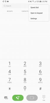
Be honest? What the heck are you talking about. I have a Note 8. The voicemail icon is on the lower left within the phone app. I made ZERO statements about how an iPhone worked for voicemail in any post in this thread. Get your facts straight because everything I posted about this is factual. Here is a screen shot of my phone app and a circle around the voicemail icon. Explain where I'm not honest.

upload_2017-11-9_14-26-57.jpeg


Kind of ironic with all of the negative press and issues and unfavorable blogs, the iPhone X is the runaway success of this holiday retail season.

https://forums.macrumors.com/thread...g-as-worlds-largest-smartphone-maker.2086863/

OK... you know that the iPhone X is a runaway success this holiday retail season, which hasn't started yet, and you are using an analyst's prediction of future sales? Speculate much? If it is a runaway success (which we'd know in January) it won't be shocking since Apple will get a bump during the next quarter, as they always do, but especially because they just released a new design for the first time in 4 years. Duh.

That Really seems to burst his bubble. That and displaymates results.

You talking about my bubble? My bubble is just fine. I looked at alternatives from Apple, Samsung, and Google, and made a decision on the Note 8. I am very happy with my purchase. Why would I give a crap about some analysts's projection of sales on something I don't intend to buy. I hope Apple and Samsung continue to go after each other aggressively. Its the best thing that can happen for consumers who care about finding the best product for their needs.

As for Displaymate, we've covered this already. If you actually look at their analysis, the only category that the X display won was color accuracy. As a photographer, I've shared several times on here what color accuracy means to me on a smartphone. Ironically there is a very long thread on here of new X users trying to tweak the accurate color because they don't like it. Samsung has thoughtfully added 4 presets for color mode selection. I picked the one I like best and am quite happy with it.
 
  • Like
Reactions: Apple Fritter

mikef07

Suspended
Aug 8, 2007
305
273
Be honest? What the heck are you talking about. I have a Note 8. The voicemail icon is on the lower left within the phone app. I made ZERO statements about how an iPhone worked for voicemail in any post in this thread. Get your facts straight because everything I posted about this is factual. Here is a screen shot of my phone app and a circle around the voicemail icon. Explain where I'm not honest.

View attachment 734053


OK... you know that the iPhone X is a runaway success this holiday retail season, which hasn't started yet, and you are using an analyst's prediction of future sales? Speculate much? If it is a runaway success (which we'd know in January) it won't be shocking since Apple will get a bump during the next quarter, as they always do, but especially because they just released a new design for the first time in 4 years. Duh.


You talking about my bubble? My bubble is just fine. I looked at alternatives from Apple, Samsung, and Google, and made a decision on the Note 8. I am very happy with my purchase. Why would I give a crap about some analysts's projection of sales on something I don't intend to buy. I hope Apple and Samsung continue to go after each other aggressively. Its the best thing that can happen for consumers who care about finding the best product for their needs.

As for Displaymate, we've covered this already. If you actually look at their analysis, the only category that the X display won was color accuracy. As a photographer, I've shared several times on here what color accuracy means to me on a smartphone. Ironically there is a very long thread on here of new X users trying to tweak the accurate color because they don't like it. Samsung has thoughtfully added 4 presets for color mode selection. I picked the one I like best and am quite happy with it.


Ok when I hit my call phone icon on the bottom left I get taken right into a menu that has recents selected. I have to then hit the icon at the bottom right to get to the picture that you posted. I can then select what you circled. I do not have to do that with an iphone. No matter which window I am on a visual voicemail is always available on the bottom right. Someone asked how could it be easier to access vociemail. By always having that icon you have circled on any call screen whether dialer (what you have show in your picture) is selcted, whether recents is selected (it is not there if recents is selected), or whether contacts is selected (it is not there if contacts is selected.)

On the iphone X I hit the phone button I am on the favorites selection at the bottom right I can select voicemail, I then go to recents and on the bottom right I can select voicemail, I then go to contacts and on the bottom right I can select voicemail.

Please post a photo of what you see when you select recents tab.
 

convergent

macrumors 68040
May 6, 2008
3,034
3,083
Ok when I hit my call phone icon on the bottom left I get taken right into a menu that has recents selected. I have to then hit the icon at the bottom right to get to the picture that you posted. I can then select what you circled. I do not have to do that with an iphone. No matter which window I am on a visual voicemail is always available on the bottom right. Someone asked how could it be easier to access vociemail. By always having that icon you have circled on any call screen whether dialer (what you have show in your picture) is selcted, whether recents is selected (it is not there if recents is selected), or whether contacts is selected (it is not there if contacts is selected.)

On the iphone X I hit the phone button I am on the favorites selection at the bottom right I can select voicemail, I then go to recents and on the bottom right I can select voicemail, I then go to contacts and on the bottom right I can select voicemail.

Please post a photo of what you see when you select recents tab.

You are correct, I see what you are saying. It persists on the screen you were on last, and so that is why when I opened the app it was there. It would be better to be on all screens. Put that in the con column for the Note 8. There are always pros and cons.
 

LIVEFRMNYC

macrumors G3
Oct 27, 2009
8,877
10,987
Ok when I hit my call phone icon on the bottom left I get taken right into a menu that has recents selected. I have to then hit the icon at the bottom right to get to the picture that you posted. I can then select what you circled. I do not have to do that with an iphone. No matter which window I am on a visual voicemail is always available on the bottom right. Someone asked how could it be easier to access vociemail. By always having that icon you have circled on any call screen whether dialer (what you have show in your picture) is selcted, whether recents is selected (it is not there if recents is selected), or whether contacts is selected (it is not there if contacts is selected.)

On the iphone X I hit the phone button I am on the favorites selection at the bottom right I can select voicemail, I then go to recents and on the bottom right I can select voicemail, I then go to contacts and on the bottom right I can select voicemail.

Please post a photo of what you see when you select recents tab.

You are correct, I see what you are saying. It persists on the screen you were on last, and so that is why when I opened the app it was there. It would be better to be on all screens. Put that in the con column for the Note 8. There are always pros and cons.


There is a setting when you tap the Phone icon, "Open to Keypad" or "Open to last viewed".


Phone icon1.jpg Phone icons 2.jpg
 

convergent

macrumors 68040
May 6, 2008
3,034
3,083
There is a setting when you tap the Phone icon, "Open to Keypad" or "Open to last viewed".

There you go... that explains why I saw it the way I did. I had that setting turned on.

That said, I do agree that a better design would be to have it on every pane.
 

apolloa

Suspended
Oct 21, 2008
12,318
7,802
Time, because it rules EVERYTHING!
I don’t see the problem really, widgets on Android are alright but not missed on iOS, not sure what default apps people have an issue with either? I just use Outlook, and you just choose your browser you want? And then you can remove the default Apple one.

Notifications is the only area I think that needs work.

And whilst people would argue for a complete overhaul, IMO Samsung has copied Apples look these days, which I’m not complaining about as it looks very nice and swish.
 

convergent

macrumors 68040
May 6, 2008
3,034
3,083
I don’t see the problem really, widgets on Android are alright but not missed on iOS, not sure what default apps people have an issue with either? I just use Outlook, and you just choose your browser you want? And then you can remove the default Apple one.

Notifications is the only area I think that needs work.

And whilst people would argue for a complete overhaul, IMO Samsung has copied Apples look these days, which I’m not complaining about as it looks very nice and swish.

In what way is Samsung copying Apple these days? I don't see anything remotely similar between iOS and Samsung's version of Android. Both very good, and both unique.
 
  • Like
Reactions: Tig Bitties

LIVEFRMNYC

macrumors G3
Oct 27, 2009
8,877
10,987
There you go... that explains why I saw it the way I did. I had that setting turned on.

That said, I do agree that a better design would be to have it on every pane.

On every pane, you do have the green dialer button that takes you right back to the dialer with the voicemail icon. I look at it as just the nature of different UIs rather than any con. It's a one tap difference from iOS if you're in recents or contacts.
 

nviz22

Cancelled
Jun 24, 2013
5,277
3,071
It is only scratching the surface

The iPhone should be un-tethered from iTunes.
No Default apps is ridiculous
Settings are a complete mess
Springboard is utterly outdated.
And notifications

to name a few.

Quite why IOS users put up with it i don't know.

Personally, I won't return to IOS until iTunes is canned. (yes i hate it that much)

Despite the iFlaws that comes with iPhone ownership, I just rather put up with iFlaws than deal with Samsung right now because I just simply don't have the patience for unpatched bugs, the rash of newer hardware defects, lack of battery life, the device degrading over time since the iPhone actually ages well in terms of software support. Samsung is all over the place that is spectacularly frustrating.
 

tbayrgs

macrumors 604
Jul 5, 2009
7,467
5,097
Despite the iFlaws that comes with iPhone ownership, I just rather put up with iFlaws than deal with Samsung right now because I just simply don't have the patience for unpatched bugs, the rash of newer hardware defects, lack of battery life, the device degrading over time since the iPhone actually ages well in terms of software support. Samsung is all over the place that is spectacularly frustrating.

Anyone that’s been here for a while would know my preference tend to align with Apple’s hardware and software but even I’ll admit you could quite easily replace Samsung with Apple in your statement and it seems to be a spot on description for recent events. IOS 11 has been a bit of a cluster****, requiring quite a few .x updates to deal with any number of bugs, affecting battery life of all versions of devices prior to the iPhones 8 and X, with widespread reports of users 6 and 6s grinding to a near halt in speed since being updated. I’ve seen quite a few iPhone 6/6s owners complain how iOS 11 has basically made their devices unenjoyable to use.

Add to it some early reports of inconsistent displays on the iPhone X and now cold weather performance deficiencies and Apple really isn’t separating themselves from the rest of its competition of late.
 
Last edited:
Register on MacRumors! This sidebar will go away, and you'll see fewer ads.