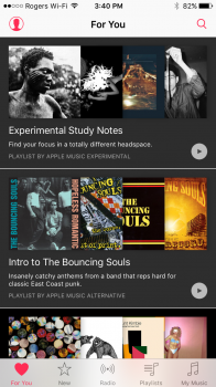
I agree with a bunch of you guys that the UI of the new music app is atrocious.
I do believe that the Apple Music service should be its own app (an optional App Store download) and the radio features should also be a separate app.
The stock music app should resemble and function more like the previous releases (especially the iOS 6 version) and re-add some of the features they took away since iOS 8.4 such as landscape view, customizable tabs and shake-to-shuffle.
As for the design layout, they should remove the transparent status bar over the album art in the Now Playing screen, it's really distracting and I'm sure that I'm not the only person irked by that design flaw.
There's a lot more that needs to be fixed with the stock music app and until Apple does a complete overhaul (and actually does it right), I'm not gonna be buying anymore iOS devices anytime soon. Part of the reason why I was so attracted to Apple products was for how easy and fun it was to play and listen to music on them. Now, the experience is aggravating and the app is poorly designed. WTF Apple? You made the iPod and iTunes (before it got so bloated), you can do so much better than the crap you have out right now. Very un-Apple and I've been very disappointed with Apple lately but hopefully they will come around and surprise/amaze us again but I won't hold my breath because Tim Cook's Apple is all about the bottom line and mediocrity doesn't seem to be a concern in Cupertino nowadays...
[doublepost=1454699436][/doublepost]
Heres the issue.
Side note: why can't in Multitasking for iOS and Mission Control for Mac, show above the card an icon that indicates the app currently has background audio.. I get so mad when accidentally close my music.
I miss the little 'play' indicator on the top right-hand side of the status bar. It was an iOS fixture until Jony Ive removed it in 7 for some reason. What was the point of removing it again?