Become a MacRumors Supporter for $50/year with no ads, ability to filter front page stories, and private forums.

adamhenry

macrumors 68000
Jan 1, 2015
1,621
611
On the Beach
Lol...seperate app? Yeah, right. While we're at it lets have apps that cost money have their own App Store app. I don't want to look at apps that cost money when looking for free apps.

I barely ever use bookmarks in Safari. Apple should have Safari bookmarks as a separate app also. I don't want to see the bookmark button at the bottom while browsing.

Seperate apps for every feature of iOS!!! Things are too simple these days.

This isn't a jab at you, but some people just can't adapt to change very well or some people refuse to adapt.
 

oldmacs

macrumors 601
Sep 14, 2010
4,941
7,182
Australia
The previous music app also allowed you to choose and rearrange the tabs. That’s also gone.
This is what I miss the most. I don't use Apple Muisc, so once I turn that off, I'm left with a waste of space bottom menu, and no way to put artists, albums, songs etc across the bottom like we used to. Big step back in usability and my biggest annoyance of the music app itself (ignoring the terrible layout and organisation of Apple music).
 
  • Like
Reactions: heffsf and Zwhaler

lagwagon

Suspended
Oct 12, 2014
3,899
2,759
Calgary, Alberta, Canada
Remember how Podcasts used to be baked into the iPod/Music app? It's the same mentality really. The Apple Music streaming service app should be an optional download in the App Store kinda like Spotify. The radio features of Beats and iTunes could also be a separate app called Radio (I'm pretty sure Apple was considering this idea at one point). Therefore, the Music app would essentially go back to the basics, a focus on storing your personal music library and being the traditional iPod player that we all know and love.

A big part of Apple Music is being able to blend your purchased/previously owned music WITH the streaming of the Apple Music catalog. If it was separate new people getting their first iPhone would never know about it unless someone told them. Having it built into Music app (and essentially built into iOS) the discovery rate of the service is greatly improved and more convenient because it's there and nothing to install. It would be bad business to seperate it and hide it in the App Store for no one to find.

Do a couple tabs at the bottom on the screen that don't have to be pressed really ruin your life so much? It still stores your personal music library, it still plays your personal music library.
[doublepost=1454729154][/doublepost]
This isn't a jab at you, but some people just can't adapt to change very well or some people refuse to adapt.

You really don't grasp sarcasm do you?

And for the record I seem to be able to adapt a lot more than many on these forums who complain about every single tiny little change made because it doesn't look how they want or they can't use it 100% tailored to how weird way they use it.
 

RobbyIdol

macrumors regular
Mar 20, 2012
248
185
Having it built into Music app (and essentially built into iOS) the discovery rate of the service is greatly improved and more convenient because it's there and nothing to install. It would be bad business to seperate it and hide it in the App Store for no one to find.

It wouldn't be hidden - it would still be a part of the OS as much as that lame Apple Watch app that we're stuck with, even though I don't own a Watch and don't need the app.

Also, I miss podcasts being baked into the Music app. I've gained nothing having them in a separate app, only the slight inconvenience of switching apps now and then.
 

lagwagon

Suspended
Oct 12, 2014
3,899
2,759
Calgary, Alberta, Canada
It wouldn't be hidden - it would still be a part of the OS as much as that lame Apple Watch app that we're stuck with, even though I don't own a Watch and don't need the app.

I guess you missed the part from the person that I was replying to that said "The Apple Music streaming service app should be an optional download in the App Store kinda like Spotify."

If that was the case then yes it would be hidden and much less likely people would sign up. That's bad business for Apple. They would never do that to one of their own services. They will bake them into iOS for convenience and discoverability by new users.
 

BillyMatt87

macrumors 6502a
Dec 23, 2013
636
823
I guess you missed the part from the person that I was replying to that said "The Apple Music streaming service app should be an optional download in the App Store kinda like Spotify."

If that was the case then yes it would be hidden and much less likely people would sign up. That's bad business for Apple. They would never do that to one of their own services. They will bake them into iOS for convenience and discoverability by new users.

Yeah but they shouldn't have to shove it down our throats with constant advertising for it within the app. Kinda like the U2 album, it's great that the band and Apple offered their new record free (although it was meh compared to their early stuff) but just let people decide for themselves if they want it. It'll be there waiting for anyone who wants to download it but don't push it on people, I mean Apple used to be more subtle and restrained about this kind of stuff under Jobs.
[doublepost=1454742383][/doublepost]
A big part of Apple Music is being able to blend your purchased/previously owned music WITH the streaming of the Apple Music catalog.

Do a couple tabs at the bottom on the screen that don't have to be pressed really ruin your life so much? It still stores your personal music library, it still plays your personal music library.

I miss being able to customize the bottom tabs of the music app. One reason why people hate Apple is due to the lack of OS customization. While iOS has never been big on customization, at least the tabs in the old music app were a nice touch. Now there's even less customization. And yeah I know I can still play my local music library but it's so incredibly sidelined for the streaming service which I have no interest in subscribing to. The thing that was always great about the ipod/music app was that is was very elegant and simple to use and was very straightforward about its functions as an app. Now, it's extremely convoluted, cluttered and poorly designed that I just don't wanna touch the app or even load my music onto it. It's just not worth it.

I get the whole discovery and curation thing is a big part of the service. I did however, have another idea to work around that:

All that curation and discovery stuff could be integrated into the iTunes Store app. If you're a subscriber of Apple Music, you use the iTunes Store app to find music the way you'd normally do but in addition to the traditional 'buy' button, you'd have a '+' button next to it and tapping it would give you two options: Save song/album for local or Save song/album for streaming. Also, there would be a button on the top left hand corner on both the music app and the iTunes Store app for back and forth access between the two apps (another old iOS feature that Jony Ive removed in iOS 7).

That way, Apple's streaming service builds on the foundation of the iTunes Store and basically tells the customer: hey look, streaming music from iTunes is just as simple as buying it. The process is much more streamlined that way.

Basically, instead of the cluster**** of the music app we have now, you could spin all of the features into 3 apps:

- Discovering and searching for music: iTunes Store app
- iTunes Radio and Beats1: Radio app
- Music playback/iPod player: Music app
 

lagwagon

Suspended
Oct 12, 2014
3,899
2,759
Calgary, Alberta, Canada
All that curation and discovery stuff could be integrated into the iTunes Store app. If you're a subscriber of Apple Music, you use the iTunes Store app to find music the way you'd normally do but in addition to the traditional 'buy' button, you'd have a '+' button next to it and tapping it would give you two options: Save song/album for local or Save song/album for streaming. Also, there would be a button on the top left hand corner on both the music app and the iTunes Store app for back and forth access between the two apps (another old iOS feature that Jony Ive removed in iOS 7).

That way, Apple's streaming service builds on the foundation of the iTunes Store and basically tells the customer: hey look, streaming music from iTunes is just as simple as buying it. The process is much more streamlined that way.

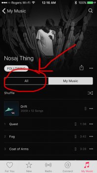
I still can't see how separating AM out of Music app could be more streamlined. It forces the user to bounce between apps to go from playing something, to adding something and back to playing something. How is that more streamlined than (see screenshot) where you can just tap the "All" tab within an artist you have and see all available albums and such and add them without leaving the artist page. In the case of the artist in the screenshot I have 2 of the 4 albums, I could add the other two right then and there and not have to bounce out of Music and go add it in iTunes and then go back to Music to play the newly added albums/songs like you suggest. That would be clunky and the opposite of streamlined.

I get it that people who don't wish to subscribe are a little annoyed with a few extra tabs. They are still tweaking the app in nearly every update since its release in 8.4. I believe they killed off iTunes Radio for non AM subscribers very recently. So it's possible they may tweak the tabs for non subscribers in a future update.
 

Attachments

  • image.jpeg
    image.jpeg
    429.4 KB · Views: 113

oldmacs

macrumors 601
Sep 14, 2010
4,941
7,182
Australia
Do a couple tabs at the bottom on the screen that don't have to be pressed really ruin your life so much? It still stores your personal music library, it still plays your personal music library.

Yet it makes doing things that used to include one tap, take more taps which is a step backwards. The bottom menu is now a waste of space, with three tabs 'My Music', 'Radio' and 'Playlists'. Users should be able to put Artists, Albums etc there. I just don't get why it has to be two steps forward and 2 steps back. The space wastage in the music app is just ridiculous.

And on the whole blending personal music, they need to work on it. It should be smart enough that if I search Apple music for a song I already have, or say an album i have half of, Apple Music should know and not need to stream the songs I own.
 

unobtainium

macrumors 68030
Mar 27, 2011
2,650
4,086
No problem. You start paying for my data and service and I'll sign right up. That way I'm still paying for my music once. As it is now I pay for my music, then pay Apple to stream it to me, and pay VZW for the bandwidth to stream it to me?
No. Here's how it works: you pay an absurdly low monthly fee to Spotify for access to unlimited music. You sync up to 10,000 songs to your phone for offline playback. Do this at home or at work or at Starbucks or anywhere else with Wi-Fi. If you're with Verizon*, disable streaming over cellular and you're good to go.

If you get bored with your 10,000 offline tracks, you can change them up whenever you're on Wi-Fi.

* Better yet, switch to T-Mobile and get unlimited streaming.
 

BillyMatt87

macrumors 6502a
Dec 23, 2013
636
823
They are still tweaking the app in nearly every update since its release in 8.4. I believe they killed off iTunes Radio for non AM subscribers very recently. So it's possible they may tweak the tabs for non subscribers in a future update.

They're still tweaking it? It doesn't look any different or better from what I've seen? It's the same POS app from iOS 8.4 Where's the landscape view? Where's shake-to-shuffle? Why is the status bar bleeding into the album art?

I think it's pretty clear now that when Apple redesigns software, whether it be a single app or the entire OS that once they redesign it, they kinda just let it stagnate and they rest on their laurels until they eventually feel the need to do a complete redesign again. That's why the initial iOS 7 redesign didn't and still hasn't completely worked and won over everyone. Apple used to be more gradual and incremental when it came to redesigning aspects of their software, they were basically puzzle pieces coming together slowly but they ended forming a beautiful and consistent picture at the end of the day. Nowadays at Apple, it's the exact opposite since we only seem to get occasional radical redesigns and things are mostly left untouched afterwards.
 

lagwagon

Suspended
Oct 12, 2014
3,899
2,759
Calgary, Alberta, Canada
They're still tweaking it? It doesn't look any different or better from what I've seen? It's the same POS app from iOS 8.4 Where's the landscape view? Where's shake-to-shuffle? Why is the status bar bleeding into the album art?

It's seen quite a few tweaks since 8.4. They've moved a ton out of the "..." Menus. It made many of the options that were in those menus originally in 8.4 easier now. They've improved the downloaded icons and it now includes the icon on every track instead of just on the album cover art (This was nearly the top complaint in 8.4.) They added a dedicated "shuffle" and "shuffle all" buttons to fully library, artist, album, playlist that was missing in 8.4.

There has been lots of things like that. Just because you haven't noticed or care, doesn't mean they haven't been making tweaks to it in nearly every update since 8.4.

Landscape cover flow was one of the most complained about things pre 8.4. No one liked it. That's why it's gone people complained and got what they wanted. Just like people are complaining now with different areas of the app. Shake to Shuffle was useless, I bet not even 1% of users ever used it. The status bar doesn't "bleed" into album art. It's transparent just like it is in many, many other areas in iOS. Do people really sit there and stare at the cover art? That's like saying the status bar bleeds into my wallpaper on my lock screen and home screen ruining my staring at my home screen experience. Such a ridiculous complaint.
 

dk001

macrumors demi-god
Oct 3, 2014
11,136
15,488
Sage, Lightning, and Mountains
I was an early adopter of AM and dumped it after it borked my music collect not once, but twice.
Reading this thread, it appears that it hasn't improved.
Still, interesting reading.
 

BillyMatt87

macrumors 6502a
Dec 23, 2013
636
823
It's seen quite a few tweaks since 8.4. They've moved a ton out of the "..." Menus. It made many of the options that were in those menus originally in 8.4 easier now. They've improved the downloaded icons and it now includes the icon on every track instead of just on the album cover art (This was nearly the top complaint in 8.4.) They added a dedicated "shuffle" and "shuffle all" buttons to fully library, artist, album, playlist that was missing in 8.4.

There has been lots of things like that. Just because you haven't noticed or care, doesn't mean they haven't been making tweaks to it in nearly every update since 8.4.

Landscape cover flow was one of the most complained about things pre 8.4. No one liked it. That's why it's gone people complained and got what they wanted. Just like people are complaining now with different areas of the app. Shake to Shuffle was useless, I bet not even 1% of users ever used it. The status bar doesn't "bleed" into album art. It's transparent just like it is in many, many other areas in iOS. Do people really sit there and stare at the cover art? That's like saying the status bar bleeds into my wallpaper on my lock screen and home screen ruining my staring at my home screen experience. Such a ridiculous complaint.

While I'd admit that the landscape tile view from iOS 7-8.3 was kinda meh, the original Cover Flow interface from iOS 1-6.1 was awesome. It adapted the iTunes interface perfectly onto the iPhone and gave the iPod/Music app more of a classic jukebox feel to it. People didn't want landscape mode removed, they wanted a replacement worthy of the original interface. Apple listened to the first complaint but ignored the second. They completely half-assed it there and it just wastes the larger display canvases of the iPhone 6 & 6 Plus. Apple has amazing displays with their iOS device, yet for some reason, the UI barely takes advantage of this but that is more of an iPad issue though.

As for Shake-to-Shuffle, I thought it was a fun yet useful feature. I used it regularly and thought it had a purpose. Also it was an OPTIONAL feature in the settings. You weren't forced to use it at all, you could always toggle it on or off but now it's completely gone and that's another -1 for customization in iOS.

As for the status bar over the album art, that alone violates one of Apple's most important GUI guidelines: alleviating the content. By having the status bar completely transparent over the album, it distracts from the main content and partially obstructs it (the album art) and makes the interface at the top a bit too noisy. I understand Apple intention was to have it be a full screen experience but the execution is so poorly done. I wanna see my album art fully unobstructed (like it used to be), if I wanna see the signal strength or battery percentage remaining, it should just be hidden from that now playing view so I could just swipe down off the now playing to the main screen where all that stuff is anyways. As for the transparent status bar on the home screen, that was another big design mistake made by Jony Ive. The status bar should always be on a translucent strip at the top for better UI contrast, like the menu bar in OS X.

But continue being an apologist, I'm an Apple fan who's realizing that they've been screwing up a lot lately and it's become harder to root for them and people like you enable Apple to continue to release subpar products and services because you'll buy it anyway and everything Apple does, no matter how ridiculous some of their recent decisions have been, you'll find a way to justify it. It's honestly tough for a long-time fan of Apple like me to admit that they're on the path towards becoming just another tech company. It really is, the current music app represents a lot of what's wrong with Tim Cook's mishandling of Apple on the product end. He's a competent businessman and bean counter but e's clearly nothing special and has no true vision of his own, he's just riding on Jobs's success and betraying a lot of what his former stood for and intended for Apple. They've lost their edge under Cook and forgotten what made them so successful again in the first place.
 
  • Like
Reactions: heffsf and dk001

lagwagon

Suspended
Oct 12, 2014
3,899
2,759
Calgary, Alberta, Canada
But continue being an apologist, I'm an Apple fan who's realizing that they've been screwing up a lot lately and it's become harder to root for them and people like you enable Apple to continue to release subpar products and services because you'll buy it anyway and everything Apple does, no matter how ridiculous some of their recent decisions have been, you'll find a way to justify it.

I'm an apple apologist because I'm fine with the design change? And then to say "because of people like me they continue to release subpar products". That's laughable and completely ignorant.

I'm sorry I don't get upset over a bunch of 1's and 0's and because of that your life is ruined because something doesn't look exactly how you want it to look.

I bet people like you would rage so hard if Apple decided to move the clock and date on the lock screen down 3 by pixels. Claiming how it ruins your lock screen experience.
 

BillyMatt87

macrumors 6502a
Dec 23, 2013
636
823
I'm an apple apologist because I'm fine with the design change? And then to say "because of people like me they continue to release subpar products". That's laughable and completely ignorant.

I'm sorry I don't get upset over a bunch of 1's and 0's and because of that your life is ruined because something doesn't look exactly how you want it to look.

I bet people like you would rage so hard if Apple decided to move the clock and date on the lock screen down 3 by pixels. Claiming how it ruins your lock screen experience.

No, it's not necessarily about how it looks but how it works and it just doesn't on so many levels. Since Jony Ive took over UI design (a position he was never qualified for to begin with), we've seen a steep decline in the quality of software design. Say what you will about Scott Forstall but he was an absolute perfectionist like Jobs and while skuemorphism may or may not have run its course is a separate debate, his attention to UI details and the overall design were second to none. None of the UI designs coming out of Apple lately are convincing me that the same level of focus and detail attention is still there. A lot of it looks unfinished and half-assed even for final public releases. It just proves my point that Apple can completely phone it in and still make an insane profit because of the brand recognition and die-hard loyalists who insist that Apple is perfect and almighty and can do no wrong.

I know it may seem hard for you to understand but I have been a long-time Apple fan but that magic and passion that defined Jobs's tenure as CEO has definitely run out under Tim Cook. While they enough enough money to shield themselves from bankruptcy, the Apple of Tim Cook is no different than the Apple of 1985-96 in terms of quality of products.
 
  • Like
Reactions: heffsf and Zwhaler

lagwagon

Suspended
Oct 12, 2014
3,899
2,759
Calgary, Alberta, Canada
No, it's not necessarily about how it looks but how it works and it just doesn't on so many levels. Since Jony Ive took over UI design (a position he was never qualified for to begin with), we've seen a steep decline in the quality of software design. Say what you will about Scott Forstall but he was an absolute perfectionist like Jobs and while skuemorphism may or may not have run its course is a separate debate, his attention to UI details and the overall design were second to none. None of the UI designs coming out of Apple lately are convincing me that the same level of focus and detail attention is still there. A lot of it looks unfinished and half-assed even for final public releases. It just proves my point that Apple can completely phone it in and still make an insane profit because of the brand recognition and die-hard loyalists who insist that Apple is perfect and almighty and can do no wrong.

I know it may seem hard for you to understand but I have been a long-time Apple fan but that magic and passion that defined Jobs's tenure as CEO has definitely run out under Tim Cook. While they enough enough money to shield themselves from bankruptcy, the Apple of Tim Cook is no different than the Apple of 1985-96 in terms of quality of products.

How a design looks is purely subjective. For every one person who doesn't like how looks there will be at the very least equally one person who does like it. Then there are people in the middle who really don't care at all and just go about their day actually using their device and not worrying about some pixels.

As for not working the way you want it. Welcome to every piece of software in the history of software. They work how they were programmed to be used. Just like Windows is used in a different way to Andriod, iOS. Just like Adobe Lightroom is used in a different way to On One Perfect Effects. They are made to work and be used how they want it to because it's THIER product and software.

No company in the world can please everyone. Even if Apple made changes and made it "perfect" for the people who don't like how iOS 7-9 look now, the tables would just flip and a different set of people will be upset. There is and never will be a OS that makes everyone happy. One persons "perfect" is another persons "disaster".
 

BillyMatt87

macrumors 6502a
Dec 23, 2013
636
823
How a design looks is purely subjective.

As for not working the way you want it. Welcome to every piece of software in the history of software.

No company in the world can please everyone. Even if Apple made changes and made it "perfect" for the people who don't like how iOS 7-9 look now, the tables would just flip and a different set of people will be upset. There is and never will be a OS that makes everyone happy. One persons "perfect" is another persons "disaster".

- Except there's barely any design left in iOS since Jony essentially stripped it all away and gave us nothing of substance as the replacement. Hell, even the buttons are nothing more than 90s-style hyperlinks. The icon designs for the stock apps are still all over the place, no sense of consistency or harmony among them as opposed to the original iOS icons. Sure he stripped out all the unnecessary textures but now it just feels sterile and soulless as well as blindingly white. There's not even a bloody dark mode to remedy it. The problem with the current design language is that it still looks as unpolished and unfinished as the initial iOS 7 betas. At least the original interface was better thought-out and not rushed to meet a deadline. Was there an actual need to redesign iOS other than for the sake of it? I get that Jony's vanity project of a redesign was rushed for WWDC, but he and his team never bothered to actually polish or refine it. It's not a very elegant design and certainly doesn't feel very Apple whatsoever. I really hope iOS is redesigned soon and actually done right with their attention to details and perfecting it.

- What happened to the "it just works" mantra that defined Apple's amazing software quality under Jobs and Forstall? It definitely seems like your content with the mediocrity of the current state of Apple's software. But real Apple fans know that Apple isn't living up to its software potential anymore. Sure it was never completely perfect, but it was beautifully designed and engineered and it really did just work 99% of the time. It was near-flawless but Craig Federighi (again I think the guy is quite likable) is incompetent and Jony Ive can't design software to save his life. Are these really the people who should be helming the development of Apple's software. We had actual pros like Scott Forstall and Greg Christie who actually knew what they were doing. I can't stress enough how much of a mistake Tim Cook made by firing Scott Forstall.

- I agree, you can't please everyone. However, maybe it's time Apple offered a classic theme for iOS.
 
  • Like
Reactions: heffsf and dk001

lagwagon

Suspended
Oct 12, 2014
3,899
2,759
Calgary, Alberta, Canada
- Except there's barely any design left in iOS since Jony essentially stripped it all away and gave us nothing of substance as the replacement. Hell, even the buttons are nothing more than 90s-style hyperlinks. The icon designs for the stock apps are still all over the place, no sense of consistency or harmony among them as opposed to the original iOS icons. Sure he stripped out all the unnecessary textures but now it just feels sterile and soulless as well as blindingly white. There's not even a bloody dark mode to remedy it. The problem with the current design language is that it still looks as unpolished and unfinished as the initial iOS 7 betas. At least the original interface was better thought-out and not rushed to meet a deadline. Was there an actual need to redesign iOS other than for the sake of it? I get that Jony's vanity project of a redesign was rushed for WWDC, but he and his team never bothered to actually polish or refine it. It's not a very elegant design and certainly doesn't feel very Apple whatsoever. I really hope iOS is redesigned soon and actually done right with their attention to details and perfecting it.

- What happened to the "it just works" mantra that defined Apple's amazing software quality under Jobs and Forstall? It definitely seems like your content with the mediocrity of the current state of Apple's software. But real Apple fans know that Apple isn't living up to its software potential anymore. Sure it was never completely perfect, but it was beautifully designed and engineered and it really did just work 99% of the time. It was near-flawless but Craig Federighi (again I think the guy is quite likable) is incompetent and Jony Ive can't design software to save his life. Are these really the people who should be helming the development of Apple's software. We had actual pros like Scott Forstall and Greg Christie who actually knew what they were doing. I can't stress enough how much of a mistake Tim Cook made by firing Scott Forstall.

- I agree, you can't please everyone. However, maybe it's time Apple offered a classic theme for iOS.

Just because you think it's sterile or soulless does not make it not design. Just like if one artist splatters paint on a canvas vs another artist doing a photorealistic portrait oil painting doesn't mean it's not art.

If iOS 7-9 and Jony Ives design choice is so terrible then why do Andriod and Windows also use a similar flat design? It's the current trend and eventually it will change to a new trend. (Even Android uses the same transparent status bar on their home screen, did Jony Ive design Android also?)

I'm not being content with mediocrity, I just don't get bend out of shape over how some pixels look. It's their software, so it's their choice in how they want it to look. Not mine. And guess what. It also works, not only for me but tens of million others as well.

"real Apple fans like you"? LOL. Is there a course to take with some sort of certificate or diploma at the end you can get for that? I didn't know self proclaiming to be a "real Apple fan" gives you entitlement to have their operating system catered and tailored to your and only your every need and want.
 

BillyMatt87

macrumors 6502a
Dec 23, 2013
636
823
If iOS 7-9 and Jony Ives design choice is so terrible then why do Andriod and Windows also use a similar flat design? It's the current trend and eventually it will change to a new trend. (Even Android uses the same transparent status bar on their home screen, did Jony Ive design Android also?)

You do realize that Apple copied Google and Microsoft with the flat design, not the other way around. I really liked the old design because it was distinctly Apple and unique, now iOS looks like every other mobile OS. With iOS 7, Apple lost a huge chunk of its design identity, thankfully their hardware designs are still top-notch. But what's the point of using beautiful hardware when its software is now absolutely hideous? One of my main issues with Tim Cook is that he cares way too much about the competition instead of making superior products. Whereas Steve Jobs did his own thing and did it better than everyone else. Apple didn't need to stoop to Google and Microsoft's level in terms of inspiration for its unnecessary redesign of iOS.

Does the whole mantra of "think different" ever resonate with Tim? Probably not...
 
  • Like
Reactions: heffsf and dk001

lagwagon

Suspended
Oct 12, 2014
3,899
2,759
Calgary, Alberta, Canada
You do realize that Apple copied Google and Microsoft with the flat design, not the other way around. I really liked the old design because it was distinctly Apple and unique, now iOS looks like every other mobile OS. With iOS 7, Apple lost a huge chunk of its design identity, thankfully their hardware designs are still top-notch. But what's the point of using beautiful hardware when its software is now absolutely hideous? One of my main issues with Tim Cook is that he cares way too much about the competition instead of making superior products. Whereas Steve Jobs did his own thing and did it better than everyone else. Apple didn't need to stoop to Google and Microsoft's level in terms of inspiration for its unnecessary redesign of iOS.

Does the whole mantra of "think different" ever resonate with Tim? Probably not...

I never said Google and Microsoft copied Apple. I was saying if Ive's design is so bad then why do others also use and continue to use similar flat style design for their OS.

It's your opinion that it's hideous, it's not fact.

"Steve wouldn't do this", "Steve wouldn't do that." Time to let it go and stop living in the past. The world doesn't revolve around Steve or you.
 

BillyMatt87

macrumors 6502a
Dec 23, 2013
636
823
I never said Google and Microsoft copied Apple. I was saying if Ive's design is so bad then why do others also use and continue to use similar flat style design for their OS.

It's your opinion that it's hideous, it's not fact.

"Steve wouldn't do this", "Steve wouldn't do that." Time to let it go and stop living in the past. The world doesn't revolve around Steve or you.
Steve wouldn't have Scott Forstall, that's pretty much a given considering how much of protege he was to him. Jobs protected Forstall but it's obvious that Cook had no love for him. As much as he may have been a prick to work with, he was brilliant and efficient, can't really say that about the new guys. Sometimes you just gotta work with talented *******s to get the results you need. Basically, Forstall not being fired would mean Jony Ive wouldn't be allowed near software design which is a good thing considering his previous experience with designing user interfaces (hint: zero). Tim Cook doesn't seem to give a crap when it comes to track records and/or previous experience. I mean, his initial retail VP replacement for Ron Johnson was a guy from the UK who ran a retail chain with a horrible customer service record amongst other things. The British users on here warned us about him but we didn't listen, we thought Tim Cook knew best. Barely 6 months later and the guy is shown the door and our friends from across the pond were all like "we told you so." The new retail VP isn't much better, she's turning marketing Apple products as fashion statements like the Watch. One thing Steve never wanted was for Apple to be treated like a fashion brand. Plus she's made their annual promotional sales either really stingy or non-existent altogether.

I digress, Tim Cook is just not a good judge of character the way Jobs was. Jony Ive had/has no business designing software, he's a talented hardware designer but his minimalist designs don't translate well to software. Cook should've hired an actual UI designer, someone that actually had previous experience doing such. Jony Ive's iOS redesign was nothing more than a vanity project. At least OS X's redesign was not as drastic and still retains most of its character. Hopefully the next design refresh will look more like OS X and hopefully the music app gets a much-needed overhaul.
 
  • Like
Reactions: heffsf and dk001

lagwagon

Suspended
Oct 12, 2014
3,899
2,759
Calgary, Alberta, Canada
Steve wouldn't have Scott Forstall, that's pretty much a given considering how much of protege he was to him. Jobs protected Forstall but it's obvious that Cook had no love for him. As much as he may have been a prick to work with, he was brilliant and efficient, can't really say that about the new guys. Sometimes you just gotta work with talented *******s to get the results you need. Basically, Forstall not being fired would mean Jony Ive wouldn't be allowed near software design which is a good thing considering his previous experience with designing user interfaces (hint: zero). Tim Cook doesn't seem to give a crap when it comes to track records and/or previous experience. I mean, his initial retail VP replacement for Ron Johnson was a guy from the UK who ran a retail chain with a horrible customer service record amongst other things. The British users on here warned us about him but we didn't listen, we thought Tim Cook knew best. Barely 6 months later and the guy is shown the door and our friends from across the pond were all like "we told you so." The new retail VP isn't much better, she's turning marketing Apple products as fashion statements like the Watch. One thing Steve never wanted was for Apple to be treated like a fashion brand. Plus she's made their annual promotional sales either really stingy or non-existent altogether.

I digress, Tim Cook is just not a good judge of character the way Jobs was. Jony Ive had/has no business designing software, he's a talented hardware designer but his minimalist designs don't translate well to software. Cook should've hired an actual UI designer, someone that actually had previous experience doing such. Jony Ive's iOS redesign was nothing more than a vanity project. At least OS X's redesign was not as drastic and still retains most of its character. Hopefully the next design refresh will look more like OS X and hopefully the music app gets a much-needed overhaul.

OS X's redesign was based off iOS 7-8's look. That flat design. Obviously they aren't identical in every way, but that is because they are used very differently. iOS is used for touch and OS X is traditional mouse/click.

I do agree there is too much white. I've sent feedback for a true Dark Mode for OS X in the first Yosemite, then for iOS when they invited a limited amount of people from the Yosemite beta when they did the initial launch of iOS Public Beta starting with 8.3. Then again for both El Capitan and iOS 9 betas. It's something they may finally add with iOS 10 or maybe as a later feature in a later 10.x update like how Night Shift is getting added in 9.3. Maybe iOS 11 if not 10. But I honestly don't think a true Dark Mode will be added until 2018 when its been said to be the expected year Apple finally makes the switch to OLED. That's also probably when the next redesign to iOS happens. To take advantage of OLED technology.
 

BillyMatt87

macrumors 6502a
Dec 23, 2013
636
823
OS X's redesign was based off iOS 7-8's look. That flat design. Obviously they aren't identical in every way, but that is because they are used very differently. iOS is used for touch and OS X is traditional mouse/click.

I do agree there is too much white. I've sent feedback for a true Dark Mode for OS X in the first Yosemite, then for iOS when they invited a limited amount of people from the Yosemite beta when they did the initial launch of iOS Public Beta starting with 8.3. Then again for both El Capitan and iOS 9 betas. It's something they may finally add with iOS 10 or maybe as a later feature in a later 10.x update like how Night Shift is getting added in 9.3. Maybe iOS 11 if not 10. But I honestly don't think a true Dark Mode will be added until 2018 when its been said to be the expected year Apple finally makes the switch to OLED. That's also probably when the next redesign to iOS happens. To take advantage of OLED technology.

While yes, the new OS X design is based off the new iOS design but it has a much more refined, polished and mature look compared to the current state iOS. I do find it ironic that OS X still has the same traditional looking buttons but iOS has colored hyperlinks for action buttons. The OS X button style should be implemented on iOS because it's much more inviting for touch and is a better indication of a tap target. The current button style is clunky and intuitive and the button shapes option in the settings is kinda poorly done. The OS X icons show that in a sort-of flat design, depth and shadows are fine. The OS X icons still have that iconic Apple look and have a more consistent look and feel than their iOS counterparts plus there's definitely more detail in them. I would love to see the iOS icons redesigned to better match the OS X versions, I think they'd look pretty cool if they did that actually.

I really hope a full dark mode is introduced sooner rather but all the white should be replaced by the same type of translucent grey in the OS X app windows.
 
  • Like
Reactions: dk001

dk001

macrumors demi-god
Oct 3, 2014
11,136
15,488
Sage, Lightning, and Mountains
Just because you think it's sterile or soulless does not make it not design. Just like if one artist splatters paint on a canvas vs another artist doing a photorealistic portrait oil painting doesn't mean it's not art.

If iOS 7-9 and Jony Ives design choice is so terrible then why do Andriod and Windows also use a similar flat design? It's the current trend and eventually it will change to a new trend. (Even Android uses the same transparent status bar on their home screen, did Jony Ive design Android also?)
...

One big difference between Android and iOS for design; Android is finished and the parts / pieces match. I can also change the theme if I want. I stand on my impression that since iOS7, iOS looks like it was designed by a dyslexic schizophrenic who missed some meds. There is no consistency to it. Or maybe inconsistency is the consistency?
 
  • Like
Reactions: BillyMatt87

whsbuss

macrumors 601
May 4, 2010
4,264
1,094
SE Penna.
No. Here's how it works: you pay an absurdly low monthly fee to Spotify for access to unlimited music. You sync up to 10,000 songs to your phone for offline playback. Do this at home or at work or at Starbucks or anywhere else with Wi-Fi. If you're with Verizon*, disable streaming over cellular and you're good to go.

If you get bored with your 10,000 offline tracks, you can change them up whenever you're on Wi-Fi.

* Better yet, switch to T-Mobile and get unlimited streaming.

But I sure like the Siri integration w/AM
 
Register on MacRumors! This sidebar will go away, and you'll see fewer ads.