Become a MacRumors Supporter for $50/year with no ads, ability to filter front page stories, and private forums.
Status
The first post of this thread is a WikiPost and can be edited by anyone with the appropiate permissions. Your edits will be public.
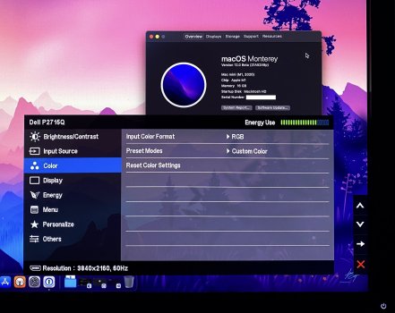
The first beta of macOS 12 has resolved the YPbPr output issue on my old Dell P2715Q. First time I've got RGB out of my M1 Mac Mini.

Interestingly when I installed it I made a note to check the video output and confirmed it was still YPbPr. Today I rebooted and after a lengthier-than-normal reboot and blank screen, it came back in RGB.
 

Attachments

  • IMG_4751.jpg
    IMG_4751.jpg
    427.1 KB · Views: 465
Anyone yet tested Monterey with 2K/2560x1440 monitor running at native 2560x1440 if fonts look better than in Big Sur? Or is it still as terrible?
 
A general point for using QHD monitors with OS X - you can trick the system into doing Retina oversampling which should sharpen things up a bit. It obviously has more effect if you create smaller virtual resolutions.

When I had a 2560x1440 monitor I used to run it at 2048 x 1152 virtual (i.e. downscaled 4096 x 2304) and it was fairly decent, at the expense of some screen real estate.

see here:

 
  • Like
Reactions: AlphaCentauri
When I had a 2560x1440 monitor I used to run it at 2048 x 1152 virtual (i.e. downscaled 4096 x 2304) and it was fairly decent, at the expense of some screen real estate.
I can't really go lower than 2560x1440 screen estate. It is just too limiting factor basically almost the same as 4k at HiDPI 1920x1080 which would be the next best solution otherwise. I know I could run 4K at 2560x1440 looks like but with certain scaling issues so not sure I want such trade off.
 
IMHO that's a more than worthy tradeoff. And it still looks better than a native 2560x1440 monitor in my experience.
Yeah, I guess that is what I'm eventually forced to do...
However still experimenting with my 2K monitor and actually found interesting combination using default Font Smoothing combined with antialiasing enabled. I think the latter on needs to be used with Apple default Font Smoothing on.
 
  • Like
Reactions: Amethyst1
I decided to buy a Mac mini only after I already bought a Dell U3419W for a Windows machine I use as well. After reading numerous posts it seems like 2K displays will never really look great with a mini, and there are effectively 1 or 2 displays that come close to being as good as an internal display: the LG 5K and the LG 5K2K (maybe?).

I guess if I had known this, I would have got the LG5K. I use Citrix with my mac to log into a Windows platform, and there is no problem there with font rendering, as many have noted.

I think the best I have come up with so far is to tweak the contrast a bit in the Accessibility setting to a 1/2 tick of increased contrast and to use TinkerTool to turn off font smoothing. It's amazing that there are so few reasonable options to reproduce the sharpness and clarity of an internal retina display on an external display.
 
I guess if I had known this, I would have got the LG5K. I use Citrix with my mac to log into a Windows platform, and there is no problem there with font rendering, as many have noted.
Yes, it seems 5K monitor is the only choice to get about the same display quality as internal displays Apple uses.
4K probably next best choice but not really best solution unless you are happy with (2x) 1920x1080 even fractional scaling is pretty good in M1's. However simple tests show that's not optimal for graphics even fonts surely are much nicer than in 2K monitors.

Anyway looks like font rendering can be made work in MacOS since even Microsoft Remote Desktop shows fonts in Windows just as good you would see them using machine local.

I think the best I have come up with so far is to tweak the contrast a bit in the Accessibility setting to a 1/2 tick of increased contrast and to use TinkerTool to turn off font smoothing. It's amazing that there are so few reasonable options to reproduce the sharpness and clarity of an internal retina display on an external display.
I also used my M1 a while with turning off Font Smoothing completely but later on I started to notice more and more issues with it where fonts just got too thin, especially anything with colored text boxes like iMessage, Calendar etc...
Now just couple days ago I took another approach using Font Smoothing at default value (2) + antialiaising switched on (not sure yet but I think it makes a minor difference) and then those colored text boxes look good and "fat" fonts surely show up here and there but not really too badly other than just menu bar. Also I removed custom css for Safari and let it be default too now.

So currently I'm using these settings:
AppleFontSmoothing 2
CGFontRenderingFontSmoothingDisabled NO
 
CGFontRenderingFontSmoothingDisabled NO
In Tinkertool is the "Enforce old style font smoothing" option?!
 
CGFontRenderingFontSmoothingDisabled NO
In Tinkertool is the "Enforce old style font smoothing" option?!
Good question and I really don't know (I don't use TinkerTools myself but just terminal commands).
I think using that with default Apple Font Smoothing is the best solution for now. Surely it won't match Retina font look and it still looks kinda bold in some cases but overall still I prefer this over Font Smoothing disabled because that made many smaller fonts pretty bad, especially fonts in colored text box and such.
Also I think larger fonts already look pretty good with my current settings and are a little "Retina" like.
 
In may case the connection to the monitor made the difference. I recently switched to a OWC TB3 dock and a miniDP to DP adapter. The difference is night and day. I have a 2K Dell 32” curved gaming monitor. The MBA now drives the display by default at a 164Hz, and while still using YPBPR as input, the colors are crisp, fonts are sharp and no distortion at all. Using my old USB to HDMI adapter no more!
 
In may case the connection to the monitor made the difference. I recently switched to a OWC TB3 dock and a miniDP to DP adapter. The difference is night and day. I have a 2K Dell 32” curved gaming monitor. The MBA now drives the display by default at a 164Hz, and while still using YPBPR as input, the colors are crisp, fonts are sharp and no distortion at all. Using my old USB to HDMI adapter no more!
So fonts looking bad with 2k monitor running at native rate is not OS feature but just bad adapter? Interesting. I got impression it was related to missing HiDPI support for 2k monitors.

I have usb-c to dp cable but I understood it is just a cable since usb-c in M1 Mini support DP too. So getting TB3 dock should give me perfect fonts with my U2518D?
 
That is definitely interesting. I’m using a usb-c cable that came with the monitor for the connection. Maybe that’s a problem? Is there a best usb-c cable for video for mac to external? I’ll try dock as well.

So it looks like I may have been pretty naive about cables. I see that Apple sells a TB3 Pro cable. I guess I should probably try that by itself and also try that along with that and a hub and mini DP.
 
Last edited:
So it looks like I may have been pretty naive about cables.
I've been thinking that too many times but I doubt since there are so many places where people talk about issues with 2K monitors and lack of HiDPI mode causing bad looking fonts. I find it hard to believe that all is just because of they used "wrong" cables. I see point if the cable has some kind of build in converted that actually does something to image rather than just pass USB-C native DP to DP in monitor, or that's what I thought my cable was doing.
Also I find it hard to believe if my cable actually has some sort of video processor causing bad looking font then why all the graphics are pixel perfect AND why using Windows 10 thru Microsoft Remote Desktop using my M1 results sharp fonts that look exactly the same as if I was using that Windows machine locally?
 
Yeah I don’t have a good explanation for Windows vs Mac font rendering and I tend to agree with you. I may try the expensive cable and see. If it doesn’t make any difference I’ll return it.
 
Yeah I don’t have a good explanation for Windows vs Mac font rendering and I tend to agree with you. I may try the expensive cable and see. If it doesn’t make any difference I’ll return it.

Guys, it has been said so many times already in different threads all over internet, since Mojave, MacOS looks crap on non-HiDPI displays due to Apple caring about retina displays only.

Don’t waste your money on cables as this will not change font rendering used by Apple OS. Windows is different (better), in this regard.

YpBpR vs RGB is entirely different issue as it relates to colour space used by the monitor.
 
Last edited:
Guys, it has been said so many times already in different threads all over internet, since Mojave, MacOS looks crap on non-HiDPI displays due to Apple promoting retina displays only.

Don’t waste your money on cables as this will not change font rendering used by Apple OS. Windows is different (better), in this regard.
Yeah, that was my impression too but how can you explain how another person just mention above that getting different adapter resulted "fonts are sharp and no distortion at all."? To me that sounds like that fixed the font issue completely.
See the full quote below.

In may case the connection to the monitor made the difference. I recently switched to a OWC TB3 dock and a miniDP to DP adapter. The difference is night and day. I have a 2K Dell 32” curved gaming monitor. The MBA now drives the display by default at a 164Hz, and while still using YPBPR as input, the colors are crisp, fonts are sharp and no distortion at all. Using my old USB to HDMI adapter no more!
 
Yeah, that was my impression too but how can you explain how another person just mention above that getting different adapter resulted "fonts are sharp and no distortion at all."? To me that sounds like that fixed the font issue completely.
See the full quote below.

Yes, I’ve read this and I think it is either expectation bias or different perception on how crisp font should look like. By all means, try a different cable but it will not make fonts any sharper. It might improve colour space, yes.

Having said that, it is theoretically possible that using different cable somehow unlocked HiDPI resolution in MacOS on 2K screen but I doubt it. We would need to see this person’s display preferences screenshot to see what resolution he is running after changing cable, is it 1:1 or is it HiDPI?
 
Last edited:
Yes, I’ve read this and I think it is either expectation bias or different perception on how crisp font should look like. By all means, try a different cable but it will not make fonts any sharper. It might improve colour space, yes.
I experimented with color space between YPbPr as RGB already and found a way to force RGB mode which resulted more realistic colors (YPbPr was too saturated) but as far as fonts in MacOS I doubt they could improve since as I said all the graphics show pixel perfect already and if I use Microsoft Remote Desktop to run Windows in MacOS also results sharp fonts, just as if I was using that machine locally. I would expect seeing the same issue in those situations too in case it was just that.
 
  • Like
Reactions: AlphaCentauri
How does one determine if their monitor is HiDIP?

By plugging it in and checking display preferences scaled resolutions, see my posts #332 and #335 in this thread.

Normally, MacOS will show native resolution on this list (non HiDPI) and various other resolutions which are all HiDPI (if monitor is HiDPI capable according to Mac OS). Tick box “show low resolution modes” will show available non HiDPI resolutions which all have crappy looking fonts.
 
Last edited:
  • Like
Reactions: seadragon
By plugging it in and checking display preferences scaled resolutions, see my posts #332 and #335 in this thread.

Normally, MacOS will show native resolution on this list (non HiDPI) and various other resolutions which are all HiDPI (if monitor is HiDPI capable according to Mac OS). Tick box “show low resolution modes” will show available non HiDPI resolutions which all have crappy looking fonts.


Thank you. This is what I see:

i-HdKW2Xg-M.png
 
Register on MacRumors! This sidebar will go away, and you'll see fewer ads.