Can you upload the pic of new login screen, please? I am also glad it is not blurry anymore.The reason you gave me was that it was a design element. Of course it's a design element—I know this. IMO, it's a silly design element. I'm glad that Apple is going back to their older roots by reversing some of these stupid features. I love that, for example, software updates have been moved back to Sys Prefs; and, I think it's cool that, for the first time since OS9, we have color accents. Similarly, the blurred login window is no more: we can see our wallpapers again.
I don't want to see a blurred version of my wallpaper. I wear glasses so that my screen ISN'T blurry. If I wanted to see a blurred version of my wallpaper, I'd take my glasses off.
Got a tip for us?
Let us know
Become a MacRumors Supporter for $50/year with no ads, ability to filter front page stories, and private forums.
macOS 10.14 Mojave: All The Little Things
- Thread starter Galaxas0
- WikiPost WikiPost
- Start date
- Sort by reaction score
You are using an out of date browser. It may not display this or other websites correctly.
You should upgrade or use an alternative browser.
You should upgrade or use an alternative browser.
- Status
- The first post of this thread is a WikiPost and can be edited by anyone with the appropiate permissions. Your edits will be public.
Cool. Some of us outliers run our lives through Dashboard so glad Tim Cook uses it too.Dashboard is still there.
Can you upload the pic of new login screen, please? I am also glad it is not blurry anymore.
It's german but I guess you should be able to ignore that
Thanks a lot.View attachment 765270
It's german but I guess you should be able to ignore thatJust says the normal enter code and cancel
Unfortunately the translator widget doesn't seem to work anymore and some widget have graphical glitchesCool. Some of us outliers run our lives through Dashboard so glad Tim Cook uses it too.
I can give my opinion on it. Saying that it's silly is an opinion; although, I think I still have a pretty good case for why it was a good decision for Apple to go back to what they had been doing for YEARS.View attachment 765253 View attachment 765254
Apple had always had a normal background image associated with the login screen. Then, in Yosemite (or whenever), they decided, "Nope, let's make it look as though you lost your prescription glasses before sitting in front of the computer."
They're going back to their [great] roots by bringing back this non-blurry design element to Mojave.
Meh. Classic Aqua login screen looked cool for early 2000s, and Yosemite login screen looks cool for today.
It's mostly a fashion thing, really.
[doublepost=1528408126][/doublepost]
Exactly. Options are ALWAYS good!
Options mean complexity. They make the UI more complex (that's why you often see an 'Advanced' page in settings, and that's why oftentimes, settings don't get shown in the UI at all and require command-line tweaks), and they make the code more complex. More UI complexity means scaring off users and keeping them from seeing the forest for the trees, and more code complexity means maintenance hell for developers.
It doesn't follow that there shouldn't be options at all, but how many options you do in a piece of software is a fairly hard tradeoff to make.
And with Dashboard in particular, I wouldn't be surprised if Apple eventually decides the cost of keeping it around (or modernizing it) isn't worth it. It's hard to explain to users why both Dashboard and the Today view exist, and why they work entirely differently, and it's perhaps even harder to justify to third-party to developers to create widgets for both of them when even Apple themselves haven't bothered.
Seems like the touchbar has been updated. It looks a bit cleaner (buttons aren't separate if they're right beside each other and some other minor GUI enhancements) but it also seems to be more responsive, like my play button seems to work more accurately as in it works when I want it on the first click now instead of before where it would sometimes register that I clicked but wouldn't play/pause.
Thanks a lot.
I've changed. mine like this now. I just hope they give us the Option to adapt the login screen to the UI size you choose inside. This matches the default size on my Macbook Pro. But actually I set the UI to be bit smaller and that makes the login completely out of place
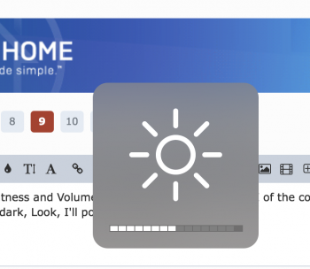
Yes i have the same issue here. But this exists only in Darkmode. Bright mode (or how do they call it) is still finePS, my Brightness and Volume sliders are glitchy on the GUI of the computer (not the touchbar). Have of them are white and half are dark, Look, I'll post a screenshot
https://forums.macrumors.com/threads/any-chance-for-a-darker-theme.2118615/We need a darkmode for Macrumors
PS, I would call them Light Mode and Dark Mode.
I always assumed they blurred the login screen picture for privacy reasons. Because it was your desktop wallpaper, and in public settings like offices or school dorms or whatever, that you wouldn't necessarily want a stranger to see your family or whatever personal photo (which many people use as wallpaper).
Maybe it was for aesthetic reasons, but the privacy thing made sense to me. Not sure why they changed it, unless they've now divorced the login screen photo from your wallpaper choice. Can anyone test that?
Maybe it was for aesthetic reasons, but the privacy thing made sense to me. Not sure why they changed it, unless they've now divorced the login screen photo from your wallpaper choice. Can anyone test that?
Safari: Can someone see if they've fixed the keyboard shortcut for zoom? They broke it on High Sierra. Prior to HS, you could press [Cmd]+[=] and zoom. Now you must also press shift (to get the +) for zoom. Small, but annoying.
Is there a way to change this to how it was? Mainly to display progress in size (MB generally). I like how Android has that, but iOS never had it. I also thought Mac OS X didn't have it but it was a nice surprise when I found out it did. It would be a shame if they removed it completely, only displaying it graphically and not numerically.This is how Updates are now shown. iOS style progress indicators.
True. The classic Macintosh OS (System 8 or 9) through Snow Leopard (10.6.8) had the default wallpaper sitting behind the login window, then 10.7-10.9 used the grey linen background. Starting with 10.10, we saw the blurred background.They're going back to their [great] roots by bringing back this non-blurry design element to Mojave.
Can anyone confirm that no matter what desktop image is set, the login window uses the default Mojave wallpaper?
[...] They're going back to their [great] roots by bringing back this non-blurry design element to Mojave.
If you really want to talk about going back to their roots...
http://nixon-development.com/guis/nextstep3/login.png
A few questions:
a) What does the installer look like? Any changes, or is it still the standard iOS-like black/white screen with the Apple logo and progress bar? Was the installer logo updated with the Mojave logo, or is it still the High Sierra logo? And, any way to see a final installer logo after a completed install?
b) Does the old classic wristwatch mouse "cursor" still appear randomly?
c) Was the Dashboard Tile puzzle logo updated for Mojave, or does it still show the Yosemite logo?
True. The classic Macintosh OS (System 8 or 9) through Snow Leopard (10.6.8) had the default wallpaper sitting behind the login window, then 10.7-10.9 used the grey linen background. Starting with 10.10, we saw the blurred background.
Can anyone confirm that no matter what desktop image is set, the login window uses the default Mojave wallpaper?
I think these might just be beta 1 quirks.
[doublepost=1528433122][/doublepost]
A few questions:
a) What does the installer look like? Any changes, or is it still the standard iOS-like black/white screen with the Apple logo and progress bar? Was the installer logo updated with the Mojave logo, or is it still the High Sierra logo? And, any way to see a final installer logo after a completed install?
b) Does the old classic wristwatch mouse "cursor" still appear randomly?
c) Was the Dashboard Tile puzzle logo updated for Mojave, or does it still show the Yosemite logo?
Again; such polishes will be done before final release I fancy. Not so early in the development cycle.
Can anyone confirm that no matter what desktop image is set, the login window uses the default Mojave wallpaper?
I can confirm that that does NOT happen. Changed the wallpaper. Locked the computer... when I unlocked it, I got my current wallpaper as the login background. Shut the system down and restarted... got my current wallpaper... gonna say this one's busted.
Zip files automatically get unzipped after downloaded!
This option has been in Safari for a looooong time. The update probably enabled this setting for you, it’s within the Safari setting > General.
Wow, how did you do that? Is that 'Increase contrast' mode? And, is the window selected or de-selected?[/QUOTE]
It’s dark mode and the window selected. I wanted to show what i think is an example of attention to detail. The ”inside” of the buttons indicating what a button does is black in dark mode. In the standard mode the buttons look like they do in High Sierra i.e white. (My preference would be white, though)
It’s dark mode and the window selected. I wanted to show what i think is an example of attention to detail. The ”inside” of the buttons indicating what a button does is black in dark mode. In the standard mode the buttons look like they do in High Sierra i.e white. (My preference would be white, though)
On my MBP 13 inch 2015 the Adjust Display Brightness is always getting to enabled after every restart.
Sames as the Keyboard backlight - I set it to turn off after 5 seconds but after every restart the check button switches back.
I like the Dark mode but it definitely needs more fine tuning.
Mojave does not fix a problem for me which I had on several machines with Safari. All of a sudden safari stops autofilling anything and the option to Quit is greyed out. I have to force kill Safari and restart it.
I am just curious - what is in general the frequency of DP releases based on previous OS DP release base?
I presume next week will not see anything since all devs are now stuck at WWDC and next week they might be working on updates.
Register on MacRumors! This sidebar will go away, and you'll see fewer ads.


