If you're talking about the stock ones that you clicked on and downloaded, they actually take up very little space. There was some article recently about how the system dynamically compresses them when they're not being used.Is there any way to remove the Screensavers to save some GB?
Got a tip for us?
Let us know
Become a MacRumors Supporter for $50/year with no ads, ability to filter front page stories, and private forums.
macOS Sonoma: All the little things!
- Thread starter KoolAid-Drink
- Start date
- Sort by reaction score
You are using an out of date browser. It may not display this or other websites correctly.
You should upgrade or use an alternative browser.
You should upgrade or use an alternative browser.
Is there any way to remove the Screensavers to save some GB?
The screensavers are in one of the subdirectories of /Library/Application Support/com.apple.idleassetsd/Customer , depending on their resolution.
You can delete them with finder. I read, that they are deleted by the OS when disk space is low, but I think Apple should add an option in the settings.
On my 2020 iMac the screensavers where between 500 MB and 1,5 GB each.
I picked the "Shuffle All" option shortly after installing, CPU and network activity roared away for a good couple of minutes and I was left with 16GB+ of animated backgrounds.. I was expecting it to just download one before the interval refresh.
But that might put an end to the days of hunting for new backgrounds every now and then, if these look as stunning as they do on tvOS.
EDIT:
Oh yeah and I love the new text cursor animation and how it changes colors depending on your accent and which site/text box you're on/in!
But that might put an end to the days of hunting for new backgrounds every now and then, if these look as stunning as they do on tvOS.
EDIT:
Oh yeah and I love the new text cursor animation and how it changes colors depending on your accent and which site/text box you're on/in!
Last edited:
BATTERY
I think that apple made changes in 'optimized battery charge' in sonoma.
I have this feature enabled from ventura,
but now it seems that mac os handles it differently.
Also, when you click on battery icon, it has a new option to fully charge battery, if it is on an ongoing procedure of reducing load.
Does anyone observed it too?
This isn't new, there's always been the option to override the settings and charge to full.Also, when you click on battery icon, it has a new option to fully charge battery, if it is on an ongoing procedure of reducing load.
I noticed this too. I thought I was imagining things.Menus have been rewritten in AppKit, and the timing of the fade animation and the double blink animation when an item is selected changed. The double blink seems faster.
When I drag an item into a section on the Finder sidebar (say from Documents view into Desktop) the icon for that sidebar item slightly bounces. Is this new?
Apple did add animations to its SF Symbols in macOS 14, so this might indeed be new.
How come? Outlook accounts aka Hotmail/Windows Live were migrated to Microsoft Exchange. It's the same thing.Has Apple by any chance added "Outlook" account support (different than "Exchange" account support)?
I really wish Apple would have stuck with the WinXP-inspired abstract wallpaper for the boot screen. As soon as I enable FileVault to protect my precious, irreplaceable, food photos and data, the boot screen wallpaper defaults to an aerial view of some guy's Sonoma vineyard and now I'm reminded every time I power up my Mac that I've underachieved in this life (I mean I've achieved closer to vineyard-life v. box of wine-life, but still painful and my parents never forgave me for not going to law school/medical school... what was this post about again?) 
P.S. In all these years, never tried to turn on the feature to announce the time. Went in to sample some of the voices, the Novelty voices (Albert, Bahh, and Whisper) are good Halloween voices. Zarvox has a bit of the old school Tron “bit” voice.
P.S.S. Not sure it’s been mentioned, but on my 2019 MBP, doing a fresh install of 14.1 and noticed the Siri orb during setup is no longer animated/swirling as it was for Big Sur and Monterey. Also doesn’t swirl when configuring additional users.
huh? in what way?Have been using Sonoma for about 10 days now. I can say that Sonoma is making a determined effort to catch upto Windows Vista.
The new "features"!!. Previously I had my Finder to Desktop 4 and I could easily access Finder menu from any of the Desktops (I have a total of 6). Now, unless I go to Desktop 4, I cannot access Finder. That's just one example.huh? in what way?
When you hover over the icons in Dock, it looks like the labels have a little bit of linear gradient to them, giving them slight 3D look. I do not remember it being there before
edit: I think it was just an illusion
edit: I think it was just an illusion
Yes, this is 100% the best improvement from my perspective. I've never had very strong vision, and with age it only got worse. Sonoma made it possible for me for the first time to use the Macbook at its default resolution. Still not perfect - the Reminders font is pretty small and can't be changed. But I use GoodTask anyway.The new accessibility font size for native Apple apps like finder is a great addition, but I'm disappointed it lacks some major apple apps like the music, settings and podcast ones. Hope it'll be add up in feature Somona updates.
There seems to be a nice fix in Sonoma, where my very large Books library would randomly cause a memory leak. After a few days, not one crash…
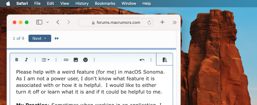
Please help with a weird feature (for me) in macOS Sonoma. As I am not a power user, I don't know what feature it is associated with or how it is helpful. I would like to either turn it off or learn what it is and if it could be helpful to me.
My Practice: Sometimes when working in an application, I click off of the application to change to finder or some other application. In the past, this just worked (probably why I formed this particular habit). In Sonoma, something new is happening.
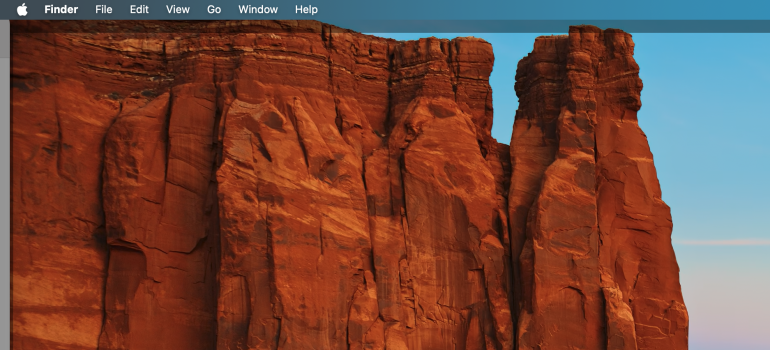
Behavior in macOS Sonoma: When I click off the app, all windows leave the screen and now the whole desktop has a shaded box around its now empty workspace. See attached photos. Note: Whenever this happens, I feel like I have done something wrong or made a mistake. I quickly recover, but it is annoying to me at this point.
Question to my macrumor support group: What is going on? Is it part of something useful? Can I turn it off? Do you suggest adopting whatever this feature is and retraining myself to be a more functional part of the macOS community?
Attachments
Please help with a weird feature (for me) in macOS Sonoma. As I am not a power user, I don't know what feature it is associated with or how it is helpful. I would like to either turn it off or learn what it is and if it could be helpful to me.
My Practice: Sometimes when working in an application, I click off of the application to change to finder or some other application. In the past, this just worked (probably why I formed this particular habit). In Sonoma, something new is happening.
Behavior in macOS Sonoma: When I click off the app, all windows leave the screen and now the whole desktop has a shaded box around its now empty workspace. See attached photos. Note: Whenever this happens, I feel like I have done something wrong or made a mistake. I quickly recover, but it is annoying to me at this point.
Question to my macrumor support group: What is going on? Is it part of something useful? Can I turn it off? Do you suggest adopting whatever this feature is and retraining myself to be a more functional part of the macOS community?
- Open Settings.
- Choose Desktop & Dock.
- Scroll down to Desktop & Stage Manager.
- Under click wallpaper to reveal desktop, click to change from Always to Only in Stage Manager.
I am so grateful for your help! I hope that I can one day return the favor! Thank you, tons!
- Open Settings.
- Choose Desktop & Dock.
- Scroll down to Desktop & Stage Manager.
- Under click wallpaper to reveal desktop, click to change from Always to Only in Stage Manager.
Thanks! I leave this on for Stage Manager where I guess it can make sense? I just don’t ever use Stage Manager really.I am so grateful for your help! I hope that I can one day return the favor! Thank you, tons!
Thanks! I leave this on for Stage Manager where I guess it can make sense? I just don’t ever use Stage Manager really.
I believe the actual reason for this is to allow users to expose the desktop widgets easily
Thanks, gwhizkids! Clearly, I am not familiar enough with Stage Manager or widgets at this point. I’ll probably look into it at some point as I can’t see the point or use case so far. I am an old dog that CAN learn new tricks, however, it takes a lot more effort than it used to.I believe the actual reason for this is to allow users to expose the desktop widgets easily
I have a feature question I hope is not a gripe.Having read through previous threads, I'd like to ask that this one be kept to little things, aka features, not bugs or gripes etc.
On System Settings, why is the icon grey sometimes ex: General while Sound, Display etc are in color?
thanks in advance
Register on MacRumors! This sidebar will go away, and you'll see fewer ads.


