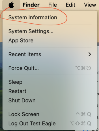
They might treat the System Settings menu item as a special case, because it is functionally similar to the Preferences/Settings menu items which always have an ellipsis. At least in older versions of the Human Interface Guidelines, Apple said that the Preferences/Settings menu item should have an ellipsis, because it opens a window where the user can perform the action (broadly, viewing and changing the settings).
Yes, I agree that the various Preferences/Settings menus are probably now a special case (while they weren't when the original HIG were introduced).
To expand on this:
Many years ago, I was explained that pretty much the only legitimate use of ellipsis is when the menu opens a modal dialog (although I don't know what the exact wording was in the guidelines back then).
The main point regarding the ellipsis in the current guidelines (
https://developer.apple.com/design/human-interface-guidelines/menus) is the following:
Append an ellipsis to a menu item’s label when people need to provide additional information before the action can complete.
Modal dialog is basically the only case when users
must do something before the action can complete (that is, they must dismiss the dialog in order to proceed).
Back in the day it applied to the Preferences window in pretty much all apps - as the Preferences window was always modal. So it had to be dismissed via the OK/Cancel buttons to write (or dismiss) the changes. At some point Cocoa bindings were introduced, which eliminated the need to explicitly dismiss the dialog anymore - any changes to preferences were registered automatically and instantly as they're made. Obviously, not all apps are employing the bindings so the Preferences window in many apps is still modal.
I assume that, like you mentioned, the Preferences/Settings menu is now a special case and always requires ellipsis for consistency sake.
In all other cases, that is when the menu doesn't open a
modal dialog, users basically don't really
have to take any action after opening a window, panel, or another app. Users can proceed to do whatever they need without doing anything before the action can complete.


